Sites We Love from 2014
We’ve had another fun year of finding great type all over the web. Here’s a roundup of some of our favorites from the sites we profiled in 2014. We look forward to seeing what the next year brings from you all!
Openings
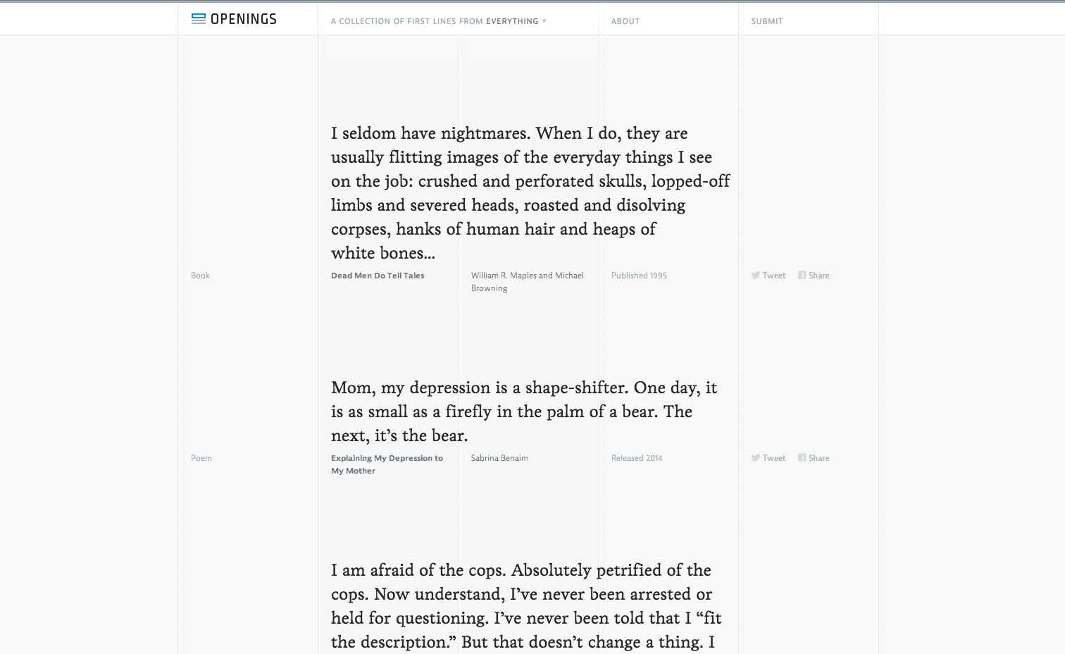
Showcasing the first lines from a long list of books, poems, songs, and other works, Openings uses Livory as the primary body text font and JAF Bernina Sans for unobtrusive navigation. (From February 7.)
TechDept
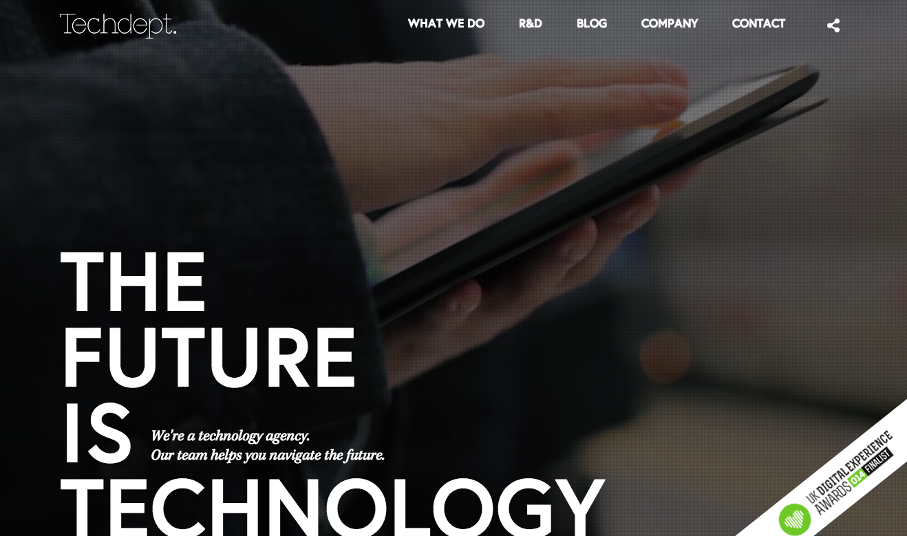
“The Future Is Technology” intro text in stunning Europa captures the eye on the Techdept website; body text is set in Kepler. (From May 9.)
RiceBowls
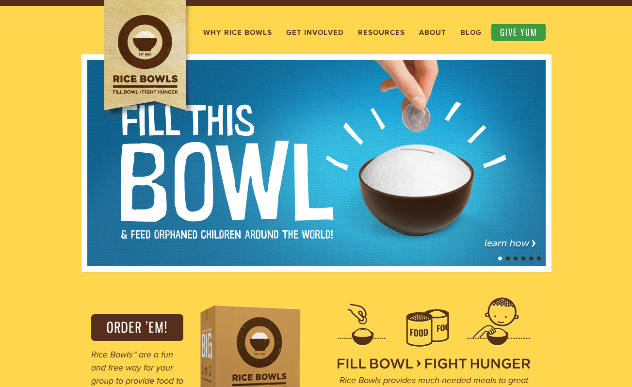
The bright Rice Bowls website uses sleek Gnuolane for headers and Proxima Nova for the body text. (From May 2.)
Katie Christ
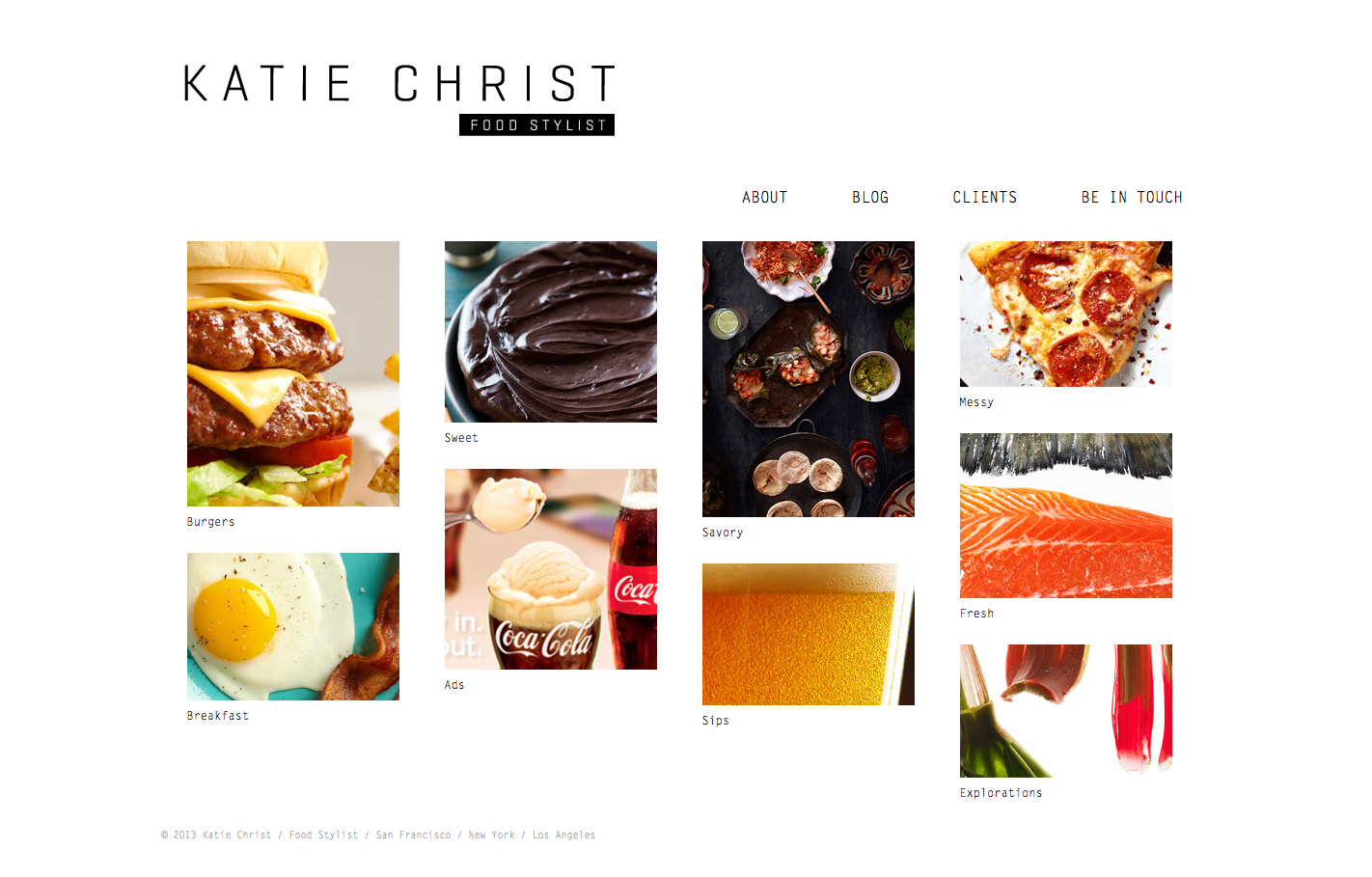
The delicious-looking photography portfolio of food stylist Katie Christ accomplishes a bit of a retro-electric-typewriter aesthetic with monospaced Letter Gothic Std. (From February 28.)
A Very Happy Thursday
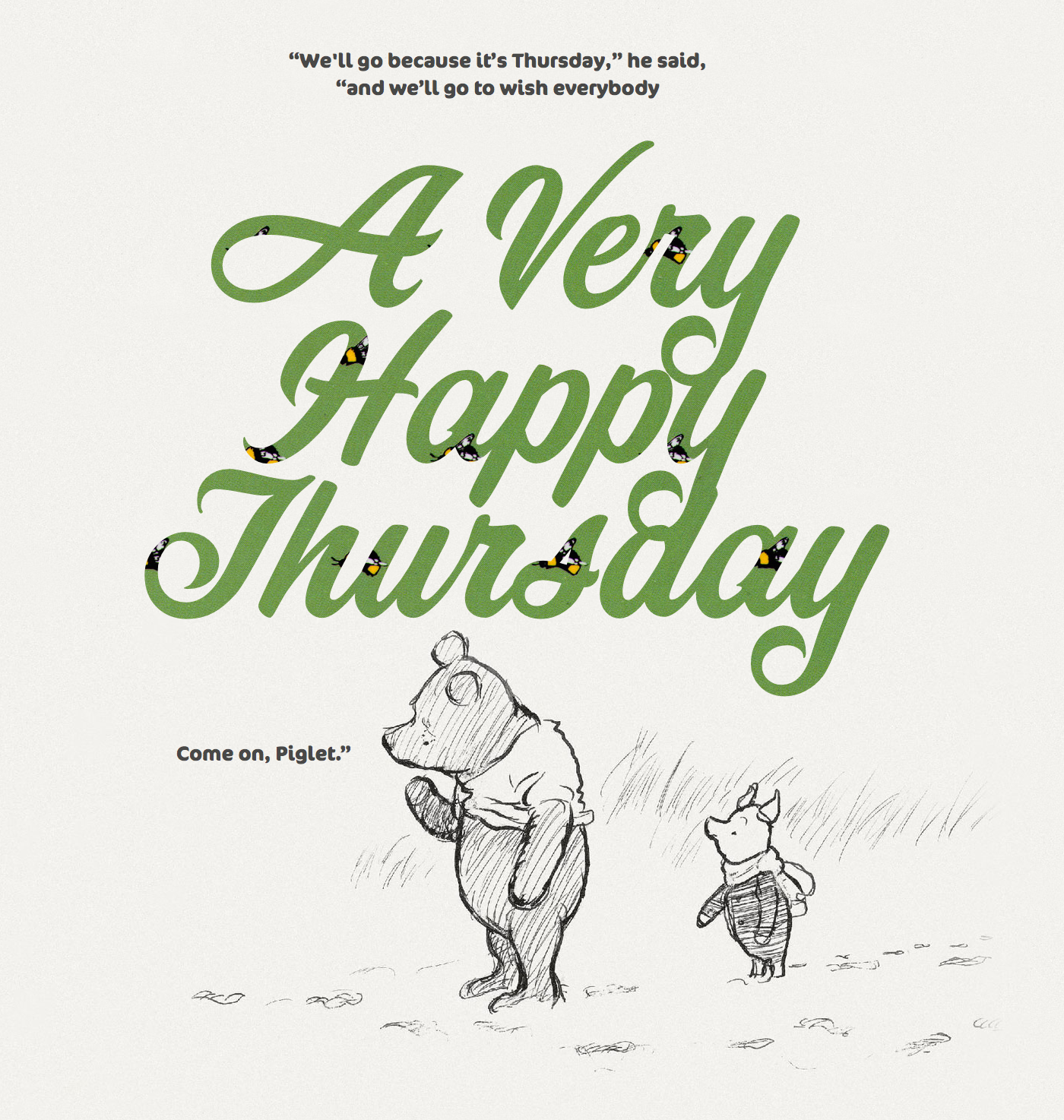
Corner Store is set large and bright with bumblebees peeping through the transparent text on A Very Happy Thursday, and is paired with cheerfully-rounded FF Cocon. (From April 3.)
How Many People Are In Space Right Now?
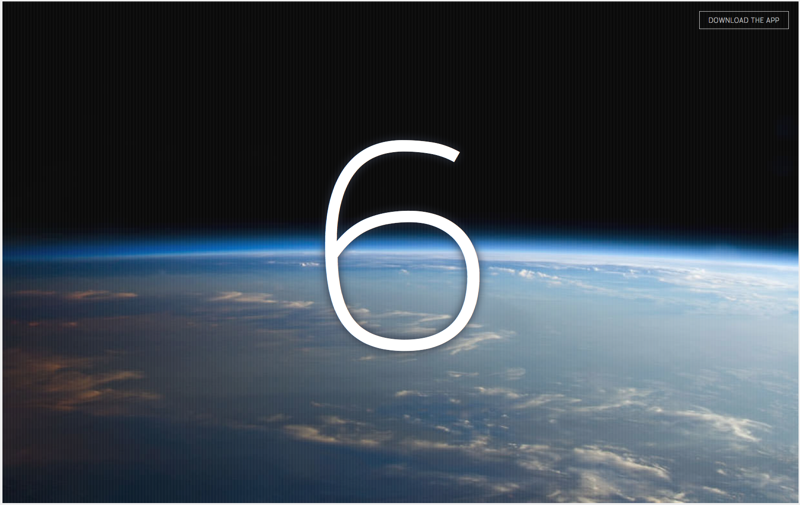
How Many People Are in Space Right Now? answers its own question with the current number in graceful FF Enzo. (From January 31.)
Oozled
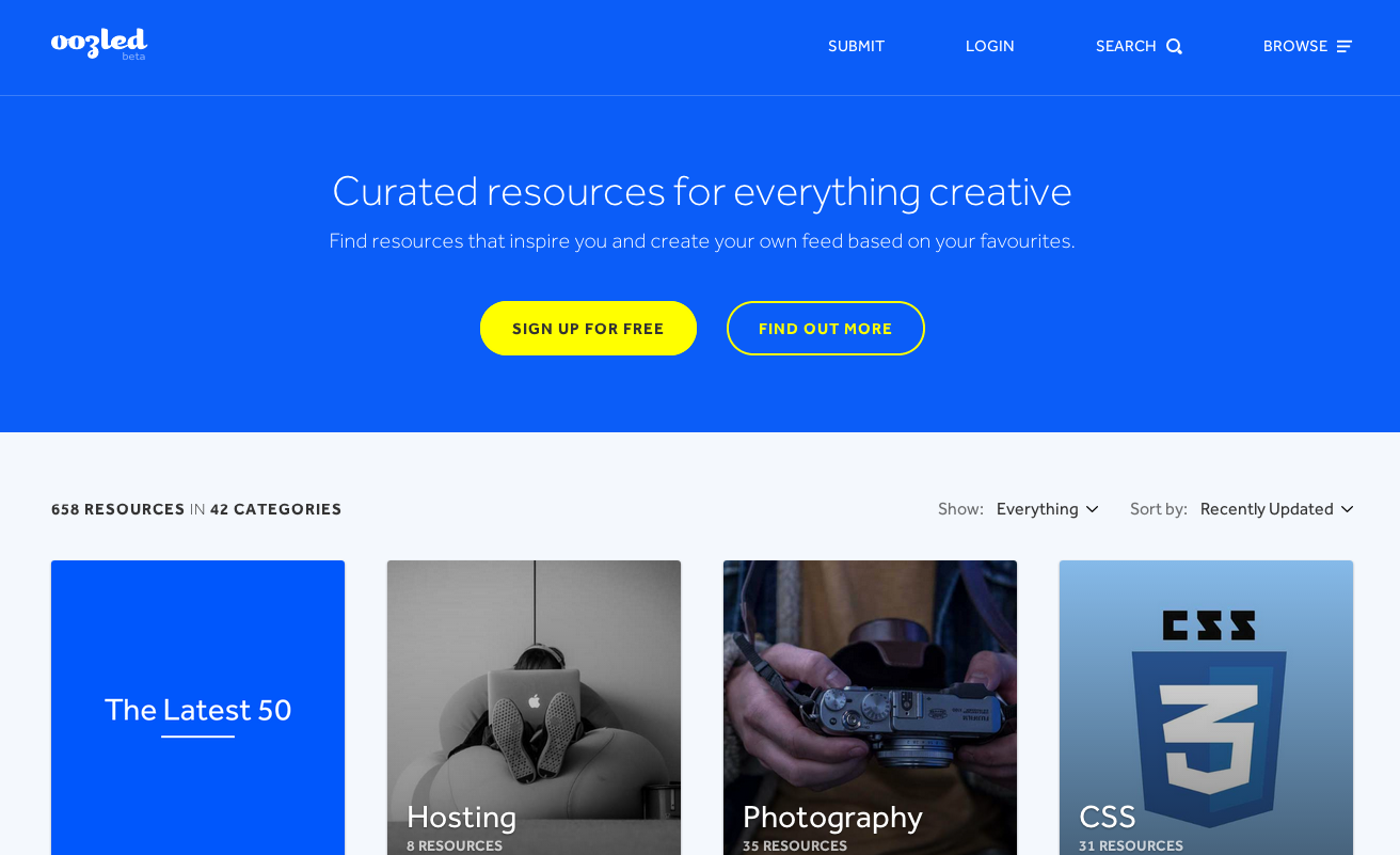
Effra looks fantastic on Oozled, graceful and unobtrusive, making for a comfortable browsing experience on this collaborative directory of web resources. (From July 11.)
University of Reading
The Department of Typography & Graphic Communication at the University of Reading delivers a fantastic type pairing on their website, with Abril Text for the body text and Iskra in the headings. (From March 14.)
Moonbase
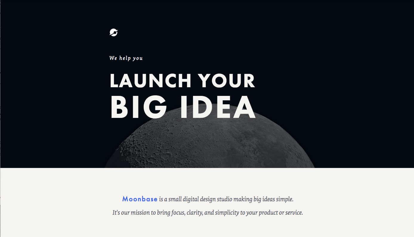
Iconic geometric face Futura PT is paired with serif Elena on the Moonbase homepage. (From November 21.)
A Ban Against Neglect
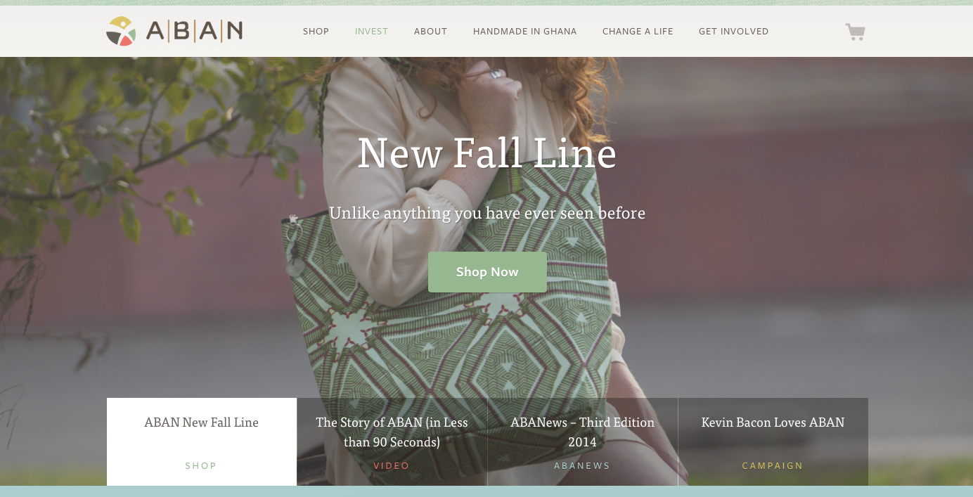
On the A Ban Against Neglect website, FF Tisa headlines beautifully, with Freight Sans in place for the top-level nav and subheads. Button text appears in FF Tisa Sans. (From October 24.)
Lumio
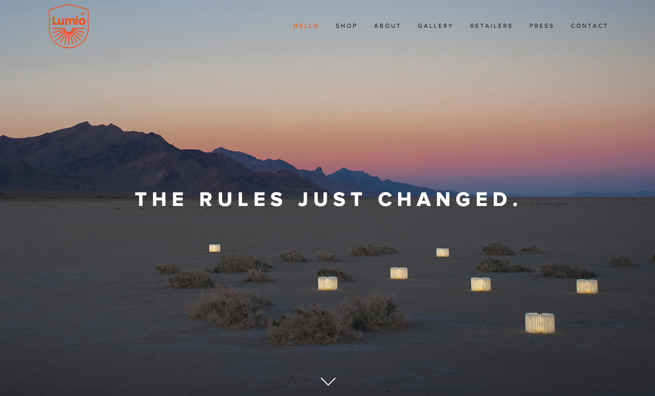
Proxima Nova is one of those typefaces where bumping up the weight can have a huge effect, as we see here on the bold design of the Lumio website. (From July 17.)
The Future of Car Sharing
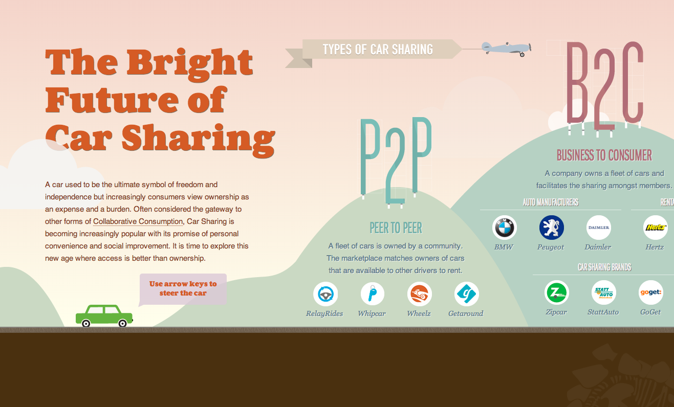
“The Bright Future of Car Sharing” infographic uses hefty Aurea Ultra for the headers, a nice counterbalance to the busy animations, and Franklin Gothic URW Extra Compressed as an alternate header. (From June 13.)
Polecat
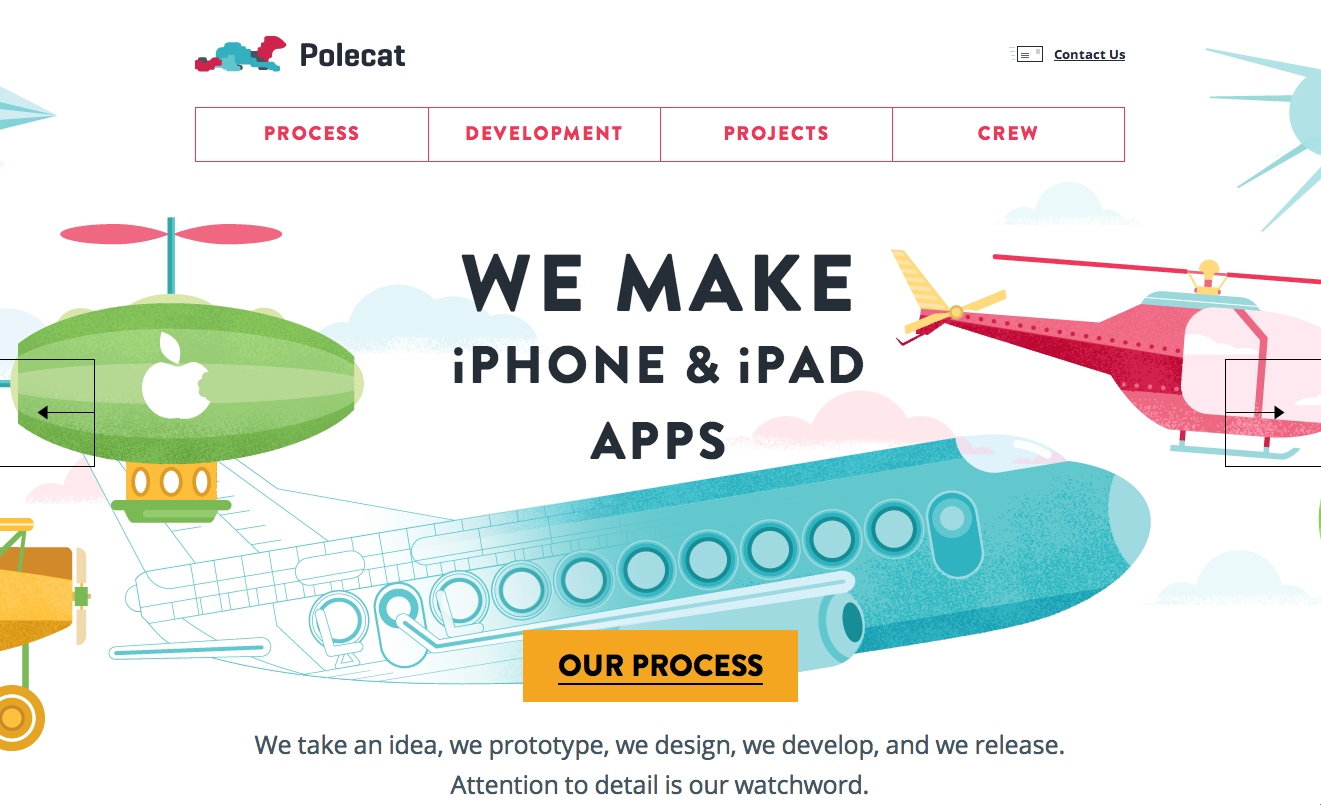
Polecat caught our eye with their Brandon Grotesque header; FF Prater Script is hidden in some of the subheads, and body text is set in Open Sans. (From June 26.)
If you’ve seen Typekit on a site you like, please share in the comments. We’ll be back with more in 2015; have a happy New Year!