Sites We Like: Emily Brick & Katie Christ
We love seeing all the different ways people use Typekit on their portfolio sites; these are spaces where people are putting their best faces forward, and we’re always fascinated to see which typefaces people choose to reflect their own distinct personalities.
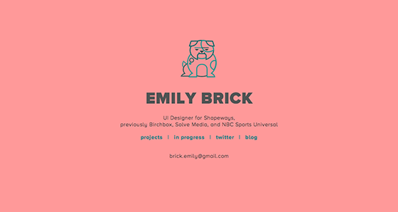
UI designer Emily Brick takes a minimal approach to her homescreen, with an animated bulldog stealing the show at the top of the page. Header text is set in Proxima Nova Alt, and the body text is in the Light weight of Omnes. The effect of the pairing is clean, open, and friendly—with the last quality emphasized by the dog’s wagging tail.
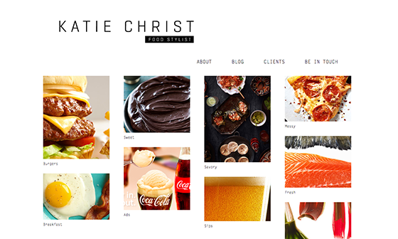
Food stylist Katie Christ has an absolutely delicious-looking photography portfolio here. Have a snack nearby when you browse this site, because you will definitely get hungry. The monospaced Letter Gothic Std hasn’t come up often in a portfolio site, and we like the way it looks here—especially in the header, where it retains a lot of its retro-electric-typewriter aesthetic.
That’s it for this week’s sites; share sites you like in the comments!
One Response
Comments are closed.
Admiring the dedication you put into your site and detailed information you offer.
It’s awesome to come across a blog every once in a while that isn’t the same old rehashed material.
Excellent read! I’ve bookmarked your site and I’m adding
your RSS feeds to my Google account.