Sites We Like: Openings, STET, & Bookshelf
As winter trudges along, we’re drawn to cozy indoor activities—like curling up with a good read. In this week’s sites we like, we’re sharing a few literary-minded sites that show a lot of respect for the written word, be it recommending good reads, publishing them, or (in all cases) setting it in excellent type.
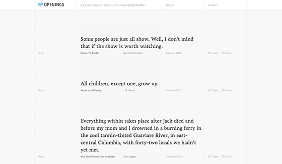
Openings features just the first line from a long list of books, poems, songs, and other works, making for a subtly brilliant site that we got completely sucked into. Livory displays beautifully here as the primary body text font, giving a warm and weighty feel to the quoted lines. Navigation in JAF Bernina Sans is clean and unobstrusive.
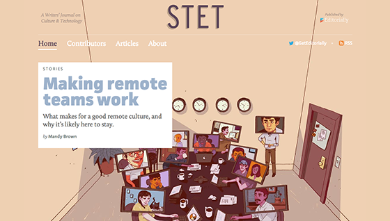
We’ve loved reading the thoughtful articles that have appeared on STET, which are accompanied by fantastic illustrations and, of course, a great type pairing. Multiple weights of JAF Facit play the part of headlines and navigation, offset by the gorgeous serif Calluna. The combination makes for an enjoyable, comfortable reading experience.
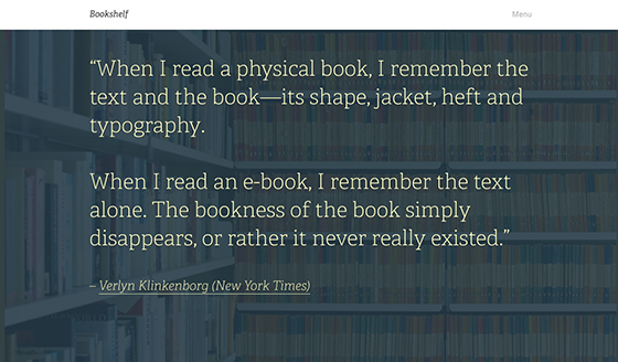
Designer Daniël Van Der Winden gives us a list of recommended reading in the most stylish manner imaginable with Bookshelf. We love seeing Adelle front and center with a sweeping quote on the main page, immediately setting the deliberate, literary tone for the site. Proxima Nova appears in subheads and navigation throughout, and a long list of other fonts make cameo appearances: Abril Fatface, Futura PT (for The Wes Anderson Collection, appropriately), League Gothic, and possibly even more with the next review he posts up there.
That’s it for this week; share sites you like in the comments!
7 Responses
Comments are closed.
I love the design of that STET website, would love to know who managed to design that detailed image!
If you mean the illustration, that was done by Justin Volz. http://justinvolz.com
I really appreciate the mention, guys. Cheers! I’ll get a new post up as soon as possible.
(Psst, Proxima Nova doesn’t appear that much. Adelle Sans plays an important role though.)
Thanks Daniel!
I really like http://pjrvs.com — clean and simple and good mix of 2 typekit fonts.
That’s actually really nice, which ones did you use?
The shape of bloody design… that book haunts me, I cannot fathom why designers are so enamoured by it, well I can… Emperor’s clothes etc.