Morisawa adds 10 more TypeBank fonts to Typekit
Morisawa, the premier type foundry in Japan, has made ten more TypeBank fonts available for web use and sync in Typekit’s subscription library. These are a fantastic addition to the Morisawa and TypeBank faces we added in the fall of 2015.
This brings our total collection of fonts from Morisawa and TypeBank up to 30 — great news for designers working with Japanese text.
Take a closer look at what’s new! 日本語でこのブログを読む (Read this post in Japanese).
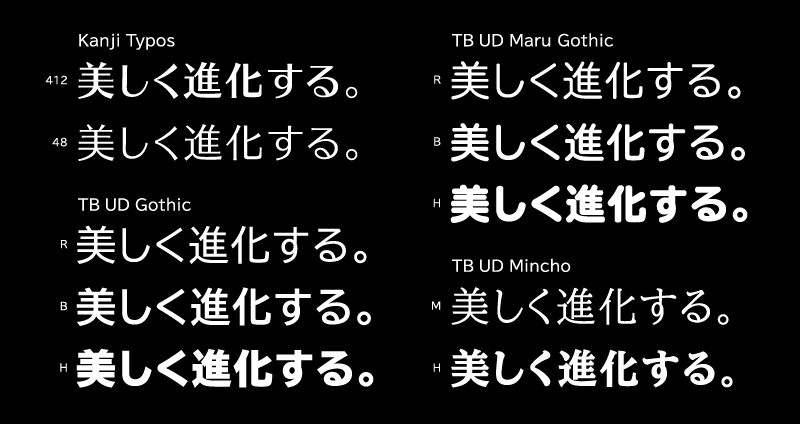
Kanji Typos 48 and 412
Typos first gained popularity in the 1960s and 70s. The numbers in the font names designate the weights of the horizontal and vertical lines in each font; for example, Kanji Typos 412 means that 4 is the horizontal line thickness and 12 is the vertical line thickness.
Ever since the Kanji design of Typos was released in 1968 on a journal book by Group Typo, its design has changed with the times. In 2008, TypeBank renewed and released five fonts as the “Kanji Typos” family for the first time. Even 40 years later, the design is still fresh, with a charming and open personality. Its simple and broad shape is attractive and makes for a highly accessible typeface, not only in print but also on screen displays.
Kanji Typos 415 has been in our library since the fall of 2015, and this addition of Kanji Typos 48 and 412 brings our total up to three fonts for the typeface.
TBUD font series
TypeBank Universal Design (TBUD) typefaces are noteworthy for incorporating the research findings of accessibility specialist Yasushi Nakano (of Keio University) into the design brief.
When designing a TBUD typeface, designers analyze the type in situations where the letters are easily misidentified, and evaluate the typeface based on its performance in these readability and legibility tests. As a result of this process, the TBUD font series has a high level of readability and legibility. This makes TBUD typefaces ideal for meeting accessibility goals and situations where readability is crucial, such as public signage.
We’ve added three typefaces from the TBUD font series to Typekit, for a total of eight new fonts meeting these rigorous accessibility standards.
TBUD Gothic Regular, Bold, and Heavy
TBUD Gothic is a Universal Design Gothic that exemplifies visibility and balance. In order to make characters easy to distinguish, unnecessary small strokes are omitted intentionally where the lines are heavily intersected. Overall it has been carefully designed to maintain clear form, with letter proportions widened to improve legibility and establish a balanced aesthetic. Compared to Kanji, the Kana characters are slightly smaller to improve the rhythm of sentences.
TBUD Maru Gothic Regular, Bold, and Heavy
TBUD Maru Gothic has soft shapes and a friendly, familiar personality that is popular for public signage environments where accessibility is crucial.
TBUD Mincho Medium and Heavy
TBUD Mincho succeeds as a graceful typeface that meets high standards for visibility and readability while maintaining the gorgeous Mincho design. In traditional Mincho type horizontal lines are typically very thin, which can make it difficult to read for people with reduced vision or when seen at a distance. The horizontal lines of TBUD Mincho are designed to have the same thickness as the vertical, much like the Gothic faces, which makes characters much more readable.
Visit the foundry pages for Morisawa and TypeBank to learn more, and to see all of their fonts available on Typekit.
2 Responses
Comments are closed.
Wonderful job! Stunning!
do quite a bit of translation work, so this is great