Introducing Pelago from Adobe Originals
Pelago is a semi-formal sans-serif type family with a crisp contemporary appearance and an understated elegance that lends itself to wide range of applications, ranging from the most demanding text-based web and print communication to expressive display work.
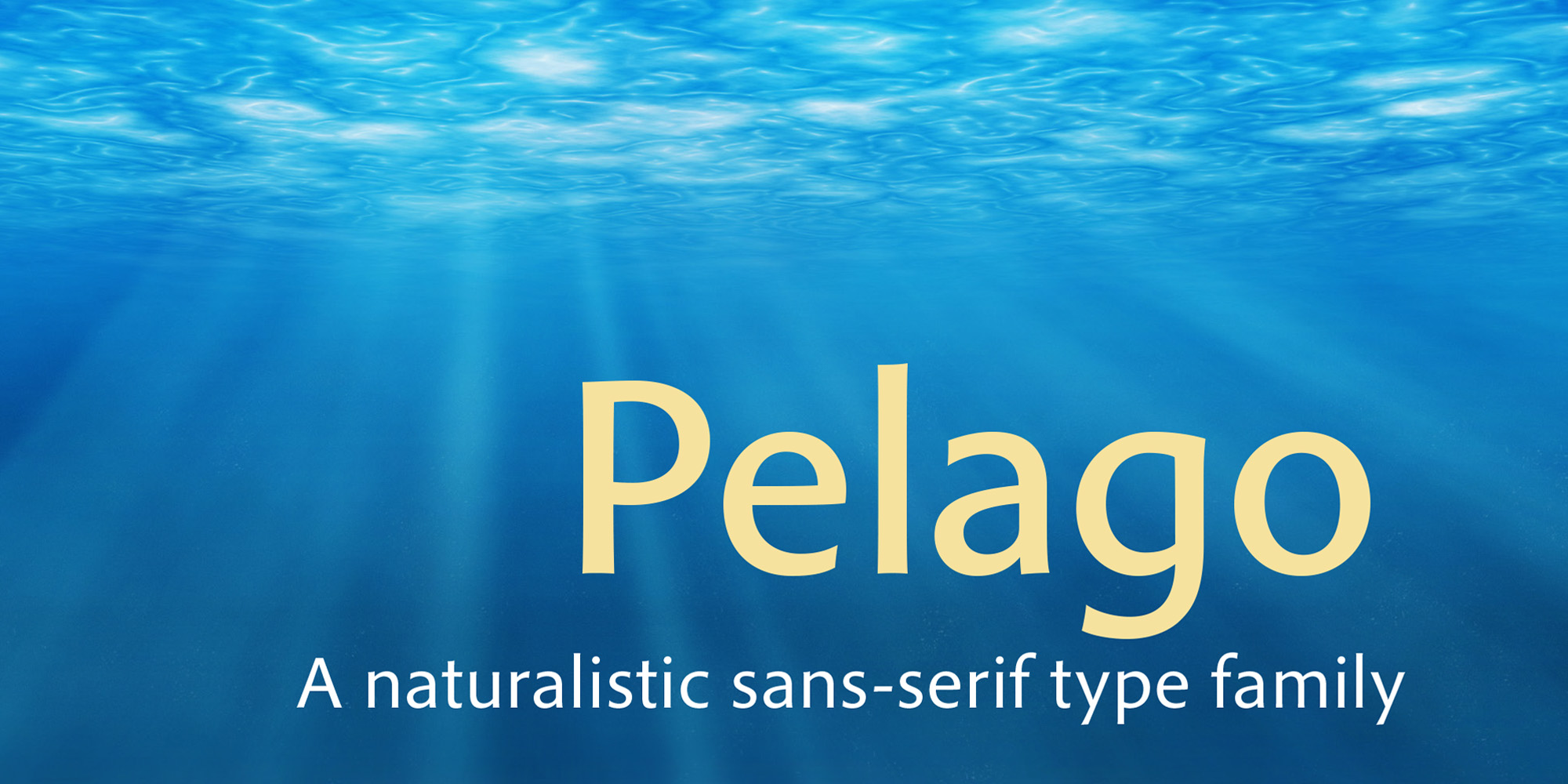
At display sizes Pelago exhibits subtly swelling stroke endings, animated letter counter shapes, and a moderate degree of stroke modulation — qualities derived from both humanist handwriting and Roman inscriptional lettering. At smaller type sizes these expressive accents recede, revealing a clear and very readable text face that doesn’t suffer from the structural rigidity found in conventional sans-serif designs.
Pelago includes six weights with matching italics, and supports multiple figure styles as well as small caps for more advanced typographic needs. Its broad language coverage includes Greek, Cyrillic, and extended Latin.
All weights are available on Typekit, and you can purchase the whole collection on Fontspring.
6 Responses
Comments are closed.
Sally –
Pelago looks inviting. But do you realize that you never mentioned, in the promotional email, who designed it? Only when I clicked through to the web page did I discover that it was done by Robert. At least I assume that’s the case; it’s his byline, but nowhere in the text does he speak of its being his typeface. It’s important to know who did the work!
John
>
Hi John, good to hear from you. I’ll pass your note along to Robert, and perhaps he’ll agree to let me make that edit 🙂 We’re also adding designer info to all our pages in the near future, because you’re quite right about that being an important component! Thanks for writing in.
Agreed. A number of typekit pr items share this issue. Designers are important! Tell us who made the type that you are making money from!
The completeness of the design notwithstanding (as it is Mr. Slimbach’s usual excellence), I wonder: did we need this face? Does it differ enough in texture and in effect from Myriad or Open Sans? With how saturated we are with new faces – some brilliant, some less so – should marketability and differentiation have a role in determining which designs or design ideas survive to market?
Thank you for the income statement, it is very important information for me.
Snoozers. I’m sure it’s nice, but I’m also pretty sure I’ve had like 5 faces almost identical to this that have been in my collection for years.