The Adobe Originals Silver Anniversary Story: An inside view of the Originals collection
This is the eighth in a series of articles from Tamye Riggs, a longtime lover of type who is working with us to celebrate the twenty-fifth anniversary of the Adobe Originals type design program. In this post, members of the Adobe Type and Adobe Typekit teams talk about their favorites from the Originals library, and what makes them standouts among the vast number of digital typefaces available today.
When you look through the list of typefaces, it’s clear that you’re essentially looking at a list of household names, and that’s an incredible achievement: to bring type to the masses. And yet we’re talking about bringing high quality type to the masses, and that’s even more impressive.
— Elliot Jay Stocks, Creative Director, Adobe Typekit
Adobe Originals more often than not set the proverbial bar higher, meaning that we are at the cutting edge of type innovation, both in terms of design, but also in functionality. Anything that cuts can also cause bleeding, which explains why being at the cutting edge often translates into our fonts sometimes being too innovative, which usually means that applications need to catch up to support some of the feature or functionality that we include. This keeps our application teams on their toes, which ultimately results in better products for our customers. After all, it is our customers who ultimately make Adobe successful.
— Dr. Ken Lunde, Senior Computer Scientist in CJKV Type Development at Adobe
The Adobe Originals program launched in 1989 through an initiative driven by Sumner Stone, Adobe’s first director of typography. A flurry of releases in that first pivotal year by lead type designers Robert Slimbach and Carol Twombly included Adobe Garamond, Utopia, the “Modern Ancients” of Trajan, Lithos, and Charlemagne, and the launch of the Adobe Wood Types. From that auspicious debut of historical revivals and original designs for Western digital typography, the Adobe Type team has become the standard bearer for expanding language support, technological innovation, and improving typographical aesthetics. Recent additions to the Originals library include open source releases — Source Sans, Source Code, and Source Serif — and a groundbreaking Pan-CJK joint effort with Google, Source Han Sans. The Originals collection now contains 101 type families. While other foundries may have released more designs over the past 25 years, the team’s mission has remained clear: to maintain the highest standards aesthetically and technologically; to anticipate needs and exceed expectations. The quality mandate remains constant due in no small part to the vision and artistic direction of Robert Slimbach, who joined the type team in 1987 and became Adobe’s first principal designer. To achieve the high standards set by Slimbach, an average of two years is spent in crafting a typical Adobe Original family for release. The time investment pays off in the form of quality, and it’s not just the end user that appreciates the craftsmanship of the Originals: the respect the Adobe Type team members have for each other’s work is a testament to the success of the program. In hopes of uncovering some personal typographic opinions, members of the Adobe Type/Typekit teams were asked the same set of questions: What’s your favorite type design from the Adobe Originals collection? Why is it your favorite, and what makes it special or significant in the world of type? The answers were enlightening, and often surprising. Paul Hunt Official title: Computer Scientist for Adobe Type Unofficial title: Typeface Designer and Font Developer The favorite: “It’s always hard for me to pick a favorite typeface. When asked this question, I always follow up with, ‘for what purpose?’ In terms of text type, I really like the solid, non-assuming character of Arno. The design doesn’t really draw too much attention to itself and it just works beautifully when setting test for extended reading. In terms of display, I have always had a soft spot for the beautifully calligraphic forms of Brioso. Unfortunately, there are not many opportunities to use a typeface of this refined, delicate character, but when one does present itself, Brioso breathes liveliness and sophistication into designs that it touches. 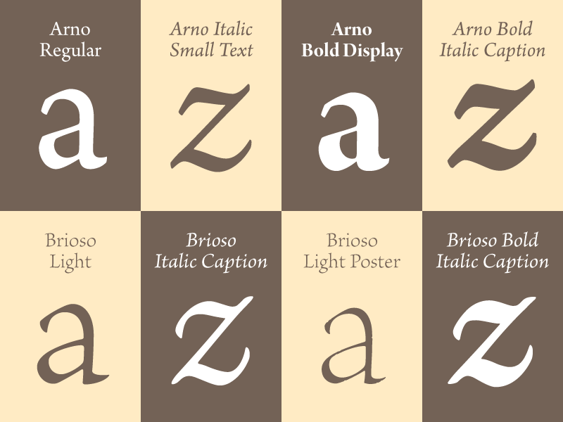 “Both of these choices are very firmly ‘Slimbach types,’ by which I mean that they are firmly rooted in the humanistic calligraphic tradition. In a way Arno and Brioso are extremes in this particular category along the axis of ‘typographic expression’: where Arno would be on the reserved end and Brioso is more an even balance between general usability and personality. To the other extreme on this scale, we have Ex Ponto by Jovica Veljović, square in the corner of free expression.” Ken Lunde Senior Computer Scientist in CJKV Type Development at Adobe The favorite: “For me, it is the 101st one, Source Han Sans, followed closely by Kazuraki. Source Han Sans holds a special place in my heart, because I first envisioned such a typeface design over 15 years ago, and continued to think about it over the years. It also embodies all of the languages and scripts that interest me, meaning all of CJK, with a little V (CJKV) thrown in. My heart and soul went into its development.
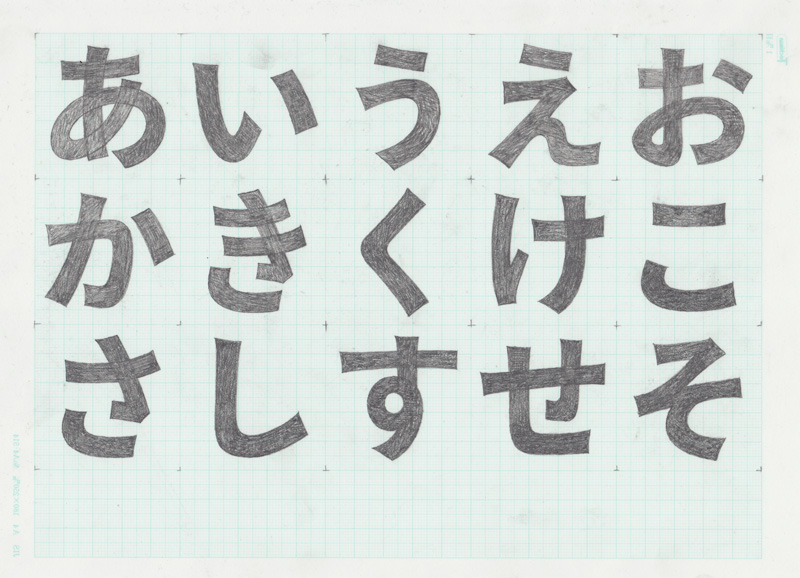
Sketches of Source Han Sans, designed by Ryoko Nishizuka.
“Kazuraki is also special to me because it breaks the traditional rigidity that is prototypical of Japanese type, and is the world’s first fully-proportional Japanese OpenType font. A lot of ingenuity went into making sure that the font works correctly for both writing directions, which was a challenge due to the fully-proportional nature of its glyphs.” Taro Yamamoto Senior Manager, Japanese Typography, Japan Research and Development The favorite: “Kazuraki — because it is a proportional Japanese typeface. Unlike traditional typefaces in Japan, each of whose type body is an EM square, Kazuraki has a proportional width.”
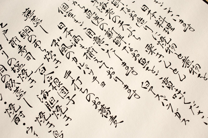
Example of Kazuraki, designed by Ryoko Nishizuka.
Elliot Jay Stocks Creative Director, Adobe Typekit The favorite: “That’s very hard! I think right now I’m going to go with Garamond Premier Pro. It’s on the top of my mind right now because I’ve been using the display weights to set the type in our Typekit print ads. Robert Slimbach is a true modern master of type design, and I have a personal fascination with display versions of text faces — I love seeing how they’re connected, and how a display weight can pull out some of that inner beauty from the text face.”
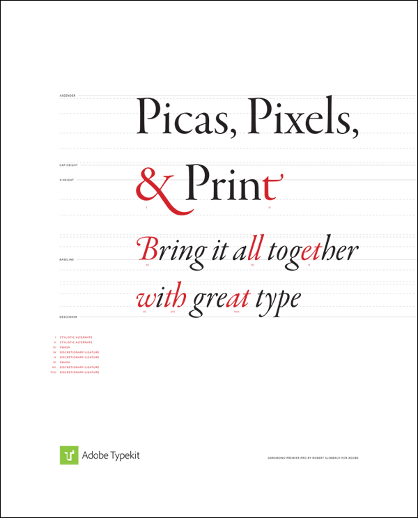
Typekit print ad, designed by Elliot Jay Stocks, featuring Garamond Premier Pro, designed by Robert Slimbach.
Caleb Belohlavek Principal Product Manager, Adobe Type The favorite: “My favorite font is Trajan Pro. I was lucky enough to see an original rubbing taken from the Trajan column when I was studying calligraphy at the age of 19. Little did I know then, that I would someday work for a company where a font derived from these very beautiful forms would be among the most popular Adobe Originals to date. To cap it off, I’ve been lucky enough to meet with Carol Twombly, the designer of Trajan Pro, a number of times — even though she is no longer designing type. Like her typeface, she is a beautiful soul as well. “For me, Trajan Pro is all about proportion, and that it was derived from characters cut into stone. I was able to see some of the work Father [Edward] Catich did incising both characters and illustrations into stone, and even though I’ve never done it myself, I am still fascinated by letters formed in three dimensions. Every time I see Trajan, my mind sees not only the pure form, but also the chiseled origins. They can’t be separated for me.” 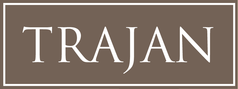 Benjamin Trissel Quality Engineer Lead for Adobe Typekit The favorite: “For sentimental reasons, I love Carol Twombly’s Trajan. My connection to it is this: Father Ed Catich taught calligraphy for a time at Colorado College — he had also taught my father back in the day. My father had had zinc cuts made of Catich’s original calligraphy of Trajan, and I used to use these in poster designs. Twombly’s Trajan takes me back to those memories in that letterform. Trajan is the first expression of a formal Roman letterform coupled with the ‘modern’ alphabet. The line from Trajan, through Arrighi and Bembo to, say, Nicholas Jenson, are, to me, the real beginnings of modern typography.”
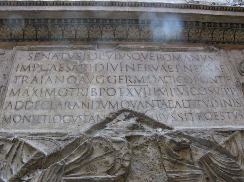
A plaster cast shows the inscription at the base of Trajan’s column, the inspiration for Carol Twombly’s landmark Adobe Original typeface. Photo by Chris Dobbins, Victoria and Albert Museum, London, 2008. License: Creative Commons Attribution 2.0 Generic https://creativecommons.org/licenses/by/2.0.
Steve Ross Program Manager, Adobe Type The favorite: “I would have to say both Minion Pro and Source Sans Pro. The former, because I leaned on it as my workhorse typeface in my prior career at design agencies. It is very economical, space-wise, which is very useful if you’re designing bilingual print pieces (as was often the case working in Canada). Robert did a fantastic job on that design. The latter, because it is both a very nice design by Paul, and also because it’s our first open source family, which made it a really cool project with which to be involved. I love it when we can have our users interact with us on projects, and the open source community certainly does that.” 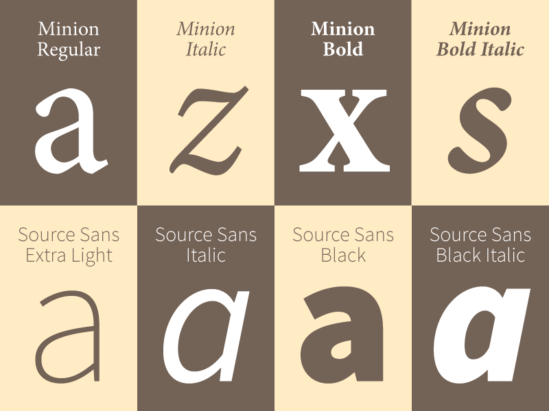 Christopher Slye Licensing Manager for Adobe Typekit The favorite: “I am not one to pick favorites, but I will admit to particular admiration for Kepler. To me, it is one of the most ambitious multiple master designs ever produced, maybe the zenith of that era. I remain amazed by how it encompasses very distinctive display sizes down to effective caption sizes — and, on top of that, also includes truly extreme dynamic ranges in weight and width. It is a design tour de force and, of course, beautiful. To me, it perfectly embodies the promise of multiple master technology, the talent of Robert Slimbach as a designer, and the collective accomplishments of the Adobe Type team.
 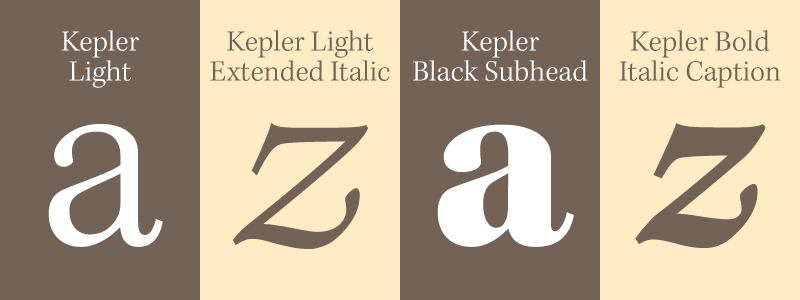 “Beyond that, I think Minion and Myriad are nearly perfect typefaces, not just among Adobe Originals, but among the vast array of contemporary and classic typefaces. They both achieve the honorable goal of a certain kind of type design, which is to convey information as clearly and unobtrusively as possible. It’s a quality that very few typefaces achieve.” Miguel Sousa Team Lead for Type Development at Adobe The favorite: “I think I have mentioned Warnock — what I like about Warnock is that it’s different from all the other ones. It’s a text face, but it’s kind of idiosyncratic. It has some shapes that you would probably not use in a text face, but then it works. It’s not a traditional text face; it’s something that would be nice if Robert would do more of, instead of just classical text faces. But that’s just my opinion! I have mentioned this to Robert: it would be nice if he could make more text faces that are unconventional. I think it’s because Warnock does not follow any historical model. All the others just kind of follow pen shapes, follow Garamond, follow old style, or traditional… Instead of a refinement of something that exists already, it’s an original that just came from Robert.”
 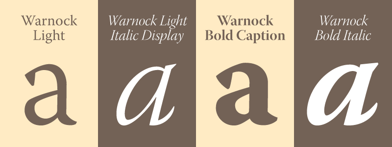 Tim Brown Type Manager for Adobe Typekit The favorite: “Oh gosh, I like so many of them. Adobe Caslon has always been one of my favorites, for simple reasons: Caslon types feel honest and thoughtful, and I knew I could trust Adobe to offer a well-made font. Source Sans is fantastic. I’ve used it for all kinds of things recently, from user interfaces to small caption text to big titles in presentation slides. The enormous Kepler family has been really useful for illustrating the ways in which type might behave in responsive design contexts — getting wider, narrower, or more optically optimal as needed.”
 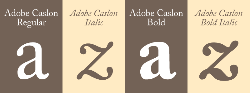 Ernest March Quality Engineer for Adobe Type The favorite: “My current personal all around favorite is Kepler, but Brioso is a close second. Kepler, because of its enormous range. Also, it’s the hugest Western font we currently have (something like 176 faces). Brioso, just because I think it’s so beautiful and the swash caps in the italics are some of my all time favorites.”
Calligraphic drawings for Brioso, designed by Robert Slimbach.
Nicole Miñoza Product Marketing Manager for Adobe Type The favorite: “My favorite of the Adobe Originals is Bickham Script, designed by Richard Lipton. It’s such a beautiful typeface — I especially love all of the swash alternates it has. I used Bickham alongside Brioso on my wedding invitation and other printed pieces when I got married six years ago.”
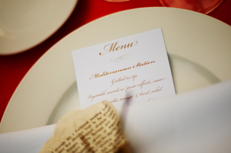
Menu card for Nicole Miñoza’s 2008 wedding features Bickham Script, designed by Richard Lipton.
Frank Grießhammer Type Designer for Adobe The favorite: “My favorite Adobe Original is Source Code Pro by Paul D. Hunt. I have been interested in monospaced and coding fonts for quite some time. I feel this project is a very good vehicle for making a broad audience (programmers on GitHub) aware of typeface design, and also showing them the amount of work that is involved with creating a decent typeface. I am happy I could contribute something to its creation, and I use it every day. 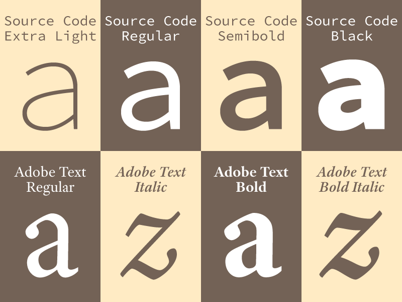 “Since a single typeface can never fulfill all possible needs, I would like to mention some more. We have a lot of good text faces in the Adobe Originals library, many of which can be seen virtually everywhere. My go-to text face is Adobe Text — simply because it is not so well-known, and, in its style, is quite different from Robert Slimbach’s other text faces. Also, I find the very limited scope of the family (really only for text) appealing. “When it comes to display type, I have a weakness for slightly odd or quirky typefaces; for instance, Michael Harvey’s Mezz or Studz (as I already mentioned in a talk at Typo Berlin this year). Often the freshness is lost in early digital typefaces, but those designs are still appealing and look good to me, even after years have passed. For the same reason I also like Galahad by Alan Blackman, in all its quaintness.”
 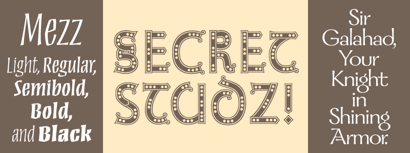 David Lemon Senior Manager of Type Development for Adobe The favorite: “I’ll talk about a different topic, since I couldn’t possibly select one face. I find it odd that some truly great design goes so unrecognized. First, there’s Carol Twombly’s work. Her faces were quite popular in Europe, but aside from Lithos and Trajan were virtually unrecognized in the United States. I think that disappointed her, and was one of the factors that led her to stop making type. Second, there’s Robert Slimbach. Lots of people know his name and some of his designs, but I think very few actually get what a consummate craftsman he is, especially with text faces. Things like Kepler, Arno, Adobe Text, and Warnock are probably better than the faces he’s well known for. “I will give a mention to Source Han Sans, our new open source Pan-CJK family. I’m seriously proud of it for two reasons. First, because it’s the largest single font development project Adobe ever undertook, and one of the largest ever done anywhere, yet we managed to do it quite well in a surprisingly short period. Second, because the project would never have happened if I hadn’t refused to give up. It took two years of wrangling with ‘stakeholders’ (as we say) inside Adobe and Google to get the green light, and there were times when I was the only person who was still pushing for it.”
Lemon’s comments regarding championing the Source Han Sans project are, in a way, representative of the history of the Adobe Originals program and the people who worked so diligently to make it a success. During the early years of the desktop publishing revolution, typography was in a sorry state. The pioneers at Adobe Type, brought together in a perfect storm of aesthetics, technological curiosity, and industry upheaval, were in a position to craft digital type at a level that would gain broad acceptance, and change the world of publishing for the better. Effecting that kind of change is not easy, and maintaining ever-higher standards of perfection is a difficult proposition even for the most dedicated. “The program succeeded in its mission to legitimize digital type and establish a long-lasting collection of typeface designs that work within, but also transcend, their digital medium,” Slye said. “Simply proving that was an invaluable contribution. Obviously, there are many others who have made important contributions in the last 25 years, but Adobe’s focus on that goal, in those early days especially, has been the most impactful, it seems to me. Using its unique and highly visible position as an innovator allowed Adobe to carry the typographic arts into a new era, and also helped create a really solid foundation on which others could build.” Up next: An outside perspective on the Adobe Originals. Keep up with the Adobe Originals celebration via RSS by bookmarking this series. And, in case you missed any posts, check out the rest of the series!
3 Responses
Comments are closed.
Minion and Myriad are firm favourites of mine as well – clear, concise and make for great easy reading without the rendering issues of Open Sans in webkit browsers; take a look at peopleperhour for a lesson on how NOT to use a font!
That being said, Source Code has pretty much replaced any Open Sans I did use.
I’m really surprised nobody mentioned Chaparral Pro — but then, that’s a typeface that never really got the credit it deserves…
Good Job & Perfect thank’s all.