Introducing Source Serif: A new open source typeface from Adobe
We are pleased to announce the release of Source Serif, a new open source typeface which is now available here on Typekit — as well as directly from GitHub, for anyone who feels inspired to dig into the original font files.
Source Serif was designed by Frank Grießhammer as the serif counterpart to our popular Source Sans family. In addition to being Adobe’s third open source typeface, Source Serif hits another important milestone as the 100th typeface from the Adobe Originals program, which is celebrating its 25th anniversary this year.
Adobe’s principal type designer, Robert Slimbach, consulted with Frank on the design of Source Serif, helping to ensure its compatibility with Source Sans. With its simplified, eminently readable letter shapes, Source Serif is well-suited for digital environments, and shines when used for extended text setting on paper or on screen.
Typographic background
A careful match of letter proportions and typographic color establishes the close relationship between Sans and Serif. While attaining harmony with its Sans counterpart, Source Serif has a very unique style. Following the work of Pierre Simon Fournier, it draws from a distinctly different period in type history than Source Sans.
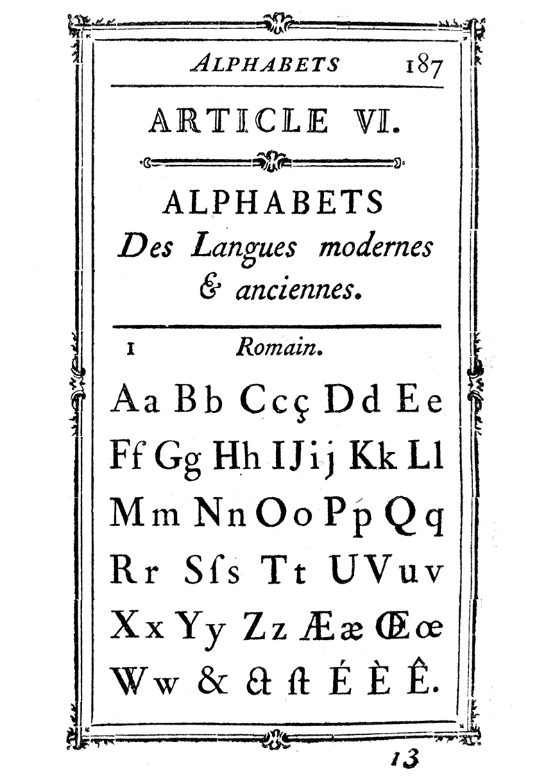
Type sample from Pierre Simon Fournier’s Manuel Typographique, 1766
Fournier’s model has served as a basis for very versatile interpretations, such as Matthew Carter’s Charter family (1987), which was optimized for low-resolution output devices of the time, and Joshua Darden’s Corundum Text (2006), a contemporary revival. A fresh take on the transitional style, without trying to be purely historical, Source Serif takes cues from Fournier’s designs and reworks his aesthetic for the modern age, echoing some of the idiosyncrasies typical to his style.
Where to find Source Serif
Source Serif, like Source Sans, is available with any level of Typekit plan (including the free level). It can be used on the web or synced for use in any desktop application.
If you haven’t tried out desktop font syncing before, it’s pretty simple; Greg Veen demonstrates the process in this video, where he opens up an InDesign file and syncs Source Serif as he works.
Join the community
There is more to come for Source Serif. Frank is working on additional weights and italics, and plans to add Cyrillic and Greek language support. We are also looking forward to seeing contributions to the Source Serif project on GitHub, which will help to make the typeface even more versatile. If you would like to get involved, see the GitHub project page for details.
Note: We have updated some links in this post for clarity; Adobe open source projects are hosted on GitHub, but no longer on SourceForge. (10/23/2014)
11 Responses
Comments are closed.
Would it be also available in Google Fonts soon?
Yes, I’ll add it to Google Fonts soon 🙂
This looks great. Any idea on when italics will be available?
Hi Peter – The italics will be coming. There’s no ETA yet but as soon as they are finished we’ll be releasing them on Typekit, SourceForge, and Github. Cheers!
It is already available from brick.im by the way.
I also would need the italics (for desktop). And I’m sorry, I can’t find it on brick.im.
Where exectly do I find it? And when will it be available on typekit?
Thanks a lot!
Hi Thomas – We’re working on the italics. No ETA as to when they will be released on Typekit, SourceForge, and Github. Thanks.
very useful information. thank for this.
Hi Nicole, I’m actually working on a Corporate Design using and recommending Source Sans and Serif to my client. (I know that’s quite fast after release.) But I’m sure you understand, that’s required to have the italics available – or at least to know more about an ETA for italics. Any idea? Many thanks in advance!
This is fantastic. My first impression is that it looks particularly well-suited to printing on low quality paper because of its sturdy build and angular counters, much the same as Charter. It’s almost as if it were the offspring of Times Roman and Charter, which in this case is a very good thing.
Thomas, we can’t give an ETA on the Italics, but can say it’ll be a while. Other extensions are a higher near-term priority.