Announcing Source Code Pro
Following up on Source Sans
The public reception of the release of Source Sans Pro last month was very encouraging. My colleague, Ken Lunde, pointed out that this was not Adobe’s first open source font as Kenten Generic has been available for some time now. But I stand by my claim that it is Adobe’s first open source type family. Sorry, Ken. The blog post announcing the family’s release has been our most popular in the history of Typblography and the news was picked up by major tech media outlets such as Wired, Ars Technica, The Verge, &c. As of today, the fonts have been downloaded over 68,250 times.
One particularly surprising aspect of Source Sans’s release was the amount of interest generated by the teaser graphic of the monospaced version. It seemed that this generated about as much buzz as the fonts that we released. Brackets, the open source code editor created by Adobe, has just recently implemented the regular weight of Source Code into their project. Likewise, the font will be integrated into Adobe Edge Code, which was announced this morning at our Create the Web event in San Francisco. The complete family of six weights will also be available as part of our new Adobe Edge Web Fonts service, which was just announced this morning.
Why monospace?
As a font developer, I spend a good chunk of each day coding in a text editor and reading output messages from a terminal window, so I can appreciate the importance of a good monospaced font. Of course there is no technical limitation to using monospaced fonts when coding, but it is a very useful convention. When the Brackets team reached out to us on the Adobe type team, asking if we could develop a coding font for their open source application, we thought it made sense to adapt Source Sans, which I was working on at the time. Personally, I felt that I could use this opportunity to create a coding font that I would want to use myself. Given the existing family name, I couldn’t resist the opportunity to name the monospaced variant designed for coding applications Source Code.
Adapting the design
To my eye, many existing monospaced font suffer from one of three problems. The first problem that I often notice is that, many monospaced fonts force lowercase letters with a very large x-height into a single width, resulting in overly condensed letter forms which result in words and text with a monotonous rhythm, which quickly becomes tedious for human eyes to process. The second problem is somewhat the opposite of the first: many monospaced fonts have lowercase letters that leave too much space in between letters, causing words and strings to not hold together. Lastly, there is a category of monospaced fonts whose details I find to be too fussy to really work well in coding applications where a programmer doesn’t want to be distracted by such things.
In designing Source Code, I tried my best to avoid these common design flaws. I had already put significant thought in how to differentiate similarly-structured characters in Source Sans, so many of its design features translated well in adapting the design to a monospaced version. Modifying the uppercase letters was mostly a simple task of condensing the glyph shapes to fit within the standard monowidth of 60% of the em square. Only the M and the W needed to be more heavily modified. I also swapped out the simple, single-stroke uppercase I with a serifed version to better fill out the advance width.
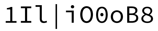
Some potentially confusable characters
In adapting the lowercase letter shapes, I wanted to keep the more elegant vertical proportions of Source Sans. Keeping the moderate x-height of the parent family allowed me to retain the salient features of each letter so that each character shape can be readily deciphered. In particular the greater difference in letter heights between upper and lowercase makes it much simpler to differentiate lowercase o from uppercase O. The challenge in adapting the lowercase letters to monospaced versions is to extend them enough so that words and strings hold together, while preventing them from becoming so wide that they appear too much of a caricature.
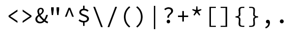
Some metacharacters with special meaning in computer languages
As with Source Sans, I sought to distill each letterform to its simplest form, only adding serifs to the tops of i, j, and l in areas that would seem like empty gaps otherwise. The figures of Source Sans were made somewhat smaller than the capital height to provide for greater ease of reading in text settings. I kept this feature in Source Code, where this difference also serves to further distinguish 0 from O, and 1 from l. In coding, many of the characters we take for granted are more meaningful symbols in computer languages. To make these more legible, I increased the size of punctuation marks, and optimized the shapes of important characters like the greater- and less-than signs, and adjusted heights of dashes and mathematical symbols so that these align better with each other. Many of these important adjustments came from input we received from working closely with the Brackets team, and I thank them for their valuable contributions to this project.
Where are the bitmaps?
I understand that many coders prefer working with bitmapped monospaced fonts. If you fit this description, I regret to inform you that you will be disappointed at the Source Code fonts in this regard. In today’s rendering environments of Retina displays, DirectWrite, Clear Type, and font smoothing we decided to target antialiased rendering environments only. According to my fellow font developer, Frank Grießhammer, “Probably, monospaced pixel fonts optimized for 10, 11 and 12 pt. are the only genre in which one can say ‘Yes – there are enough of them already.’”
Availability
Today I’m glad to announce that the complete Source Code family of six weights is ready for primetime and is available through the same channels as Source Sans. You can clone and fork the project on GitHub. You can also use the fonts on the web through Adobe Edge Web Fonts, Typekit, WebINK, and Google Web Fonts. Again I have to thank my colleagues on Adobe’s type team for all their invaluable help and support with this project: thank you Miguel Sousa, Frank Grießhammer, and Ernie March.
Note: We have updated some links in this post for clarity; Adobe open source projects are hosted on GitHub, but no longer on SourceForge. (10/23/2014)
222 Responses
Comments are closed.
Don’t forget that ‘-‘ character should also get special treatment in a font meant for source code display. It should look like a minus sign, which means it should have a design that works well with the plus (+) by having the same width and lining up with its crossbar. I realize that Unicode says that the ASCII ‘-‘ is a dash (hyphen) and that a true mathematical minus sign has a different code point. Unfortunately, that is not what programming languages expect.
Unfortunately many languages also use the hyphen as a hyphen. There is no great solution.
Very few programming languages will use an actual hyphen for anything else than comments. Possibly Shakespeare Programming Language.
The Lisp family of languages (Common Lisp, Racket, various Schemes, Clojure…) all allow “-” as a symbol character, so you can have variables named “foo-from-bar”.
All C derived languages (C, C++, Objective-C etc.) use the hyphen in pointer syntax. These languages probably make up the majority of languages in use today.
How do C-derived languages use the hyphen in pointer syntax? I am aware of *foo and &foo.
or probably not
struct baz { int bar; };
struct baz *foo = getAPointerToABaz();
foo->bar;
somepointer->element->subelement->etc
For example:
foo->bar()
foo->bar is syntactic sugar for (*foo).bar .
COBOL code frequently uses hyphens as the word separator, much like the underscore in C/C++.
Actually what Unicode says is that U+002D is a “hyphen-minus”. “Actual hyphen” (U+2010) and “actual minus” (U+2212) are *both* separate characters, as are the en dash (U+2013) and em dash (U+2014). In other words, U+002D is a legacy character that *might* have to serve either role, but *shouldn’t* be used for either for typographical purposes.
It’s gorgeous. Great work, Adobe.
Thanks! Glad you like it.
Another one joins the choir, me. Thanks for the good work.
You’re very welcome. :^D
Absolutely agree. It’s a great font. I’ve just set it up for my email reader as well as for coding work on my Linux box.
Installed in VS2012 and Sublime Text 2 (replacing Consolas in both), first impressions are good. Nice work.
Having spent an evening with it, I will not be switching back to Consolas. Really great font, spacious and easy on the eyes. Top job, Paul!
As always, Adobe is answering problems for every day people!
completely agree. Adobe is like Apple, do best in whatever they do
Just downloaded and installed the Source Code Pro for use in UltraEdit and oXygen. Very nice font, very legible.
My wishlist for the future:
– A “semi-condensed” version, that runs a little bit tighter for longer code lines.
– Italic.
– Better language support: Please integrate cyrillic, greek.
– Better language support: RTL – hebrew and arabic?
– Going Global font: Hindi, Gujarati etc? Maybe Japanese?
Okay, I stop for now 🙂
Thanks for the great job!
That’s a long wish list! Are you going to help accomplish it? :^D
A good starting place would be to include in the fonts’ description which Unicode blocks are supported, so a potential user can know what to expect.
Me, I’d like the support for the Currency block, please. 😀
Kids, back in my day, I’d have to design only 256 characters, so it wasn’t that much work. Now get off my lawn! 🙂
Maybe we should state more prominently that the fonts currently support our Adobe Latin 4 glyph set.
Excellent, thank you.
Now, when is Latin 5 coming? 😉
BTW, I’ve tried this font for a day now. I like it.
Thanks for the nice looking font!
+1 to the “semi-condensed” request. It is a little too wide for my taste (esp working with multiple panes on vim 🙂 at the moment. I use Meslo LG M at 9 pts.
I have a problem with jEdit but I don’t know if that is a bug with the font, the editor or Java.
http://i.minus.com/im35xgXWnX4MI.jpg
http://i.minus.com/ilUPTEO84L8jY.jpg
Any tip?
Which font files did you use, the OTFs or the TTFs?
That was the problem, both versions were installed. With only one version everything works fine.
Thanks a lot for such a great font
Which do you recommend installing, TTF or OTF?
Both formats should work fine. I tend to prefer OTF.
At least in Sublime Text 2, I’ve found that using the OTFs results in ‘blobby’ text, while the TTF renders nice and clear, as it should.
With Windows 7 using OTF results in horrible visual presentation for me (while 11pt is still better than 10pt). So i needed to use TTF.
Links are broken. Have in your initial paragraph.
Wow. Your system doesn’t strip out HTML?
I meant to say, there’s a stray in your initial paragraph.
Fixed, thanks!
They’re using WordPress, which allows some limited HTML in comments.
Awesome! But is it okay with middle eastern languages? (Such as Persian)
If you’re asking if the fonts support Arabic, the answer is no. Otherwise, I’m not sure what you’re asking.
I installed the font on the Intelli J .it looks good on normal .but it does not look decent with Italics
This family has no italic fonts, so you must be getting faux italics.
Excellent font! I previously used Consolas at 12 point in Visual Studio – Source Code Pro lets me run at 11 pt while still being readable.
I’m curious – any thoughts on Metafont or Metapost for font design?
For font design we only use FontLab or RoboFont.
Congratulations, Paul and Adobe, for your excellent work! I’ve already tested the Regular in Brackets and it looks awesomely clear. Installing right now in Ubuntu so I can enjoy ’em with FreeType rendering 😉
Very nice font. Just trying it out now, and I think it’s very likely to replace Meslo Medium and Ubuntu Mono as my standard coding and terminal fonts respectively, especially given it’s under an open licence.
Thank you! Awesome work. I’ll be checking out Source Sans next…
Awesome work from the fonts team as usual. It is my distinct pleasure to sit a few offices down from these guys. Kudos on a great new type family.
Since Source Sans has an italic (which itself is mostly just an oblique), it would be wonderful if Source Code Pro also had an italic. Some editors like to set comments in italic, for example.
It’d also make it competitive with Bitstream Vera derived fonts, including Deja Vu Sans Mono, Liberation Mono, and Apple’s Menlo. These fonts also have a wider collection of glyphs, but that’s less of an issue for most coding applications.
Although The letterforms of Source Sans are mostly oblique forms, that doesn’t mean they were generated automagically. The Italics represent about as much work as the upright design. If there is enough interest in companion italics for Source Code, hopefully the community will help to develop them.
Very sexy. Thanks guys!
http://i.imgur.com/dJKNo.png
In many ways this reminds me of the OS/2 terminal font, which remains one of my favorites to this day. The curve on the lowercase ‘L’ is especially pleasant. The serif on your lowercase ‘i’ feels a little too long to me, but that’s my only nitpick so far. Love it!
Overall, I like this one a lot. It is a lot like DejaVu Sans Mono, with some subtle differences. On the plus side, the tails on the Q, comma, and semicolon are more pronounced, which makes it easier to tell these from O, period, and colon. The overall spacing seems better. On the minus side, there isn’t much separation in !, which could cause it to be mistaken for 1 or l. In italics, the | is slanted, where it is not in DejaVu. This could cause it to be mistaken for /. I’m neutral about the numbers being a little shorter than the capital letters. Regardless, I’ll be running this for a while as it appears to be very nicely done. Thanks!
There are no italics. So if you are seeing any, they are likely being caused by your system skewing the upright outlines. This would explain the slanted bar.
Great work!
Looks great in putty and gVim!
Very nice. Thanks
How good is the support for control character symbols (f.ex, “space”, “newline”, “tab”,…). Those are a very nice to have feature, if you want to – for example – visualise trailing spaces or tabs in the editor.
Also, is there a table of the implemented glyphs available?
I tend to spend a lot of time on the console, so box-drawing characters are quite important to me too.
Currently I am stuck with the font “Anonymous Pro” as it is the only programming font I found so far which has good support of box-drawing characters (f. ex.: ├─), and which also has support for the aforementioned symbols (f. ex. a “space”: ␣)
Are there plans to expand on this in case these symbols are not yet implemented? I personally don’t have *any* experience in font development or I would give it a shot myself 🙁
Reference:
* http://www.fileformat.info/info/unicode/char/2423/index.htm
* http://www.fileformat.info/info/unicode/char/251c/index.htm
* http://www.fileformat.info/info/unicode/char/2500/index.htm
* http://www.ms-studio.com/FontSales/anonymouspro.html
Currently there are not plans to support box drawing elements unless someone from the open source community wants to help create them for this family.
The line art elements are showing up correctly in PuTTY when I launch authconfig-tui or tmux, with the small issue that the vertical line is not the complete length of the character space. See my comment below or the screenshot here: http://bschaefe.net/lineart.png
The bitmap font “Terminus” should have decent support for the Unicode box-drawing characters, I drew them myself. 🙂
I am in love with Terminus. It’s the first thing i do with my consoles – change the fotn to Terminus.
The only FAIL I find immediately is the “*” (splat), which should be at the same height as “+”. For a superscripted splat, there’s markup. In code, splat is always a mathematical operator.
I would be very interested to see a side-by-side comparison to Raph Levien’s Inconsolata, with commentary. Thus far Inconsolata has been my favorite for serious work. An extremely common disqualifying failure of monospace fonts is extravagant waste of space. Here too Inconsolata excels.
In C code the splat is not only a mathematical operator, it is a sigil which denotes a pointer. I’m not sold on having the splat so close to x-height, it has felt wrong in all the fonts I’ve seen it in so far.
Splat is a new term for me. To which character are you referring?
“Splat” is programmer-speak for “asterisk” (U+002A). Among other things, it’s commonly used to represent multiplication. And, while some fonts (Menlo, for one) relocate the asterisk to the same height as the plus and minus, there is actually a separate Unicode code point (U+2217) for the “math asterisk”. So, the asterisk is in the correct location, even though some programmers apparently prefer that the math asterisk glyph be used for the asterisk character.
Making a variant “lowered” glyph for the asterisk would be a nice touch, I suppose, for those who prefer it.
I guess I should not be responding to comments while still in bed :^p I missed the asterisk the first time. I may add an alternate ‘splat’, but I’m inclined to leave the default as it is. I think I had noticed only one other font with the asterisk more in line with the other mathematical symbols.
I don’t think I’ve ever heard the asterisk referred to as a “splat” in nearly 20 years of development; “star” or “asterisk” being what I’ve normally heard and used.
I think the origin of this terminology is ruby programmers, where splat is a term more for the behavior than the symbol itself (http://kconrails.com/2010/12/22/rubys-splat-operator/). In my opinion, it is much better to refer to the character as “star” (or “math asterisk” if you are talking about the lower version), and the principle of a function argument that can act as multiple arguments as a splat.
Go ahead and do the side-by-side comparison. We’re very interested to know about Inconsolata’s stronger qualities.
I agree, * is the first character I check and unless it’s a 5 pointed star that is the same size and position as the +, I’m not going to use the font. A shame because otherwise it does look very nice.
You can’t please everyone.
That is so incorrect. The proper splat is the same size and position as + and is six pointed star. Like with GNU Unifont http://www.inside.org/~raynet/unifont.png
I just tried Source Code Pro for XCode environment. First issue that I noticed – different width of four Space symbols against one Tab symbol. All code’ alignment was discarded.
Second, I didn’t notice dot inside the Zero symbol although it presents on “Some potentially confusable characters” picture. Imho it would be cool feature, loosed since epoch of Hercules displays.
Are you certain you are looking at the correct fonts? The zero is definitely dotted in Source Code, so if you are not seeing this, I’m guessing it’s user error.
This font is simply stupendously gargalicious !
It feels a little wide to me. So I’ll probably go back to Consolas, which has always been my favorite.
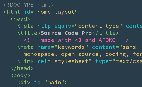
But does anyone happen to know what’s that color scheme in the image on top? It looks pretty good.
Consolas is narrower than most monospaced fonts at 55% of the Em square, where I stuck with 60% for Source Code. If the narrowness is a top selling point for you, then Consolas is definitely king.
The colour scheme looks like Solarized to me. I’m a massive fan, and use it absolutely everywhere – editors, terminals, etc
http://ethanschoonover.com/solarized
It’s the only colourscheme I know of that has had as much care and attention paid to it as a good font design.
I’m fairly sure that isn’t Solarized. The almost pastel green doesn’t seem like a Solarized color.
It’s not Solarized. It’s custom, as stated elsewhere.
Agreed. It is too wide (or too short). I still prefer DejaVu Sans Mono.
Switched to Georgia for dev some time ago.
Still there.
I ike i, because it’s nice to read, and it takes less horizontal space than most standard fonts.
Give it a try.
Agree with Nathan. The star should be the same size and in the same position as the plus character.
It would be the grates if you could extend it with other “Latin Extended” characters. Once that interest me the most are: ęóąśłżźćń ĘÓĄŚŁŻŹĆŃ . Just in case you’re gonna do it: Thanks! 😉
I just saw, that ó & Ó are aleady supported.
ALL of those characters are already supported by Source Code Pro (and Source Sans Pro).
Reminds me of Droid Sans Mono – the default monospaced font on android phones. Unlike Source Pro it has better international support.
This font is completely unusable for me on Mac OS X. The 12pt Source Sans Pro Regular has weird character spacing. “minimum” looks more like “mi ni mu m”. Perhaps I’m doing something wrong.
Is there a certain app you are seeing this in? I’m also on Mac, but I must admit I use it at 13 pts. usually. Is going larger a deal-breaker for you?
you probably did what I did and grabbed the wrong font. Source Code Pro is not the same as Source Sans Pro. And Source Sans Pro is not monospaced. Us ing as a nonsp a ced font re sults in ugliness.
check the zero. If you have the right font there is a dot in the zero. if there is no dot, you grabbed the wrong file
i code a lot , and just tried this — good legibility between i, I 1, and lowercase l, however it is a bit wide for a 80 column terminal, and one pixel thin at low point sizes instead of 2 pixels — also, ascii art borders created with | and _ characters dont turn out so well. switching back to monaco 10pt. 🙂
As explained above, I chose a standard width of 60% of the Em square which is used by most monospaced fonts. If you find the Regular too light, try the semibold.
Beautiful work, my new default font for VC++. Thank you very much for making it available.
Excellent work. This may finally depose Inconsolata as my go-to programming font. Thanks for making it available as open source.
One thing I’d have liked changed is ‘ vs ” . There are occasions where you have an apostrophe in a string or a character which is a quote, which gives you ‘”‘ or “‘”. It would be VERY nice to be able to tell those apart – by making the apostrophe angled (as in the opposite of a backtick), or thicker.
Using it already, looks great in vi! I’m using ‘ExtraLight’ with white text on black and its very readable without looking fuzzy or ‘bleeding’ out into the background.
I like it well enough so far, going to continue testing. One thing i have noticed is that while there ARE the correct line-art codepoints, the vertical line is not solid. This means that in tmux or authconfig-tui or any ncurses application, the horizontal “window” lines will be solid and the vertical lines will be sort-of dashed. Would be nice to see these solid in a future release.
Can you provide a screenshot of what you just described? That would help a lot.
http://bschaefe.net/lineart.png — Shows what the font looks like in PuTTY. Don’t have this problem with other “console” fonts. Would love to see Source Code Pro implement this though, it’s something that is rarely done properly, and you’re so close!
don’t mind the poor rendering, i had to do this via RDP since i don’t have admin rights on my work laptop…
I’ll look into it.
Pretty nice font, the “square”-ness of the characters might take a bit of getting used to, but the readability of non-alphanumerics makes up for it. I particularly like the weighty quality of the period, comma and colon.
My only suggestion for you as far as readability goes would be to trim the bottom of the slash, backslash and vertical bar very slightly closer to the baseline, the extended lower portion keeps distracting me while reading code.
Can you post some screen captures on GitHub in the issue tracking area?
I’m not sure what you are seeing that is ‘square’. The letterforms all seem very round to me.
I would imagine most comments about ‘squareness’ or ‘wideness’ come from a combination of Source Code’s 60%-em width, and the x-height being small compared to, say, DejaVu Sans Mono, or Monaco.
Gorgeous font – thanks!
I noticed one issue with the ampersand using the normal weight. In NetBeans, the XML syntax highlighting shows entity references in bold. The ampersand seems to disappear when this happens. This is not an issue with the Extra Light, Light, Semibold, or Bold weights, just the normal weight.
I noticed this in NetBeans as well. Any idea what is causing this?
I get a similar issue when using double ampersands (and sometimes vertical bars) in vim via gnome terminal
See screenshot at http://i.imgur.com/48CUy.png (which are ampersands)
Ouch! Looks like a nasty hinting bug crept in there in the TTF file. If you can, switch to using the OTF files.
It would be great if some of the mathematical operators (U+2200-U+22FF) and letterlike symbols (U+2100-U+214F) were included. Modern programming languages like Haskell and Agda are able to use the full Unicode in source code. As a result, consise mathematical notation may be used to improve code clarity. It would be wonderful if we could use this typeface.
I’ll look into those Unicode blocks.
This is a truly excellent programming font, congratulations. But really, greek letters and mathematical symbols are missing. Not only for programming in modern languages such as Haskell or Agda, but to be able to publish maths-related content on the web using this font.
If you can file this as an issue on the GitHub page with as much detail as possible about which characters in particular you would like to see supported, we will be able to better track your request: https://github.com/adobe/source-code-pro/issues?page=1&state=open
Paul – Popped them open in FontLab Studio 5 – I must say… Nice Job – first coding font I’ve even seen with ligatures, fractions, subscripts, and superscripts! They are even hinted for small point sizes – nice.
Being an old-school PostScript print person, could you add, in the documentation, the PostScript names? Yea, I can pull them out – but many others may run into problems. Publishing a set of old-school .PFA, .PFB, .AFM, .INF, .PFM files would be a nice touch.. the .PFAs more than anything (printer resident fonts).
Again, nice job and thanks for the contribution.
The PostScript names are the same as the final font names minus the file extension. Type1 is quickly becoming an obsolete format: it could not adequately contain everything in these fonts without generating multiple subset fonts. We diverged from that path over a decade ago now and I doubt we want to go back down that path. Modern operating systems and printers should handle OpenType fonts just fine.
Really nice font. I especially enjoy the distinguishable underscores, so that __ looks like 2 rather than one really long one.
For me it’s a little bit too wide, so I’ll stick DejaVu Mono until I find a better one.
Inconsolata would be ideal, but it doesn’t have a built-in bold which causes problems in my editor 🙁
I also think that line spacing (?) is a bit too high with this compared to DejaVu Sans – simply by switching to this font the amount of lines displayed in my editor drops from 71 to 62.
I think the width difference you’re seeing is an illusion of sorts. When I put samples of Deja Vu Mono and Source Code Pro side by side (rather, top by bottom), they’re exactly the same width, at least using point sizes between 9 and 11. What’s different is that Source is shorter, both in terms of X-height and in terms of total character height, which I think makes it look wider then Deja Vu in isolation.
Please, add cyrillic and greek symbols.
What a gorgeous monospace font!
Addiitionally, does anyone know what dark style/theme is used at the code-screenshot? It looks great and I want to ue it as well.
Let me know if you find out. Looks like it could be “Tom’s dark DW dark code colorization for Dreamweaver” found here http://wptom.com/dreamweaver/dark-coding-colorization-for-dreamweaver/ but just in case it’s not I’d like to know! 🙂
Read my response to other comments above.
Hey, this is a great font. One thing I noticed is that the Bold variant is too bold for use in Terminal.app with antialiasing. I found myself disabling the Bold variant so that Terminal.app would pick the semibold variant and that was perfect. Just FYI.
I’ve been trying it out with Eclipse Orion. I wrote some observations here:
http://goo.gl/wVHb7
I really like this font, and I’m finding it generally useful at larger point sizes (11+).
However, I’m seeing some antialiasing weirdness with some glyphs at smaller point sizes, primarily with dark text on a light background. Hopefully, this screenshot is useful:
http://i.imgur.com/1Hvbh.png
The three fonts, top to bottom, are Source Code Pro, Deja Vu Sans, and Menlo, all at 10pt. If you magnify the image a bit, note that the equals and plus signs are more grey than black for Source Code Pro. Also note that the 8 and 0 are a little more difficult to distinguish than the other two This antialiasing problem goes away with larger point sizes; even 10.5 pt is large enough to clear everything up.
The problem is that I typically work at 9 or 10 pt. I can turn off antialiasing completely, but the results are hideous. Ideas?
I’m missing most of the greek and math characters. that is really bad for writing websites in unicode :(((
Will stick to Unifont.
Not bad, but consolas is still the best!
Well, my favorite font remains Bitstream Vera Sans Mono Bold at 9pt under Windows. Oddly, however, that font doesn’t look as good at different sizes, or when it isn’t bold, or under Linux (where the characters seem less sharp, bold looks too bold and regular too light).
Source Code Pro’s characters look pretty good, the semibold version has the right amount of weight, but IMO the characters are spaced too far apart and when I choose the semibold variant then turn on Bold, it doesn’t get any bolder. Guess it beats Courier New, though.
Now can anyone recommend a proportional font that looks good for code? Maybe something almost-fixed-width, so that the ‘.’s and ‘,’s and ‘i’s and spaces stand out more, but that still saves some horizontal space compared to a fixed-width font.
Tried in Visual Studio 2010… don’t feel very enthusiast; Consolas still appears better.
I have now compared Source Code Pro against Inconsolata, not just
side-by-side but pixel-on-pixel.
My first comment is that the asterisk being higher than normal for a
code font turns out to be OK. It’s higher and smaller, but not too
much so. (I have to admit astonishment at finding someone designing
a code font and not noticing that the asterisk in well-liked code
fonts is lower than is normal when used as a superscript in text.
I am also astonished at one’s not knowing that hackers often call
the asterisk “splat” as well as “star” when reciting code aloud.
Is “bang” for the exclamation mark also unfamiliar?)
Test setup: I set up my Gnome2/Mate desktop with Inconsolata as the
“system monospace font”, with RGBA anti-aliasing and full hinting,
using libfreetype 2.4.9. (I can check under libotf 0.9.11 on emacs23
if that would be helpful; I notice that emacs renderings are sometimes
better than under programs that use libfreetype.) Then, I opened some
Gnome-terminal windows displaying various source code in C, Sh, and
Make. I brought up the terminal’s “profile preferences” box,
unchecked “use the system fixed width font” and chose Source Code
Pro. Checking and un-checking the aforementioned box causes all
the terminal windows to re-render in the chosen face, almost
instantaneously, allowing me to flip back and forth several times
per second.
What I noticed first was that the point sizes are not commensurate.
I.e., I had to use different point sizes to get the same-size glyphs,
and yet others to get the same line heights. (This is a not unfamiliar
experience.) For each point size in one font I found a matching size
in the other, although the mapping differed depending on whether I was
matching leading or glyphs. The character widths of SCP matched
Inconsolata precisely, making comparisons easy. A good starting
point is IC Medium 12 vs. SCP Regular 10, or 11 vs. 9.
By choosing point sizes with identical metrics between the two fonts,
I was able to see how the faces compared pixelwise. I found that,
overall, SCP glyphs are individually more compact than IC’s, leaving
more whitespace around them. The tighter curves at small point sizes
are necessarily less smoothly curved, so IC’s p’s and q’s look better-
rounded. Next, I noticed that SCP glyphs are more top-heavy, with
substantially less presence on the baseline, mainly a consequence of
the designs of the “l” and “i”. SCP and IC made opposite choices for
baseline serifs on “l” and “1”: SCP has it on the “1”, IC on the “l”,
with a lighter “1”. SCP would benefit from matching that choice, as
serifs on numerals are not nearly so perceptually helpful as on
letters. With a serif on “l”, the “i” would want one too, and then
its top serif would not need to be oddly wide.
I found Source Code Pro an excellent first effort. While it has a
fair distance to go to compete with Inconsolata, it’s already much
better than most monospace fonts that came before.
There is no accounting for taste. Thankfully for this project I only had to please the Brackets team and myself. My own take on Inconsolata is that it fall into my categorization of ‘too fussy for serious coding’, but that’s my own personal view.
That’s funny, because SCP and IC are more like one another than either is to anything else. Flipping between them, my impression was that SCR looks like IC with the letters squashed to leave more whitespace between lines.
And that’s high praise.
I took an informal poll around my office of many very skilled 15-20 year developers. None of them have ever heard * called “splat”. But ! being called “bang” was known by most.
I guess you’ll be even more astonished now. 😉
Taking the time to do this comparison motivated me to do much the
same with Droid Sans Mono and Deja Vu Mono. The first thing
I notice is that SCP is much closer to Inconsolata than to these others.
The second is that choosing face point sizes so that the glyphs’ size
matches, I get a different impression than when I compared them before.
Both the Droid and Deja Vu fonts are quite a bit heavier than either
SCP or Inconsolata. They leave less white space between lines and
between glyphs, offering greater vertical density. They actually
stand up rather better than I remember from less-precise trials.
I recall now why I rejected Droid Sans Mono when it came out: despite its superior density, its lines as rendered have a blotchy quality that Inconsolata and SCP lack. How you get that, or fix it, are beyond me.
Awesome job Paul. This is a beautiful font, at least in VS 2012. My 46 year old developer eyes thank you whole heartedly! Sorry Consolas, it’s time we part ways.
The font is OK, but with one exception, should be more narrow in width. I like to see more code on the screen.
See my comments in the post and above regarding width.
Thank you for a great font. Please consider adding greek lang support.
Looks great.
But is it just me or are the bold characters wider then normal characters?
I tried the Font (TTF) in Notepad++ and if on one line there are bold and normal characters mixed, then the colums dont line up anymore. Monospace is broken then.
Or should I install the bold-fonts (TTF) as well?
Yes, you will need to install both the Regular and the Bold style font for proper bold. Otherwise, what you often get is faux bolding, which will likely make the glyph shapes wider by mathematically emboldening the outlines.
Nice to see a new monospaced screen font – I just installed it but went back to Bitstream Vera Sans which seems to be better hinted as a screen font at 10 pt (in Windows 7). At larger sizes Source Code is certainly nice, but at the small point sizes a lot of things look awkward.
Just tried it out in Xcode with my Tomorrow Night theme.. can’t say I’m a fan, basically because of the styling of the letter i. In particular when used in “switch” it just looks terrible, it’s like the w and i are connected.
The missing baseline on the lowercase ‘i’ is very distracting.
Seems to be a bug in the bold font, which is that the ampersand character does not exist.
Yes, this was already reported above. We’ve fixed this in the sources on GitHub, but have not yet made a new version of the fonts.
This font looks great. Thanks a lot!
Loving this font! Thanks so much for creating it! It’s easy on the eyes and a joy to look at all day. Much props!
This font looks great. Thanks a lot!
Thanks for the effort.
The one and only font style for coding still is and will remain FixedSys.
This in a monotype redesign woud be just perfect.
Alex.
The zero is a bit funky.
Anybody know the theme used in the screenshot? Looks nice!
The ‘screenshot’ is actually a graphic I designed in Illustrator with a custom color scheme. If you’re really interested, you might try pulling out the colors with a tool like kuler.
In fact, I just did that: http://kuler.adobe.com/#themeID/2092413
Not bad, but too wide. Went back to Consolas.
Well done. I’ve been very happy with Inconsolata but will give this one a go anyway.
No chance without Cyrillic! http://www.google.com/webfonts/specimen/PT+Mono is more clean & powerful
All those little, extra serifs make me crazy. I would not call that ‘clean’.
Thank you for this!
One suggestion: make the backtick ` yet a little bigger please, it’s one of the most worst chars for programmers though..
Hello Adobe, thank you for you contribution, but some Cyrillic would be nice!
Posted a small blog entry on this at http://wiert.me/2012/09/30/new-open-source-font-from-adobe-source-code-pro/
Two things I’d appreciate in the future:
– a version with smaller leading
– italic/oblique
Need to check the star/asterisk over the next week or so to see if it can really work in my day-to-day coding (mainly Visual Studio and Delphi)
The general design is awesome, and the hinting is great.
Good job for a 1.0 version!
–jeroen
It’s easy to move the splat down, in fontforge. Leading might be equally easy to adjust. The hardest part is deciding what to call the new font. Whiles you’re at it, you could take the bottom serif off of the “1” and stick it on the “l” and “i”, and then shorten the freakish top serif on the “i”. Then it would be a squat Inconsolata, and useful, because you could fit three term windows, one atop the next, into 1080 pixels. Maybe call it “Inconsoulata Squat”?
That’s not right. Call it something entirely different, please.
OK, then “Sauce Cold Prawn”? But “Inconsoulata Squat” would make a good band name.
I’m having a lot of fun with this, but I understand how you would not find joking around with your baby very humorous. It’s very gracious of you to have let my comments stand, and I thank you and apologize for any discomfiture I have provoked.
All serious now.
Thanks, that’s appreciated. We’re trying to work here.
Some applications allow you to change the leading. You might check and see if it is an option in your preferred app.
The leading can’t be made any smaller because there needs to be enough space to accommodate for the Black weight.
When used in VS2010, if comments are bolded, the ampersand character in comments causes a blurred blob to extend above the top of the previous line of code
so in the lines below, you will see a rectangular area that is the colour of the comment font extending up into the first line of code, through the equals signs.
.
int x = 1;
int y = 2;
// so & is here
That was a bug. It got fixed in version 1.010.
It’s great to see a programming-specific font come out once in a (long) while. Some feedback:
– As with most fonts, the underscore is dropped down from the character base-lines. Not since the age of line printers where underbars were actually used to underline has there been a case for it. It’s now mostly used as a word separator and having it be at char baseline works better.
– The “<” and “>” glyphs have blunt points. This makes them look fuzzy at smaller sizes. The same is true of “^”.
– I find no use for the grave (`) glyph. Why not make it look like a back-quote and suddenly all those error messages (and LaTeX docs) start looking great?
– The asterisk is placed a bit too high for programming languages, none which which uses it as a superscript as is done in typography. IOW, having *= line up would be great.
Thanks for making this available to the programming community.
Is it just me, or in Netbeans is everything obfuscated with this font now? Was fine yesterday…
Looks beautifully crafted and I appreciate feasting my eyes on beautiful fonts. But it’s a bit too wide for my taste. Source Code Narrow would be nice maybe. Until then I will use Consolas.
This is both awesome and gorgeous, but I’m wondering about the choice of a dotted zero rather than a slashed zero. To me, a slashed zero is both less confusing at small sizes and more readable at a quick glance. (Hoping a fork will take care of this! I have no idea about modifying fonts myself.)
Why is the slashed zero more clear?
Partly personal preference, as it’s what I grew up with, and partly because at small sizes the slanted slash makes it look less like an 8 than the dot in the middle.
I’m afraid I didn’t design these fonts for sizes so small where this will be an issue. If you need something that scales to small point sizes better, Source Code might not be for you.
In the context of programming Users typically want to see as much code as possible at a time, as clearly as possible. Unfortunately, since this font does not work at small font sizes, and (due to the leading allowance for the Black weight) it lacks efficiency in its use of vertical space (a premium on landscape monitors), it doesn’t fulfill any of the requirements I’d associate with a font targeted at developers. Perhaps a better avenue for publicizing this font would be “Adobe Sans” something, as “Source Code Pro” is somewhat misleading?
I don’t find it misleading, of course you are entitled to your own opinions on the matter. I guess I’m fortunate that I have the option of increasing the font size to something that is actually readable. My poor eyes can’t handle 8 pts. of anything on screen.
I simply meant ‘misleading’ in the sense that the name Source Code Pro would imply that it is useful to developers viewing source code, where in fact it is not optimized for that, it’s more of just a display or fun font.
This is your opinion, to which you are entitled. I do my coding in this font every day and have for the past several months.
Thank you so much for the awesome font. Your work on this will benefit millions of programmers and I am grateful for the time and care you put into the effort.
Wow, this is a really great font. I haven’t seen a monospace font I actually wanted to switch to in years! I’ve been using it for my terminal and text editor for a few days now and it’s great! Thank you so much. Nice to see Adobe going back to its roots 😉
Im’a give this one a try, even though I currently use italics extensively for syntax styling. Maybe I’ll be better off without it.
For some unknown reason the font is not monospaced for me when I use it in Sublime Text 2 (on Windows). I’ve tried both OTF and TTF and the font looks super nice, but is not monospaced. Any thoughts? Am I missing something?
Are you sure you’re using Source Code Pro and not Source Sans Pro? Other people have made that mistake: Strange spacing.
As far as we know, the fonts work fine in ST2: Bold and Italic styles in Sublime Text 2.
Hi!
First of all, thanks for the nice font – I’ve been using it for some days now and I’m getting used to it and like it a lot!
My problem is, that within certain IDEs, the font doesn’t seem to be registered as a bold version. So whenever I set syntax-highlighting to bold, I get a substitute font instead. If I can select the font type like in Eclipse, everything works fine, but if I only have a checkbox saying “bold”, the wrong font is chosen. Is there any solution for this problem, e.g. can I register a certain facon of the font as being “bold”?
Thanks a lot for your help!
Greez
Mimi
Which IDEs specifically?
Seems to be a bug when used on Xcode. Can’t indent past 4 tabs; other fonts work fine.
That doesn’t sound like a font bug.
Great font for programmers:) I’m going to use it in netbeans. Thx Adobe:*
Thanks
Thank you so much for this font, I liked it a lot.
I tried it on all the IDEs that I use and it looks good
Fantastic steps taken by Adobe. Thanks!
One thought on the glyph sets — Adobe Latin 4 covers a humongous number of languages. And that’s super, because most code editors I’ve seen restrict you to a single font (or family). In that regard, Source Code Pro is a champ compared to most monospaced fonts.
But one reason I’m working in a code editor using a code font is to edit the source XML files for dictionaries — and the pronunciation segment typically requires glyphs from IPA Extensions.
Making a Source Code Pro for Greek or for Cyrillic or for the languages in Adobe Latin 5 would extend the font to a new language community. But including IPA Extensions would enable users from all the 61 languages in AL4 to make dictionaries, a way larger benefit than any other addition you might make, IMO.
Thanks again.
That’s an interesting perspective. Thanks for sharing.
Tip:
In Visual Studio 2012, I installed Source Code Pro with the program open, and when I switched to this font, no dot was present inside the zero.
Only after closing and reopening VS2012 did the dot appear. It is working well and all looks good now.
Please, add (extended) Greek, Cyrillic & extra Latin to the font, it’ll get even better 🙂
There is a bug with “&” symbol in Dreamweaver, it doesn’t show up and in EditRocket it’s smushed. Can someone please look into this? Tried multiple editors and these are the only ones with problems, everything else looks very cool.
Love the font, but i want it to be my default everywhere there is code, i’m stuck at work in Dreamweaver because i do a lot of HTML there and can navigate in someone else’s code faster, noticed this bug when i tried adding ” ” 🙁
Nevermind, went through some post up top and noticed this issue is fixed in the updated version, was still using 1.009.
Now i can die happy. 😛
Between ” ” it was the non-breaking space entity code, seems it got converted into the actual character.
Tried version 1.010 on WindowsXP and everything is very spidery. Also it doesn’t show up in Visual Studio 2010
Spidery? Do you have ClearType turned on? Not sure what to tell you about Visual Studio.
Which files did you install? The TTFs or the OTFs?
This is a fantastic font. Thank you for donating the result of what was surely a lot of hard work! I think this font has narrowly beat out Consolas as my favorite monospace font. I enjoy how clean and open it feels. I may not be able to get as much text on the screen at once but I think it’s a tradeoff my eyes will thank me for.
I’ve found that it renders well on Windows, Mac, and Linux machines – many other fonts I tested do not fare so well.
Being a programmer by profession, I’ll be looking at this font for countless hours over the next N years. Keep up the great work!
Good work! Thank you Adobe!
Although currently not really see many applications in my area, but the whole is still quite nice.
I almost love this font, but the “squatness” or “wideness” other people have alluded to is uncomfortable. Monaco has the right proportions for me; if only there was a Monaco bold 🙂
LOL…
You simply took Consolas and adjusted spacing to be wider… and then reband it as “Adobe Source Code Pro” – and people clap in their hands…
almost feels like watching Apple announce their ‘reinvented’ last-years-model-with-new-modelnumber-iDevice
In the spirt of openness, I’m publishing your remark, but I do not know why anyone would want to expose their ignorance this way in a public forum. Anyone with any typographic savvy at all will recognize that while there are some similarities between the design of Source Code Pro and Consolas (as there are in all monospaced type designs), they are not the same at all. Of course you’re entitled to your uneducated opinion, but as they say about opinions: it stinks.
Paul is right man. You’d have to be completely blind to not see the differences. Both are good fonts but are definitely different. Of course at very small point sizes all fonts begin to look more similar due to the pixel grid limitations, but really, open your eyes.
Very nice
The best mono font ever, seriously!
I’m coding for 13 years and saw many mono fonts. But this one is just a perfection.
PLEASE, add cyrillic 🙂
Thanks for the feedback. I’m glad you’re enjoying the fonts. I do have in mind to add Cyrillic to this project eventually, as I am currently adding Cyrillic to Source Sans and adapting the shapes should be fairly easy. However, there are many aspects of this project that I am continuing to develop so as with other things this will probably take a good chunk of time. Thanks for your interest in this project and your patience.
Thanks a lot for your great font.
From description and font itself i see that coders’ traditional problems with IliO0… and small punctuation symbols were addressed perfectly.
Thank you!
The font goes to a lot of trouble to visually differentiate between similar characters such l, 1 and I and aids better troubleshooting. Certainly it’s better than any of monospaced fonts that ship by default in MS Windows and working in putty with those fonts can be a serious problem.
great font. always use it. success.
Excellent! I’m willing to try it.
I really like using Source Sans Pro.
You cannot imagine how many monospaced fonts I tried and used.
This is the most easiest programming font, you instantly adapt on it! Excellent rendering, characters are clean and similar chars differ.
Thank you for this gift, I use this font and enjoy it or better to say have no problems, hard time, strange feel when using it.
Proposal for future: please add Cyrillic typefaces.
Please, create nice italic typefaces for this font too. This is the only matter that made me stick with Consolas.
Fedora users please “sudo yum install adobe-source-code-pro-fonts”
Any word on true italics? It would really be nice…