Interview with Ryoko Nishizuka, lead designer for Source Han Sans
You may have already heard about the enormous effort that went into the design of Source Han Sans, our new Pan-CJK type family. Among those who were involved in its creation is Ryoko Nishizuka, one of the three members of the typeface design team based in Adobe’s Tokyo office. Ryoko is a seasoned type designer, with fonts like Kazuraki and the Ryo family under her belt, and she’s been busy this past year getting Source Han Sans out the door. We sat down to ask her a few questions about her work, and to get an idea of what inspires her designs.

Where did you grow up? What was your childhood like?
I was born and raised in Fukushima Prefecture. I spent a lot of time playing outside, because the ocean and mountains were nearby. In particular, it was an area where fossils could be found, and I fondly recall the fossil-hunting craze.
Is your family creative?
My parents and relatives don’t come from families that made creative things, but many of them taught related topics — such as writing beautifully-shaped characters, which I myself practiced. I did not learn calligraphy, though, because it was more popular at that point to learn piano. From a young age, I liked to make things, and my mother said that once I started on something, I wouldn’t come out of my room for hours.
How did you first get interested in graphic design, and, more specifically, type design?
I first noticed that there was more to writing characters beautifully by seeing the printed shapes in textbooks during elementary school. I would try to reproduce these shapes by hand, writing the titles in my notes in Mincho style. My love for crafts and for writing characters brought me to art school at Musashino Art University, but I only learned about graphic design and typeface design after I enrolled there.
After graduation, Ryoko worked at Morisawa & Company and as a graphic designer. Her opportunity to break into type design came when she applied to the Morisawa typeface competition and won honorable mention for “Branch Letter”.
Ryoko joined Adobe in 1997, and her first project there was to produce glyphs for Kozuka Mincho.
You’ve designed several typefaces for Adobe since you started here. Would you say you have a standard process for designing type, or does each typeface end up taking a unique path?
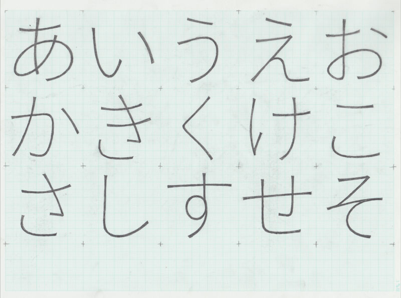
First, I must carefully consider the intended purpose of the typeface. Is it for titles, for body text, for what types of content? Related to this, I must also decide about the importance of readability and other design characteristics. After I have a rough image, I begin with sketches of kana. After most of the kana have been finished, I then start working on the kanji and other characters. I do not look at the kana at all during that period. When I pull out the earlier work in one or two months, looking at it with fresh eyes, the process of making changes becomes easier. If my eyes have become too familiar with the glyphs, I will repeat the process of putting them away for one to two months.
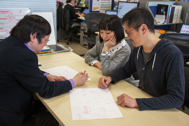
Meeting with her two colleagues on the Adobe Japan type team. From left to right: Taro Yamamoto, Ryoko Nishizuka, Masataka Hattori.
What is the biggest challenge you face when designing typefaces? What part of the work comes easiest to you?
Every typeface is a new challenge, and the kana in particular are quite difficult. Also, kana are difficult not only in their form, but also in that the expressions change in horizontal and vertical writing. But what I find easy is to remain persistent, and to continue this work for hours.
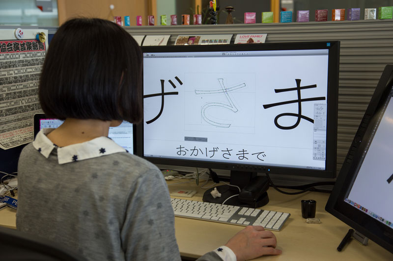
Ryoko Nishizuka working on a new display typeface called Chidori.
Let’s talk about the Kazuraki typeface in particular, which has some interesting historical background. What was it about the calligraphic style of Fujiwara-no Teika that inspired you to use it as the basis of a modern typeface?
The calligraphy of Fujiwara-no Teika is very unique and charming. During that period [the late 12th century] it must have been a beautifully flowing style of writing, which is why it is considered excellent calligraphy. Teika said his writing was poor scribbling, however he was a very popular poet. His writing is relatively easy to understand for modern people like us, compared to other writers during his period. This is only my guess, but his writing must have been easy to read even for readers in that old time. I believe that his characters are something like a font, as common and readable as a character design in the modern computer world, although computers did not exist in his age. Kazuraki is designed based on his writing style, and it was praised as the first fully-proportional Japanese font. It took a long time to produce, so we couldn’t include a sufficient number of kanji characters, and we frequently get requests to expand the number of glyphs.
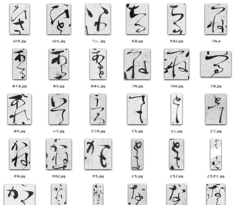
Original scans that served as inspiration for Kazuraki’s many vertical-only hiragana ligatures.
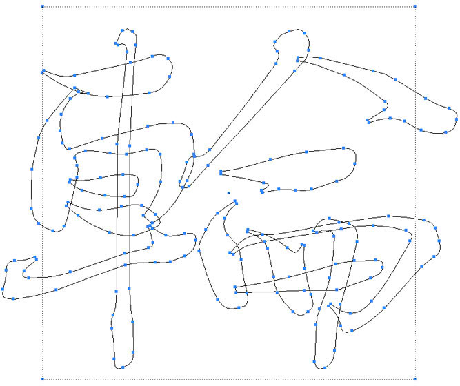
The Kazuraki glyph for 輪 (U+8F2A) shown overlaid on the prototypical em-box.
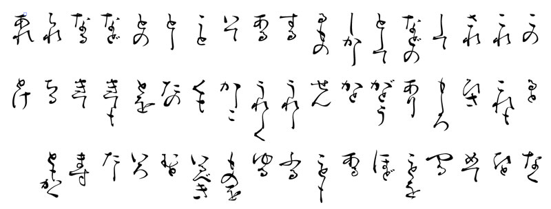
Kazuraki’s vertical-only hiragana ligatures.
Can you talk a little about why it is so unusual for a Japanese typeface to be fully proportional?
Japanese is unique in the following points: it can be laid out both horizontally and vertically; it uses three different styles of characters (which are kanji, hiragana, and katakana); and the number of characters is simply huge. When typesetting started in Japan, they put all characters into a rectangular shape so that it would be easier to set. Printing characters are based on a rectangular design for this reason. Now, if you change this rule, using a rectangular design space to design characters, it means we lose the rules for lining up characters like we had before. It becomes difficult to control characters, and causes character collisions or undesirable spacing.
When designing Source Han Sans, Ryoko didn’t have to worry about proportional type as much, but she did have a much different consideration: the sheer number of glyphs and languages that would need support. The typeface was designed for Chinese, Japanese, and Korean, which share many written characters but each introduce a number of regional variations. Ryoko explained how the team needed to reach a point of harmony whereby each language could stand on its own in Source Han Sans, but still feel internally consistent as part of the same typeface.
What did you use as a basis for the initial font design?
The project started by first basing the kanji on Kozuka Gothic, and the kana on Ryo Gothic. Source Han Sans is intended to be used on smartphones, so when we began to design, we were looking at how to reduce discomfort while reading long texts or in vertical writing, such as ebooks.
Sketch of Source Han Sans by Ryoko Nishizuka.
What was the most challenging aspect of the Source Han Sans project?
There were many challenges in this font, so I cannot decide only one! Starting the project with our company’s proprietary application for making kanji, while it is still under development, was a challenge; also, reviewing Kozuka Gothic glyphs made from modified elements, and understanding the designs of other countries. For Japanese, the kana were quite challenging. While the design has a light touch of uniqueness, our aim was to make it look as “normal” and unobtrusive as possible.
Artwork for Source Han Sans designed by Min Wang.
What was it like to work with other foundries on the project?
This was a project that could not have been achieved without the cooperation of our partners. Dr. Ken Lunde mediated us well. It is difficult to understand the design intent outside of one’s country, so judging all of the cases one by one to determine whether each quirk is an error or intentional, was quite time-consuming. But, because it is best for in-country designers to make things for that country, I think that this point was a big success.
We thought so, too! Source Han Sans is now available on Typekit, and we look forward to seeing more designs from Ryoko.