Sites we love, Second Edition
To mark two years of the sites we like column, here are some of our favorite sites from the past year.
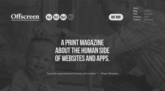
Offscreen Magazine is as lovely on the screen as, well, off. Featuring Calluna and Bebas Neue.
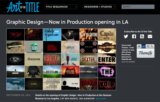
Soleil and FF Meta Serif team up on the ever entertaining Art of the Title.
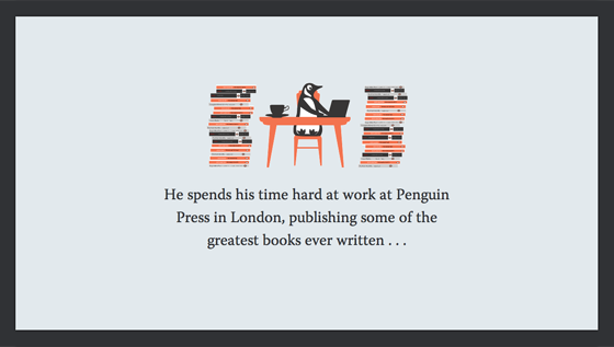
Impress a Penguin shows off Robert Slimbach’s oft-overlooked Warnock.
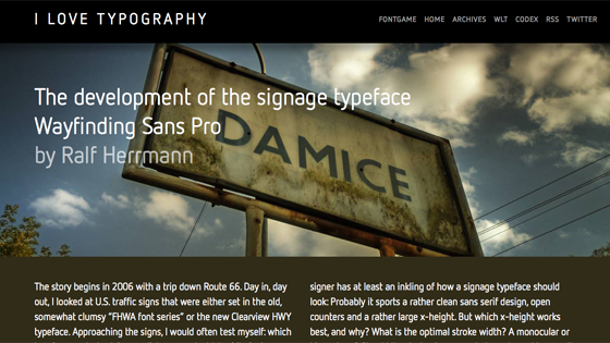
A fascinating essay on the design of a typeface for wayfinding pairs the rounded FF Netto with the soft slabs of FF Tisa.
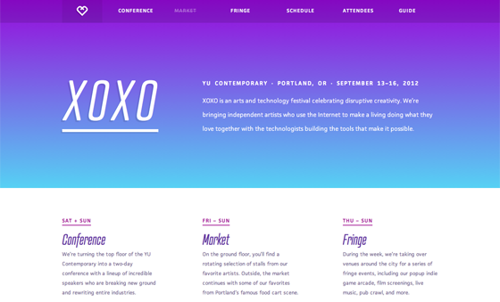
The XOXO Festival combines Atrament italic with all-caps JAF Facit.
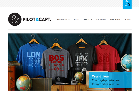
From the Heads of State, the wonderfully retro Pilot & Captain makes excellent use of Brandon Grotesque.
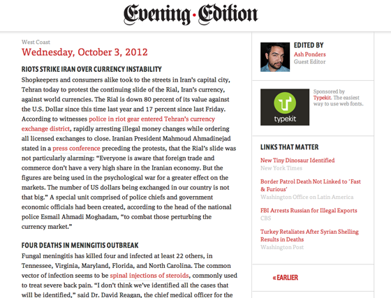
Mule Design’s Evening Edition delivers commute-sized news with Prenton Condensed and the always classic FF Meta Serif.
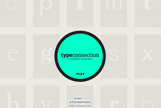
Type Connection pairs FF Tisa (and its companion small caps) in a playful typographic dating game.
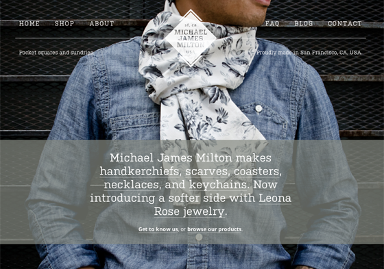
Michael James Milton puts the blocky slab serif Kulturista to work.
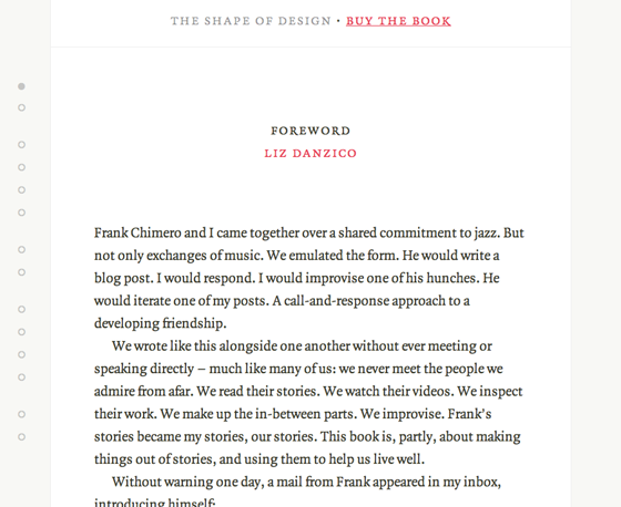
And last but not least, The Shape of Design stars the bookish FF Quadraat, available from FontShop.
Have a favorite we missed? Share it in the comments!
2 Responses
Comments are closed.
There is no shame in self promotion for a freelancer.
Matthewcarleton.com