Fonts for your finals: New on Typekit for May
It’s hard to believe we’re already at the end of April — but here we are, and we’ve got more new type in the library to share with you. Have a look at what we’ve added this past month and a few other things that we’ve had going on.
Jamie Clarke Type
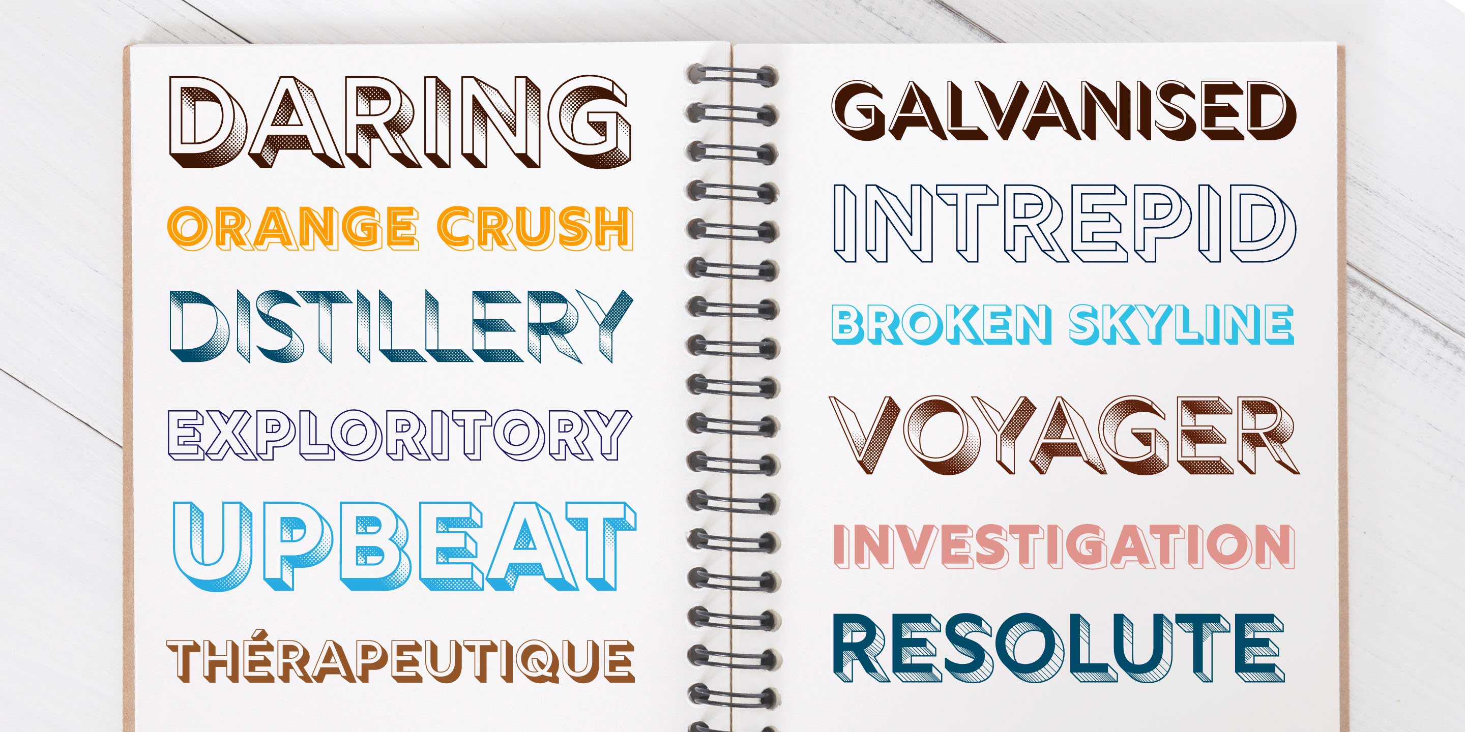
Rig Solid from Jamie Clarke Type
We love the bold, fresh type from designer Jamie Clarke, full of energy and fantastic for display. His Rig Shaded recently won the Platinum award in the Graphis competition for typography. Rig Shaded and its sibling Rig Solid are both available in a stunning variety of styles that can be layered on top of one another for shadow effects, outlines, gradients, and more.
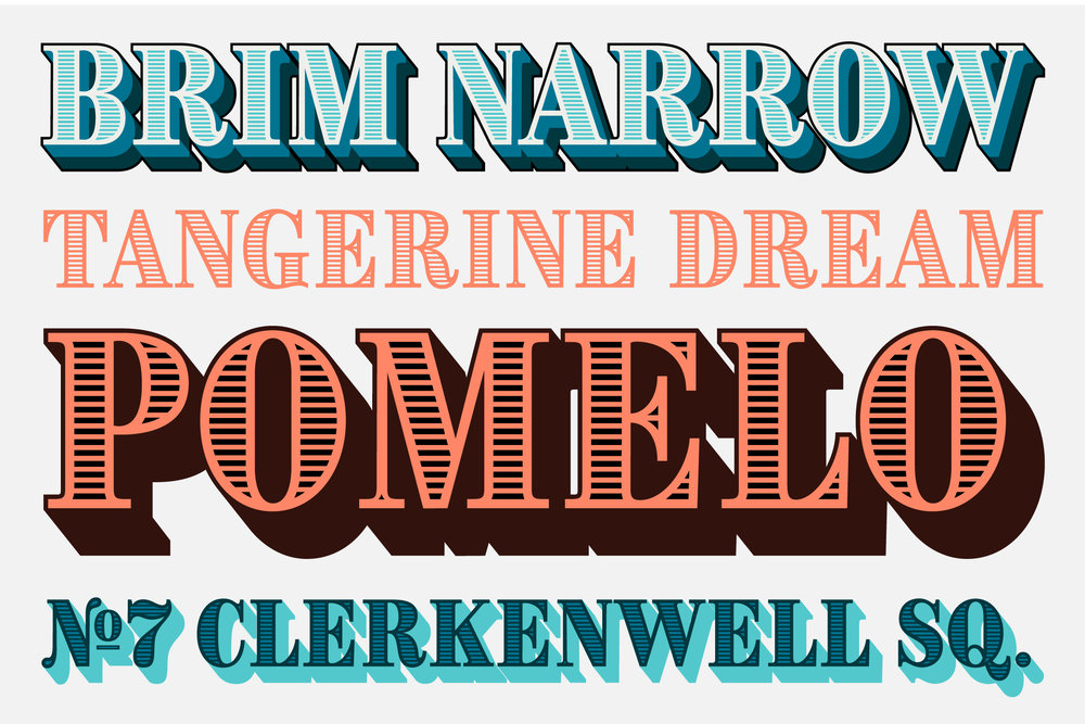
Brim Narrow
Brim Narrow offers a similar variety of layering options but with a decidedly different style featuring stately serifs. Use Brim Narrow Combined for simplicity if you’re working with just one color or want the fonts on your website (although it is possible to combine layers using CSS!).
Production Type
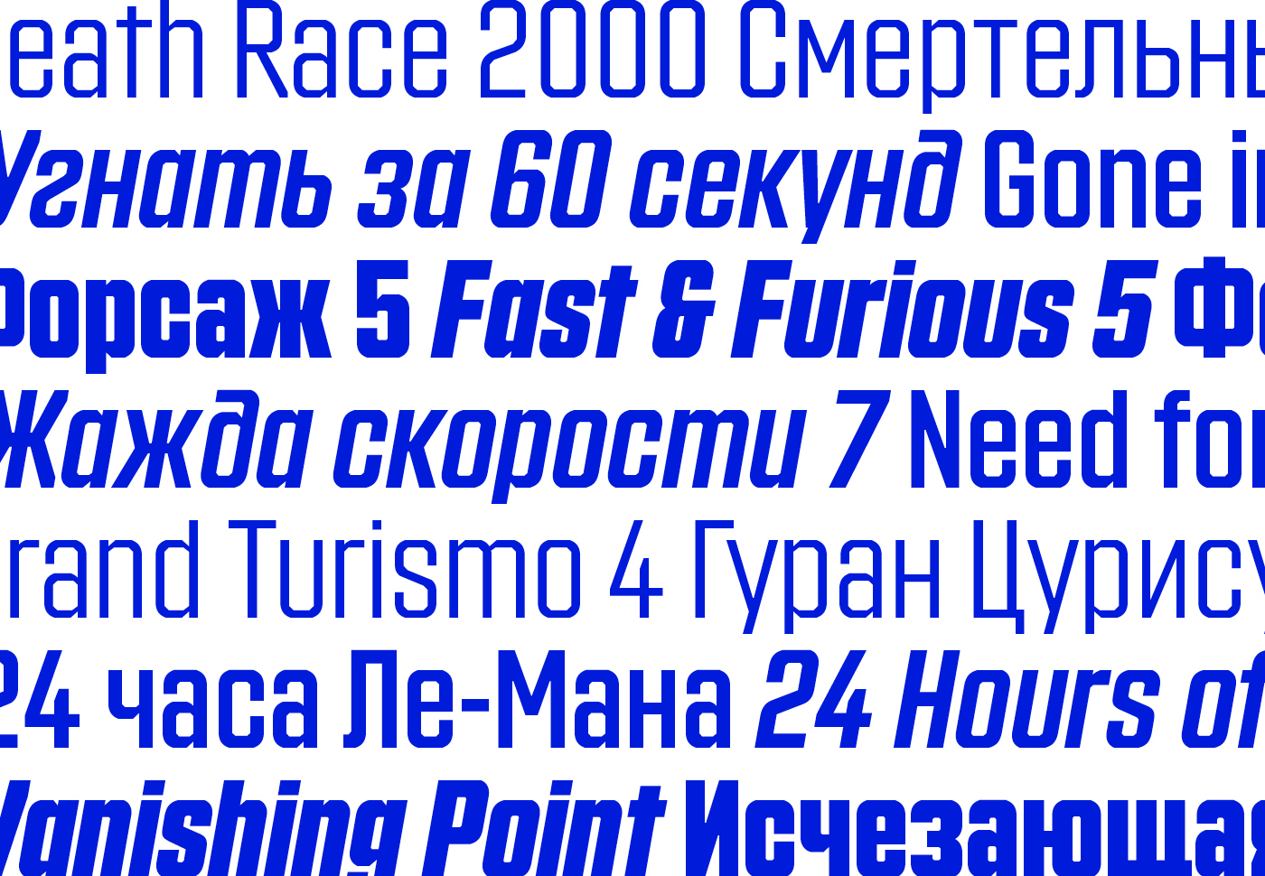
Countach from Production Type
We added several Production Type families from Jean-Baptiste Levée and his team to our subscription library. Countach is one of these — originally designed for a car racing game, with an emphatic italic style that exhibits a clear velocity and an extended character set including a well-rounded Cyrillic.

Panorama Extended (left) and Semicondensed (right)
Once in a while a type family just keeps growing and growing over the years, and Production Type’s Panorama collection is such an example. Six widths and eight weights, plus italics, make for a whopping 96 font styles for this family. The variety makes this an especially adaptable choice for all manner of projects. We’ve added the whole shebang to our Marketplace: Panorama Regular as well as Semi Condensed, Condensed, Extra Condensed, Extended, and Extra Extended.
See everything from Production Type on their foundry page.
New from Device Fonts
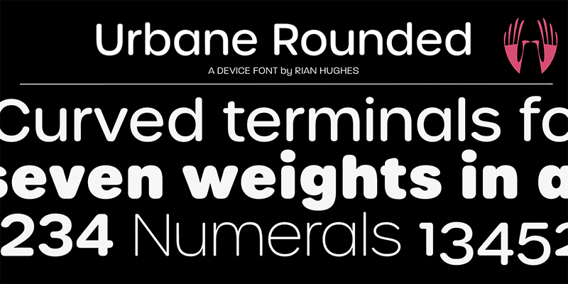
Urbane Rounded from Device Fonts
Urbane Rounded comes to us from Rian Hughes of Device Fonts. It’s a cheerful rounded sans with seven weights, and will easily lighten the mood where it’s used — the heaviest weight in particular is nearly balloon-like, in the best way possible. Use the lighter weights where more subtlety is needed, like in site navigation or smaller text.
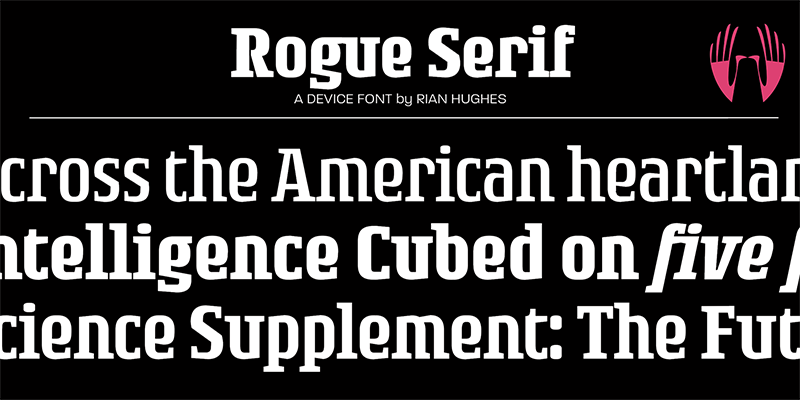
Rogue Serif
Rogue Serif has a hearty personality like many slab serifs, perhaps with a slight edginess from the sharply-carved sides and terminals. If you’re going with a lighter weight it’s perfectly lovely for body text, but less is more when it comes to the heavier weights — size it up, trim your copy, and give the letters plenty of space to shine.
There’s more from Device this month, too; have a look over on the foundry page for the full collection.
Adobe Type news
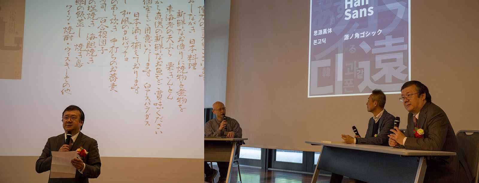
Taro Yamamoto accepting the Keinosuke Sato award (left) and joining a panel discussion with fellow winner Akira Kobayashi and moderator Kiyonori Muroga.
The Japan Typography Association selected Adobe as the 2017 company winner of the Keinosuke Sato award, which is given to a selected company and individual each year for meaningful contributions to Japanese typography. Taro Yamamoto accepted the award on behalf of Adobe Type on April 20 in Tokyo.
We also celebrated the first anniversary since Source Han Serif‘s release, and added Ten Mincho to our free tier. Oh, and how was your Font Day this year?
Conference season ramping up
It’s getting to be that time of the year when everyone seems to be traveling. In case you missed our speaking event roundup earlier in the spring, here’s a few upcoming highlights:
- Dan Rhatigan presents at HOW Design Live on May 2
- Computer Scientist Persa Zula will speak at !!Con in New York on May 12
- There’s still time to register for the 2018 Ampersand Conference in Brighton! Dan will be speaking there, too. (PS: Use code ADOBE10 when you register for 10% off the ticket price.)