Typespotting: Industrial-chic address
Addresses are a great source for type inspiration. It’s a place where big display typefaces can really shine.
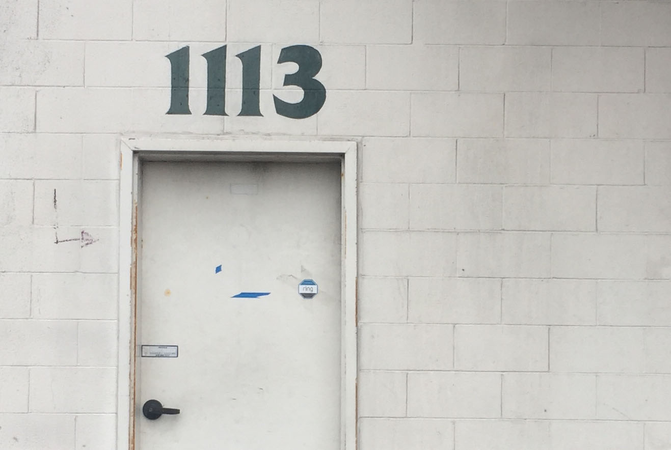
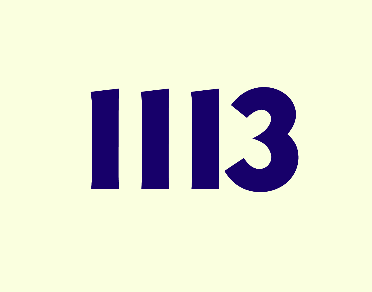
I walked by this entrance to an otherwise-unlabeled building complex while heading to a cafe, and of course noticed the painted numbers. This is in the Dogpatch neighborhood in San Francisco, where light industry is adjacent to a growing upscale commercial district — which makes for a lot of variety in the signage. What would visual search point me towards this time?
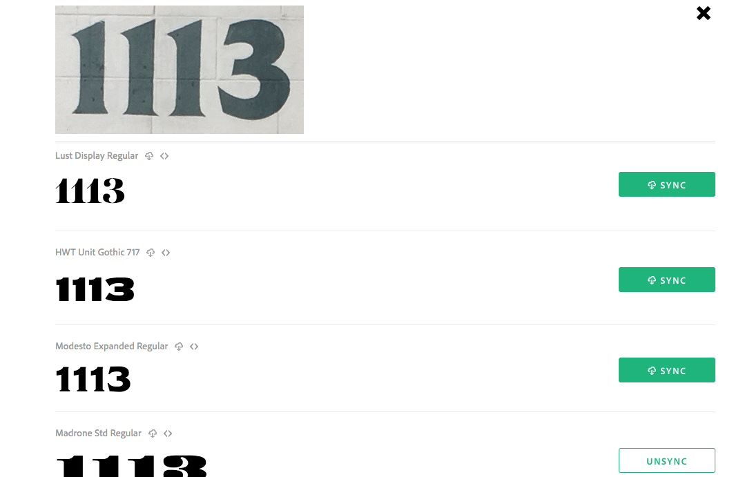
The initial results from visual search were a little scattered. I wondered if the tool was picking up different cues from the 1 and the 3, and tried running the search again on each number in isolation.
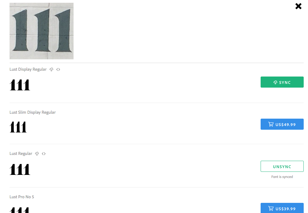
Lust seemed like the clear preference for the number 1; in fact, there wasn’t anything but Lust variations in the recommendations. It definitely shares some of the same flavor, but Lust has an extremely high contrast while these numbers… don’t.
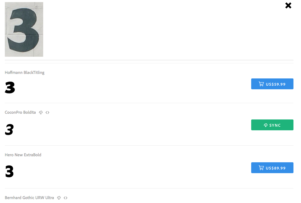
Unsurprisingly, Lust wasn’t even in the list of recommendations for the 3. I thought New Hero Super and Magallanes ExtraBold seemed reasonably good, but each of these had clear differences too.
The more I compared the 1113 numbers to their counterparts in the recommendations, the more I noticed odd details about them — like how the sides of the 1 bow inward while there’s none of that in the 3, and how the bottom edge of the 3 is angled far more sharply and in a different direction than the top and middle — something I didn’t see in any of the typefaces listed as suggestions.
Clearly I wasn’t going to find an exact doppelgänger for this one, so I looked at the suggestions and tried out “1113” in all of them to see what I liked best. Bernhard Gothic URW Ultra was a surprise fit — it came up in the suggestions for the “3” and when I tested it the “1” was actually not that far off.
Bernhard Gothic URW Ultra, very squished.
The type needed a bit more manipulation once I’d placed it in Illustrator, which I managed in the Character panel; the numbers were much more widely spaced and I wanted to bring them more closely adjacent.

Character panel in Illustrator. I edited the bottom two values.
I haven’t looked this closely at numbers since I wrote the type for numerals post, but they are truly everywhere — keep your eyes open for interesting addresses and let us know if something strikes you! Tag us on Twitter or Instagram and let us know what visual search helps you uncover.
One Response
Comments are closed.
great type sleuthing post Sally!