New on Typekit in January 2018
We’ve started off 2018 with a great batch of new type on Typekit. Did you make any design resolutions that could use a boost with a new typeface to play with? Have a look at what we’ve added and see what inspires you.
New from Plau
One of our newest foundry partners, Plau is a type foundry and brand identity studio based in Rio de Janeiro, Brazil.
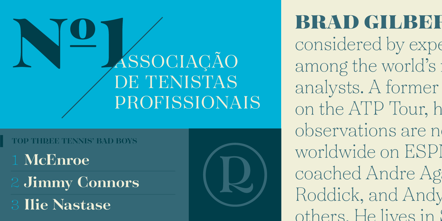
Tenez from Plau.
Tenez has roots in pointed nib calligraphy, and the high contrast letters here definitely share some characteristics with Didot and Bodoni styles. Look for stylish details emerging from the organic construction of the letters, too. The capital R in particular has a gloriously distinct personality.
Plau from… Plau.
Plau’s namesake typeface, Plau, is a great addition to any shortlist of futurist-inspired design. The foundry calls out its “rounded corner personality and interestingly deliberate lettershapes.”
Primot from Plau. Art specimens courtesy of Plau.
And don’t miss Primot, the “ice cream sandwich in a font.” It’s inspired by Italian gelato shop signage and feels like artfully-contained exuberance.
Fonts from G-Type
Remora from G-Type.
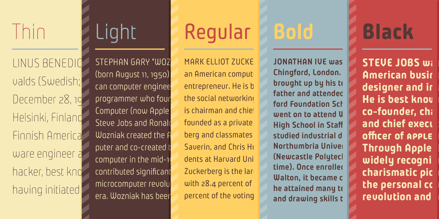
Of the 112 fonts we’ve added to the library from our new foundry partner G-Type, a whopping 70 are part of the Remora Sans type system by Nick Cooke. Width classes are noted with W1–5 in the names, and for each width there are seven different styles — plus italics. Hope you have a lot to say! Remora Sans with 5 weights and 7 styles, plus italics — a total of 70 fonts.
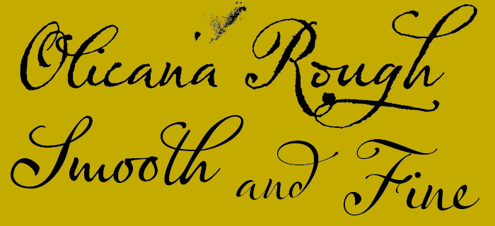
Olicana from G-Type, featuring Rough, Smooth, and Fine styles.
When a sans-serif won’t cut it, check out the three hand scripts we’ve added, too: the splotchy-pen intensity of Gizmo, Rollerscript, and lovely ligature-packed Olicana.
More to sync from Jan Fromm
Komet by Jan Fromm. Artwork by Jan Fromm.
Jan Fromm has been one of our foundry partners since 2010 — the year after Typekit launched! — and we’ve featured the web versions of Rooney, Rooney Sans, and CamingoDos in plenty of Sites We Like over the years. Now those fonts are also available for purchase on Marketplace, which means you can use them in your desktop applications as well — and in addition to that, Jan has added his Komet family to our regular subscription library for web and sync.
New from Laura Worthington
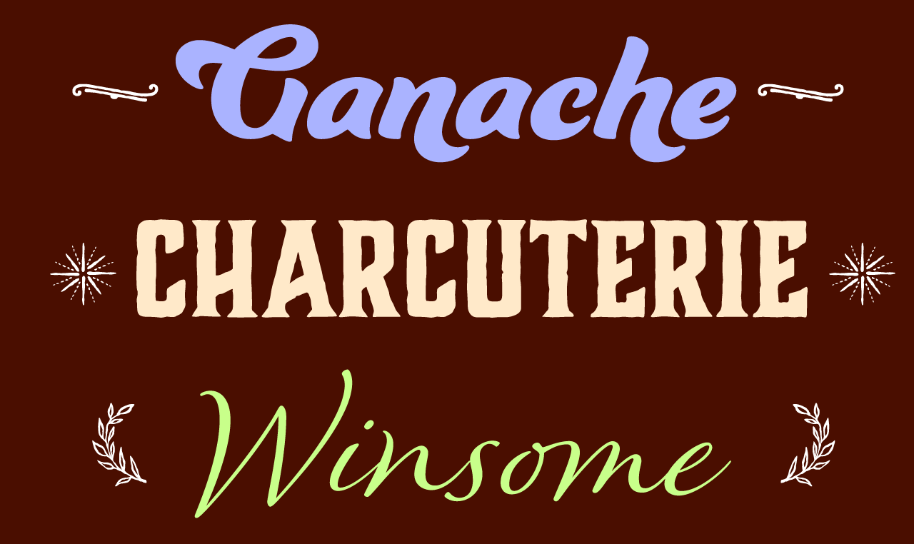
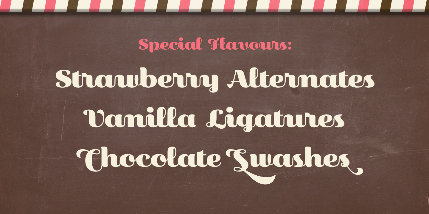
Ganache, Charcuterie, and Winsome from Laura Worthington, with ornaments also from Charcuterie collection.
Laura Worthington is well-known for her gorgeous scripts, which are primarily based on her own calligraphy and lettering. Plenty of these scripts are among the 101 fonts (!) we’ve added from her — but be sure to take a look at the Charcuterie collection too. An ambitious undertaking, Charcuterie comprises ten font families and three decorative typefaces to boot, which can make for fantastic combinations of styles if you use more than one in a design. Laura’s thoughtful overview of her goals with Charcuterie is definitely worth reading, too.
Introducing Landa from Sudtipos
Landa from Sudtipos. Artwork courtesy of Sudtipos.
Our newest addition from Argentinian foundry Sudtipos is Landa by Pablo Alaejos, a beautifully textured serif the foundry calls “A rendez-vous between Nicolas Jenson, Oldrich Menhart, and nature itself.” You can sync Regular and Italic right away from our subscription library, and if that doesn’t quite whet your appetite, four more weights and their italics are available for purchase on Marketplace.
New in the library from Northern Block
Neusa from Northern Block. Artwork by Northern Block.
Northern Block has two new additions to our library: charming Eldwin Script with its tidy six weights, and then there’s Mariya V. Pigoulevskaya’s powerhouse sans Neusa Next. Neusa Next is really multiple font families, with Condensed, Compact, and Wide widths in addition to the regular width, and each of those comes in five different weights with italics.
Rival & Rival Sans from Mostardesign
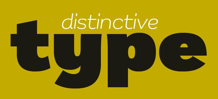
Rival from Mostardesign. Art by Mostardesign.
The Rival superfamily is an exciting addition to our library from designer Olivier Gourvat. Check out all seven weights of Rival, which feels typewriter-like at the lighter weights and goes up to Extra Bold and Black for when you need something with a lot of gravity. Rival Sans is even more extensive, with a Narrow width for tight spacing needs and an additional Thin weight.
’90s throwbacks from Adobe Originals
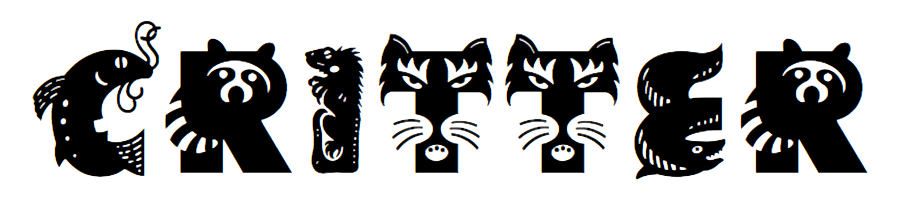
Admittedly, Critter falls pretty far outside our regular range for type. If you want your letter R to have the shape of a raccoon, we simply don’t have a filter you can use to browse for that on Typekit. But when we learned that we’d be making Critter available to sync, we kind of fell in love with it. You must be at least a little curious to know what animals would spell your name.
Also from that prolific era, we’ve added Mezz and Galahad to the sync collection, too.
Thanks for reading this month’s roundup — we hope this gets you inspired for a new project or two! For a quick overview of what’s new in the library, visit Typekit.com/fonts and set the sorting filter to “newest.”
2 Responses
Comments are closed.
Alas, searching Typekit for “science,” “scientific,” “math,” “technical” and “STEM” turned up no fonts. Even “Greek” turned up only one and looking for one such font, STIX, turned up nothing.
Adding all these varied new fonts is well and good. But can’t TypeKit at least tag those fonts that have the specialized characters used in science, math and technical publishing? Looking for them by hand is a pain. Adding specialized STEM font sets with extensive character sets would be even better. Here is one such font.
http://stixfonts.org
Thanks for the suggestion!