Typespotting: Sans serif electric supplies
Sometimes finding a new typeface you love is just a matter of taking a walk around your neighborhood. Once in a while I walk by this electric supply building on my way to the office, and every time I find myself staring at the letters.
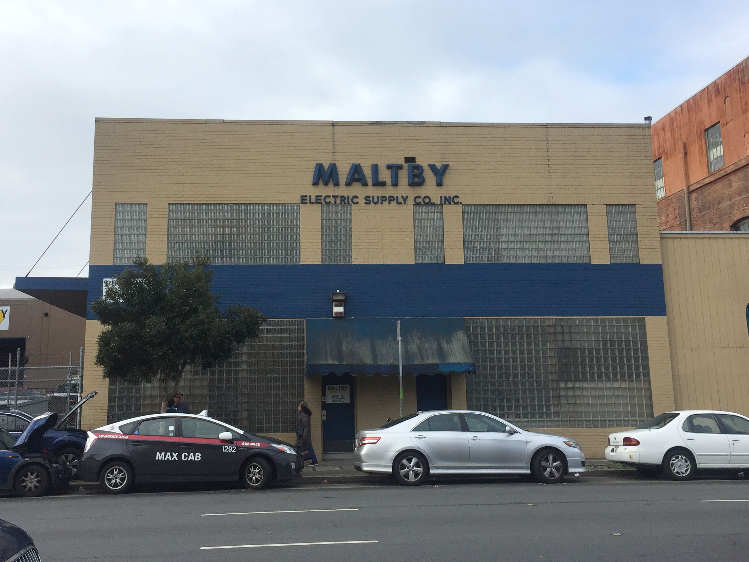
I wish I knew where the name MALTBY comes from. The building front is so spare, and really makes the letters stand out. I was curious what our visual search tool would make of it.
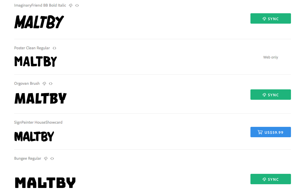
I wasn’t expecting so many sign painting typefaces for this one. Bungee was probably the closest to what I’d been expecting in the results.
Bungee has a lot of personality — maybe even more than MALTBY does. While I loved that L with the exaggerated serif, I knew I’d want to look for an alternate in this case. I also had some reservations about the A and Y, probably the least-matched of the letter shapes overall.
I decided to try running the visual search again, this time highlighting only the letters M and A from the sign. This ended up yielding some very different results.
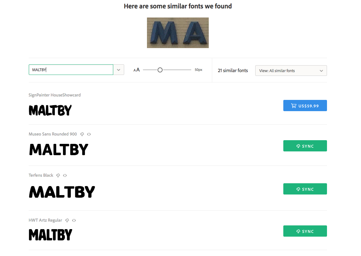
Museo Sans Rounded seemed much more similar to the sign than Bungee, with other options like Filson Soft also looking pretty close.
With that, I felt ready to take a stab at making a type specimen.
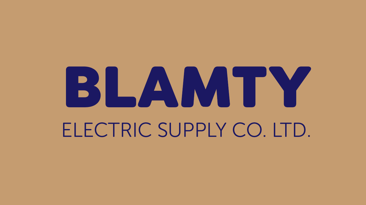
After some playing around, Museo Sans Rounded 900 looked a little too compact to me. I chose Filson Soft Heavy for the company name instead, and used Museo Sans Rounded 300 for the smaller type. I also switched up the name just for kicks.
Visual search made it fun to explore different type for an offbeat use case, and even though I didn’t end up using it I’m glad I got that introduction to Bungee. I’m definitely not going to look at that building the same way again.
4 Responses
Comments are closed.
Looks like normal Futura Bold to me.
Wow, I didn’t see that. Seems to me that it most closely resembles the Berthold version of Futura, Futura BQ, particularly in the /B.
Oops, can’t edit comments. I meant that I didn’t see Futura originally. Must be the bevels that distracted me.
I see what you mean with the Futura similarity! Maybe the bevels distracted the visual search tool too. Mostly I was curious what would come up, and would make for a similar look & feel. I’ll keep trying it out on different signs to see what happens.