Sites We Like: Monogram Project & Concourse
This week we wanted to shine a little light on two neat projects we noticed — both of which are also using some great web type on their sites, of course.
Concourse
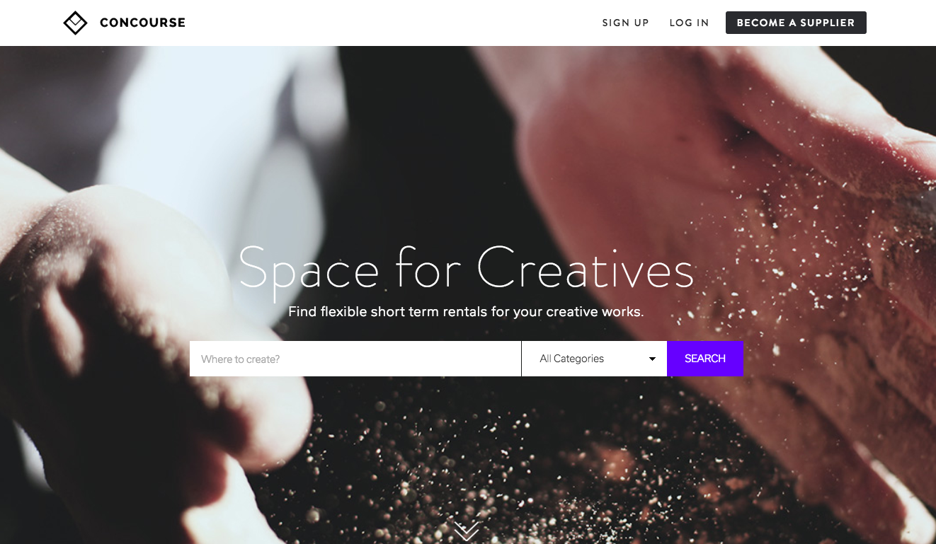
Concourse is a newly-launched website that lists available work space for creative projects, which had an early role (along with its creator Sarah Calvillo) in our Typekit Marketplace video. Sarah uses Brandon Grotesque for her headers and Usual for the body text, leaning slightly towards lighter weights for both (with the exception of those bold subheads) for an airy, open feel on the page.
Monogram Project
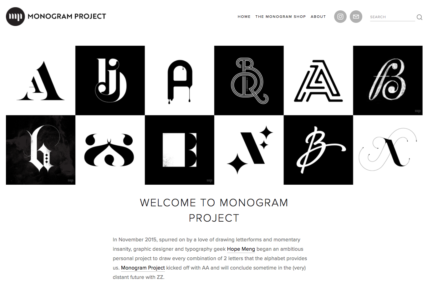
The Monogram Project is the undertaking of designer Hope Meng, who is working her way through the alphabet in two-letter combinations that put a fun and imaginative spin on ligature design. Her site uses Proxima Nova for all the text. The classic sans-serif looks especially graceful in the headers and also makes for clean body text, neatly keeping the visual focus on her awesome monogram designs.
That’s it for this week! Share sites you like in the comments, or send suggestions our way on Twitter or Instagram.
We ❤️ type on Instagram. Find us there!
One Response
Comments are closed.
Wow, thank you for the feature, Typekit! I’m a huge fan and this is an honor. 😊✌🏼