Pan-CJK Partner Profile: Sandoll Communication
While developing Source Han Sans, Adobe and Google worked with three different companies to bring the kind of in-country expertise we knew we needed to hit the quality threshold we had set for this typeface family: Iwata Corporation in Japan, Sandoll Communication in Korea, and Changzhou SinoType in China. Today we would like to introduce you to Sandoll Communication, a leading Korean type foundry.
Although Adobe possessed fairly broad knowledge in designing ideographs, we had very little design expertise with Korean, a written language that is very different from its East Asian siblings. We knew that our Korean partner would need to start from scratch to create glyphs that would not only capture the beauty of the Korean language, but would also harmonize with the Chinese and Japanese ideograph designs we were working on. Sandoll agreed to work with us.
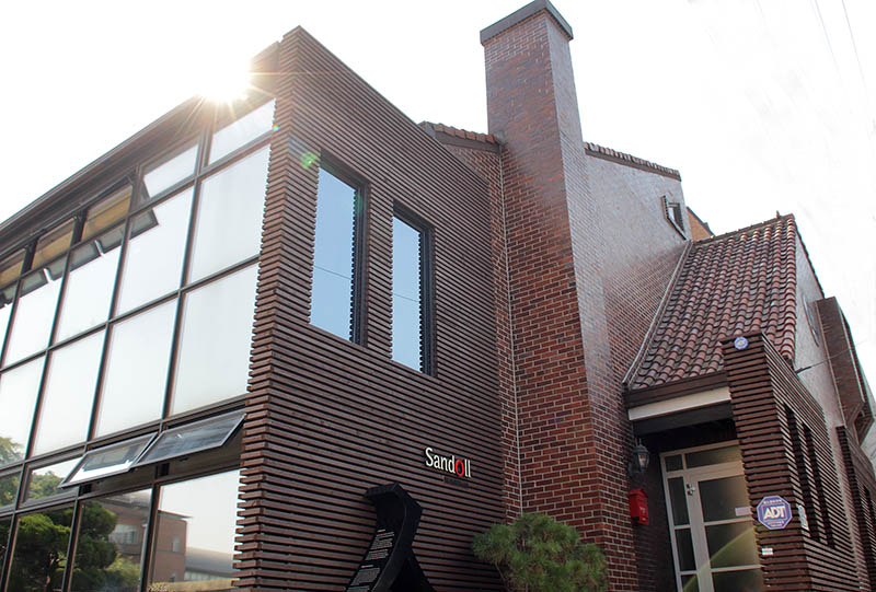
Sandoll Building – Seoul, Korea (All images courtesy of Sandoll Communication)
Founded in 1984, Sandoll is one of the larger font foundries in Korea. From the beginning, founder Geumho Seok emphasized design quality over quantity. An established leader in the Korean font industry, Sandoll’s primary market in the past focused on corporate customers such as Samsung, LG, and Kia. However, recently they’ve become intent on creating an environment that makes it easier for more people to discover and use typefaces in Korea, with innovations such as Sandoll Cloud, a cloud font service that lowers the cost barrier for customers, and a marketplace where independent designers can introduce and sell their own typefaces. Sandoll has also started a program where they work with start-up companies and venture capital firms to provide fonts for fledgling businesses. “They can make their service look great with our fonts,” said Mr. Seok. “We think it’s one way for new companies to emphasize the value of their design or product by using quality fonts.”
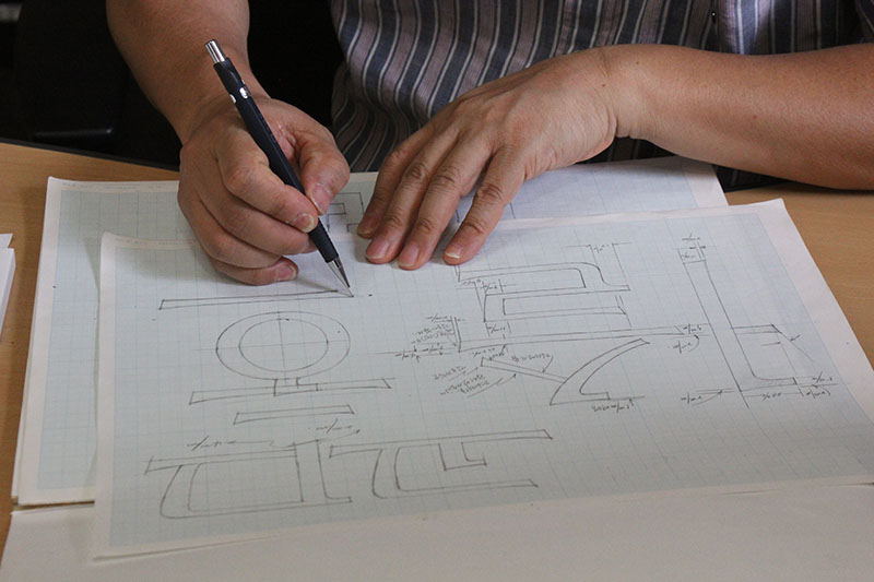
Sandoll’s founder, Geumho Seok at work
We sat down with Geumho Seok and Sandoll’s font evangelist Danny Lee for a quick Q&A about their business, and to hear their perspective on the Source Han Sans effort.
Gentlemen, you’ve mentioned your company emphasis on quality over quantity. What is the most rewarding aspect of designing typefaces?
We have a mother tongue, Korean. We think that the most valuable aspect of creating typefaces is to preserve our spirit through fonts. When Sandoll develops a font, we do not just design, we do not just create. We put our whole resources to express well even the small delicate details. Sometimes people would say that they can see our effort through the font. We think it’s the reason why the global companies choose Sandoll for their partner.
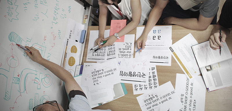
Team members in a design discussion
So, do you primarily develop for one language, or do you create fonts for several languages?
We generally develop for one language, Korean. However, there are Latin, Chinese, and Japanese characters used in Korean fonts. So we have studied for a long time to understand the principles of each language. When we developed a font for Samsung, one of our designers went to Japan to learn the fundamentals of Japanese.
What are your most popular fonts?
Malgun Gothic, Nanum Gothic, You&I typeface, and Sandoll Gothic Neo1 are the most popular fonts in Korea and we are very proud of them. Malgun Gothic is the first Korean font that adopted hinting information to support ClearType on Windows OS. And Nanum Gothic was designed for electronic displays and has become the most famous font in Korea. Our You&I typeface was developed along with Total Identity by request of Hyundai Card. They wanted to make a font which reflects the shape of a credit card. So, per their request, the design of the font looks like a card itself.
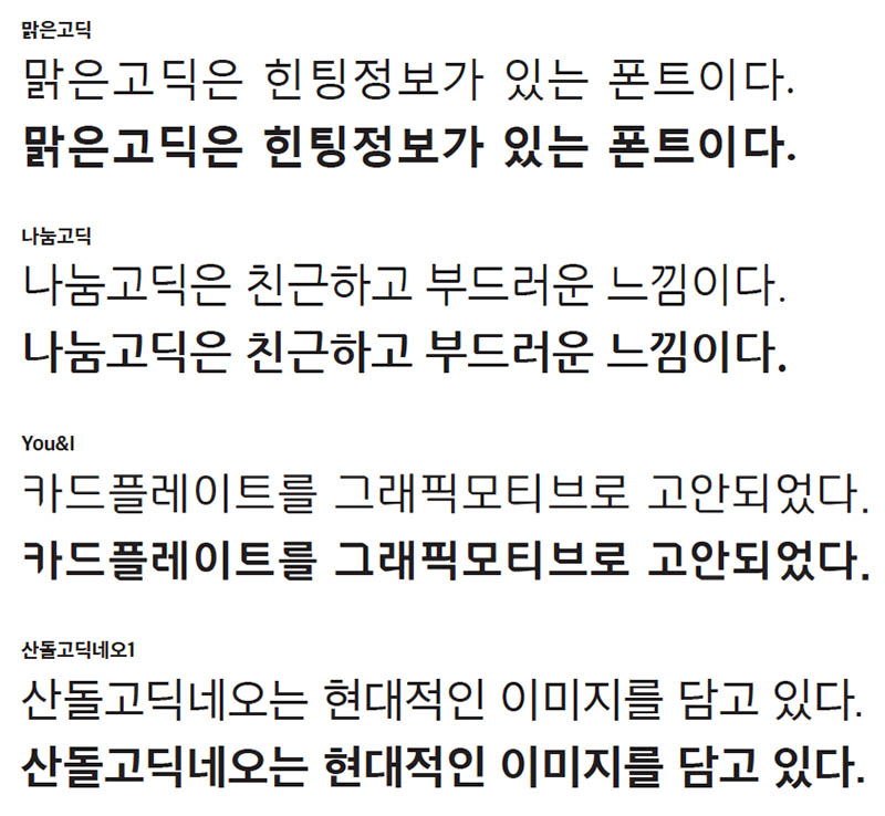
Examples of Sandoll fonts: Malgun Gothic, Nanum Gothic, You&I, and Sandoll Gothic Neo1
How challenging was it to work on this Pan-CJK project? Was there a specific task that was really challenging, or a problem that you had to solve?
Developing a font with Adobe tools we had never used before [Adobe’s Type Workbench 2] was a big challenge. The assembling/disassembling process to make a master design out of elements was totally new to us because we use different tools and processes. To make the Korean elements was the most difficult work, because there is no research or any reference of studying Korean strokes and points. It was a very complicated process to imagine the entire set of over 10,000 glyphs.
What special skills did you need to grow in order to create your portion of this font family?
Due to the full support from Adobe, our designer could concentrate on the project. What he just needed was stamina!
Now that the work is done and the font has shipped, what is your overall opinion of Source Han Sans?
We have done some thinking about who will need a bunch of different font styles. Designers? Corporations? To communicate with each other, people really need fonts. Unfortunately, they don’t always consider style. However when they try to express their emotion, they seek to find a font which can reflect their feelings. So, we think that if people can easily find a font that can match their current situation, people will start spending time to pick a proper font. [Source Han Sans] will be a start, and a font that will be widely used.
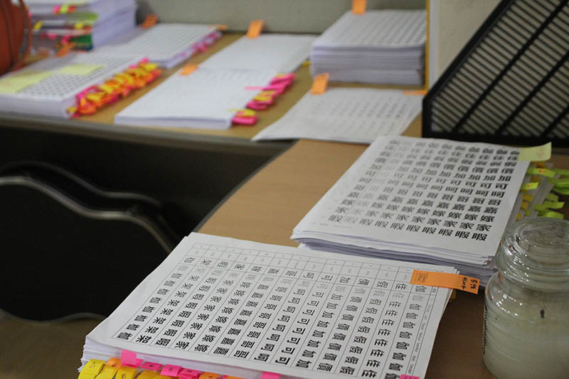
Proof pages used for testing
Is there anyone on your team that you would like to call out specifically because they were a key contributor?
Everyone is a valuable person in our company. These days Soo-young Jang, in our design team, is becoming a key player and contributor. He has participated in the Pan-CJK project as the main designer. It’s quite a long project. During the project, and even after, he tried to share his experience and knowledge with other members whenever he had time. He probably has learned how to collaborate with partners during the project. It may give him an idea that collaboration is the best solution to work well with colleagues.
Is there a defining characteristic to your company that you feel makes your company unique?
We have lots of departments at Sandoll. The most important thing in Sandoll is the harmony among people. Sandoll has a 30-year history. When we recruit a new employee, the first thing we consider is personality. The reason why Sandoll remains alive as a leading font foundry is because of people.
In many cases, our Western readers may not have heard about your company. What key information can I share with our readers that you would like them to know about?
30 years of experience. Over 500 font styles. Marvelous results with global companies. Leading font foundry in Korea. Those are some words that can reflect Sandoll’s fame. However, the best description of Sandoll is, “We build fonts.”
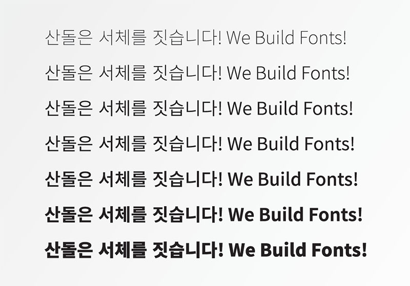
We Build Fonts!