Pan-CJK Partner Profile: SinoType
While developing Source Han Sans, Adobe and Google worked with three different companies to bring the kind of in-country expertise we knew we would need to hit the quality threshold we had set for this typeface family: Iwata Corporation in Japan, Sandoll Communication in Korea, and Changzhou SinoType in China. Over the next couple of weeks we will introduce you to each of them.
Pan-CJK fonts can suffer from a major problem. When attempting to create a font which can be used across multiple languages, quite often regional differences are overlooked — undermining the value of the font for users in those regions. For Adobe, it was critical that we find experts to help us. One of these was Changzhou SinoType. I recently had an opportunity to talk with Curt Huang, Chairman and CEO of SinoType about their relationship with Adobe.
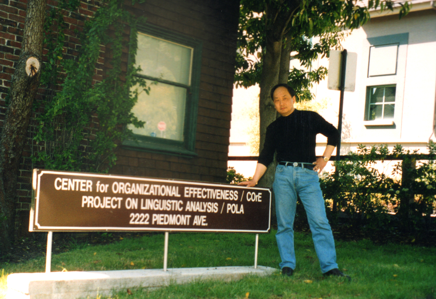
Curt Huang – Berkeley 1985
It turns out that SinoType has been a partner of Adobe’s for over twenty years. The relationship began when Curt was attending UC Berkeley in the late 80’s. Curt was in a PHD seminar in speech synthesis and recognition of computational linguistics, and became very interested in fonts when the PostScript-enabled Apple Laserwriter was introduced in 1985. As Curt tells it, “I went to my professor at Cal and told him that fonts were going to be the most important thing in computers.” Not long after that, Curt told his advisor that he wanted to return to China in order to start building Chinese fonts. His goal was to work with Adobe to build PostScript-based Chinese fonts.
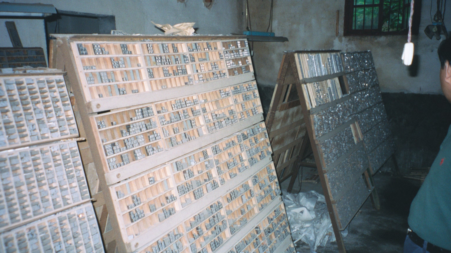
Racks of metal type which inspired Sinotype’s first designs – Image courtesy of Dirk Meyer
With his mentor’s blessing, Curt returned home and founded SinoType in 1991. They were soon creating fonts based on original metal type designs. These had been created by a master group led by Peiyuan Xie, a brilliant figure in the first generation of Chinese type designers. Curt’s company started designing their early fonts using Fontographer, and then later moved to using Adobe tools, some of which are still being used today. Their first Chinese font, STSong, was released in 1991. “I’m particularly proud that SinoType introduced PostScript fonts into the Chinese channel market. We were there well before our biggest competitors who didn’t deliver their first fonts until 1993 or later.” That first font, along with nine other SinoType fonts, was certified by the Chinese government in 1994.
Chinese font design masters, front row, left to right: Jincai Zhou, Huanqing Qian, Peiyuan Xie – Image courtesy of Dirk Meyer
They started small — at least by Chinese standards. The first version included “only” 6,763 Chinese characters, which is huge compared to Latin scripts, but relatively small compared to what is offered in China today. Many modern Adobe fonts run between 2,000 and 3,000 glyphs, but commonly-used ideographs in the Chinese language number more than ten thousand. Over time, SinoType expanded the offering to provide first an additional 14,000 glyphs and then started satisfying the Chinese government’s GB 18030 character set standard which requires over 27,000 glyphs. As you can imagine, the delivery of a high-quality, comprehensive Chinese font takes not only expertise, but lots of time. As such, the world of Chinese font production is very different from the design of fonts in the Western world.
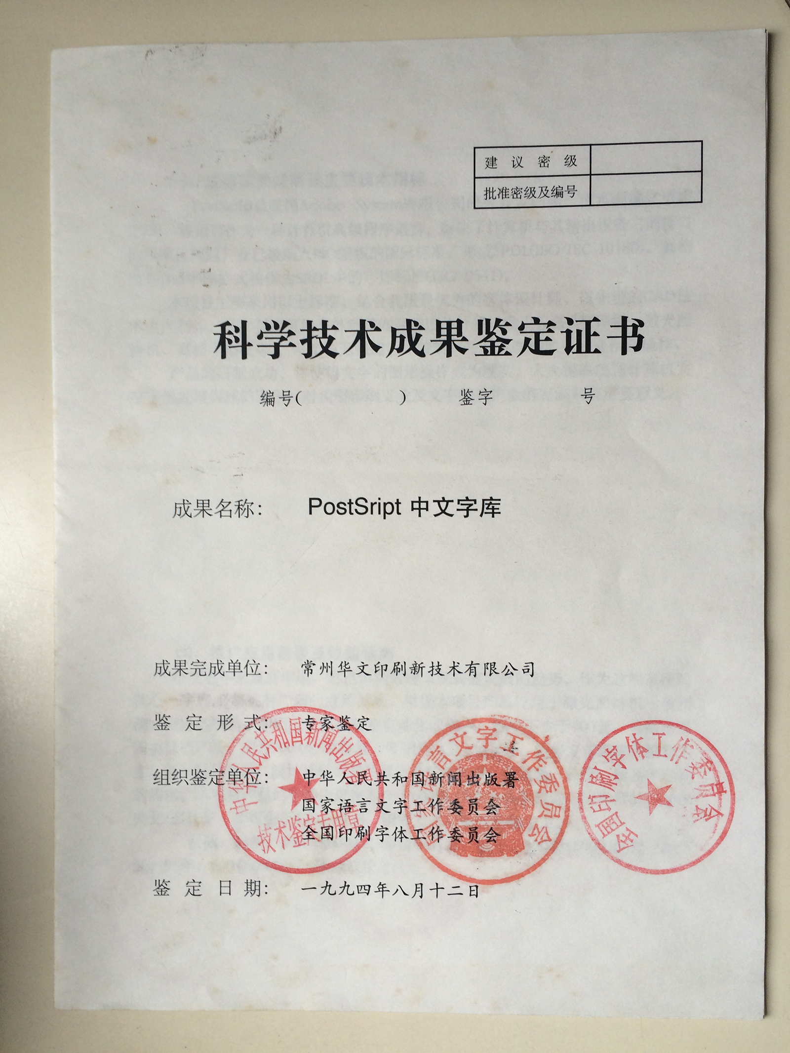
State Approval Certificate – 1994 / Image courtesy of Curt Huang
By 1996, Chuck Geschke, who founded Adobe with John Warnock, announced four new fonts from SinoType that would be offered in PostScript-based printers. This was an important milestone in China, as was the opening of the first Adobe Training Center in China, which focused on education for the use of Photoshop, Illustrator and PageMaker.
The rest is history. SinoType has grown today to be a company of about fifty people — which is quite large for a type foundry. Most of the twenty or so designers are located in Beijing, with the rest of the group in Changzhou. The size of the company piqued my interest, so I asked Curt what sorts of challenges he faced in helping to create Source Han Sans. He told me there were several:
“When we first scoped the project we planned to have about nine people work on the font. This clearly would not be enough. By the time we were done, the project had grown to twenty people. Additionally, we realized that even though Adobe had provided training in Beijing for the use of Adobe’s custom tools, we still needed more education. In the end, I flew five of us to Tokyo in order to get additional training for several days. Finally, very late in the development process, we found out that we needed to support specifications from various areas using Traditional Chinese, such as Taiwan. This required some pretty significant design changes. These were all challenges that we overcame.”
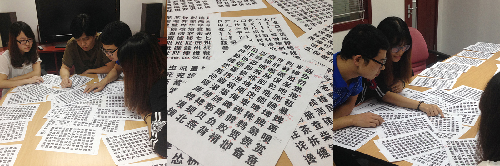
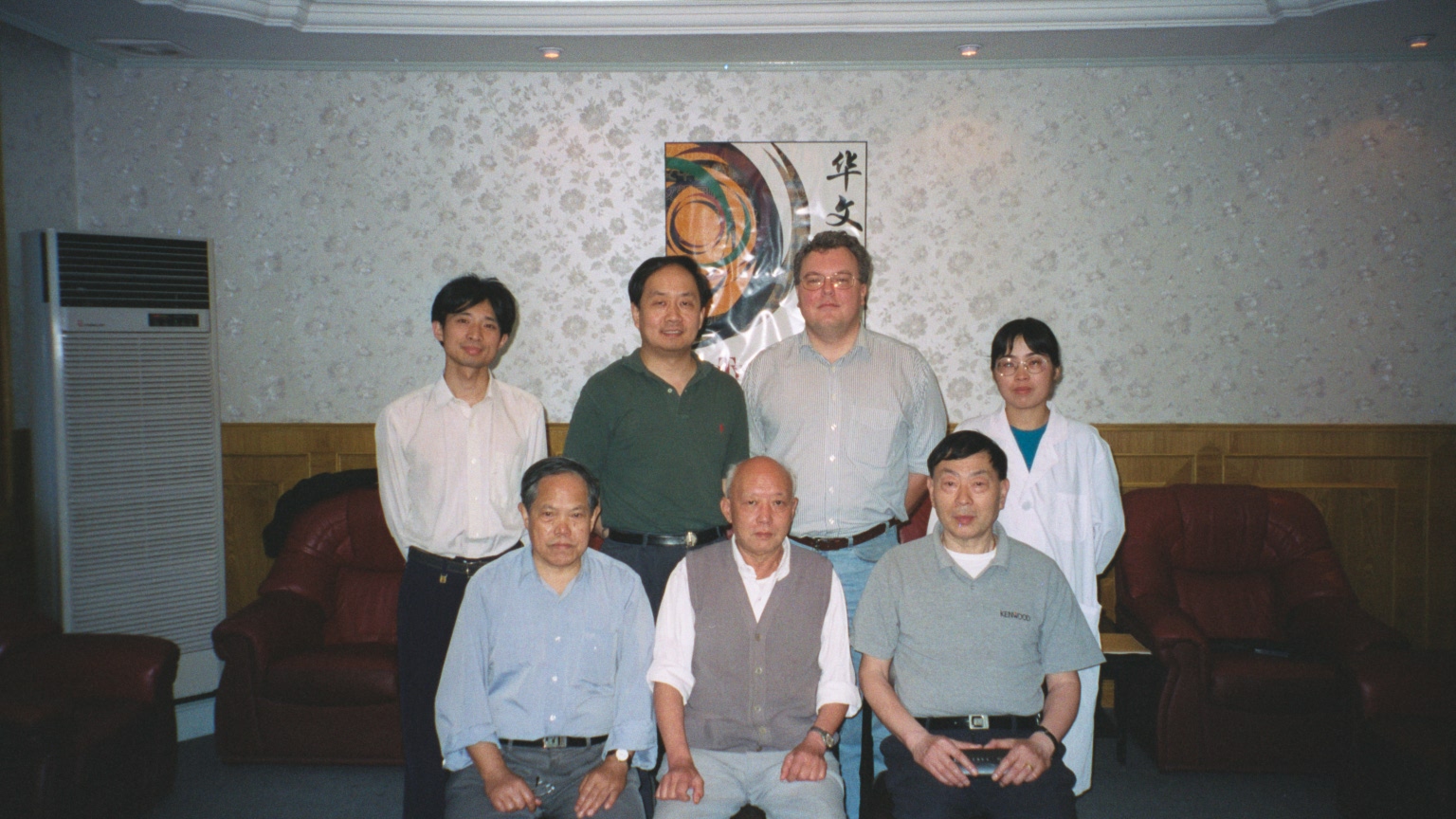
Review Meetings and Proof Sheets – Images courtesy of Curt Huang
When I asked Curt if the actual work on the glyph analysis had been daunting, he told me that it wasn’t. “In 1999, Adobe’s Ken Lunde and Dirk Meyer first started dreaming about a Pan-CJK font. They approached SinoType because they wanted to make a prototype and present it at an upcoming Unicode conference. We ended up providing the font data for that experiment. So, you see, we’ve had fifteen years to be thinking about this.”
As the supervisor of the PhD program at CAFA (China Central Academy of Fine Arts) and also the co-director of the China Typography Research Center at the school, Curt always encourages students from the China’s preeminent academy to seek first-hand experience in Chinese font design. Some of the students worked on this project. ”The students receive practical experience working on a Pan-CJK font and also get paid to do it”.

China Central Academy of Fine Arts (CAFA)
In the end, the attention to detail brought by SinoType to this project was invaluable. Source Han Sans is available in both Traditional and Simplified Chinese. For any single Chinese ideograph used in the font, there can be as few as one glyph or as many as four. The challenge that we gave to Curt and company was to analyze each character and recommend, design, and produce the right number of characters. When I talked with Ken Lunde recently (our CJK specialist who oversaw the project), he told me that SinoType had to look closely at Japanese characters we had provided as well. “More than 1500 characters were modified by SinoType to make them more acceptable to Chinese users, but they had to be designed in a way that would not impact the usage of the font by our Japanese customers.”
I finished my discussion by asking Curt what he was most proud of in the work he had done over the years with his company. He told me that being part of the introduction of digital Chinese fonts was definitely a highlight. But he also cited today’s broad usage of SinoType fonts by leading manufacturers. “Adobe, Google, Microsoft, Apple, IBM and now even Amazon (in their Kindle products) are using SinoType fonts. Microsoft bundles ten SinoType fonts with Microsoft Office and ST Heiti, our most popular font, is used in over 70% of set-top boxes. That is about 180 million devices.”
In my opinion, that is a lot of people who could be looking at your work every day. The quality had better be high, or you are going to hear about it. I know that Adobe and Google have been very happy with the work that SinoType has done for us. It has been a pleasure working with Curt and his team.