Introducing Source Han Sans: An open source Pan-CJK typeface
Adobe, in partnership with Google, is pleased to announce the release of Source Han Sans, a new open source Pan-CJK typeface family that is now available on Typekit for desktop use. If you don’t have a Typekit account, it’s easy to set one up and start using the font immediately with our free subscription. And for those who want to play with the original source files, you can get those from our download page on GitHub.
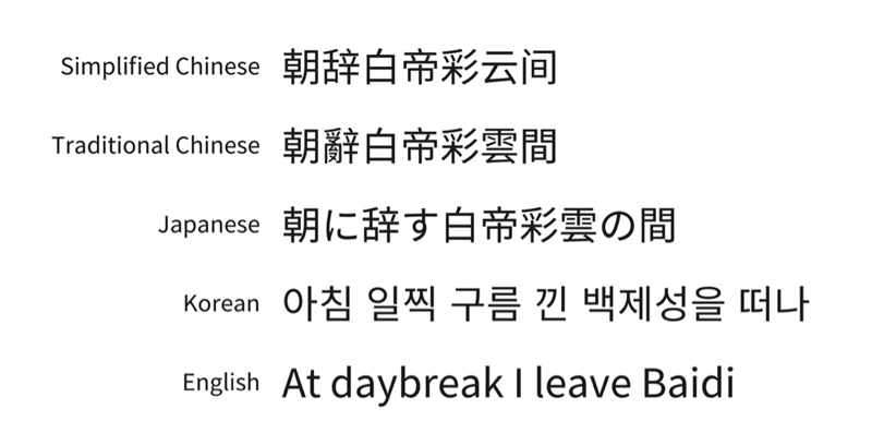
閱讀該文章的繁體中文版本 (Read this article in Chinese Traditional)
阅读该文章的简体中文版本 (Read this article in Chinese Simplified)
日本語の記事を読む (Read this article in Japanese)
한국어로 이 글을 봅니다 (Read this article in Korean)
Source Han Sans, available in seven weights, is a typeface family which provides full support for Japanese, Korean, Traditional Chinese, and Simplified Chinese, all in one font. It also includes Latin, Greek, and Cyrillic glyphs from our popular Source Sans family. All told, each font weight in the family has a total of 65,535 glyphs (the maximum supported in the OpenType format), and the entire family rounds out at just under half a million total glyphs. Never before has a typeface family of this magnitude, development scope, and value been offered via open source — which makes it a no-cost solution for designers, developers, and everyday users who need a font supporting a broad set of languages. Adobe is changing the world through digital experiences, and the release of Source Han Sans is yet another way we can forward that vision by giving to the community.
This is a rather large undertaking for any type foundry, and we couldn’t have done it without Google as a key partner. Our discussions with the type team at Google started more than three years ago when they identified a need for an open-source typeface that covered a broad set of East Asian languages. They reached out to Adobe, where we had recently started development on our own open source typeface family. It was a good match; Google contributed significant input into project direction, helped to define requirements, provided in-country testing resources and expertise, and provided funding that made this project possible; Adobe brought strong design and technical prowess to the table, along with proven in-country type design experience, massive coordination, and automation.
Ryoko Nishizuka, a Senior Designer on our Tokyo-based type team, created the underlying designs for the new typeface family. The key requirements were daunting: the family had to cover the broad set of languages mentioned above, and also support regional glyph variations from the regions using those languages. (In some cases, glyphs based on an original Chinese pictograph might have as many as four regional variations.) It was also very important that the typeface perform exceptionally well for print, and across the screens of the many tablets and mobile devices in use today. Finally, Adobe planned on including Source Sans for the Latin glyphs, and Google needed the font to work well with their Roboto and Noto Sans families. The new design needed to complement both, since Google is also offering their own version of this font. More information on Google’s Noto Sans CJK family is available on their blog.
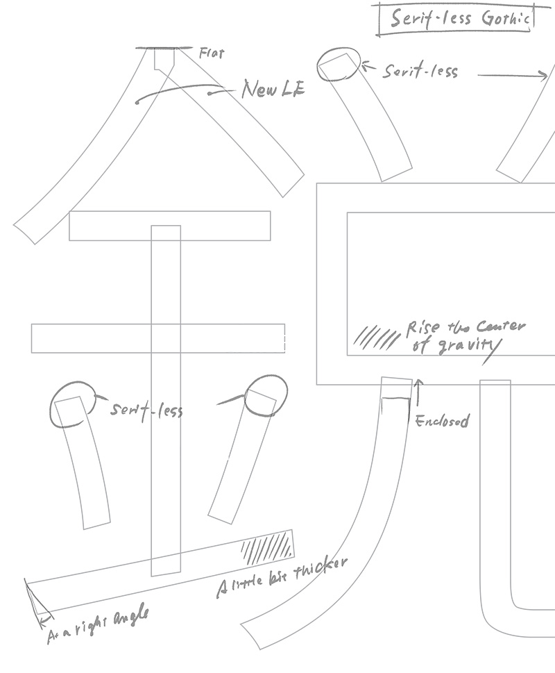
Ryoko created a typeface that is moderately modern in style, with simplified strokes and a monolinear quality. This makes it more readable on smaller devices such as tablets and smartphones. But despite its simplification, it retains much of the elegance of a traditional sans serif typeface design, providing a high level of readability for text consisting of single lines or short phrases as found in software menus, or for longer text blocks such as those found in ebooks.
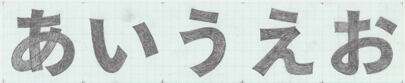
Original sketch by type designer Ryoko Nishizuka.
An early draft of a Kanji character.
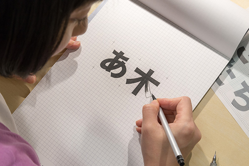
Type designer, Ryoko Nishizuka, drawing some of the characters for Source Han Sans.
With Ryoko’s designs in progress, we knew that to develop a truly successful Pan-CJK font, we would require expertise that could be found only in type foundries with years of in-country design experience. We chose to partner with Iwata to expand our Japanese glyph selection. In Korea, we went with Sandoll Communication, who also designed the Korean hangul (the native alphabet of the Korean language) and in China, we partnered with our longtime friends at Changzhou Sinotype. Our project had now grown to become a collaborative effort between five companies — something somewhat unprecedented in the world of type design.
Why was it important to get this expertise? Well, the writing systems for each language, particularly their ideographs that are based on historical Chinese forms, took different paths over time. While some characters remained unchanged and common across the languages, others morphed into regional variations. One can see these in the glyphs represented below. While the variations may be subtle, especially to the Western eye, they are very important to the users of each language.

Ideograph U+9AA8 (“bone”). From left to right: Simplified Chinese, Traditional Chinese, and Japanese/Korean (shared).
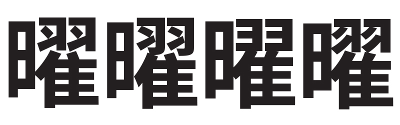
Ideograph U+66DC. From left to right: Simplified Chinese, Traditional Chinese, Japanese, and Korean.
The final requirement was for someone to pull it all together — and that person was Dr. Ken Lunde. Ken is our world-renowned CJKV type expert, and he ultimately managed the specification of the glyph set and Unicode mappings, the interaction with our partners and consolidation of their glyph content, and the creation of the final font resources. Acting as the primary contact with Google, Ken spent thousands of hours reviewing designs, delivering intermediate releases and overseeing the testing of the family. It is largely due to Ken’s efforts that we are able to release Source Han Sans, our 101st Adobe Originals typeface, as we celebrate our 25th Anniversary.
Where to find Source Han Sans
Source Han Sans is available in the following weights: ExtraLight, Light, Normal, Regular, Medium, Bold and Heavy. It is available for desktop use with any level of Typekit plan (including the free level), and can be synced for use in any desktop application. If you haven’t tried out desktop font syncing before, it’s pretty simple.
Source Han Sans is made available under the Apache 2.0 license. UPDATE: As of version 1.002, Source Han Sans has been available under the SIL Open Font License (OFL) v1.1. Downloadable versions of the full multi-language font family, individual language subsets, and original sources, are available on GitHub. Google will release their own version of this font under the name Noto Sans CJK as part of their Noto pan-Unicode font family.
Note: We have updated some links in this post for clarity; Adobe open source projects are hosted on GitHub, but no longer on SourceForge. (10/23/2014)
13 Responses
Comments are closed.
I’m logged into my TypeKit account. Which one do I need to download, and how do I download it? I’m new to Adobe CC and TypeKit. Thanks!
Only the region-specific fonts are available through Typekit at this time, so it really depends on whether you need the Simplified Chinese, Traditional Chinese, Japanese, or Korean version.
Thanks for the info. I really only need the English version. Where do I download that one?
If you have no use for the glyphs for CJK characters, you are much better served by Source Sans Pro, not Source Han Sans.
Sounds goos. I’ll check it out. Thanks!
Thank you all very much and happy 25th birthday! These fonts are absolutely beautiful and the quality is unprecedented in the open source world!
Typo: Sounds “good”.
太有意思了
Just curious if the differences in traditional characters between Mainland China vs. Taiwan and Hong Kong were taken into account. (and no, I don’t mean the differences between Simplified and Traditional). When books on the Mainland are printed in traditional Chinese (as a lot of books on Chinese paleography and on Old Chinese reconstruction are), they still use some glyphs which are different than what is typically used in Taiwan and Hong Kong. For instance, 夠, 吃, 才 are used in Taiwan and HK, while 喫, 够, 纔 are often in Mainland Chinese books that are printed in Traditional characters. Of course, within these 3 examples, only the 夠 vs. 够 pair is of concern for the font (but I would think there are more characters that just this one affected).
Given the examples you cited, I think that the answer is yes, mainly because of the way in which we defined the scope of Simplified versus Traditional Chinese. Simplified Chinese is based on GB 18030, which effectively means all URO and Extension A ideographs have Simplified Chinese forms that conform to China’s conventions. Traditional Chinese is split into Big Five, which follows the Taiwan MOE glyph standard, along with Hong Kong SCS, which also follows (for better or for worse) the Taiwan MOE glyph standard. This was done mainly for consistency, especially given that Hong Kong SCS is effectively an add-on to Big Five. This is the one area in which Source Han Sans is receiving some criticism, which may be deserved.
The best way to find out whether Source Han Sans fulfills your needs is to actually download and use them.
非常好
Good but why the Latin part of Source Hans Sans (Noto Sans Chinese, Noto Sans Japanese and Noto Sans Korean at Google side) are not pairing with Noto Sans?
Good question.
There are at least three reasons:
1) Noto Sans proper has exactly two weights, Regular and Bold, which doesn’t really equal the seven weights of Source Han Sans and Noto Sans CJK.
2) Noto Sans CJK (and thus Source Han Sans) is designed to harmonize with the existing weights of both the Noto Sans and Roboto families. (Your question then might have been about including Roboto given that it has a broader weight range than Noto Sans.)
3) When orchestrated via font fallback whereby Noto Sans proper or Roboto is at the head, the Latin portions of Noto Sans CJK is effectively ignored. Including Source Sans as the Western portion allows the fonts to be used stand-alone.
(I still have a long-term hope that Google will consider using Source Sans in lieu of Noto Sans or Roboto. ☺)