Coming to your desktop: Futura PT & Adonis from ParaType
This is our fifth post in a series highlighting foundry partners who will offer fonts for desktop sync, including Dalton Maag, FontFont, Mark Simonson Studio and TypeTogether.
Established in 1989, ParaType specializes in developing fonts for high-quality display on screen, with a particular skill for working across different alphabets. In 1995, ParaType introduced Futura PT, which was re-formatted to support multiple languages, including a set of Cyrillic characters. Superior hinting makes Futura PT a reliable font that can handle a wide range of screen resolutions.
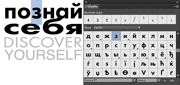
Cyrillic character set shown in Adobe InDesign’s Glyph panel.
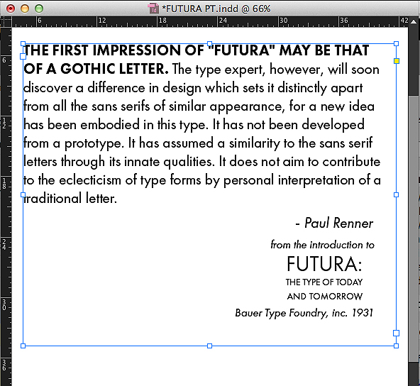
ParaType’s release is just one of the most recent milestones in the long timeline of Futura’s history. Originally introduced in 1931, Futura was first designed for Bauer Type Foundry by Paul Renner. In a specimen book titled Futura: The Type of Today and Tomorrow, Renner elaborates on his design ideas.
Renner was deeply influenced by the Bauhaus School, and this is reflected in his thinking about Futura. He strove to design a typeface that was timeless, based on form and function, with a look that was more mechanical than calligraphic. Renner explains:
“Futura attempts, for the first time, to present the form of characters in the most abstract manner conceivable… Through the looking glass the letters of Futura are never of quite equal weight… These variations, derived from the recognition of optical illusion, bring about an equal distribution of color.”
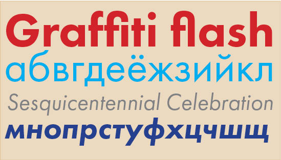 Futura PT Speciman: Heavy, Book, Book Oblique, Heavy Oblique
Futura is built from geometric shapes—rectangles, circles, and triangles. Here, Renner used symmetry and proportion to his advantage: the ascenders on the lowercase letters are taller than the caps. The caps themselves are based on classic Roman type proportions. The counters are perfect circles, while the surrounding arcs are elliptical. The vertices on the lighter weight caps, like the ‘M’, descend just below the baseline.
The sum is a typeface that is gently propulsive. Since Futura’s introduction decades ago, it has been in constant use by designers, proving to be as timeless as Renner had hoped. Available in several different styles for the web, Futura PT comes in two distinct weights for desktop syncing—Book and Heavy—as well as their oblique variants.

Adonis.
Also available from ParaType for the desktop is an original face, Adonis. Designed by Natalia Vasilyeva, Adonis is an all-purpose serif with a noble yet affable feel. From the ParaType website: “Adonis is a typeface of classical appearance with slightly oblong proportions, small rounded serifs, and soft letterforms. The face is both space-saving and quite legible in small sizes. The family consists of four standard font styles and proposed for text and display typography.” Adonis includes two weights, plus italics.
Add Futura PT and Adonis to your favorites so you can access them easily when desktop syncing becomes available, and use them on the web today. If you’ve never given Typekit a try, sign up (it’s free!) and upgrade to a paid plan whenever you’re ready.
One Response
Comments are closed.
Can’t wait for the desktop syncing! 😀