Inscriptional faces from Adobe Type

We’re happy to welcome two new display typefaces to the Typekit library: Trajan Sans and Lithos. Plus, Adobe’s popular Trajan typeface is now available in four additional weights, with support for Greek and Cyrillic (just enable the All Characters subset in your kit). This new version is called Trajan Pro 3.
These are all display faces, best suited for use at large sizes. Let’s talk about using display faces well, finding stand-ins suitable for smaller sizes, and choosing good text pairings. (Demo.)

Trajan Sans is a brand new design, meant to exhibit the same elegance and stonecut lineage as its serifed counterpart. Its letterforms are striking, and you may find it works best with no embellishment. Composing this type sample, I began with text-shadows and masks, but decided to remove them. I did make the text slightly transparent, to bring in some of the background image and color.
.trajan-sans {
  font-family: "trajan-sans-pro", sans-serif;
  color: #b42408;
  color: rgba(180,36,8,0.9);
  }

Trajan is often employed when a stately, elegant presence is needed; however, its subtle contours and chisel-thin serifs weren’t designed for use at small sizes. Use Trajan big. Choose a similarly tasteful Renaissance-inspired text typeface for navigation, small headlines, and short bursts of copy. Minion (used for the three lines of text, above) is just such a text face.
Here’s what those three lines of text looked like before, set in too-small Trajan:

.trajan h3 {
  font-family: "trajan-pro-3", serif;
  font-size: 19.2px;
  font-size: 1.2rem;
  line-height: 1.5;
  color: #403824;
  }
Here’s how I adjusted Minion’s size, color, and letter-spacing so it feels inscriptional, like Trajan:

.trajan h3.minion {
  font-family: "minion-pro", serif;
  font-size: 20.8px;
  font-size: 1.3rem;
  line-height: 1.4;
  color: #5d5645;
  letter-spacing: 1.6px;
  letter-spacing: 0.1rem;
  }
Bonus points if anyone can tell me what rems are. (Hint, hint.)

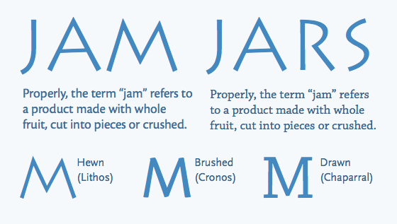
Lithos is easily overused, but can set a lively tone if used sparingly. Choose a text face that resonates with this titling face. The hand-tooled forms and compatible geometry of Cronos and Lithos help them feel like a natural pair. Chaparral and Lithos are jaunty, low-contrast faces, and they’re siblings — both designed by Carol Twombly.
Upgrade to a Portfolio plan to use Trajan Pro 3, and a Personal plan or higher to use Trajan Sans and Lithos. If you’ve never given Typekit a try, sign up (it’s free!) and upgrade to a paid plan whenever you’re ready.
3 Responses
Comments are closed.
A rem is like a relative em, right?
Yes! And here, Ethan Marcotte explains rems in more detail.
Oh it’s all coming back to me now…very good stuff. Way outta my league!