 A Brief Excerpt from The Wonderful Wizard of Oz
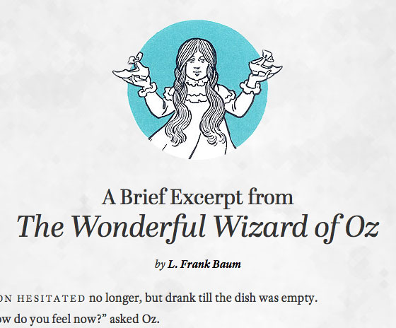
The Lion hesitated no longer, but drank till…
…Type study: Sizing the legible letter
Type study is an ongoing series of guest posts about typography on the web. In this article, Ethan Marcotte dishes up advice on font size.
Yes, it’s true. This is a blog entry about sizing text for the web.
…look, I know you’re still out there. I can hear you breathing.
Sure, sizing text isn’t the most glamorous topic. What’s more, it can get downright contentious, with camps forming around their favorite units of measurement. The truth is, each approach has its own unique strengths and limitations. So below, let’s dive into a few popular methods, discuss them with a bit of equanimity, and wrap up this little essay with a better understanding of our options for font-size.
Our old friend, the pixel
Let’s dive in with a quick little demo. To start us off, I pulled a short passage from an old, favorite book, marked it up in some basic HTML5, and applied some light CSS. If you’d like, you can view my little page.
Now, sharp-eyed reader that you are, you’ve probably noticed the markup’s as modest as the design:
Our page is essentially one big article element, which contains:
- A
headerto house the headline (h1.main-title) and byline (marked up oh-so-imaginatively ash2.byline). - The primary text is contained inside a
divwith a class ofarticle-body. - Finally, a
footerelement rounds out the copy with some attribution.
Nothing too fancy, right? Well, the styling’s just as unassuming. Now, since this is an article about font sizing, let’s not worry our pretty little heads about layout. Instead, let’s focus on the fonts:
body {
  font: normal 16px/24px adobe-text-pro, Cambria, Georgia, "Times New Roman", Times, serif;
}

.main-title {
  font: normal 30px/36px abril-display, Palatino, Georgia, Times, serif;
}

.main-title cite {
  font-size: 42px;
  line-height: 50px;
}

.article-body {
  font-size: 18px;
}

.caps,
figure,
footer {
  font-size: 14px;
}
From the outset, it’s obvious the page relies heavily on Adobe Text Pro set on the body, with TypeTogether’s elegant (and new!) Abril Display prettying up our .main-title headline. And with those defaults established, the rest of the CSS is dedicated to specifying a few different font sizes: five rules, five different font-size values, each set in pixels. And that’s basically it.
Easy, right? I think that’s half the appeal of the mighty pixel, actually: just how easy it is to use. We can transfer a few pixel values from Photoshop into CSS, and — voilà — your work’s nearly finished. But efficiency aside, I think there’s something appealing about the promise of control that comes with declaring a few quick pixel values, a control that’s so darn appealing to us designers. But for all its strengths, px isn’t the best game in town.
In fact, there’s one well-known drawback to sizing type in pixels: Internet Explorer’s “Text Size” tool (still) won’t resize any text set in pixels. Now, it’s true that many desktop browsers, including more recent versions of IE, include some form of page zoom, which can magnify the size of your entire design, including its text. But older versions of IE are, alas, still out there.
Moreover, exploring alternatives to the venerable pixel might result in some real, practical benefits. Ever built a menu that allowed the user to dynamically change the size of text on a page? I’ve worked on a few, including one that launched recently. If your design’s universally set in pixels, each text size “level” would require you to redeclare sizes for every px-based element of your design. So it’s very possible that on some projects, pixels simply won’t scale. (Pun unfortunate, but intended.)
Now that I’ve stepped off my soapbox, let’s take a look at a slightly more proportional alternative, a unit of measurement that does play nicely with resizing: namely, the em.
Becoming context-aware with ems
Because I’m a sucker for nostalgia, let’s revisit our body rule. Here’s what we’re currently working with:
body {
  font: normal 16px adobe-text-pro, Cambria, Georgia, "Times New Roman", Times, serif;
}
Before we start getting more proportional, let’s tweak it ever so slightly:
body {
  font: normal 100% adobe-text-pro, Cambria, Georgia, "Times New Roman", Times, serif;
}
Catch the difference? All we’ve done is change the font-size value to 100%, setting our document’s base type size to the browser’s default, which is usually 16px. As a result, we’re left with a flexible baseline, a point of reference from which we can size our text up or down using relative units of measurement—specifically, the em.
It’s worth mentioning that some folks prefer setting the body to a font-size of 62.5%, as this gives us a relative baseline of approximately 10px—which can make relative font sizing much, much easier. Richard Rutter, author of the original 62.5% technique, wrote a fantastic article for A List Apart recommending 100% as a better baseline, one that ensured more consistent cross-browser results.
But I digress. Regardless of what your baseline preference might be, our job at this point is to convert our pixel-based font-size values into their em equivalents. To do so, we’ll need to do a teensy bit of math: we’ll simply take the target pixel value we’ve already set, and then divide it by the font-size of its containing element — in other words, its context. The result is our desired font-size, but converted neatly into relative terms, which we can then drop directly into our CSS as ems.
In other words, relative font sizes can be calculated like so:
target ÷ context = result
Let’s take a quick example. Remember our main headline?
.main-title {
  font: normal 30px/36px abril-display, Palatino, Georgia, Times, serif;
}
In order to turn the headline’s 30px size into an em-based value, we need to define it in relationship to its context — that is, the font-size of the body element. Let’s assume our font-size: 100% is roughly equivalent to 16px. So let’s plug our .main-title’s target font size (30px) and its context (16px) into our formula:
30 ÷ 16 = 1.875
Boom. 30px is 1.875 times greater than 16px, so our font size is 1.875em.
Now you may recall that the book’s title was wrapped in a cite element inside our main headline, and sized a bit larger than the text that preceded it:
.main-title cite {
  font-size: 42px;
}
If we want to convert that 42px to ems, it’s important to note that our context has changed. Since we’ve set a font-size on our .main-title headline, the font-size of any elements within need to be expressed in relation to that value. In other words, our cite’s target value of 42px needs to be divided not by 16px, the body’s font-size, but by the 30px we set on our headline:
42 ÷ 30 = 1.4
And that’s it. With a little bit of contextual awareness, we’re left with a proportional font-size for our .main-title headline, as well as the cite inside it:
.main-title {
  font: normal 1.875em/36px abril-display, Palatino, Georgia, Times, serif;  /* 30 / 18 */
}

.main-title cite {
  font-size: 1.4em;  /* 42 / 30 */
  line-height: 50px;
}
(I personally like including the target and context values as comments in my CSS, usually off to the right of the relevant property. I’ve found it makes revising these relative values much easier, especially since the origin of a value like 1.875em might not be immediately apparent.)
Sizing text proportionally simply requires a little contextual awareness. And that applies to setting our document’s line-height, too. For example:
.main-title {
  font: normal 1.875em/36px abril-display, Palatino, Georgia, Times, serif;  /* 30 / 18 */
}

.main-title cite {
  font-size: 1.4em;  /* 42 / 30 */
  line-height: 50px;
}
The line height in both rules — 36px for .main-title, and 50px for the cite within it — are still in pixels, which means the line-height values won’t scale along with their respective relative font-size values. Presumably because they hate freedom.
But thankfully, we can quickly move those pixel-based values into something more proportional. But this time, our context is the font-size itself, our target the pixel-based line-heights. So with that in mind, let’s do a little bit more math:
36 ÷ 30 = 1.2
50 ÷ 42 = 1.2
There we are: both .main-title and the cite within it have a line-height of 1.2. And since the two elements share the same line height, we can actually just set the value once on the higher element, and let its descendants inherit it:
.main-title {
  font: normal 1.875em/1.2 abril-display, Palatino, Georgia, Times, serif;  /* 30 / 18; 36 / 30 */
}

.main-title cite {
  font-size: 1.4em;  /* 42 / 30 */
}
That is, as the kids say, that. What’s more, we don’t actually need to add units to the line-height, as Eric Meyer’s covered so ably before. Instead, we can leave that proportional value in place, sans pixels, percentages, or ems.
But yes! Context rocks! And armed with that knowledge, we can turn to our remaining pixel-based rules:
.article-body {
  font-size: 18px;
}

.caps,
figure,
footer {
  font-size: 14px;
}
As before, with some simple math and an awareness of a given element’s context, we can turn those values into oh-so-flexible ems:
.article-body {
  font-size: 1.125em;  /* 18 / 16 */
}

/* figure and .caps are children of .article-body, so their context is 18px */
figure,
.caps {
  font-size: 0.777777778em;  /* 14 / 18 */
}

/* The footer's context is the body element, so we'll use 16px here */
footer {
  font-size: 0.875em;  /* 14 / 16 */
}
And with that, we’ve successfully moved our page beyond the pixel. The design’s identical to the original px-based version, but considerably more flexible, proportional, and accessible.
Meet the rem
The em is powerful voodoo indeed, but it’s not without its limitations. Obviously, it requires an awareness of an element’s context, which can be unwieldy at best. What’s more, it can complicate moving modules within your design, as their font-size might be tied to a specific position in the document’s hierarchy. So for especially complicated, content-heavy sites, this could potentially require some work.
Thankfully, there’s been some traction on improving our old friend the em. Introduced in the CSS3 specification, the rem behaves much like the em: it’s a relative unit of measurement, sizing text up or down from a baseline value. But the rem is sized relative to the root of your document—in other words, the value set on the body element.
Here’s what our CSS looks like, once we switch everything over to rems:
body {
  font: normal 100%/1.5 adobe-text-pro, Cambria, Georgia, "Times New Roman", Times, serif;
}

.main-title {
  font: normal 1.875rem abril-display, Palatino, Georgia, Times, serif;  /* 30 / 16 */
}

.main-title cite {
  font-size: 2.625rem;  /* 42 / 16 */
}

.article-body {
  font-size: 1.125rem;  /* 18 / 16 */
}

.caps,
figure,
footer {
  font-size: 0.875rem;  /* 14 / 16 */
}
This is still relative font sizing, so we’re still using our target ÷ context formula. But now, our context is 16px throughout the CSS. That’s right: no more tracking various context values, worrying about which element’s inheriting which font-size value and going slowly mad. And as someone who hates math, this consistency is kind of exciting.
Sadly, support for the rem is still evolving. Firefox 3.6+, Chrome, Safari 5, and IE9 all support the rem. (And IE9+ even resizes text set in rems!) Unfortunately, while support’s broad, that doesn’t mean it’s universal. So if you’re supporting a significant number of browsers beyond that list, you might need to declare a fallback in pixels:
body {
  font: normal 100% adobe-text-pro, Cambria, Georgia, "Times New Roman", Times, serif;
}

.main-title {
  font: normal 30px abril-display, Palatino, Georgia, Times, serif;
  font-size: 1.875rem;  /* 30 / 16 */
}

.main-title cite {
  font-size: 42px;
  font-size: 2.625rem;  /* 42 / 16 */
}

.article-body {
  font-size: 18px;
  font-size: 1.125rem;  /* 18 / 16 */
}

.caps,
figure,
footer {
  font-size: 14px;
  font-size: 0.875rem;  /* 14 / 16 */
}
Sexy? Maybe not. But this hybrid approach leaves us with resizable text in rem-compliant browsers, with a pixel-based fallback for older ones — a match made in heaven.
Pixels, ems, and rems—oh my!
Whether you prefer slinging px or em, or have started dabbling in rem — each approach has its unique drawbacks and strengths, its own unique contributions to the project you’re working on.
Pixels afford a high degree of precision, but at the expense of versatility. And while ems offer us both the control we crave and the accessibility we need, there’s a certain amount of overhead with the contextual math involved. I hope better browser support means rems offer a way forward — but personally, those px-based fallbacks don’t feel like an appropriate trade-off. Hopefully, we’ll be able to move past those fallbacks soon.

Ethan Marcotte is an independent designer/developer who’s passionate about web standards, gorgeous design, and how the two intersect. He’s perhaps best known for starting that whole “responsive web design” thing, and even wrote a little book on the topic.
18 Responses
Comments are closed.
Not sure about the rems with px fallback being a “match made in heaven”.
Wasn’t the main reason for not using pixels in the first place that they didn’t resize in IE? We’ve now got resizing in IE9, but earlier versions are still back exactly where they started…
I suppose the benefit of using pixels and rems is that one only does the math once, though—as you say—that’s a dubious benefit at best. Using rems with an em fallback requires doing contextual and context-free calculations, and at that point, wouldn’t one just leave out rems entirely for simplicity?
This is a legacy-compatibility issue that’s hard to reconcile easily.
Yep, that phrase might’ve overstated it slightly. I was going for “kind of lame rhetorical flourish to close out a section,” rather than “unvarnished and unassailable FACT.” 🙂
I will point out that I mentioned in the conclusion that I’m not a fan of an inherently inflexible fallback. But really, I think the onus is on the designer to pick the approach that’s right for them and their project.
Thanks for the feedback!
Really useful article about ems. I’ve been using pixel-based design for a long time and only just recently started migrating away from it, but ran into a lot of confusion when it came to ems, Especially when I wanted to try and keep to a baseline grid.
I’m curious, though, why you didn’t mention pt? That’s what I ended up using, after finding a few articles that recommended it. Is there a specific reason that you would suggest not using pt as a unit of font measurement?
Thanks! 🙂
Great questions, Sarah—thanks!
Points are an absolute unit of measurement, much like pixels, but are ideally reserved for print media. Chris Coyier has a nice write-up that covers some of the drawbacks (http://css-tricks.com/2580-css-font-size/), but this has been an issue we’ve kicked around for ages. (For some old, old gold, see Todd Fahrner’s classic critique: http://style.cleverchimp.com/font_size/points/dump.html, http://style.cleverchimp.com/font_size/points/font_wars.GIF)
Hope that helps? Thanks again!
Ethan, very timely.. just been watching ‘Responsive and Responsible’ from Scott Jehl explaining the Boston Globe re-design including using ems. Also being mathematically challenged, rems are looking good. It’ll also be simpler to teach. Thanks for the article. Going into Friday’s class. 🙂 Richard
Nice article! I think the step from just using px to rem isn’t too far, this is comparable to any additional vendor-specific prefix line in your css. I will use this in the future!
Great little diddy, Ethan! I too am looking forward to when we can drop the pixel fallback for browsers that don’t support rems.
For anyone interested in using rem units in Sass/Scss, I’ve created a mixin that converts pixel-based Sass into rem-based CSS, complete with the pixel fallback. Check it out here: https://github.com/bitmanic/rem
Thanks for the great article, Ethan. I’ve found a lot of value in Tim Brown’s work around picking a base size for your body copy that renders in the “sweet spot” of the typeface (http://vimeo.com/17079380) and designing from that point out.
Do you have any thoughts on taking that methodology into consideration when starting with a body font size: 100% and then using em’s, etc.? It seems like there’s a greater chance to start with a font rendering outside of the “sweet spot” resulting in funky letterforms.
Thanks!
I’m glad you found value in my talk, Ethan. At the risk of appearing to speak for Mr. Marcotte, I’ll say this about base sizes and measurement precision:
According to Rich Rutter’s research, setting a base size of 100% yields a good amount of cross-browser consistency. Now, browsers and devices have changed since Rich wrote that ALA article, but there is still value in the idea of basing measurements on a device’s standard type size.
A pixel is not a pixel is not a pixel. In other words, there are no absolute sizes when it comes to measuring web type. Everything is relative. So a sensible place to start is by zeroing our scales to the “normal” of a given environment.
What does that mean for systems of measurement like modular scales? It means more math. Proportionally, there is no change to a given scale. But there are different numbers a calculator would need to produce for us. Remember the modular scale calculator’s third column of results (the percentage of 13px)? Like that. But rather than base that range of specific numbers on 13px, we’d base it on the pixel size that most closely matches a given environment’s “normal”.
For example…
First, I would look at a range of sizes of a web font specimen in a given environment (say, on some new tablet thingy), and find the size that looks best to me (maybe 18px).
Next, I would set some type at a font-size of 100%, view it in that same environment, and see which pixel size it most closely matches (let’s say 16px).
Then I’d essentially have fuel for the target / context equation that Ethan explains so nicely in this post: pixel size that looks best (18px) / pixel size that most closely matches 100% (16px).
To create a modular scale, I’d plug 18px in as the starting type size. What I’d want to see in the calculated results is a column of numbers expressing my scale as a multiple (rather than a percentage) of 16px. I could use those numbers as my REM values. And I’d want the ability to make as many of this kind of column as necessary, to support calculations based on different environments’ “normal” font sizes.
Thanks for asking this good question! Maybe it’s time I updated the calculator….
Woah, thanks for the detailed response Tim! That’s perfect.
I like the idea of ems or any kind of device-independent unit rather than the pixel. However, the way that ems are relative to their container seems like unnecessary complexity. Every time I try to use ems on a site the CSS for font sizes starts to resemble… I don’t know, a real big mess. Two elements of text that I want the same size happen to be within different levels of the document structure and so have different em sizes…. am I missing something?
Wait… I confess that I skipped the part about the rem unit – that’s how frustrated I am with the em! – but sounds like I’ll be waiting for the rem unit to be fully supported. That sounds awesome and thank you for mentioning it in this article.
Hey, Jason—great points! The em does have a healthy amount of contextual baggage, it’s true. One thing that I’ve found helpful is to try and minimize inheritance whenever possible, and be as atomic as you can with your font-size declarations. À la Nicole Sullivan’s fine work on OOCSS. (https://github.com/stubbornella/oocss/wiki/faq)
Great post & comments. One technique I’ve been using, that I’ve found very helpful, albeit not foolproof, is, via using LESS, specifying font sizes in pixel values that are output as em or rem values in CSS. (This is likewise doable in SASS and Stylus.)
For example:
@font-size: 16;
@em: @font-size*1em;
h3 {
font-size: 18 / @em; // which is output in CSS as 18 ÷ 16 = 1.125em
}
Pixels have great benefits (namely no extraneous calculations when converting a design from Photoshop) and two faults that you mention. First that it doesn’t scale in older browsers, and second it’s hard to code a font resizing menu.
I don’t see that rem is a solution to the first problem, since older browsers don’t support them and IE has had page zoom since version 7 released in 2006. Are web developers still really supporting older browsers than that?
Second, I feel that instead of rem, why not give developers a Javascript API for the page zoom? At glance, I don’t see any security implications. It seems it would be a whole lot easier. But until then, I just don’t put font resize menu on webpages. People that are sight impaired and need to resize a web page know how to do so with their own browsers or if they don’t are better off learning it than having a specific menu on one page they visit.
Great article Ethan.
One clarifying point & potential gotcha: the root element is actually the html element.
The example works as-is since the body font-size is identical to the browser default for the html element. But if the font-size for the html element changes at all, you’ll see the rest of the rem renderings change.
Be especially wary of this if you use tools like Normalize.css or other frameworks!
Auntie Em?