Sites we like: ConvergeSE 2012, Quovo, and Offscreen Magazine
Workshops, smart investments, and going offscreen in this week’s sites we like.

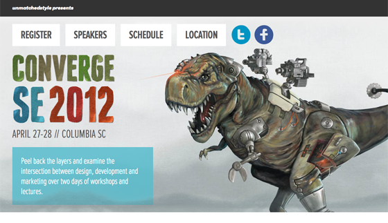
ConvergeSE 2012 combines Proxima Nova Extra Condensed and Proxima Nova in a responsive design that manages to be both energetic and practiced. (Bonus points for the scrolling effect on the dinosaur.)

Quovo is a simple tool that helps you invest smarter. The now classic combination of Museo Sans and Museo Slab make for a friendly and inviting design, a departure from your typical investment website.

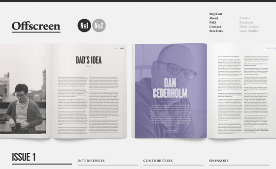
Offscreen Magazine is a new publication looking at the people behind the bits and pixels. Calluna delivers a classy but contemporary design.
That’s all for this week; share sites that you like in the comments.
2 Responses
Comments are closed.
Typography-wise Quovo is my favourite of these, everything just seems so balanced and effective. That said I LOVE the illustrations of Converge, as well as, how their design itself relates to the themes of their content.
I would humbly suggest our new site – it’s got lots of Typekit love in it 🙂
http://fortysevenmedia.com/