Type rendering: the design of fonts for the web
This is our fourth post in an ongoing series about type rendering on the web. Read the first, second, third, fifth, sixth, and final posts.
Now that we’ve talked about operating systems and browsers, it’s time to tackle the third element of all web type rendering mixes — the fonts themselves. When it comes to font files and screen rendering, there are two issues of equal importance to discuss: font file formats, which I’ll cover in our next post, and how the design philosophy of a typeface influences its rendering.
Design philosophy and the means of production
We have a tendency to think of fonts as one-size-fits-all, because that’s largely how personal computing has taught us to think. On the web, in rich email, or in a word processor, we have the ability to scale fonts to sizes that were never intended by the designers of those fonts. Historically, fonts have been designed with specific (and limited) sizes and contexts in mind. In fact, in metal type the word “font” means a particular typeface at a specific size — a “font of type” meant a drawer full of leaden letters.
Type designers, ideally focused on creating the most beautiful and meaningful forms possible, have always had to consider the means of production as they design and produce typefaces — but rarely if ever have type designs been used in such a broad array of contexts as they are today. Different media (screen/print), viewing formats (projector/laptop/phone), and rendering engines exercise type in a variety of ways, and it’s extremely difficult to prepare a typeface to handle all of these situations at once.

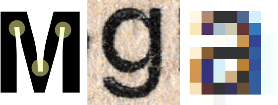
Ink traps, print thickening, and antialiasing, each accounted for by design.
Just as newspaper fonts are designed with ink traps to account for the spread of ink on cheap paper, and fonts for letterpress are designed with thin strokes that produce a thicker imprint, some typefaces are made to look good at low resolution on screens. But that preparation for low resolution is also a design philosophy. Fonts like these are designed to fit the pixel grid. At higher resolutions or larger sizes, where antialiasing is less critical to basic legibility, these same typefaces can be unsuitable. They can feel too open, boxy, or thick — the very same qualities that make them work well at small sizes.

FacitWeb (left) and Minion Pro (right) at 30px (above) and 12px (below).
Available on the web today, there are great typefaces coming from these two different, and valid, perspectives: typefaces designed for web use at low resolution (like FacitWeb), and typefaces not designed for web use that are being improved and rereleased for better screen rendering (like Minion Pro). Depending on the size at which one intends to set text, it’s easy to see the advantage of either approach. Type designed for low resolution looks great on screens at small sizes, and type drawn for its own sake — without low resolution antialiasing as a design philosophy — is arguably more balanced and beautiful at mid-to-large sizes.
How can we adapt the great typefaces of the pre-web era to work successfully on the web today? Our next posts will discuss the different font file formats and how those files can be improved by hinting instructions. Hinting is an arduous, time-consuming task that requires a great deal of skill, but under the right circumstances it can improve the way a font renders on the web. We’ll also look ahead to how newer rendering engines may affect font rendering in the future. Stay tuned!
5 Responses
Comments are closed.
VERY interesting post, thanks.
Do you know Paul Shaw, epigraphy/calligraphy/typography expert in NYC? Here’s his blog, in case you’re interested:
http://paulshawletterdesign.blogspot.com/
Bye for now, Star
http://mymilanitaly.blogspot.com
http://arsacupicturaestellae.blogspot.com
We’ve been using typekit on a great deal of websites at work, and we are all very impressed, however we can relate to how some fonts look awful at a small size (although, this also depends on the OS. I work on an iMac, and what look great on mine often looks dreadful on the PC’s.
Perhaps adding a classification to each font with regards to if it renders well at small sizes (say 12px) so that when I’m looking for a font to use for the body of the site, I can limit results to fonts that render well at small sizes, rather than ones that seem to pixelate. I guess this would almost be a ‘Web Safe’ font list, but only applicable to smaller sizes?
Maybe this helps there is at least a “windows-compat.” classification available here:
http://www.sleepoversf.com/the-great-typekit-table/
“Type designed for low resolution looks great on screens at small sizes, and type drawn for its own sake — without low resolution antialiasing as a design philosophy — is arguably more balanced and beautiful at mid-to-large sizes.”
The phrase “type for its own sake” shows just how ignorant your team are about the reasons behind type design. Few typefaces exist for their own sake – they are useful tools and each is drawn to solve specific design och technical problems. I have heard from my typedesigner friend that you offer a very low royalty, and this ignorance, perhaps well-intentioned, helps me to understand why this could happen.
The phrase “type designed for its own sake” was intended to contrast with type designed at low resolution; we of course understand that type is designed for specific purposes in mind, and the article addresses that. Our point was that there are two different, yet appropriate, approaches in designing type, depending on their intended use: design against the pixel grid, which is suitable for fonts displayed at small sizes and at low resolution, or allow the shape of the letters to emerge without respect for the pixel grid, which can create more beautiful forms at larger sizes.