A closer look at TrueType hinting
This is our sixth post in an ongoing series about type rendering on the web. Read the first, second, third, fourth, fifth, and final posts.
As Tim Brown explained in the previous post on font formats, glyphs in web fonts are stored as Bézier curves. The shapes are drawn as outlines that consist of nodes on the contour and so-called handles, which help control the exact shape of the curves. Since the contours are stored as abstract mathematical formulas, they are infinitely smooth and precise. As such, they can be scaled to any size.
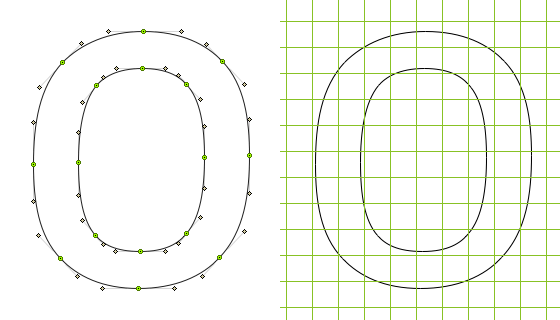
Glyphs are stored as Bézier curves but need to be rasterized for output.
On screen, however, the shapes have to be translated into pixels in a more or less coarse grid. In font technology, this resolution is expressed in ppem, which stands for “pixels per em,” and is exactly the same as the font size in pixels that you specify in CSS.
The simplest way to rasterize a letter would be to make the pixels black whenever the center of the pixel falls inside the shape. Unfortunately, this means that if part of the letter accidentally catches too many or too few pixels, the characters can become ugly or even unreadable. Missing pixels can pose as much of a problem as having too many.
In the unhinted example below, the left side of the letter happens to fall on two rows of pixels, whereas, by coincidence, the right side of the letter falls on only one row. As a result, our lowercase “o” is lopsided. In the worst case scenario, you can end up with dropouts, where the thinner parts of a letter fail to fall on any pixels at all and so disappear entirely.
Unhinted (left) and hinted (right) letter at ppem 17.
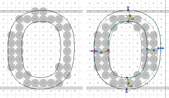
This is where hinting steps in. TrueType hinting — sometimes more correctly called instructions — bends the contour of the letter into a slightly different shape before it is rasterized. As a first step, this typically involves snapping the outline to the grid, as indicated by the blue arrows in the figure above. The top and bottom of the letter are linked to the gray alignment zones, which help control at which sizes the round letters such as the o “stick out” above and below the others.
Furthermore, we want to make sure that the stem weights are representative of the original when rasterized. Individually aligning the nodes to the grid would not achieve that; we need to link pairs of associated nodes, as shown by the yellow “R” symbols. These links control the distance between the two nodes — in other words, the stem weight. Categorizing the stems makes sure they are consistent across all glyphs in the font. In the above example, the horizontal stems are assigned to the “LC” class, which includes all comparable lowercase stems.
The smart thing about this kind of hinting is that it still works if the ppem size is changed, for example from 17 to 18.
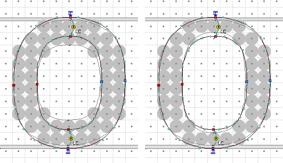
Hinted letters at ppem 18, with different stem settings.
At some sizes the most appropriate stem thickness is debatable. In the above example, one has to choose between somewhat too thick or too thin; these are essentially design decisions and as such require a good understanding of the typeface and its stylistic character.
Note that so far, the hinting instructions that we’ve shown are not specific to a particular font size. TrueType hinting allows for specific tweaks at only one particular ppem size if necessary. This so-called delta hinting is a tedious process and is often promoted as a sign of font quality. However, it is not necessarily a sign of good hinting — if the right strategy is applied then general hinting can work well at all sizes and delta hints are unnecessary.
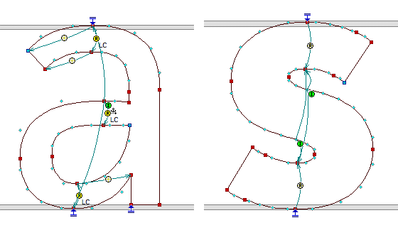
Some letters require complex hinting.
Finding a good hinting strategy can be tricky at times. Some more complex letters can require special attention, and design-related questions arise: do we want to keep the black strokes consistent, or should we preserve the white inner space? In extra bold fonts such as the “s” above, one might instead choose to preserve the relationship between the black and white parts of the letter. The interplay of black and white is at the very heart of type design (and, likewise, of reading).
In the next and final post in this series, Tim Brown returns to look at what’s ahead: now that we’ve surveyed the current landscape of type rendering, what do we have to look forward to?

The newest member of Typekit, Tim Ahrens is a type designer and architect who runs the London-based studio Just Another Foundry. He designed FacitWeb specifically for screen display.
7 Responses
Comments are closed.
webfonts dont use bezier curves, they use quadratic curves
Rich, all web fonts use Bézier curves. TrueType-based formats use 2nd order (quadratic) Bézier curves whereas PostScript-based formats use 3rd order (cubic) Bézier curves.
Great overview of hinting technology and the hinting process, Tim.
Tough stuff to explain, Tim. Nice job of it.
Question: Peter Bilak of Typotheque has a posting on hinting in which he estimates that it takes about 40 hours to hint a font.
And I am assuming he means one font, one file – certainly not a four member family.
Does this time estimate agree with your experience?
Thanks, Jason!
Richard, very hard to give any numbers in my opinion. In hinting, like with many things in the world, initial improvements can be achieved quickly and without too much effort but as you get closer to perfection the effort that is necessary to achieve improvements increases. Good autohinting – we are currently improving our own system at Typekit – is already better than no hinting at all. Spending a few hours setting manual hints fixes most remaining problems but if you want relly perfect rendering you can spend much more time, virtually without any upper limit. Thinking of Verdana as an extreme example, where the hinting probably took weeks or months.
re: hours to hint a font.
Assuming we’re talking about “manually” hinting a font, using Visual TrueType, I think the 40 hours estimate is pretty accurate for a Latin 1 character set. A WGL character set could take twice that. The biggest factor in hinting time estimate is “what is the target rendering environment”? If you had to hint for a “black and white” rasterizer, it could take longer than 40 hours. Likewise, lighter weight fonts and italic fonts typically take longer than regular weight and roman fonts.
Hi Tim,
Great write up, and helpful to the new, and according to the comments, the well versed alike. I’m curious to hear more about what TypeKit is doing to auto hint. Does that mean you all are attempting to apply an auto-hint to one font at a time and adjusting it per font? Or are you aiming at an algorithm that will cover more ground?
This is probably one of the main points that will draw people to use TypeKit over other services I would think.