Type rendering: operating systems
This is our second post in an ongoing series about type rendering on the web. Read the first, third, fourth, fifth, sixth, and final posts.
As we dig into type rendering on the web, we’ll begin by looking at text rendering engines. We are all familiar with operating systems like Windows and Mac OS X, but within each OS are smaller, specialized components available for use by applications like web browsers. APIs such as Core Text on Mac OS X, and DirectWrite and GDI on Windows, are examples of these components and are responsible for rasterizing fonts’ vector outlines. Let’s examine screenshots of web type as rendered by each of these APIs, and talk about the application independence of rendering engines.

The screenshots below were taken by visiting this test page that features two Typekit fonts, FacitWeb and Minion Pro. FacitWeb, occupying the top row of each screenshot, has a 120px capital R, a 21px subhead, and 12px text. Minion Pro, across the bottom of each screenshot, has a 130px capital R, a 24px subhead, and 14px text. The detail images are zoomed to 300%.
Core Text
Core Text is a rendering engine available on Mac OS X and iOS. In fact, it’s part of a suite of APIs called Core Foundation that underlies much of the slick interaction and glossiness for which Apple user interfaces are loved. It’s no surprise that Apple-rendered text reflects this same slickness, some would argue to the detriment of legibility. Core Text type tends to respect a typeface’s designed shape, which essentially means thicker letters (rather than pixel grid strictness). This can make letters, as well as spaces within and among letters, seem blurry at paragraph sizes. However, at very large sizes Core Text type looks natural and smooth. Part of its success at large sizes has to do with y-direction antialiasing, which is especially noticeable in the subtle curves of large letters — compare the detail images of Core Text’s capital R with those of GDI, which does not antialias vertically.
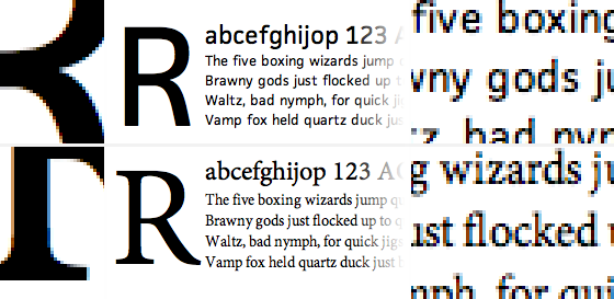
Above: Core Text rendering of FacitWeb (above) and Minion Pro (below).
Look closely at the detail images and you’ll notice that some pixels are tinted with color. This is called sub-pixel antialiasing, which uses the vertically-oriented thirds of red, green, and blue light within each pixel of an LCD screen to effectively triple the horizontal resolution of text. At reading distance from the screen, our eyes cease to notice colored sub-pixels and we instead see sharper text than we otherwise would. Or at least, that’s the idea. For some folks, the sub-pixels are always noticeable and this amounts to an annoying color fringe effect on the edges of letters.
DirectWrite
If Apple sub-pixel antialiased text is true to typeface design at the expense of some blurriness, Microsoft sub-pixel antialiased text is crisp and legible at the expense of style (and at the cost of many font production hours, but we’ll get to that in a future post). As Joel Spolsky once noted, there is a philosophical difference between the two companies’ approaches, and this is evident as we compare Apple’s Core Text to Microsoft’s DirectWrite.
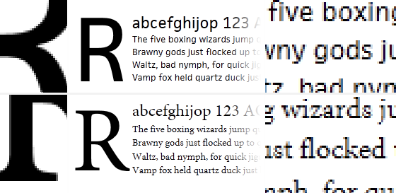
Above: DirectWrite rendering of FacitWeb (above) and Minion Pro (below).
DirectWrite, the latest and greatest text rendering engine for Windows, is available on Windows 7 and Windows Vista. It is markedly clearer, smoother, and has less intense color fringing than Core Text and older Windows text rendering engines. As with Core Text, there is y-direction antialiasing for smooth curves. (Compare, however, the bottom edges of paragraph text in DirectWrite with those of Core Text; Both engines use y-direction antialiasing, but Core Text’s closer adherence to actual glyph outlines translates to subtle antialiasing smudges below the baseline. Microsoft engines clean this up.) And as with Core Text, sub-pixels in DirectWrite are used not only to antialias text but also to space letters horizontally, which means letters can sit more naturally next to one another than in Microsoft’s older text rendering engine, GDI.
Graphics Device Interface (GDI)
The GDI text rendering engine, available on Windows 7, Windows Vista, and Windows XP, actually comes in two flavors: GDI and GDI+. GDI+ is superior and has been included with Windows since XP, so when I talk about GDI here I’m actually referring to GDI+. Another bit of disambiguation: text rendering engines like GDI and DirectWrite both use, but are paradigmatically different than, the sub-pixel antialiasing algorithm ClearType. Antialiasing is just one function of text rendering engines, which are also responsible for Unicode mapping, OpenType features, and integration with other APIs like web browser layout engines.
In keeping with another philosophical difference between Apple and Microsoft, Windows operating systems provide users with several antialiasing preferences from which to choose: ClearType (sub-pixel antialiasing), Standard (grayscale antialiasing), or no antialiasing (black and white text without any smoothness). By default, ClearType is enabled in Windows 7 and Windows Vista, and Standard is enabled in Windows XP. We’ll revisit these preferences in our next post about web browsers, some of which have their own font smoothing options.
GDI with ClearType antialiasing enabled
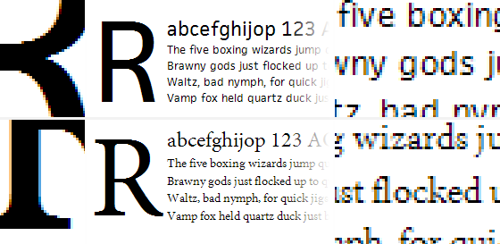
Above: GDI rendering of FacitWeb (above) and Minion Pro (below) with ClearType enabled.
As you see here, and as most Windows 7 and Windows Vista users see when they browse the web, GDI-rendered type with ClearType enabled – unlike DirectWrite or Core Text – does not antialias text in the y-direction. Note the abrupt, staircase-like curves in the capital R detail. This text also exhibits sub-pixel antialiasing with significant color fringing, perhaps because this early breed of the ClearType algorithm had yet to be refined.
There are different versions of ClearType, just as there are different Windows rendering engines and different web browsers. These nested components evolve independently, but the latest version of each may not be present in a given web browsing experience. For example, a version of ClearType with y-direction antialiasing, similar to what we see in DirectWrite, was available via another Windows API called Windows Presentation Foundation (WPF). But because no version of Internet Explorer made proper use of WPF, web text viewed with a Windows browser has traditionally lacked y-direction antialiasing.
GDI with Standard antialiasing enabled
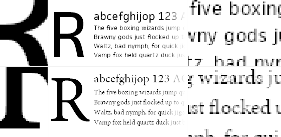
Above: GDI rendering of FacitWeb (above) and Minion Pro (below) with Standard antialiasing.
You wouldn’t know it by our survey of text rendering engines thus far, but there was a time when sub-pixel antialiasing was not the most common means of smoothing fonts on screens. Windows Standard antialiasing is in good ol’ grayscale. This is how most Windows XP users see type on the web (unless they browse with Internet Explorer 7 or 8, but we’ll get to that later!), and how most users with CRT monitors see type as well (LCD-based sub-pixel antialiasing doesn’t work when there are no sub-pixels).
Grayscale antialiasing adjusts whole pixels at once, doing its best to approximate the partial presence of a letterform by showing a solid gray representation of the two-dimensional area consumed by the shape’s overlap upon a given pixel. Grayscale text is not sharp enough to be very legible and, combined with Windows’ philosophical preference for snapping to pixel edges, does not adhere to the design of a particular typeface very well.
GDI with no antialiasing
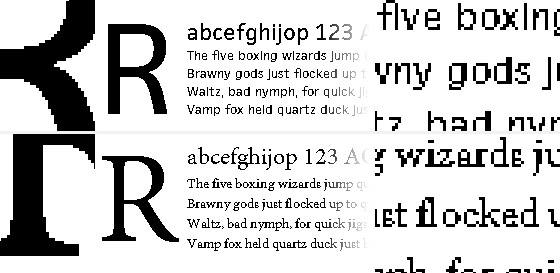
Above: GDI rendering of FacitWeb (above) and Minion Pro (below) with no antialiasing.
While rare because it is not the default choice on any modern Windows OS, aliased text (that is, text without any kind of antialiasing) is what some folks see as they read web text. The most common reasons type is rendered this way are because the user (or computer’s administrator) prefers this style of text rendering and has adjusted the OS antialiasing settings, or because a particular setting within the font file has explicitly disabled antialiasing for the specific font size being used. We’ll talk more about this setting in a future post about font files.
Screenshot review
Here again are each of the screenshots. For extra fun, try opening each image in a new tab and flipping quickly among them.

Above: Core Text rendering of FacitWeb (above) and Minion Pro (below).

Above: DirectWrite rendering of FacitWeb (above) and Minion Pro (below).

Above: GDI rendering of FacitWeb (above) and Minion Pro (below) with ClearType enabled.

Above: GDI rendering of FacitWeb (above) and Minion Pro (below) with Standard antialiasing.

Above: GDI rendering of FacitWeb (above) and Minion Pro (below) with no antialiasing.
In summary, most people reading text on the web view type in one of these five ways. Mac OS X users see Core Text, Windows 7 and Windows Vista users see either DirectWrite or GDI, and Windows XP users see GDI. For now, I have not included details about Linux or Android OS. (If you have any good references for how web browsers on these platforms render text, please link them up in the comments!) But as we will see in future posts, preferences, web browsers, font formats, and CSS properties may each affect the way type is rendered on the web.
34 Responses
Comments are closed.
I did some quick comparisons between OS X (Safari), Windows 7 (IE 9), and Ubuntu 10.10 (Firefox). They appear halfway down this thread.
http://typophile.com/node/74817
Awesome, Claus. Thanks for sharing this!
Great post! I started out as a print designer, though have focused my career now, as a web designer, this is great information to know. Thanks!!
Great post guys. Your dedication to typography is why i choose you over other font services. Keep it up!
Holy Toledo, so much goes into fonts on the web. This answers a lot of questions, as well as raises them – I look forward to the proposed future posts. Nice job.
Wouldn’t blown-up screengrabs misrepresent or exaggerate the effect of LCD sub-pixel antialiasing?
Certainly exaggerate. But that’s why the text in the middle of the screenshots is actual size. Do you think we can show the effect of sub-pixel antialiasing at an enlarged scale in a more accurate way?
I’ve seen examples which appear to have been made with an array of colored overlays in Photoshop, but they tend toward the simplistic as well. I’d be very curious to see some photographic comparisons of these rendering techniques in situ, perhaps macro photos of a pure white screen could be used as the overlay on enlarged screenshots.
At any rate, thanks for the article, I look forward to more!
One challenge with sub-pixel anti-aliasing is pixel orientation on portable devices like phones and tablets that can be using in more than one orientation – in general you want the RGB stripes vertically, as in these examples. Also, some AMOLED screens don’t have stripes eg Nexus One:
http://arstechnica.com/gadgets/news/2010/03/secrets-of-the-nexus-ones-screen-science-color-and-hacks.ars/
I do have a USB microscope, so could capture macro pictures of the different LED pixels showing type as one answer.
I’ve noticed that SilverLight on Mac (eg in Seesmic Desktop 2) seems to use greyscale anti-aliasing only, like the GDI standard examples, which makes the type look wrong to my mac-trained eyes.
Great points, Kevin. Maybe at some point we should write a post rounding up different kinds of screens, and cover orientation. And there especially, photographic evidence of text made of physical pixels would be enlightening.
Also screens of current smart phones tend to be higher (some *much* higher) density than desktops, so sub-pixel anti-aliasing is much less useful. For perspective: a desktop LCD is generally < 100dpi; the G1's screen was about 180dpi; the N1 is around 270dpi. With a 270dpi screen, there is just no reason to make things more complicated with sub-pixel rendering.
Great info to get out there, Tim.
nice work!
CoreText is not responsible for rendering, rendering is done by CoreGraphics. CoreText is layout.
You make the same mistake with DirectWrite, DirectWrite is not rendering it is layout. DW can work with different renderers but typically uses GDI.
GDI and GDI+ are different rendering engines and give different results. GDI+ sits on top of GDI but does its own font rendering (GDI becomes just a mechanism to get bitmaps onto the screen). Most apps don’t use GDI+ because it doesn’t give the standard Windows-like font rendering appearance, more like OS X. BTW, GDI+ is available as a redistributable for Windows ME and 2k.
GDI without antialiasing should not look like such crap, the fonts obviously don’t have proper hinting for aliased display. Fire up Win2k or NT4, the fonts are not AA but they look good.
My suspicion is that your GDI with ClearType grab is from XP and the “DirectWrite” grab is just GDI on Vista. Straight GDI will render fonts much nicer on Vista than XP (and XP better than W2k).
Thanks for this feedback, Christopher. I’m not sure how to respond about the layout/rendering mix-up. I don’t doubt you, but my research led me to believe what I wrote in this article. I’ll need to double check. Do you know of any resources that explain this clearly, that are correct in your opinion?
The GDI with ClearType screenshot was taken in IE8 on Windows 7. The DirectWrite screenshot was taken in IE9 Beta on Windows 7. Typekit doesn’t serve fonts to any Windows OS older than XP, so I’m not sure how that affects what you’ve said about GDI on ME/2k/NT4.
I second with Christopher. The role of Core Text and Core Graphics are explained clearly in Apple documentation: Core Text Programming Guide. The results of Core Text (glyph ids and positions) will be fed to Core Graphics, then Core Graphics will do the actual rendering.
If you are interested in current popular screen types, then you should look at this piece of research http://www.displaymate.com/Smartphone_ShootOut_1.htm
Right on, Claus! Thanks.
On windows, people can try a third party different engine: GDI++
http://friguron.dyndns.org/tutoriales/gdi/
Greetings
Very interesting! We probably will not spend much effort researching this, as it affects so few users (because it does not come with the OS by default), but it looks to be super helpful for CJK legibility as your page demonstrates. Thanks for sharing this.
Or you could try the regularly updated gdipp – http://code.google.com/p/gdipp/ which is essentially based on the same idea, but very active.
On Mac, you can get rid of the ugly subpixel AA color bleed by unchecking the box “Use LCD font smoothing when available” in the Appearance system pref pane. (On older versions of OS X, there was a three-choice pop-up where you could choose the “Best for CRT” option, which I found to be the best for LCD, too.)
If you test Ubuntu, please be sure to test different settings. They make a huge difference. In my opinion, the Ubuntu defaults are ugly, but if you disable subpixel AA and throttle hinting down, the result you get is very much like Mac with subpixel AA turned off: nice proper shapes without color bleed.
As far as I’m aware, Windows XP actually defaults to no antialiasing.
Thanks for these articles, great insight on a topic I’m glad someone is really taking the reigns on.
One thing I’d love to see covered at some point is best practices for designing to a baseline grid. Your previous post covering cross-browser vertical metrics would seem to make this a challenge.
Great suggestion, Eric. I assume you’ve seen these, but just for anyone else who’s curious: Setting Type on the Web to a Baseline Grid and Compose to a Vertical Rhythm.
Before (or maybe as a result of) such a post, I’d be curious to know how many designers value a baseline grid. I’ve heard some opinions in favor, some against…
The comparison isn’t very useful with FreeType missing.
I wonder what’s so hard including it. An operating system with it is free (as in beer), doesn’t need to be installed and has all interesting options accessible via on configuration dialog.
WPF is so ugly… 🙁
I pray each day someone at Microsoft will open his eyes and decide to fix it, since it begins to be very used (It think at IE9, FF4, etc.)
Font rendering under *nix systems is actually a quite interesting theme since you can plug in various backends.. To get a slight idea, here are some links:
http://www.linux.com/archive/feed/39513 (point: apple holds 3 patents on truetype hinting)
http://en.wikipedia.org/wiki/FreeType (font rasterization engine, heck there is a patch which even makes OSX style rendering possible)
Furthermore each Window toolkit (Specifically GTK+ and QT) has some kind of own font engine.. For GTK+ it’s Pango (http://en.wikipedia.org/wiki/Pango) – QT has it’s own (http://labs.qt.nokia.com/2008/09/01/subpixel-antialiasing-on-x11/).
Note that I’m NOT an expert on this field on *nix like systems. This is just what I guess/know. Hope it helps as a start and gives some overview. Fonts are an interesting theme on *nix since the rendering depends on a lot of factors – from X11, over some engines to your window toolkit’s engine..
Seriously, does someone know everything about this when it comes to linux :O?!
Thanks for sharing all of this, Luis!
Always a pleasure 🙂
Pango does not in charge for font rendering, it simply outsource it to FreeType. So does Qt, it uses FreeType rather than it’s own subpixel rendering now.
Ah thank you for that info!
good
Question: When a Windows XP user has disabled anti-aliasing system wide will -webkit-font-smoothing: antialiased; re-activate it in Safari & Chrome?
More on -webkit-font-smoothing: antialiased; here: http://maxvoltar.com/archive/-webkit-font-smoothing
At my school the admins seem to have disabled the antialiasing on our (not so) beloved Windows XP machines. It hurts me every time I need to do some research or type up a document at school.