Choosing Type for Screen
These days, almost anyone you talk to can name their favorite font. Likewise, virtually every business, whether large or small, as well as an ever-increasing number of individuals, maintain a website or blog. What if you could use your favorite font on your blog or website? With the advent of web fonts, the chances of being able to do just that are increasing day by day. In fact, this recently happened to Chelsey Scheffe as you can see from the screen capture of her blog post dated August 30 of this year. As we recently announced, Adobe has made several of its most popular typefaces available for @font-face embedding via Typekit’s service, and we plan on adding even more in the future.

Nothing Relevant blog using Adobe Garamond. Rendered in Chrome on Windows XP.
But, just because you can use your favorite font on the web, should you? This article is the second in our weekly series on web fonts, and seeks to lay out some very basic, practical design considerations to keep in mind when choosing type that is intended to be viewed on screen in the context of the web. I will thus focus on the more technical aspects of choosing type. For further guidance on choosing and pairing type, I strongly recommend reading Robert Bringhurst’s excellent Elements of Typographic Style, particularly the sixth chapter, which is entitled “Choosing & Combining Type.”
When it comes to type for body text, I’m of the opinion that it takes a very good web font to be better than no web font at all. What I mean is that unless the font you want to use renders as well as the tried and true core fonts for the web, you probably shouldn’t use it. These fonts are considered web designers’ workhorse fonts, not only because they are ubiquitous, but also because they were specifically designed for screen, and have proven to render well in various rasterization environments. Of this set of fonts, I’m rather fond of Georgia and Verdana. Design qualities that contribute to the success of these two typefaces in particular include generous x-heights and counters that remain open even at very small sizes. When choosing type for text, look for these features or plan to do some compensation for their absence. In the example above, Chelsey worked with the moderate x-height and smallish counters of Adobe Garamond Pro by choosing a slightly larger font size, and really made it shine as the text font for her blog.
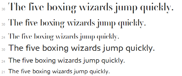
Some basic considerations for choosing a suitable type size follow. Check to see that all of your characters are easily distinguishable, and that the counters do not become clogged — particularly those of the ‘a’, ‘e’, and ‘g’ tend to suffer most. However, it is important to ensure that all letters at the chosen size are legible. Also check to see that the tops and bottoms of all uppercase characters are aligned, and that the x-heights of lowercase ones are even, and not bouncy. Lastly, choose a type size that will be comfortable to read for the entire text. With regard to weight, you might experiment with different members of the same typeface family to better determine which one gives the best legibility and appearance. For example, the semibold weight may actually be a better choice for text than the regular in some instances. Typekit’s online specimens (screenshot below) and browser samples come in very useful when trying to make these types of judgements.

Browser rendering of Myriad Pro in Typekit's web font specimen. Rendered in Chrome on Windows XP.
Another consideration, when formatting content that is intended to be read on the web, is to design for the lowest common denominator in terms of OS and browser configuration. For many of you that are designing on Mac OS X, that means you should check how your web fonts are rendering on Windows down to version XP at the least. The issue at hand here is largely an interaction between hinting instructions available in the font file and rasterization performed at the OS level. Mac OS X generally ignores hints, which results in font rendering that is smooth (if, at times, a bit blurry) on lower resolution screens. Whether or not you like the font rendering on Mac OS X, there is not much you can do about it. On Windows, however, font rasterization relies on the hinting instructions included in fonts. Depending on the OS settings, the same font may look decent, or it might look less-than-desirable. For the screenshots in this blog posting, I have chosen to show how the referenced fonts rendered on Windows XP using Chrome as the browser, and with sub-pixel rendering enabled via ClearType. Below is an illustration that demonstrates the difference between Windows XP’s ClearType rendering and Mac OS X’s Quartz rendering. The type is Chaparral Pro.

Left side rendered in Chrome on Windows XP. Right side rendered in Safari, also on Windows XP.
In contrast to choosing a good text font, choosing a suitable typeface for headings and display is much simpler. At larger sizes, the issues of rasterization all but disappear and the design of the type, rather than technical considerations, can be given greater prominence. However, it is still important to check the type you would like to use at the size you intend to use it in a variety of browsers, checking that smooth edges and that fine details are adequately rendered. For a simple, refined feel, a designer can often simply use the same type that is used for text at a size large enough to reveal interesting details of the type. In the example below, Minion Pro is set at a size that shows off the sophisticated terminal treatment on the letters ‘a’, ‘y’, and ‘r’; the elegance of the crossbar of the ‘e’; and we get to see the lovely ampersand up close.

The Story of website featuring Minion Pro. Rendered in Chrome on Windows XP.
Another simple option for pairing typefaces is to use various weights and widths of the same type family. Below you can see Myriad Pro Condensed Black working as the main headline and paired with other styles of Myriad Pro and Myriad Pro Semi Condensed. The overall effect is a cohesive and polished look.

Various styles of Myriad Pro used together in harmony. Rendered in Chrome on Windows XP.
If you are using a typeface designed for display settings, be sure to use it at a large enough size that its appearance won’t suffer too much degradation. Type designs with fine details, such as Garamond Premier Pro Display, Rosewood, Bickham Script Pro, Caflish Script Pro, or Voluta Script Pro all fall into this display type category. Lastly, have fun and experiment! We’d love to see what you create with Adobe web fonts.
8 Responses
Comments are closed.
Great article!
I recently had a debate with out senior engineer office about my choice of Myriad Pro as the base font for our website, with Trebuchet MS as fallback when it’s not available. He doesn’t seem to think Myriad Pro is ubiquitous enough, however it’s my understanding that anyone that has an Adobe Product on their machine would have Myriad Pro. (ie, just about everyone has Acrobat installed, don’t they)?
Unfortunately, because a single engineer here at the office has an aversion to anything Adobe, we had to change our base font to Trebuchet MS. I’m NOT happy about it. (He’s not even our target market!) Myriad just looks sooo much nicer. Wish I could have won that argument.
Agreed! And great post.
I’m designing a couple of websites now for clients – and the print fonts are now available for the web via Fonts.com – but damn, the rendering really, really blows. Excitement sort of went away as I started to look at the type itself.
Any way the line length (measure) on this blog can be shortened?
Too long. I keep hunting for the beginning of the next line.
We’ve just made some changes which I hope will be an improvement! See here for more info.
I’d say you fail, http://i.imgur.com/ctUEn.jpg
Most web fonts will look very bad with Windows font smoothing disabled. See here and here.
So users who are usually not tech savvy need to make a configuration change? I still say total fail, though I do appreciate the reply. BTW, I’m on Vista, not XP.
Grayscale or ClearType antialiasing is on by default for all recent Windows installations (including Vista and XP), so most not-tech-savvy users will, fortunately, not see text rendering without some kind of smoothing. Antialiasing has to be deliberately disabled (by the user or an administrator) for this bad, aliased text to appear.
It takes tremendous time and resources to create “super-hinted” fonts that look good in aliased (un-smoothed) environments, and most foundries cannot make that investment — so with your settings, you’re likely to begin seeing more and more sites using web fonts that don’t look so great. Turn font smoothing back on (or don’t disable it in the first place), and you’ll probably be happier.