Updating vertical metrics for cross-platform consistency
We are constantly learning more about how different browsers and operating systems interpret fonts’ vertical metrics. Recently, and with help from experienced type designers and a great deal of research, our understanding of metrics inconsistencies has grown substantially. As a result, we are working with our foundry partners to update fonts for cross-browser consistency.
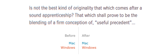
You may remember from a recent post about font metrics and vertical space in CSS that there are different sets of vertical metrics values. If the values in one set differ from another, text can be spaced unexpectedly in a layout. Without cross-platform consistency, you can see that the text below sits a bit too low in Windows (red), and a bit too high on Macs (blue).

Proxima Nova Condensed before and after having its vertical metrics updated.
We have updated Proxima Nova (including Condensed and Extra Condensed) so that the vertical metrics are consistent across browsers. Now, designers who use these fonts can be assured that page layouts will more closely match across platforms. Because this may cause slight positioning changes in some designs, we’re not rolling out these changes automatically; instead, you’ll need to republish your kits to see them.
We’re thinking of some slick ways to let Typekit users know about changes to the specific fonts in their kits. Until then, republishing your kits is all it takes to get the latest and greatest versions of these typefaces.
11 Responses
Comments are closed.
I think you should consider versioning your fonts. A change like this would completely break my design because I would have created different CSS rules for Mac and Windows to fix the spacing difference.
Thijs, you’re absolutely right. We’ve been thinking a lot about versioning.
I changed my font to proxima, but the refresh doesn’t. Maybe the servers are so much busy..
You guys are *constantly* hitting the nail on the head. Keep up the great work, friends.
So, does that mean the vertical metrics in the fonts have been changed to a single set of cross-browser settings?
Or are you serving fonts with different metrics to different browsers?
This isn’t clear.
The former. Sorry that wasn’t clear here, Rich. It’s clear to our foundry partners as they review their fonts. We recommend specific measurements and explain which ones are used by which browsers.
+1 for versioning. How can I opt out of this change?
Is the example above on the right actually showing the fonts as rendered on both platforms (which I think impossible), or is this just a diagram meant to show how the alignments used to differ and now don’t? Which platform/browser was used to render the type on the right?
Thanks Rich. You can’t opt out, but this is why we’re looking into versioning. We want users to have total control over how and when upgrades happen.
The example above is meant to show how the alignment used to differ and no longer does, but these are indeed screenshots of the typeface as rendered. They show our specimen of the font (Proxima Nova Condensed) as rendered in Safari 5 on Mac OS 10.6 and Safari 5 on Windows XP with ClearType enabled.
Thanks for clarifying, Tim.
You know how I roll: any chance you’ll be publishing info on the causes and the fixes for this problem for the community at large?
Happy to share this info, although it’s not super interesting for most people. We’re constantly learning, but here’s what we know right now: Windows browsers use Win metrics, Mac browsers use hhea metrics, and Firefox on Linux uses Typo metrics unless the hhea values are greater. Win and hhea metrics must match, including an hhea linegap of zero. Typo linegap has to be zero too, or lines of text are spaced unpredictably across browsers.
The specific values to which metrics should be changed are unique to each font file. Our internal tools for foundry partners make recommendations based on the conditions I just mentioned, and also based on the maximum ascent/descent of glyphs in the font file.
Tim,
You’re too young to remember the comedian Tim Conway on the TV show McHale’s Navy who, whenever stuff got technical, would interject: “Gee, I love that kind of talk.” (Gotta be clips or reruns on Youtube or Nick at Nite or somewhere.)
Anyway, thanks, very useful. Love that kind of talk.
Off to figure out the mind-bending repercussions of yet another documentMode in IE9…
Rich