Optical Sizes on the Web
This inaugurates a series of posts every Wednesday covering subjects related to fonts on the web. -CS
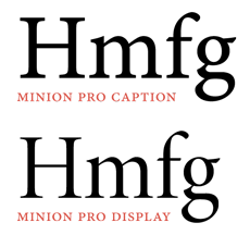
In my previous post announcing our fonts on Typekit, I mentioned that we have included various optical sizes (also sometimes called optical masters), and mentioned that they might be useful in web design. I thought it would be a good idea to cover this subject in more detail, to explain what optical sizes are and why the rules for using them on the web are still hard to pin down.
First, some background on optical sizes. Generically, this term refers to variations of a typeface design that have been made to work best at a particular size (or size range). When type was carved out of metal by hand, optical size adjustments were almost unavoidable, because the punchcutter was working with letters at actual size, and would instinctively (if not deliberately) adjust each size to optimize its appearance and readability. In general terms, the subtle details of a typeface design become unnecessary, or even problematic, as size decreases, and an increase in x-height, width, weight and letterspacing helps legibility of small text.
 These size-specific adjustments became rare in the industrial age, when it became possible to produce a range of type sizes from a single design by mechanical means. Adobe made its own effort to re-establish optical sizes in 1992, when it rolled out multiple master font technology, along with one of its first multiple master fonts, Minion MM. That typeface family featured an optical size axis defined by a 6 point design at one end, and a 72 point design at the other. By interpolating the outlines between these two ends, a design for any point size in between could be generated. Optical size axes became a regular feature of Adobe Originals created in multiple master format — particularly for text typefaces.
Support for multiple masters began to disappear when the OpenType font format emerged at the end of the 1990s. Adobe fonts previously released in MM format were converted to families of OpenType “instances.” This resulted in groups of optical sizes intended for size ranges. In most cases, these sub-groups are named Caption, Text, Subhead, and Display.
As you might have guessed, these optical sizes were created for high-resolution, printed output. So how do we utilize these design variations on the web and in other lower-resolution, on-screen environments? How do the characteristics of different optical sizes adapt to this relatively new and unpredictable medium? We’re still exploring those questions, but I’ll toss out some of my own observations.
The most obvious problem is that a low-resolution screen simply renders type differently, so the long-established rules which dictate the design of optical sizes for print don’t necessarily apply. Different screens have different resolutions and rendering technology, so the end results are difficult to predict. What you see on your monitor at home might be completely different than what another person sees on a desktop computer or mobile device somewhere else. Pixel densities vary widely today. Antialiasing technologies vary.
The general rules are still relevant. Display designs will have more subtle details, delicate forms, and tighter letterfitting, and will look their best at larger sizes, at least when screen resolution isn’t unusually coarse. Caption designs will have sturdier appearance, larger and more open counters, and wider fit. All of those features will make text look better at smaller sizes, and are similar to the characteristics that we’ve already found to work well in designs that have been created specifically for screen use (e.g. Verdana). What remains to be determined is just where the cut-off points are. At what size should you stop using Caption sizes and begin using Text sizes? For print, that crossover point might be 9 or 10 points, but it’s unlikely that specific rules will be very helpful for screens. Having a variety of optical sizes at one’s disposal is, at the very least, more opportunity to find something that works. I’d encourage users to experiment with different optical sizes on the web and see what works best.
Check out our typeface families with optical size variations on Typekit: Chaparral Pro, Cronos Pro, and Minion Pro. (Note that only the Display sizes of Garamond Premier are currently available there.) Let us know in the comments what you see, and what your own experiences have been with using our optical sizes on the web.
6 Responses
Comments are closed.

Do you have plans to release the regular version of Garamond Premier Pro on Typekit???
You’re not the first person to ask. I cannot say, but obviously we like to know what users (or potential users) are interested in seeing. (So, thanks!)
For readers who might be confused about this: Typekit currently serves only Display optical sizes of the Garamond Premier Pro family. The Display design is particularly beautiful because of all the small details it has, but of course it really should only be used at large sizes.
Typekit does have Adobe Garamond, which is another (earlier) Garamond revival. It is excellent in its own way, and also looks relatively nice on the web, because it was designed to work well on the low resolution laser printers that were typical of the time (1989) it was released.
Thanks for a nice post Christopher! So what’s your standpoint font-sizes: should you use pixels, ems, percent or points to get the best experience from web fonts?
Well, they should all be useful occasionally, right? I find specifying size by points is the most natural, but I suppose I do other things when the situation calls for it. I used to think that using ‘px’ would give me more control over appearance, but I found it to be unreliable, and more so since screen resolutions have increased and now vary widely.
I think as browsers become more attentive to typographic control, point size will become as consistent as anything. We also need a way for browsers to be aware of the pixel density of the display they are using, so that a point is really a point. (I don’t think anyone expects such awareness between hardware and software too soon, though.)
By the way — and I’m sure this is quite obvious to some — I find that setting layout dimensions (say, block widths) in ems is a great way to preserve line lengths (in characters or words) when a user scales their text size.
Christopher,
I would be very interested in having the ability to use the full range of optical sizes of Garamond Premier Pro as webfonts. In fact, I would also be interested in being able to serve different optical sizes to different operating systems, to compensate for the different rendering technologies (for example, as body type, I’d like to use Garamond Premier Pro Regular with Mac OS X while using Garamond Premier Pro Caption with Windows — simply because the Mac renders type bolder than Windows, so the difference in gradation would help to balance those differences out).
One important aspect of this would be to be able to serve fonts with oldstyle numerals and small caps directly — rather than just using the proposed CSS3 syntax, which is not yet standardized. This would probably mean that Adobe would need to create separate versions of fonts with different glyph subsets, which I could then compile into one “font” using the CSS font stack. I don’t know what your plans are for this, though, and whether what I’d be interested in doing would work though the Typekit API at all.
Best,
Adam
Hi Adam. As mentioned elsewhere around here, we really don’t have any plans to carve up the fonts to give access to those alternates. We’d prefer to help drive standardization and get browsers to enable OpenType layout.
I agree that it would be nice to be able to target certain browsers/platforms/devices with certain fonts.