Announcing East Asian web font support and new font browsing tools for Japanese customers
After many years — working across four teams, on three continents, and in five time zones — we are proud to announce that we’ve extended Typekit’s web font service to support Chinese, Japanese and Korean fonts.
Our entire library of Adobe-owned East Asian type is now available for use in your websites, and also ready for you to use via desktop sync. We have expanded our collection of Japanese typefaces with the Heisei, Kazuraki, and Ryo families from Adobe, and we have built new font browsing tools at typekit.com specifically tailored for our Japanese customers.
日本語の記事を読む (Read this article in Japanese)
閱讀該文章的繁體中文版本 (Read this article in Chinese Traditional)
阅读该文章的简体中文版本 (Read this article in Chinese Simplified)
한국어로 이 글을 봅니다 (Read this article in Korean)
Dynamic subsetting
East Asian fonts are big. Really, REALLY big. Last year we announced the introduction of Source Han Sans, with glyph counts ranging from just under 18,000 for Japanese and nearly 31,000 for Simplified Chinese. Not only do they have a lot of glyphs, they have a lot of megabytes to go with them – from 4.2 to 8.8MB per font! How are you going to use those on your site?!
Well, here’s what we have done: when you add an East Asian font family to your kit, it will automatically become what we call a dynamic kit. In a dynamic kit, you’ll have a new Character Set option in the kit editor called Dynamic Subsetting. When your dynamic kit JavaScript loads in the browser, it will detect your page’s character usage and request a dynamic subset for the glyphs needed for each member of the family. This makes for very small fonts, with incredibly fast load times.
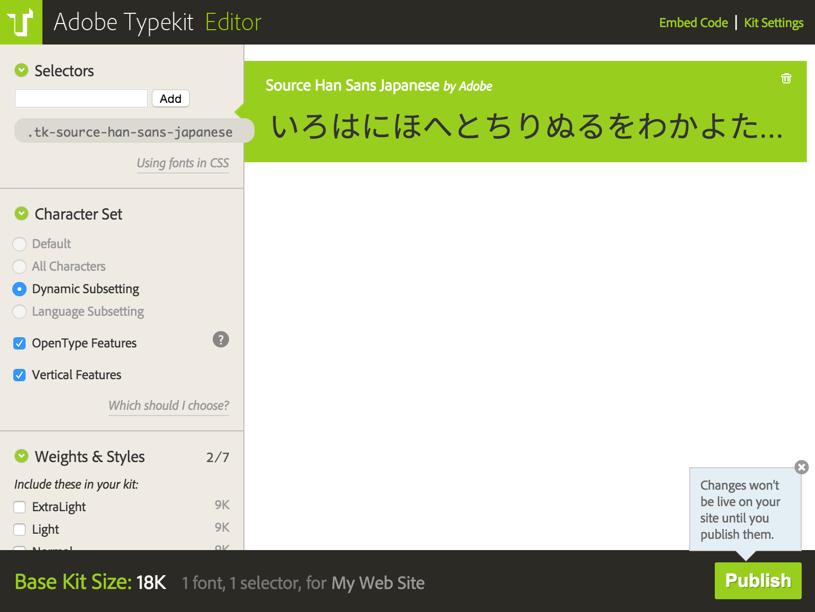
Dynamic Subsetting is automatically selected in kits using East Asian web fonts.
“Sure, neat”, I hear you say, “but what if my content includes a news feed or a comments section? Do I have to get a whole new subset if my content changes dynamically?” Nope. With a dynamic kit, we’ll look for any change to the DOM and then request that only the new characters be added to the local copy. We call this dynamic augmentation, and it’ll happen automatically for any of the font families in your kit that use the dynamic subsetting option.
Instead of redownloading an entirely new font, we can now simply request the additional glyphs, and perform the update right in your browser. Need one glyph? We can do that! And when you need another, no need to download the first again. Dynamic augmentation makes dynamic pages with custom web fonts a reality for our customers in East Asia.
For more details on how to use these new capabilities, see our updated help articles on Adding fonts to your website and Language support & subsetting. For more details on browser support, see our updated Browser and OS support page.
New browse and search
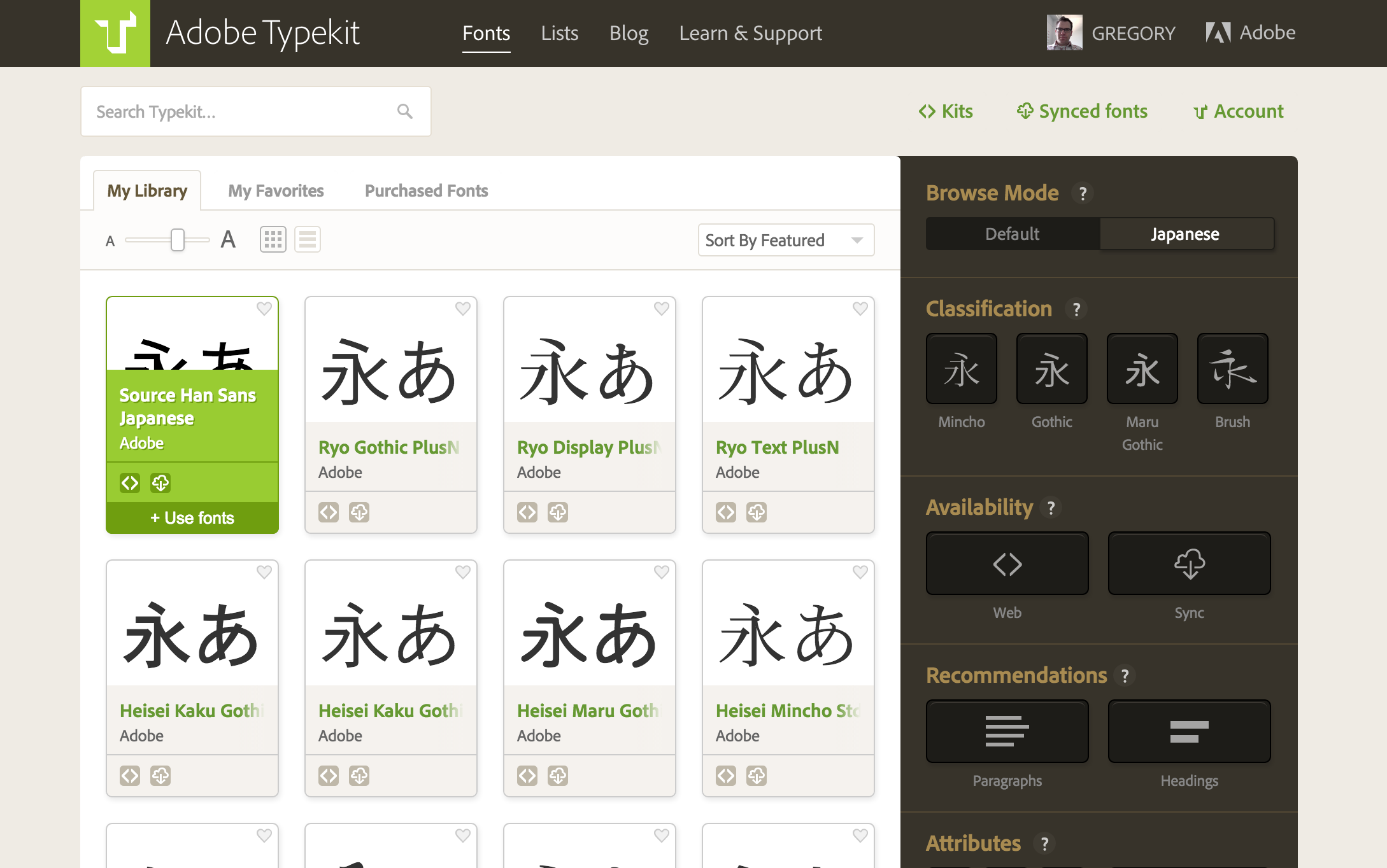
In the Japanese typeface world, Serif and Sans Serif have no meaningful place. In their stead come Mincho, Gothic, Brush, and other categories. We have created an entirely new UI for search and discovery of Japanese typefaces with the introduction of our Browse Mode switch. This lets you filter by our traditional Default filtering options or by Japanese. When you pick the Japanese option, you’ll be able to sort and categorize by the new options, showing just the Japanese font families. When in the Default mode, you’ll see your old favorites and all the other non-Japanese fonts too.
Our help articles on How to sync fonts to your desktop and Adding fonts to your website offer more details on using these new tools.
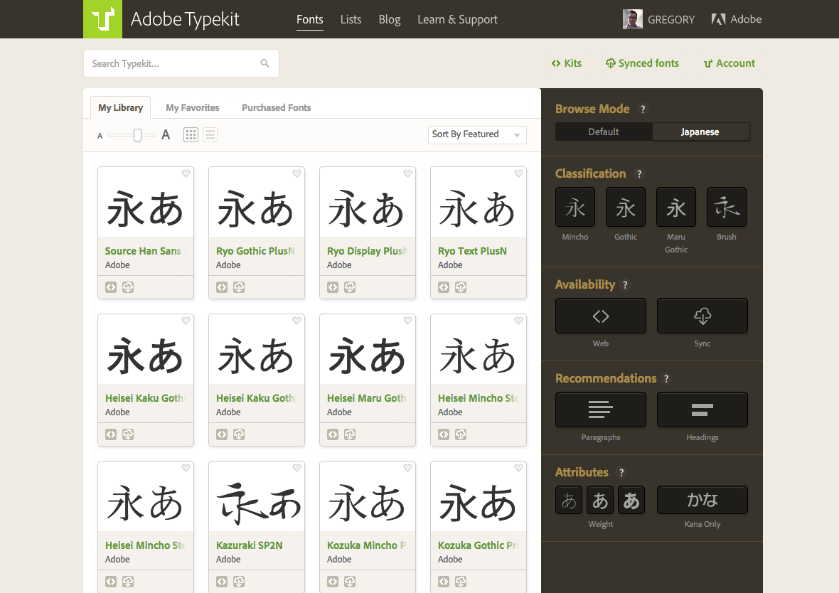
When browsing the library in Japanese mode, you will see the new filtering UI, with only Japanese fonts displayed.
We’ve shown localized text for our non-Latin fonts for a while now, but as part of this release, we are now showing the native font names for those which target Japanese. Don’t worry, if you are in the English locale, you’ll still see the English name — but for our Japanese customers, you’ll see the proper Japanese name. Additionally, we are now supporting multilingual search, so if you need to search for Kozuka Gothic , you can enter 小塚, こづか, コヅカ or even just ごしっく or ゴシック, and find what you need. This isn’t just for our Japanese customers – Chinese and Korean are now supported in our search fields as well.
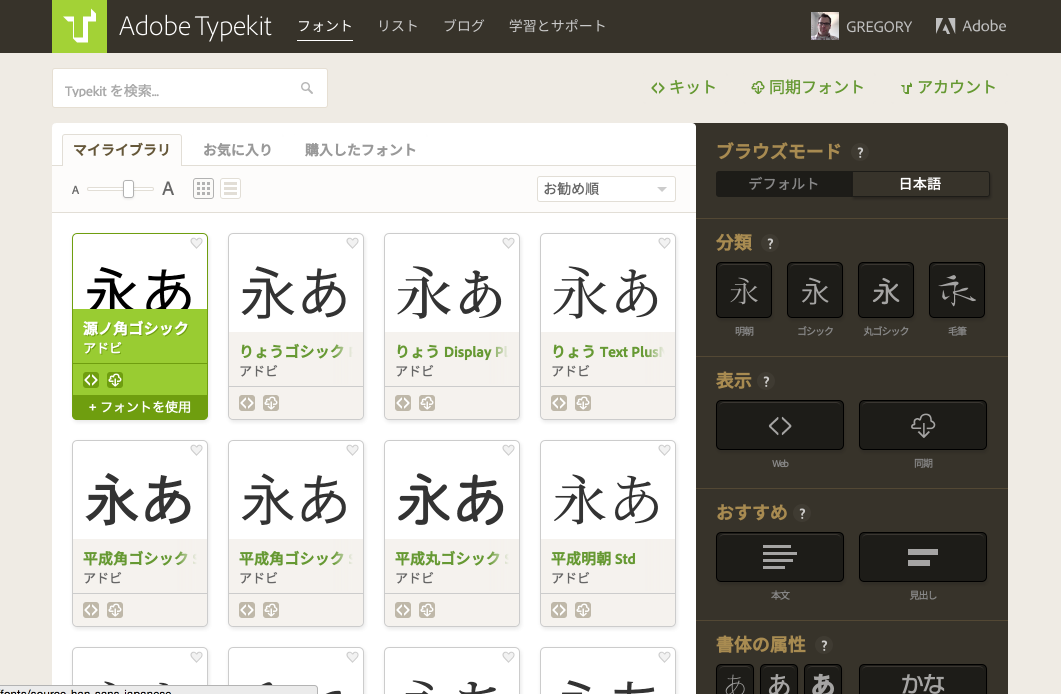
We’ve localized the font names on the cards, and now support multilingual search as well.
Enjoy!
These changes are live today with the new 2015 release of Creative Cloud. If you’re new to Typekit, it’s included with paid Creative Cloud subscriptions, or you can check out our standalone plans for great fonts everywhere you need them.
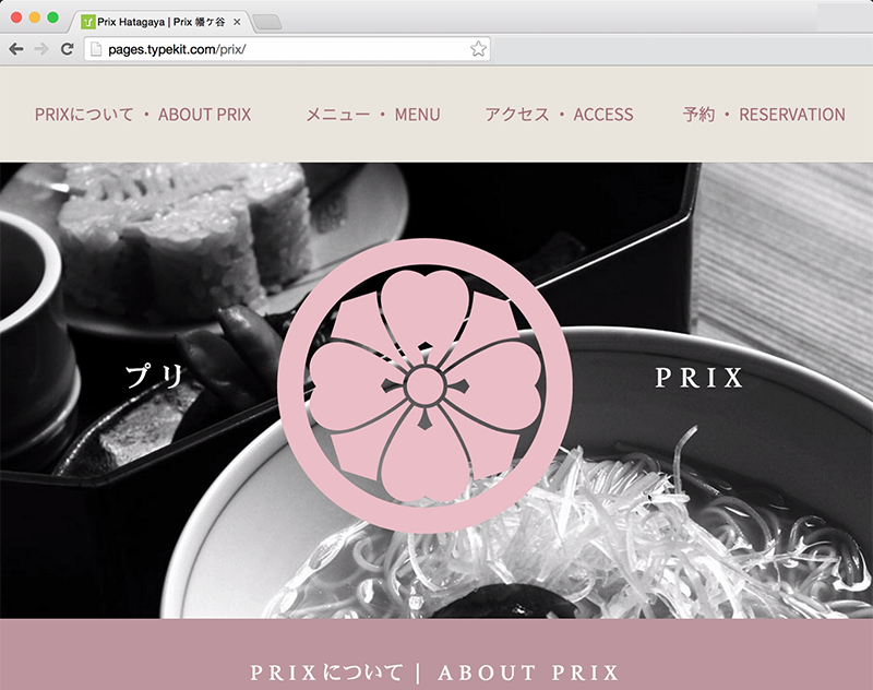
Sample website using web fonts in both Japanese and English.
It’s taken a lot of work to get this ready, but what we are most excited about is not what we have done, but what you will do with it. We look forward to seeing great web typography and design come to East Asia. We’ve commissioned an example Japanese site to demonstrate our new East Asian web font support. Let us know what you think of it in the comments, and share your own sites with us there, too!
Finally, it wouldn’t be right if we didn’t give a big “Thank you! 감사합니다! 谢谢! 謝謝!” to all our beta testers. You helped us make this a great release.
4 Responses
Comments are closed.
This is fantastic news, and well done on finding a way to deliver these fonts without the insane download sizes.
One question though, is it possible to select one of these new fonts for text appearing in say Japanese, but fall back to a different font for any roman text, rather than use the same font for both?
Nathan,
Well, there’s the right way and the less than right way. The right way would be to define families and then apply them to the spans you want with the Roman or Japanese font. The less than right way would be to define you CSS such that the Roman font comes first followed by the Japanese. When a glyph is not detected in the first, it will fall back to the second. This is less than right because it isn’t really how you should be using fallbacks and it also means that both faces will need the same weight, unless you don’t use weight and you only include a single variation for both font families. People do it, but it’s not something we can recommend as “proper”.
Gregor
This is a great development! I am about to start work on a website that will bi-lingual having pages in English and Japanese. My client lives in Japan and I live in Australia, is there any way to access the Japanese fonts via my account? Any dates on when this will be available to users outside Asia?
I can see now that this option is available.