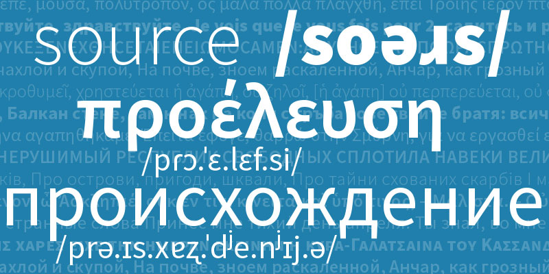
Source Sans 2.0
Since its first public release two years ago, I’ve been busily extending Source Sans Pro to add more functionality. As you may recall we released Source Code Pro and an update to the sans with small capitals in short order after the initial release. However, I had promised that we would be adding more coverage for additional writing systems to this family. Following the open source mantra to ‘release early and release often’, today we are releasing the upright font styles with Greek and Cyrillic support, despite the italic styles still lagging behind in this regard. The updated fonts are now live on Typekit for web use for all membership tiers (including free plans) and can also be synced for desktop use via desktop sync.
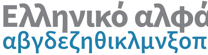
The joy of Greek
While designing a Greek alphabet for Source Sans, I worked closely with Robert Slimbach to give the minuscule letterforms the requisite degree of liveliness that is a distinguishing factor for this writing system. I wanted to avoid Latinizing the Greek letterforms, but also wanted the letter shapes to relate well to the simplified forms of the Latin design. Gerry Leonidas was a great help in this process, confirming that the underlying structure we had conceived was sound, while suggesting we rethink some details that would benefit specific forms and improve their readability. The Greek portion of Source Sans not only enables modern Greek setting (monotonic orthography), but also includes an additional ~250 glyphs per weight needed for older Greek texts set in polytonic orthography.
The passion of Cyrillic
In contrast to the seeming simplicity of adapting the design for Greek, doing the same for Cyrillic script was much more challenging. Whereas Greek letterforms are characterized by a sense of fluidity and a degree of freedom in form, readers of Cyrillic maintain strong expectations for letterforms to adhere a stricter set of guidelines. In designing the Cyrillic, I again counseled with Robert Slimbach, as well as several other designers including Maxim Zhukov, Maria Doreuli, and Ilya Ruderman. I am deeply grateful to these consultants for imparting their insight and perspective to me.

As with the Latin, I wanted to develop a set of shapes that are as simplified in structure as possible, which still retain the salient features of each character and harmonize with the overall design. To be quite frank, I struggled with the design of the characters with diagonal elements: Д, Ж, К, Л, д, ж, к, л (De, Zhe, Ka, El, de, zhe, ka, el). According to Alexandra Korolkova’s guide to evaluating Cyrillic letterforms, my design treatment regarding these shapes in particular is questionable. However, in developing these forms I wanted to stay away from purely geometric constructions, which feel much too stiff to match the rest of the design, as well as from the curvy, flower-like forms for Zhe/zhe and Ka/ka, which are much fancier than the rest of the design. My own opinion is that the default shapes are the best solution as graphic forms, but are they the best letter shapes for reading? I’m not sure. I welcome the dissenting opinions from those who read and write in Cyrillic daily. If there are type designers who would like to contribute improved shapes for this project, I would be happy to consider replacing my default character shapes.
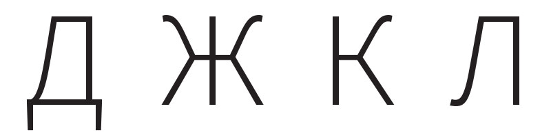
Cyrillic letters with diagonals
And more…
Beyond the additions made to support Greek and Cyrillic, I have begun to add some characters needed to render the International Phonetic Alphabet (IPA). I also took the opportunity in this update to improve the kerning for small capitals, as well as to include some additional punctuation forms specifically for the small capitals. Lastly, I improved the diacritical accents to give them more presence, as they were too small in previous versions. I also modified the diacritical shapes to harmonize better with the those of Source Serif, our latest typeface release.
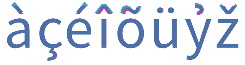
Previous diacritics in red, improved shapes in blue
Looking forward
The next step in the immediate future for the Source Sans family is to update the italics to match the character set now featured in the upright styles (minus small capitals and superscript capitals). Also, now that the upright styles of the sans have been augmented, this makes it possible to adapt the existing glyph shapes so that they can be added to the Source Code family. Beyond this, taking this family to the next level will involve adding characters needed for African languages that use Latin script and adding complete support for the IPA. In fact, Denis Jacquerye, a leading proponent for African typography, has generously offered his expertise and is currently helping to develop the requisite Latin glyphs to support African languages.
Technical notes
This update to the font sources marks a shift from using proprietary, binary sources (VFB and PFA files) to using source files in open, text-based formats. Specifically, I would like to point out that we are now using UFO sources for development and production. Since we began on this journey into the open source world, we have updated our entire font development workflow to fit better with an open model. To this end, the latest versions of the Adobe Font Development Kit for OpenType (FDK) now support UFO sources as inputs and you may need to update these tools if you would like to build fonts from these sources yourself.
We view this as a project that belongs to the public, and hope that interested parties will feel welcome to contribute to continue to make it increasingly more useful. The source files we used in the production of the fonts are available and can be referenced as a resource on how to build OpenType fonts with an FDK workflow. The full package of source files can be obtained from the GitHub project page. We hope you enjoy using the fonts!
8 Responses
Comments are closed.
Love Source Sans Pro! Thanks!
It’s great. Amazing Cyrillic fonts for our web site. Good work! Congratulate!
Please fix [ssgcpkyr.jpg] image. It’s missing one of the “л” letters in Cyrillic word. Please see this for an example of proper spelling.
Dear Yury,
As you may know, the Cyrillic alphabet is used to represent many languages besides Russian. In fact, the writing system first began its origins in Bulgaria. To honor this Bulgarian heritage, I chose the modern Bulgarian spelling of name of the writing system for the image in reference. Please see the Bulgarian language Wikipedia page for the proper Bulgarian spelling of Cyrillic: Кирилица.
Dreams come true. 🙂
Would you be good to compile a WebfontOnly package?
@Paul My bad, sorry about that.
Thanks for Cyrillic!
Thank you for the update!