The Adobe Originals Silver Anniversary Story: Expanding the Originals
This is the fifth in a series of articles from Tamye Riggs, a longtime lover of type who is working with us to celebrate the twenty-fifth anniversary of the Adobe Originals type design program. This post examines the period after Sumner Stone left Adobe Type, and how Robert Slimbach and Carol Twombly took the reins to drive the program forward.
The initial couple of years was the rise of the program. We were releasing advanced families for a number of years before other foundries began to follow suit. With every release, we were doing something new that wasn’t really in the world yet, pushing boundaries in both technology and design simultaneously. Extending capabilities. Reintroducing classic principles to modern type design that had been missing.
— Robert Slimbach, Adobe’s first Principal Designer
It was their intent for the Originals program that every single design be something that accomplished something new, that really hadn’t been done before in some way. Never do a mediocre design or a ‘me-too’ design or anything. If something’s already been done well, why should we do it?
— David Lemon, Senior Manager of Type Development at Adobe
“I don’t really mind which designs we decide to do. I just like to get in there and draw letters.”
— Carol Twombly, former Adobe type designer
After Sumner Stone, Adobe’s first director of typography, left the type team in January 1990, it was a shock to his colleagues. Several managers were brought in to try to fill the void, with varying degrees of success.
“It was harder after Sumner left — it felt like there was a real clear vision [before that].” said Carol Twombly, former Adobe type designer. “We were kind of casting about: ‘What are we going to do next, and how do we market it?’ Luckily, eventually, Dan [Mills] came in and was able to hold some of that.”
Dan Mills, former director of typography for Adobe.
Mills, who, like Twombly, had studied at the Rhode Island School of Design and been through the Stanford digital type program, took over as director of typography. He had formerly been a production manager for the type group, but his design background and an innate understanding of the sensitivities of the creative personality made him aptly suited for a higher profile role with the team.
“He was instrumental in picking up the ball,” said Fred Brady, Adobe’s manager of new type development. “Someone took over for Sumner for a few minutes, didn’t last… Dan stepped in and became director of typography. I think he did a great job. He kind of protected our group for a long time.”
“He was great at the big picture thing,” Twombly said. “Dan’s a great manager and a good guy. To this day, I’ll often say, okay, there’s a problem bothering me. What would Dan do? Because he’s very proactive. He would just pick up a phone and call somebody and ask a question so he could move to the next step. He could see how all the parts needed to fit together.”
“We went through a phase of departmental management that was rather disheartening, and (as Carol noted) Dan stepping in was a distinct improvement,” said Adobe Type’s David Lemon. “From a management standpoint, Dan was the best we’ve had (including probably better than I’ve been). But despite his font background, he left design decisions to the Originals team.”
Slimbach recalled his experience after Stone’s exit as “quite a bit different — because I didn’t interact with Sumner very often, his leaving didn’t affect me that much. I’m self-directing by nature, so I just carried on doing my thing. My primary concern was that the business side of things was taken care of so I could continue to focus on my work. I looked mostly to Fred to shield me from a lot of the everyday distractions of the corporate environment.”
With Mills taking the reins and Brady continuing in his role as manager and partner to the Originals team, Twombly and Slimbach could return their focus to the development of Myriad. A family of humanist sans serif typefaces, Myriad had been initiated by Stone as a collaborative project in 1989. At the outset, Stone, Slimbach, Twombly, and Brady were all dedicated to Myriad, which would become the first family of multiple master (MM) typefaces in the Adobe Originals library.
“Multiple masters were one of the coolest things Adobe did with font technology,” said Lemon. “We’d produce fonts that had several ‘master’ designs, and the user could specify any point in between them. This allowed nearly infinite variation in attributes like weight and width. We also used it to adjust the design for use at specific sizes.”
Twombly, Slimbach, and Brady reviewed a wealth of historical sources and existing sans models during the development of Myriad; not to find a source to base the family on, but to ensure they were doing something new. Aesthetics aside, the designers also were attempting to maximize the capabilities of MM technology, while addressing the constraints of output to low-resolution printers.
“One of the things we did for Myriad — we looked at a bunch of samples of fonts in that sans serif realm,” Brady said. “That font basically evolved more like from a functional standpoint: what looks best at these sizes; a really different process in a lot of ways. Not trying to look like another font. Myriad in its multiple master form — you can make it look like any other font. I did that experiment; people didn’t like that. [It was] kind of creepy.”
Slimbach and Twombly sketched letterforms by hand, and made numerous computer drawings and test fonts in resolving the design direction for Myriad. Once that direction was determined, each designer would tackle a particular font in the family, then hand off the design to their partner to refine. The goal was to create a clean, readable sans family free of the quirks and earmarks often inherent in faces crafted by a single designer.
“That was an intense design project, with Robert and me doing the work together, or sort of pieces of it and then switching,” Twombly said. “I’d give my design to him, he’d give his to me, and we’d rework them so it didn’t look like either of us individually; it looked more homogenous. And Sumner was [initially] directing that project, but designing by committee is really hard.”
“Getting multiple people to work on a type design project is a bit like herding cats,” Stone said. “Type designers are not by nature used to working on collaborative projects.”
“We only worked on a design project together that one time, and I think we all decided never again! [It’s] too hard,” Twombly said. “Mostly because I was the younger designer, I felt like I said yes to things more often than I might have otherwise. I didn’t say, ‘It’s gotta be my way.’ Because Robert was an excellent designer and we were designing a text face, and Sumner was in on the design, too. That made it easier, because we weren’t always butting heads. And since it wasn’t my face or his [Robert’s] face, it was more about making something homogenous — that seemed fair to me.”
Brady helped maintain a balance between Twombly and Slimbach, and served as a buffer between them and the corporate powers-that-be. “Fred was good in the comic relief department, kind of keeping us all happy, and taking care of Robert and making sure he wasn’t too upset about anything. Taking care of me, making sure I wasn’t too upset,” Twombly said. “It was quite a management project, I think — taking care of us all.”
The Myriad project was moving full-speed ahead, but it would take two years to ready the family for its release in 1992. In the meantime, there were other typographic battlefields to conquer.
Slimbach was finishing the first version of his Minion family of types for its 1990 release. A classical text face in the Garalde tradition of the late Renaissance, Minion was designed with a full range of typographic niceties, including small caps, archaic ligatures, swash characters, and ornaments. Rarely found in typefaces outside the Adobe Originals at the time, these extras made Minion appealing to high-end book typographers while it served as a legible workhorse text family for corporate interests.
While working on Myriad and other text families, Twombly was also busy overseeing the more “artistic” side of the Originals program. She led a team in reviving a series of historical wood types. Wood type historian Rob Roy Kelly “provided high-quality proofs of the wood types that we could use as a starting point for digitization,” Lemon said.
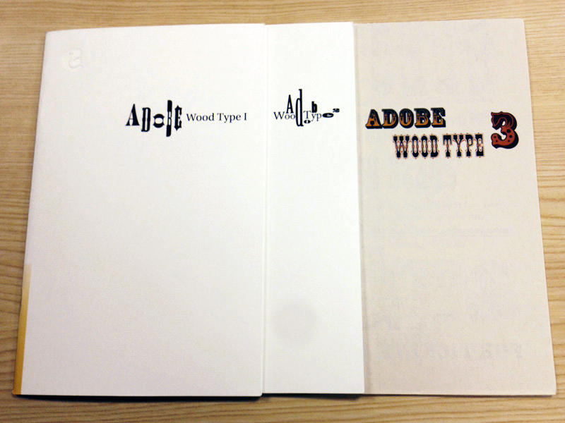
Twombly worked with Joy Reddick, Kim Buker Chansler, and Barbara Lind in developing the first two sets in the Adobe Wood Type Series from 1989 through 1991. A series of chromatic faces was developed a little later, with the help of Chansler and Carl Crossgrove — now a type designer with Monotype — who interned twice with Adobe Type in the early 1990s.
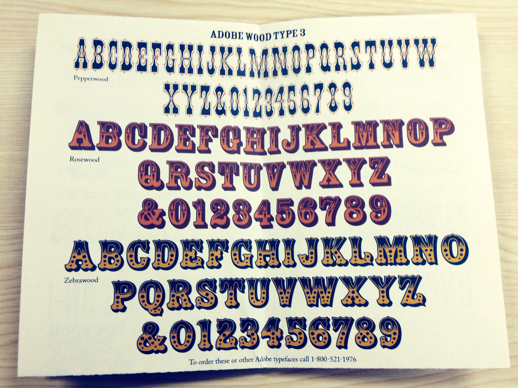
Character set for the Adobe Wood Type 3 package: Pepperwood (based on an 1877 ornamented Celtic typeface from Vanderburgh, Wells, and Company); Rosewood (based on a chromatic design by William H. Page, circa 1874);, and Zebrawood (modeled after alphabets shown in a specimen catalogue from the Wells and Webb Type Company, circa 1854).
“That [wood type project] was a very typical junior type designer thing to do — it was an alphabet and basic punctuation. They just needed to fill out the character set to some standards to Mac Type 1,” Crossgrove said. “Because the production stuff comes at the end, Carol and I figured out what would be the way these sets — two or three layers — would work together as fonts. At the time, there was no trickery about it — you had separate styles. You had to typeset them and put one layer on top of another in Illustrator or whatever.”
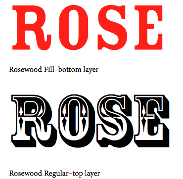
Rosewood images excerpted from the Adobe Type instructional document for the Adobe Wood Type 3 package, “Using Typefaces with Chromatic (Multi-colored) Effects.”
“Now, all these years later, one of the funny things about doing this wood type set — [I’m] fascinated how, with the outline component, diamond shapes inside, shadow effects — the one font out of that set that became more wildly popular than others was Rosewood Fill,” Crossgrove said. “It was not as interesting to use Rosewood Fill because [its] shapes and spacing were wonky. I thought Rosewood Fill was revealing of how messy and broken the design was: ‘Oh, wah wah, those inconsistencies… hidden in ornamentation.’ But I think the wonkiness is what people like. I think they choose it and gravitate toward it because it’s so clunky and strange looking.”
With the type group’s workload continually increasing, Slimbach and Twombly were blessed with two more colleagues who would become passionately involved in the Originals program: second-generation type designer and lettering artist Jim Wasco and calligrapher Linnea Lundquist, a graduate of the Rochester Institute of Technology who studied under Professor Hermann Zapf.
“She [Lundquist] was working for me doing Type 1 conversion work, then we moved her over to the Originals team,” Lemon said. “I hired her [in 1990] because of her calligraphy. It was a bit of a risk, because it wasn’t clear how well she would mesh with the tech side of it, but she worked hard at that and did well.”
In addition to becoming adept with typographic production, Lemon recalled
Lundquist was instrumental in making connections. “She acted as liaison with a number of the outside designers. She actually introduced many of them to Adobe — Jovica Veljović, Michael Harvey, Alan Blackman,” Lemon said. “A number of the more lettering- and calligraphically-oriented outside designers came in through Linnea. That was a really substantial contribution. “
Wasco, who had been taught the art of lettering by his father, had been working in San Francisco as a sign painter, calligrapher, and designer since moving to California in 1974 at the age of 18. He did a lot of work with type designer Jim Parkinson, drawing alphabets for Roger Black, and even helped Parkinson revamp the logo for Rolling Stone. Growing tired of running his own business, Wasco looked toward the fast-breaking technology sector for a career shift.
“I realized the future was in computers, so I wanted to get a job doing lettering on computers,” Wasco said. “Parkinson said I should go see David Lemon at Adobe; they needed someone like me. I went down there and David thought I was overqualified. This was about 1986.” Wasco ended up at SlideTek in San Rafael, digitizing fonts for their system in B-Spline vector graphics.
“After two years, they had enough fonts, and wanted me to demo their computer system at trade shows [such as] Seybold,” Wasco said. “Six tables with velvet curtains. Everybody had to have generic graphics and stuff. I didn’t want to do that. I gave two weeks’ notice. The same day, there was a message on my machine from David Lemon, looking for someone with more experience.”
Jim Wasco at TypeCon2007 in Seattle. Photo by Eben Sorkin.
Lemon had hired Wasco for the typographic staff in 1989, where he worked under Jocelyn Bergen, then manager of the type editors. “We would critique the Monotype and Linotype data,” Wasco said. “At that time, everyone was using Adobe tools to do their font work — if it had to be PostScript, you would do it with Adobe tools. Adobe would have control over it make sure it was done right.”
Before anything was released, Wasco said, people like Bruno Steinert (then managing director at Linotype) would send over their data. “We’d look at it and critique it and make comments about how you could make improvements,” Wasco said. “I did that while I did other production work, like taking ITC [International Typeface Corporation] fonts that were outlined with Ikarus data — they would put it through their Adobe tools and convert it to PostScript, but it didn’t have the character set to be a standard Mac font. I would add ligatures or whatever it needed to bring it up to the minimum 256 characters Mac Roman needed.”
Wasco recalled working on Cheltenham and ITC Garamond, among countless other typefaces. “I’m drawing a blank now, but I once went through and made a list of them, and there were over 100 fonts [that I had] worked on.”
Wasco’s role grew from finessing third-party fonts to working at the core of the Adobe Originals team. “I was like Robert’s helper,” he said. “I would do things like the ligatures for Waters Titling, or the small words.”
“The Originals team really functioned as a team,” Lemon said. “That was Robert and Fred and Carol as the three co-equals of the team, with Jim Wasco and Linnea Lundquist also on the team. They [Jim and Linnea] did the bulk of the production work, but they definitely participated as part of the team as well.”
Lemon recalled the process for selecting outside designers to help expand the Originals library. “The questions about whom to commission for outside designs — which we did a lot of in earlier designs — that was, as far as I can see, really a team decision. You had to get a consensus between Robert and Fred and Carol for somebody to get commissioned,” Lemon said. “I think that was a nice dynamic — they respected each other; they gave each other some leeway. If one was pushing for someone, they gave that person the benefit of the doubt. And we got a real variety of stuff and yet it was, at the same time, all innovative.”
Wasco and Linnea split duties equitably, each serving as point person for a specific designer. “Linnea worked with Michael Harvey and Akira Kobayashi. I worked with Jim Parkinson, etc.,” Wasco said. “The thing is, we were all involved with all the projects, because even though Linnea would be the one to write the letter and to convey the consensus of the group, we met as a team over the table, everything fanned out over the table. Robert, Carol, me, Linnea, David Lemon […] We would all put it on our two cents, take notes. Then Linnea would contact her people she liaised with; I would contact mine.”
One of the first outside designers to work with Adobe Type was David Siegel, yet another graduate of the Stanford typography program. Siegel had brought Tekton to the plate in 1989.
“Tekton was interesting — I spent a lot of time on Tekton myself,” Brady said. “Dave Siegel, the designer — he worked out a deal with Frank Ching, who wrote books on architectural lettering. He came up with a font — the essence of architectural handwriting. I went in and massaged a lot of the letters. When Dave was picking models out for each letterform, he was picking things that were anomalous, not representative of each letter. I thought, gee, this ‘a’ and this ‘b’ and this ‘c’ — here are a bunch of letters that look similar; not the one that should be the unique one in a batch of letters. I massaged to represent the look of overall letters — [I did] a lot he didn’t realize. I think he was very happy in the end, because I think he made a lot of money off the font.”
“One of the first projects I worked on was Tekton Bold,” Wasco said. “At the time David Seigel did Tekton, he delivered it and Fred Brady had to do a lot to get it to work. [It was a] hot seller — they gave it to me to do a bold, and Fred art directed.”
Wasco recalled meeting John Warnock at one of the Adobe company picnics. “He was always an inspiration, the way he would talk at the meetings,” Wasco said. “He asked what I was working on. I said Tekton. He said, ‘Oh great! The world needs more Tekton.”
In addition to introducing outside designers to the mix, Adobe Type brought a new kind of Original into the mix. The Wild Types were more casual, often illustrative, in stark contrast to the weighty, fully fleshed-out text families anchoring the Originals library.
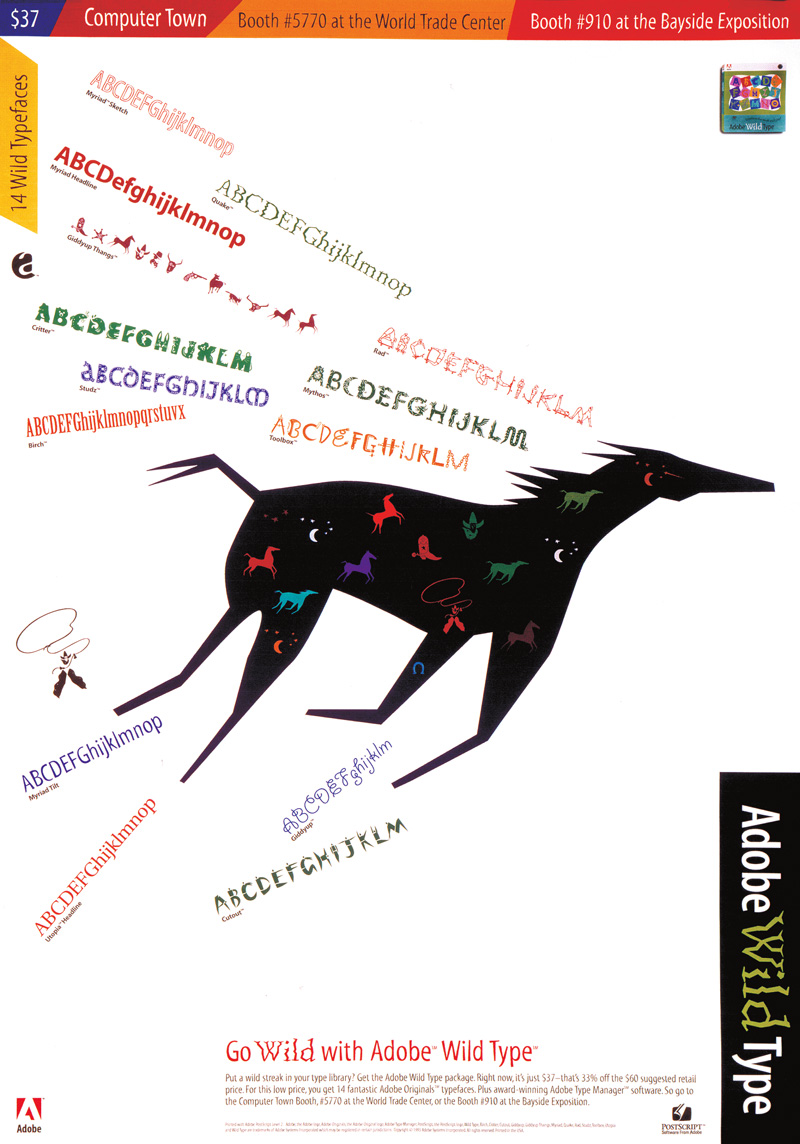
Poster for Adobe Wild Type, designed by Min Wang.
Wasco collaborated on a Wild Type with Min Wang, former design manager for Adobe Creative Services. Mythos, an all-caps family based on mythological creatures from Eastern and Western cultures. “Min came up with the idea, but his drawings were non-typographic,” Wasco said. “I made his idea into a font and made everything work.”
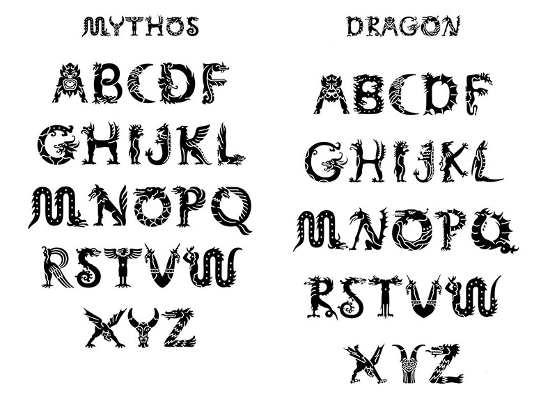
From the Adobe Wild Type series: Mythos, the finished digital font, pictured at left, compared to Min Wang’s original illustrations.
Slimbach was against the idea of the Wild Types right from the start, while Twombly was more pragmatic.
“The quality was the thing; not so much which styles to bring out, because there’s a whole gamut of different styles. But it was really wanting to do that quality on every possible style,” Twombly said. “When we tried the Wild Type thing, doing quicker fonts from outside designers, Robert was like, no, that’s lowering our standards way too much. And they’ll be decent, but they won’t be really great.”
But digital typography continued to evolve, and with its growth came a demand for more lighthearted fare from the world of fonts.
Pictured at left: Min Wang, former design manager for Adobe Creative Services.
“What are you gonna do? I mean, you’ve got to have variety,” Twombly said. “You can’t design everything, so we had no choice but to spread out. We got to review those designs and you know the poor outside designers — we would actually criticize their work until they got it up to our standards. And it was understandably very hard for some of them to deal with that!”
“One of the things I could say about the group there — their standards were super high. They were very very picky,” Wasco said. “When we had Jim [Parkinson] come in with a design like Jimbo, they would send it back like ten times to get it the way they wanted it — because they would have so many details and opinions. It was like going to the Adobe school of font production.”
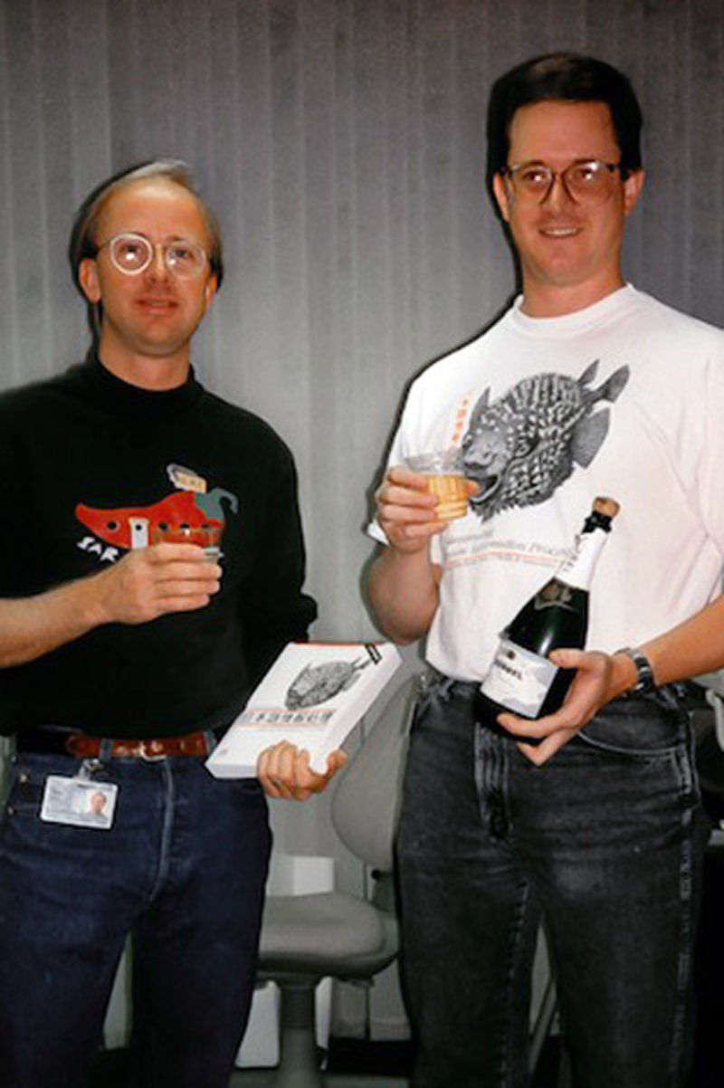
Adobe Type’s Dan Mills and Dr. Ken Lunde celebrate the publication of Lunde’s book, “Understanding Japanese Information Processing,” September 1993.
Up next: Adobe Originals go big in Japan.
Keep up with the Adobe Originals celebration via RSS by bookmarking this series. And, in case you missed any posts, check out the rest of the series!
2 Responses
Comments are closed.
May I talk to someone at Adobe about a typeface or font I have been looking for and can’t seem to find which I bought from Adobe maybe six years ago. My computer was stolen and I can’t remember the name of the font. It was elegant and suitable for titles. It looked like a modernized version of the script used in those illuminated pages of hand copied medieval bibles. The letter “H” for example had the horizontal bar of the letter extend through the right vertical column of the letter. Not much of a clue but I hope that helps.
Chuck, I’m guessing you’re thinking of our Sanvito family.