Coming to your desktop: fonts from Adobe
This is the eighth post in a series highlighting foundry partners who will offer fonts for desktop sync, including Dalton Maag, FontFont, Mark Simonson Studio, TypeTogether, ParaType, exljbris, and URW++.
Adobe’s first retail product, back in 1985, was type. Building its business around its PostScript page description language, Adobe depended on the Type 1 font format to give PostScript its powerful typographic capabilities. Soon after, the Adobe Originals program was conceived to make new typefaces specifically for desktop publishing. Adobe’s primary goal was to create full-featured, timeless typefaces with a high degree of technical care—combining thoughtful type design with an awareness of how best to engineer those fonts to perform well in any conditions. Now, with over 60 typeface families available for desktop sync from Typekit, there is a wide range of Adobe type available for work spanning print, digital documents, and the web. Let’s look at a few of them.
Adobe Garamond, designed by Robert Slimbach, was one of the first Adobe Originals released (in 1989). At the time, it sought to revive an historic and well-known design and adapt it for contemporary desktop publishing. By including an “expert collection” of old style figures, small caps, ligatures, and other typographic alternates, it also expanded the meaning of the word “revival” by re-introducing these advanced typographic features to a new generation of designers. Despite its elegant forms, the font outlines were carefully constructed for the best performance on the hardware of its day—which, conveniently, has also made it excellent for screen rendering.

Adobe Garamond Pro
Minion, also designed by Robert Slimbach and first released in 1990, was in some ways a sequel to Adobe Garamond. For Slimbach, it emerged as an idea during the extensive research and development of Adobe Garamond, and became a distinctive, original typeface inspired by the old style type forms of the late Renaissance but carefully modernized for digital use. It eventually expanded into Cyrillic and Greek scripts, and is now considered one of the high watermarks of the first “golden age” of digital type. Although ideal for book typography, it is more economical in its proportions than the typical old styles, making it useful for magazines and other formats where space can be limited. Like almost every other Adobe Originals text face, today’s OpenType version of Minion has a complete range of old style figures, small caps, fractions, ligatures, and other alternates—all easily accessed in desktop applications like Adobe InDesign.

Minion Pro
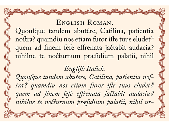
Another great revival for the Adobe Originals program, Adobe Caslon was carefully adapted by Carol Twombly from the time-honored types of William Caslon. Also released in 1990, Adobe Caslon is an amalgamation of what Twombly found in examining various specimens of Caslon’s original metal type from the 18th century. Through the design process, she worked to preserve its characteristic idiosyncracies while blending different examples into a single text design suitable for modern use.
One particularly appealing aspect of the Adobe Caslon typeface family is the ornamental quality available through its swash capitals and ornaments, based on those found in Caslon’s original specimens and other contemporary sources. They can be used to emphasize Caslon’s true personality through initial caps, energetic italic settings, and borders.
Distinctive and sturdy, Caslon long ago proved itself as a workhorse, and Adobe Caslon has already proven popular in new media like the web—a testament to Twombly’s skill and the universal appeal of Caslon’s original types.

Adobe Caslon Pro
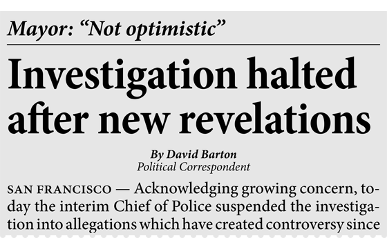
Kepler, first released in 1996, was conceived as a typeface family to cover an expansive range of text and display typography. A modern typeface with humanist, transitional elements, Kepler has a distinctive personality at large sizes in display settings, but gracefully serves at text sizes as well, avoiding the tedium that can come with reading long text passages set in more severe modern faces like Bodoni. Its vertical stress, a feature of all modern style typefaces, can often be the perfect choice for screen rendering.
Typekit offers sixteen variations of Kepler for desktop syncing, covering text and display designs in regular and semicondensed widths, and in roman and italic styles—making it a particularly flexible and powerful choice for a wide range of projects.

Kepler Std
Below is a complete list of the families from Adobe that we’ll be making available for desktop sync. Add them to your favorites so you can find them quickly when we launch the desktop sync feature, and use them on the web today. If you’ve never given Typekit a try, sign up (it’s free!), and upgrade to a paid plan when you’re ready.
- Adobe Caslon
- Adobe Garamond
- Adobe Jenson
- Adobe Text
- Alexa
- Arno
- Banshee
- Bell Centennial Address, Bold Listing, & Name & Number
- Birch
- Blackoak
- Brioso & Poster
- Brush Script
- Caflisch Script
- Chaparral
- Charlemagne
- Cooper Black
- Copal Decorated, Outline, & Solid
- Cottonwood
- Cronos
- Fusaka
- Garamond Premier
- Giddyup
- Graphite
- Hobo
- Hypatia Sans
- Immi Five Of Five
- Ironwood
- Juniper
- Kepler, including Display, Semicondensed, & Semicondensed Display
- Letter Gothic
- Lithos
- Madrone
- Mesquite
- Minion and Condensed
- Minion Std Black
- Myriad, including Condensed, Sketch, & Tilt
- Mythos
- Nueva & Condensed
- OCR-A
- Orator
- Pepperwood & Fill
- Ponderosa
- Poplar
- Prestige Elite
- Quake
- Rosewood & Fill
- Sanvito
- Shuriken
- Source Code
- Source Sans
- Stencil
- Strumpf Contour & Open
- Tekton, including Condensed & Extended
- Trajan Pro 3
- Trajan Sans
- Utopia & Headline
- Viva
- Warnock
- Willow
- Zebrawood & Fill
4 Responses
Comments are closed.
Sounds excellent. I assume that these include the optical sizes (which is, after all, half the attraction of Arno, Garamond Premier, and company)?
For many of these families, we’re starting with the most useful set of weights and styles. Over time, we expect to make even more available for desktop syncing.
Is there any chance to see “Helvetica Neue” in typekit anytime soon ?
Sounds great with the new desktop sync. However I would like to know with ever this can compete with the free font services on the web and Adobe’s own Font Folio?
I look forward to the start, and off course also the other font families in desk sync. 🙂