Optimizing Fonts for the Web: Outlines and Components
This is the first in a series of articles from Typekit’s resident type designer, Tim Ahrens, on how we optimize fonts for the web.
In our recent blog posts, we’ve talked about some of our efforts — research and font optimization — to improve the quality of the fonts we serve. Hinting, vertical metrics, and choosing between TrueType or Postscript outlines are among the main aspects we focused on.
There are, however, many other technical issues that make up a good web font, all of which need to be taken care of when fonts are prepared for use on the web. In this post, we’ll talk about two elements of that process: outlines and components.
Converting outlines
Web fonts can contain either TrueType or PostScript outlines, which use quadratic and cubic Bézier curves respectively. Today, nearly all type designers draw glyphs in PostScript format and many foundries sell only PostScript-based desktop fonts.
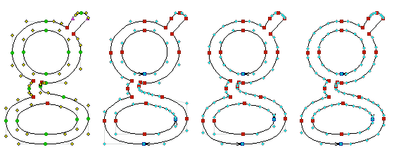
Left to right: The “g” in Omnes in the original PostScript outline; converted to TrueType with FontForge; and converted by FontLab with both regular and with increased resolution.
For display fonts (fonts intended to be used at large sizes, such as in a headline), PostScript outlines are preferred, because they render more smoothly across many Windows browsers. But for text fonts (intended for use at paragraph sizes) TrueType is often a better web font format because of its superior hinting control.
That means the original OpenType fonts that Typekit receives from the foundries often need to be converted. And since we’re dealing with fonts on the web, we have to take into consideration not only the accuracy of the outlines — their fidelity to the designer’s intention — but also the file size (which is proportional to the number of points).
In practice, the conversion itself is far from trivial; different font editors, such as FontLab, Fontographer, and FontForge, give different results. For example, FontForge is generally adept at producing an outline with a small number of points, but it struggles with certain types of curves; see above, where the two curve elements in the lower loop of the lowercase “g” have an an unnecessarily large number of control points. Meanwhile, FontLab treats this curve with more elegance but fails to recognize that some of the simpler curve elements can be expressed with fewer points. Producing the best conversion can mean choosing software based on the design of the font (or even a particular glyph); often, for the best results, it’s necessary to cobble together glyphs from different editors, or even to manually clean up the outlines to remove superfluous control points.
“Recomponentization”
Once we have solid TrueType outlines for a font, what next? There’s more we can do to minimize the file size and ensure a fast browsing experience.

Omnes’ “ä” as stored in a PostScript-based font (left) and as components (right).
In order to avoid duplicate data, TrueType permits us to store accented characters as components, building the glyph out of the base letter and the accent. Since the bulk of the characters in a font are accented letters, this can reduce the file size by a considerable amount. PostScript-based OpenType does not support components, so we need to “recomponentize” our source fonts as they are converted for the web, replacing parts of the contour with their equivalent component. This modification does not affect the appearance of the font, but it can reduce the font size by up to 40%.
Converting the outlines and creating components are but the first steps in optimizing fonts for the web; in our next post, we’ll talk about various ways in which we clean up and augment a font’s glyphs, and how attention to vertical metrics and underlines (long neglected in desktop fonts) becomes a priority for web fonts. Stay tuned!
15 Responses
Comments are closed.
Brilliant, as always!
Interesting. Thanks for taking the time to explain these details about web fonts. Also nice to hear that FontForge is a serious font editing program.
Good! Thanks, Tim…
hi, I only been on blog for five months or so. I am a designer but in fashion so it’s different for me. But one of the first things I got was typekit, it makes just an impact. I cannot fully the ccs but I will take time soon to learn setting my details in place. Your site and blog is inspiring and and the new details you mentioning here. I have a bit of illustrator experience and better at photshop. Is this something that I could consider doing or? Cheers and 🙂
It’s been a pleasure reading your blog. I have bookmarked your website so that I can come back & read more in the future as well.
Good examples about the conversion to TrueType! Its clear as 99% of typefaces designed in “otf Bézier”, any conversion to TrueType modifying the original design. No conversion is perfect, but in cases of very delicate design, a conversion almost doesn’t work, as it destruct too much designer intentions. It was very problematic to see my Sabon Next convert to TrueType because of what you explained well. TrueType works for small sizes, not display for sure! Even not discussing hinting here, just outlines. @jfporchez
Brilliant technical post. I love the detail and the graphics. Keep up the great work guys.
Thanks for your comments, everyone!
Jason: Yes, FontForge has some very powerful functions but it does not seem to be particularly popular for actual type design work, at least among the designers I know. Excellent for post-processing, though.
Kenneth: Not sure what you mean. The things outlined in this article are done by us at Typekit for fonts we host – you don’t need to do these optimizations yourself.
J F Porchez: Thanks, that’s very interesting. I didn’t know of Sabon Next as a specific example. I can imagine that it was particularly tricky to convert because of the refined curves.
Tim, btw I have nothing against TrueType, more about the conversion tools that I know… @jfporchez
I love reading about this sort of stuff – I wish I could take some classes on it locally! Until then I will live vicariously through Typekit.
Hi Tim,
I am still junior in web fonts and I am trying to design new web font right now,,, So I have some questions to you:
First of all, I am using Fontlab but I have designed my characters in Adobe Illustrator then I copy them to Fontlab.. So, Is it necessary to convert each char to truetype or to post-script ?? (via: Contour -> Convert -> curves to truetype)
Is it necessary to make hinting to my web font?
finally, I wish you can write more about hinting in the near future
Best
Hi Ott,
For bringing characters from Illustrator into FontLab, there are some step-by-step descriptions out there, I believe. You could try searching on typophile.com (their built-in search does not work so well, use a search engine).
If you are new to fonts, I’d suggest working with PostScript-based fonts, which use the same type of curves as Illustrator, are easier to edit, and easier to hint. You could even try completely unhinted PS-based fonts, which often look quite good as webfonts.
looking forward tot eh next post. I am curious about why some fonts plug-up at small point sizes, while standard resident fonts (Times New Roman,Georgia, Verdana, Arial, and Arial Narrow) are still readable.
PostScript based Opentype support subroutines, which in all practical aspects is a super-set of TrueType components.
The Fontforge user interface have support for TTF-style components in fonts made with cubic bezier curves. When a font is exported as Opentype-CFF, it generates subroutines (it also seek out other parts of the glyphs that can be compressed and speeded up using subroutines), when exported as Opentype-TTF, it generates TTF-components (it even finds components that is not made with the component-feature, e.g. if an accent is identical in several glyphs and in the accent glyph, or a character is identical in several accented glyphs). I haven’t used propriety font editors in ages (since 1996, I think), but I would be surprised if they don’t all have similar features. Also, being able to have only one version of a glyph component (like an accent) that change automagically in all glyphs that use it, makes it much easier to create glyphs. Are you sure you have to do “recomponentization” by hand (or however you do it)?
Fontforge also support layers with different kinds of splines. With a bit of scripting, I think that could simplify some of your problems (redo the hard to convert part of a glyph by hand in a separate quadratic layer, then use a script to merge (and convert) the layers). Most open source projects (using FontForge) seem to do most of the work (at least the creative part), using spiro-curves nowadays, which isn’t like bezier curves at all.
Tim!
re “Recomponentization” – there’s seems to be an ‘issue’ in later osx’s where referenced components fail to be rendered properly if the component is comprised of another component. An example would be to create a dieresis from two periods, and then to reference the dieresis in ü, ë, ä etc etc. The result would be the ‘periods’ of the dieresis would get placed on the baseline, or just randomly it seems. So, a good rule seems to be to not create components from other components. I would love to know why this is the case, if you have any ideas.