Typespotting: Laundromat mural in the Mission
Walking along 24th Street in the Mission District of San Francisco, I saw this type mural for the first time not long ago.

The laundromat has been there for years, but I’m less sure about their painted sign (maybe it was just touched up?), and “Protect the Sacred” was definitely new to me. In any case, I thought the whole thing was striking. There’s a homegrown charm to Mr. Burbujas and a definite Mission flavor, while the “Protect” work is something totally different but equally awesome.
I took closer shots of the sign from a less skewed angle, and tried both elements in our visual search feature to see what might be close in the Typekit library.
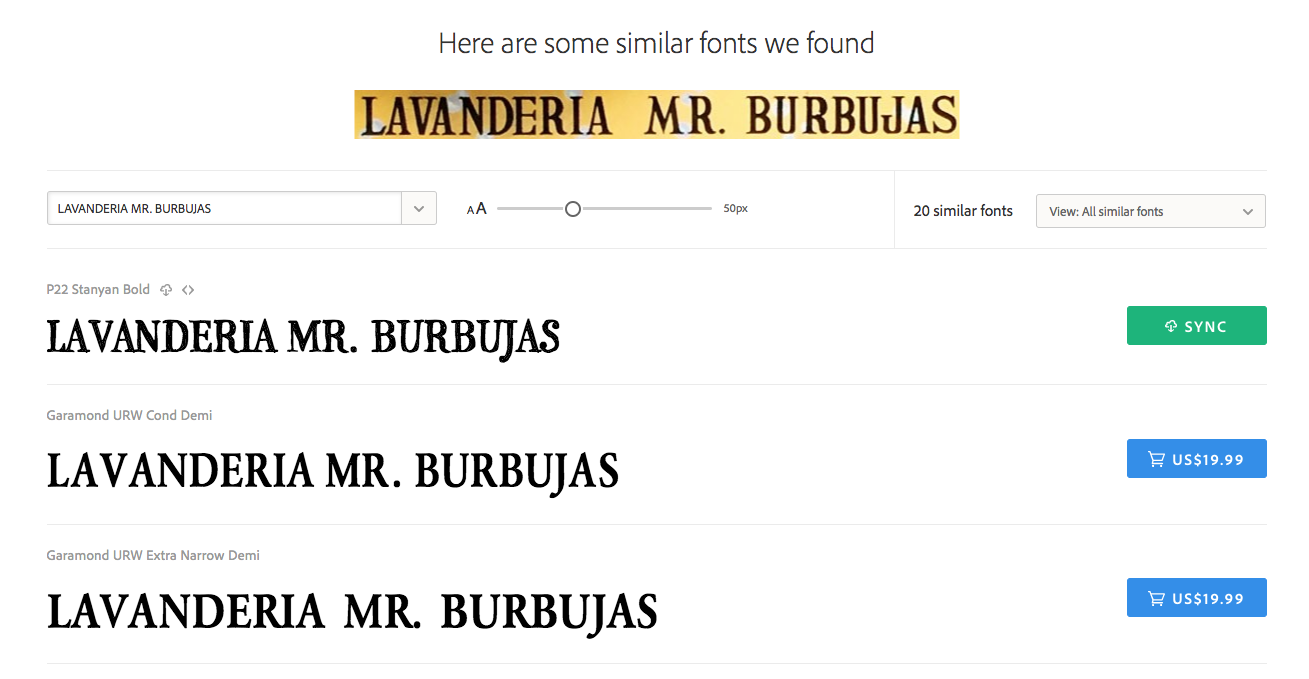
P22 Stanyan Bold, the very first result, sure did appear to be a close match to the sample text, but it seemed a little scratchier than I wanted; it seemed to be reflecting the texture of the sign more than the shape of the letters themselves. Many of the following results were similar to Garamond in style, definitely picking up on the prominent serifs.

Scrolling further down, the Duality family stood out to me; it seemed to have a little more clarity around the edges than Stanyan, but a similarly hand-drawn personality.
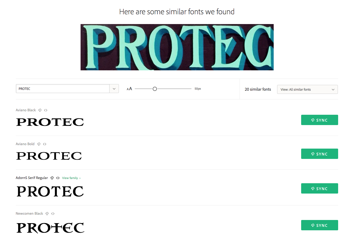
While the contrast between Aviano Black and the sample text does seem really close — as though drawn with the same pen, at nearly the same angle — the letter width is definitely not a match. Adorn Smooth Serif feels much closer in this sense, and I feel like the T is especially similar. I wish the O were a little narrower, though.
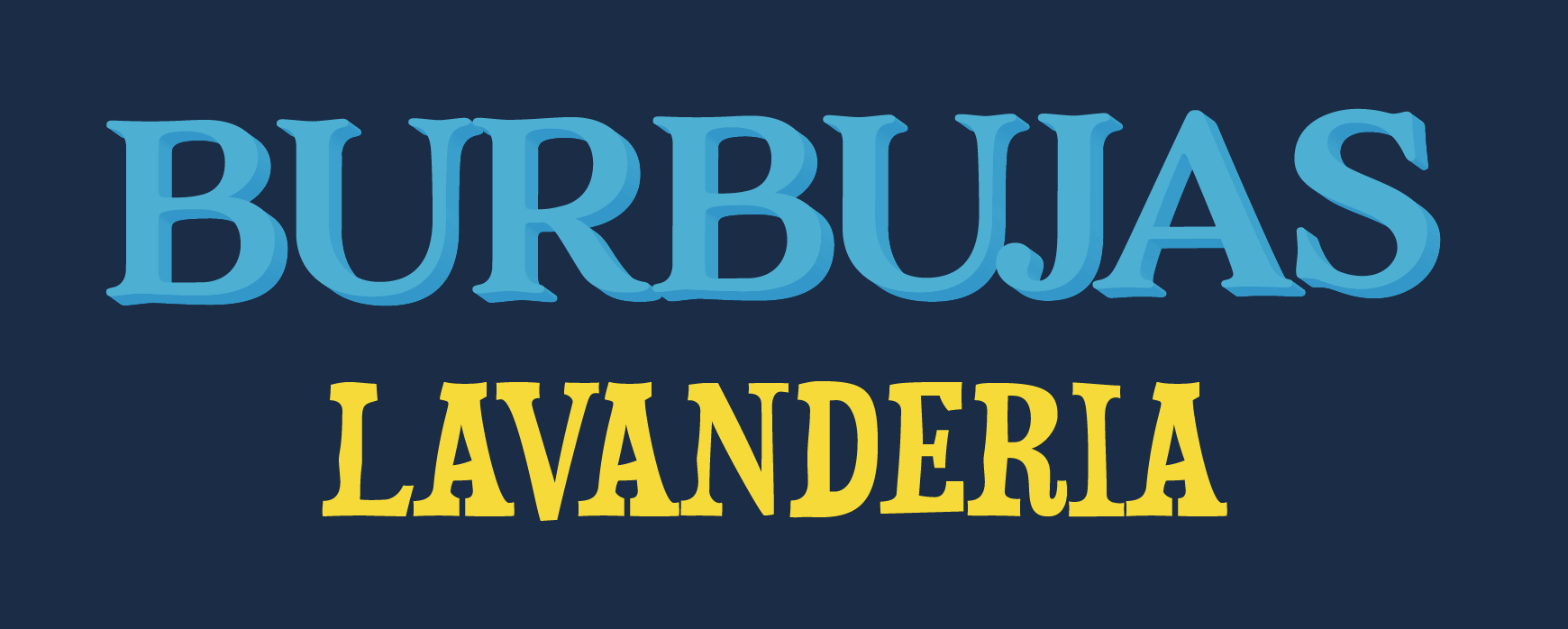
I shrank down the spacing considerably for Adorn Smooth here (BURBUJAS) in an attempt to get a slightly narrower feel to the text. I’m not all that experienced with 3D effects in type but had some fun playing around to see what I could do. I’m not sure this is ready for 24th Street, but as usual the visual search feature turned up type options I probably never would’ve thought to try out on my own.
Seen any neat type in the wild lately? If you snap a photo of it, try sending it through our visual search to see what’s similar in the Typekit library – and let us know what you find!