Sites We Like: Mixd & MVMT
Maybe vowels are a little ovrrtd. But even minimalist language requires type.
In fact, it might be even more crucial, especially for sites like these two where words are fairly sparse. And while both went in a similar typographic direction, subtle differences have a huge impact on what, in both cases, ends up being a successful design.
Mixd
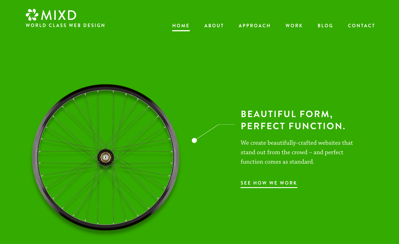
Web design studio Mixd uses classic geometric sans Brandon Grotesque beautifully, with generous spacing that makes each letter shine. Chaparral is a lovely choice for a companion typeface, and also works well with plenty of breathing room — appearing deliberate without any sense of heaviness.
MVMT Watches
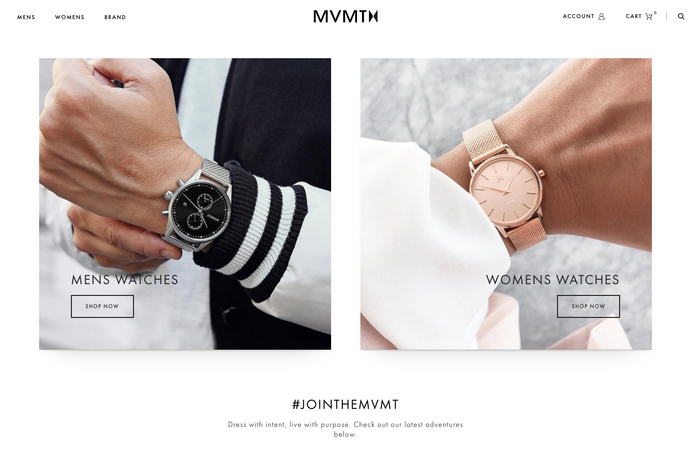
Another geometric sans is in play here on the MVMT website — Futura PT, which has a slightly sharper, more precise feel to it. Seems fitting for a website dedicated to timepieces, and thoughtful adjustments to size and weight make this a functional typeface throughout all the site navigation and body copy as well.
Seen some type in use lately that caught your eye? Let us know in the comments, or send us a heads-up on Twitter.
2 Responses
Comments are closed.
I live the concept behind MIXD. And the typography too of course! May I suggest my own site for your consideration?
usualhabitat.com
Thanks!
Maliha @ Usual Habitat
Yes, MiXD is awesome. That deep green color is very saturated and I’m loving it. It’s very simple but attractive though!