Sites We Like: The Morning News & iGNANT
Whether the content is long-form or in brief, or a mix of both, it takes a talented designer to pull together a page that invites readers to stay a while — and to check back often.
Both of these online publications do a great job with this, keeping the type in perfect balance with the overall aesthetic.
The Morning News
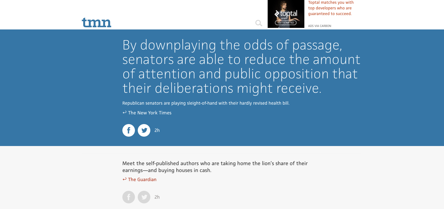
The Morning News features articles and essays by its own staff and contributors along a regular stream of headlines from publications across the web, with an understated page design that puts the content (and its readers) first.

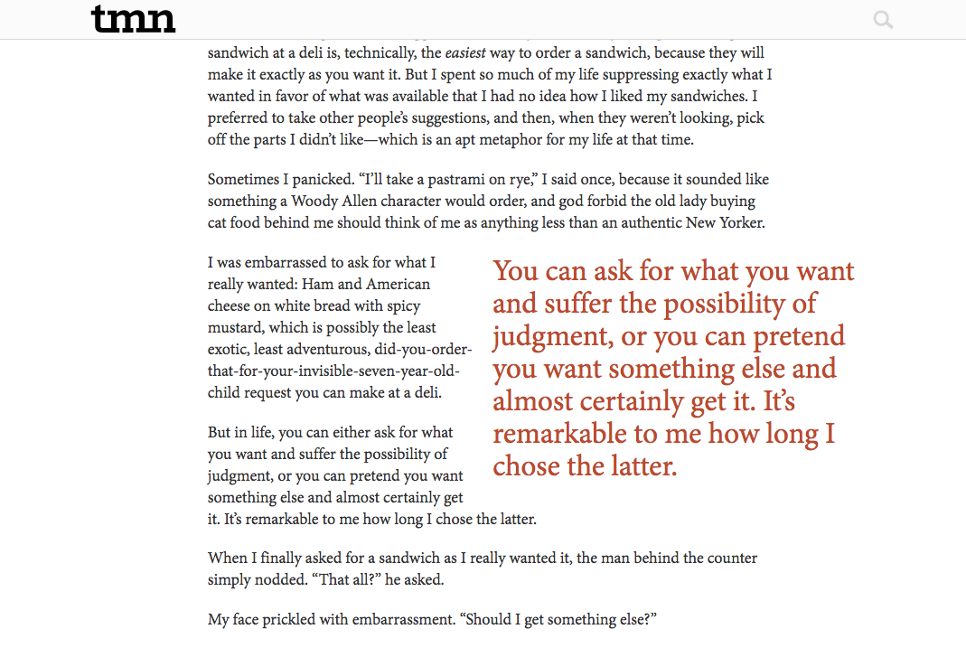
The sans-serif face used on the homepage and in navigation throughout is JAF Facit, with different weights in play to keep the page feeling vibrant. Compare block quotes to the headlines to see how the lighter weight has a voice completely distinct from the mid-range weights. Body text for the articles is set in Minion, a classic from Adobe for long-form text, and frequently spotted in book typesetting.

iGNANT
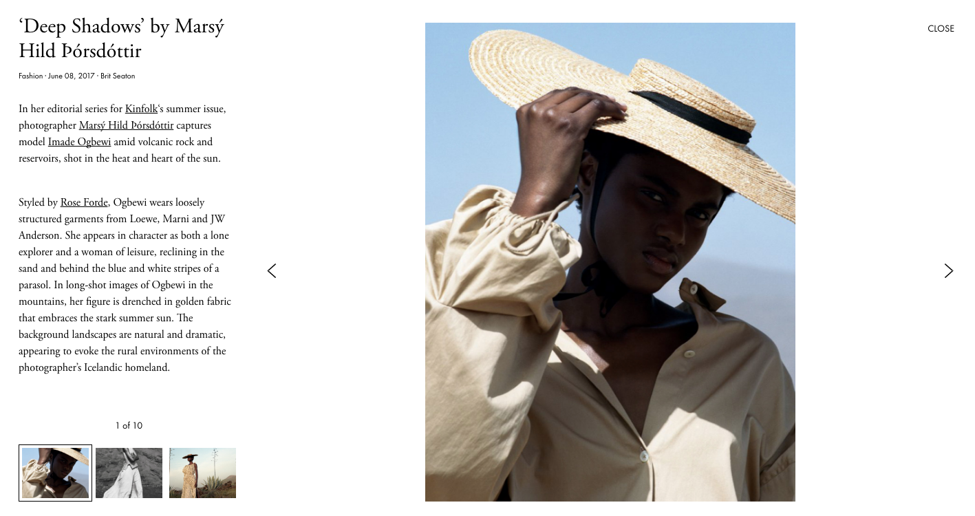
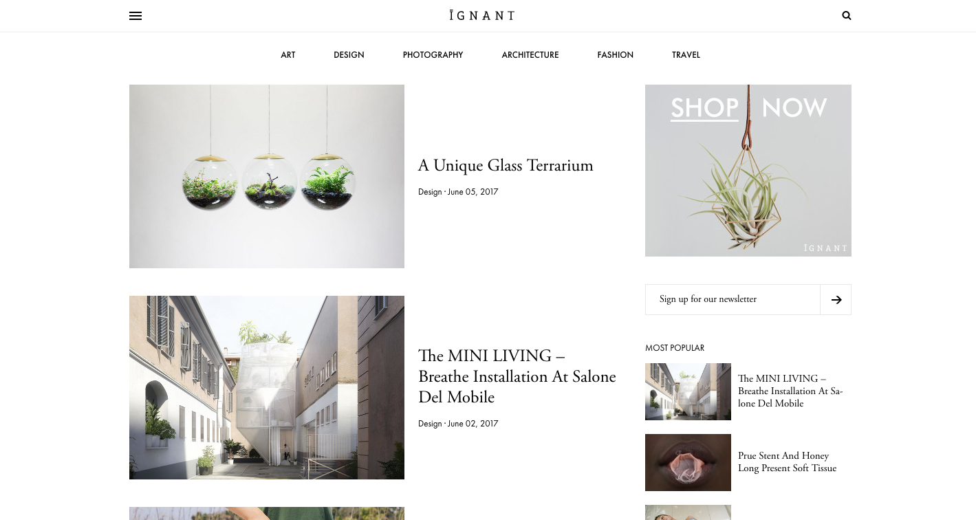
Devoted to art, fashion, design, and all things creative, iGNANT is a source of inspiration for people across virtually all artistic disciplines.

Navigation and subheads are set in Futura PT, which not only reads well at those small sizes but provides a lovely sense of balance on the page with its geometric forms. Shown large and proud in headlines and body text is Adobe Garamond, with generous line spacing giving an especially graceful feel to those tall ascenders.

That’s it for sites this time. Share sites you like in the comments!
2 Responses
Comments are closed.
I know this has almost nothing to do with this post but when are you going to be hosting Monotype fonts? It’s been a long time.
sweet sites guys