Sites We Like: Women’s March and Love & Victory
We never get tired of seeing the websites people put together with Squarespace, especially when they choose fonts from our library! Here are two sites we noticed — and we love what they’ve done here.
Women’s March

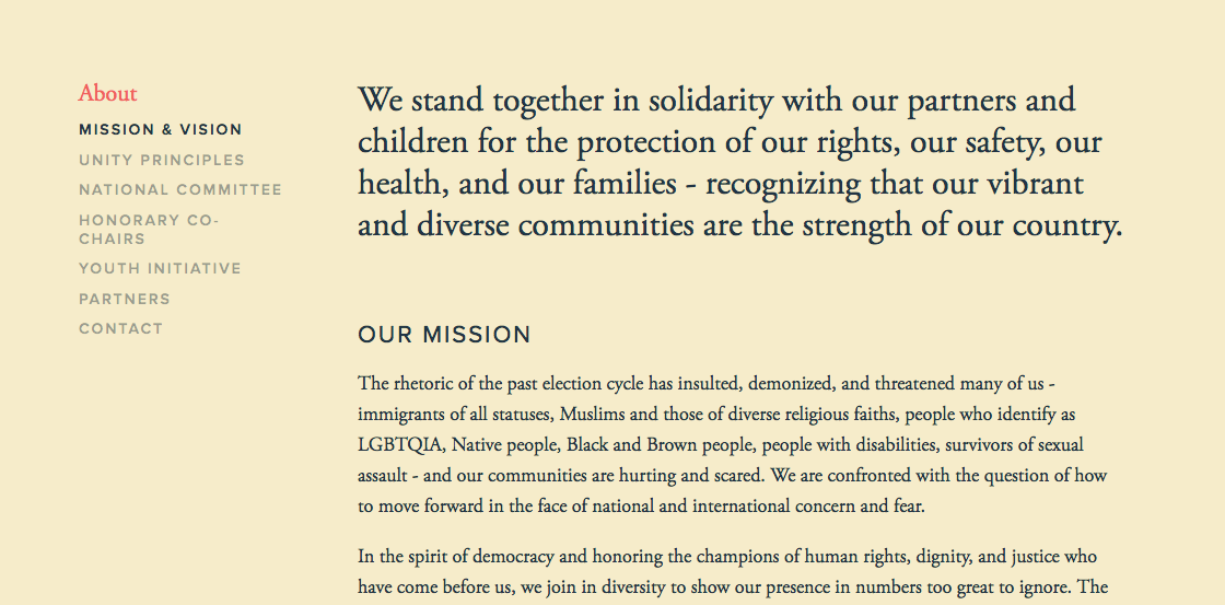
Proxima Nova is a great choice when you’re working with a lot of bold color blocks, as Women’s March does on their site. It’s a classic sans serif and popular for good reason — it’s almost impossible to make it hard to read. And clarity goes a long, long way for a site that aims to organize.
Body text is in Adobe Garamond, a serif with gorgeous tall ascenders and an easygoing style. It also has plenty of space to breathe on this page, which helps to showcase its personality.
Love & Victory

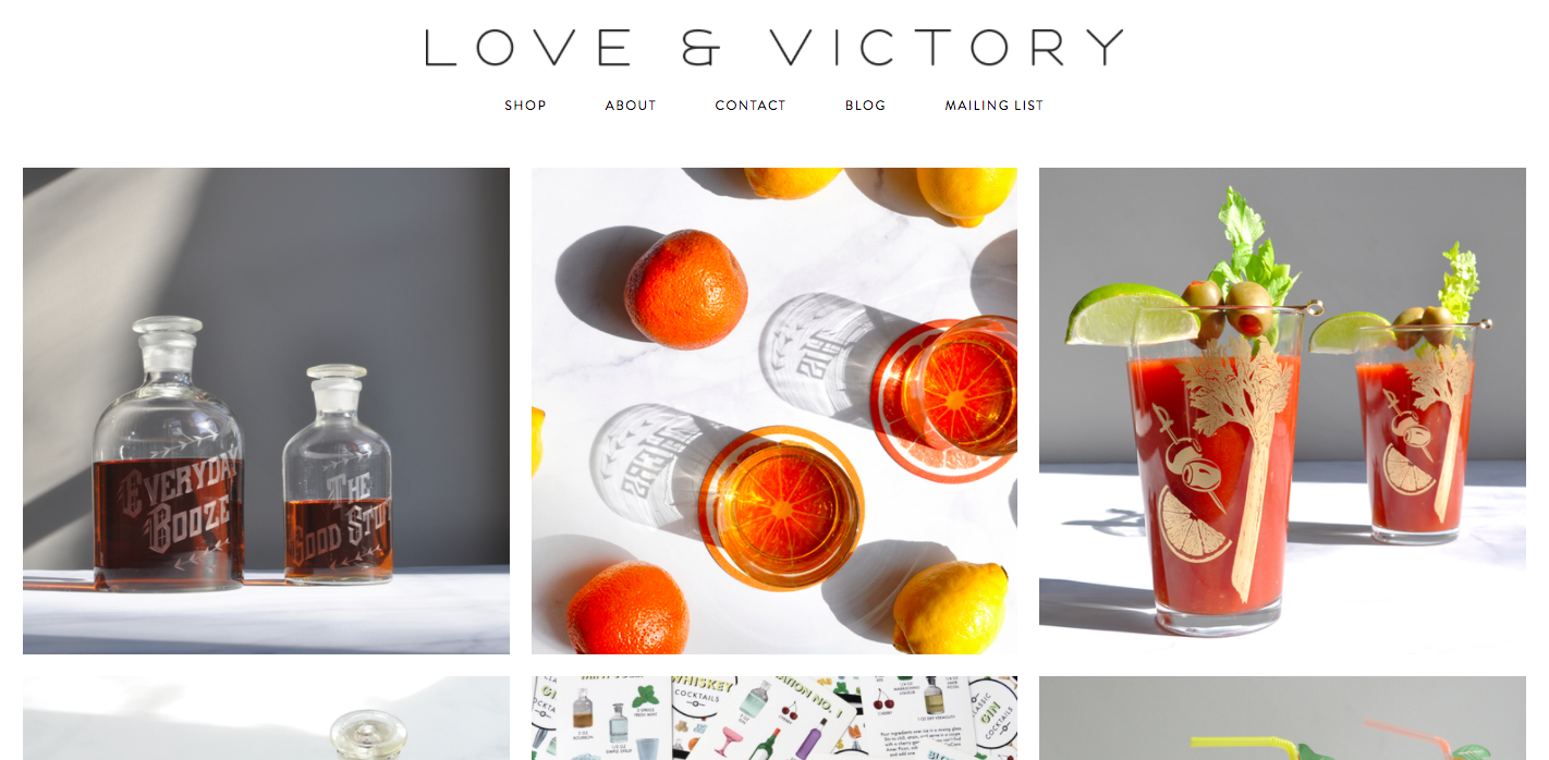
Love & Victory is a Brooklyn-based shop with a beautiful collection of items online — and evidently a decent bartender behind the camera. Most text is set in Brandon Grotesque, a graceful sans-serif that makes for light, breezy navigation (especially when set in all caps) and charming body text.
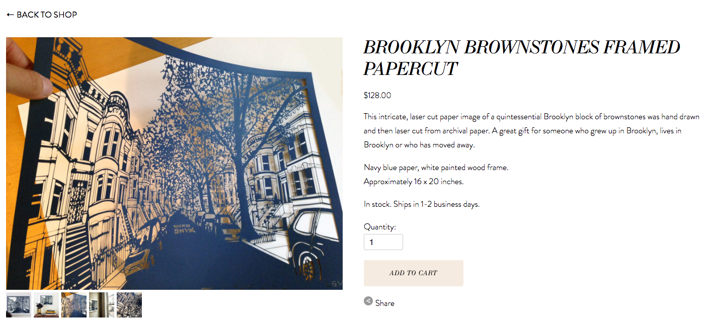
LTC Bodoni is used alternately for headings, and its high-contrast shapes draw the eye right away — especially due to being set in Italic, which adds to the energy overall.
Have you seen type you love on the web? Has a poster recently caught your eye? Seen any really funky ampersands lately? Send us submissions for Sites We Like — we’ll probably think it’s neat, too, and would love to see what stands out to you. Hit us up on Twitter, or leave a comment below.
2 Responses
Comments are closed.


Thanks for noticing our site! And Women’s March is great company to keep 😉
Good post! Keep it up