Introducing Source Serif 2.0
Version 2.0 of Source Serif is here! The work on this release has been a long time coming, and represents a major step forward. You can get this newest version of Source Serif from Typekit for web & sync, and its development files are available open source on Github.
What has changed?
If you are only using Source Serif to set texts in English, probably not much. But if you look behind the scenes, quite a lot!
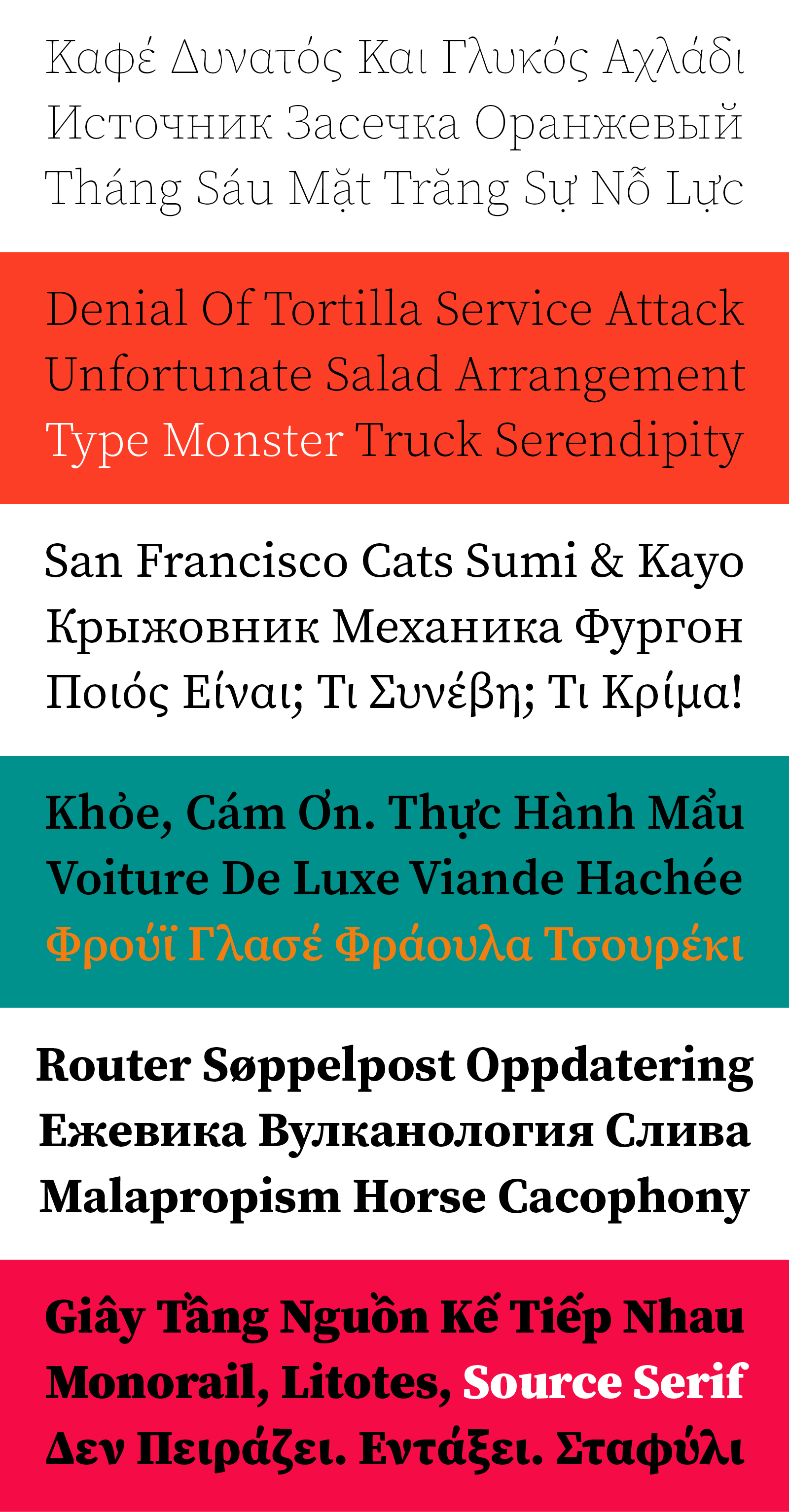
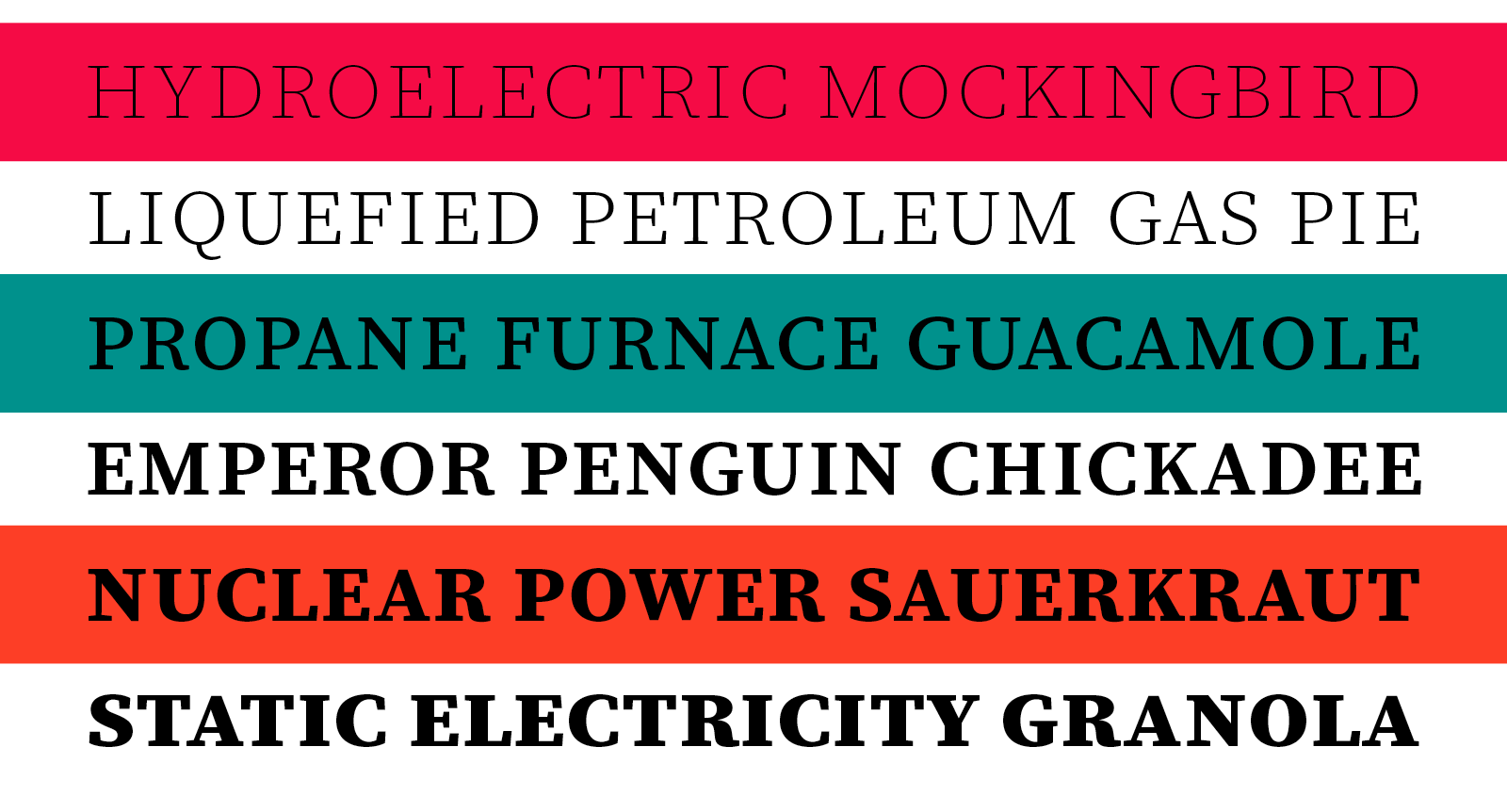
The most obvious update is the upgraded character set, which has grown from Adobe Latin 3 to Adobe Latin 4. What does this mean? Apart from roughly doubling the amount of characters, the result is broader language support. Source Serif is now capable of setting Azerbaijani (in Latin) as well as Esperanto, and can be used for Pinyin romanization of Chinese — and many more languages besides these. I am particularly proud of the added support for Vietnamese, a language seen everywhere in the San Francisco Bay Area.
Along with making a substantial expansion to the character set, version 2.0 includes several modifications to existing glyphs. In some cases, those stem from personal preference or dissatisfaction with existing shapes, while in other cases glyphs have been changed to better fit their surroundings — such as adapting the Greek to suit the context of running text, rather than standing as mathematical symbols.
The differences may not be obvious until compared directly: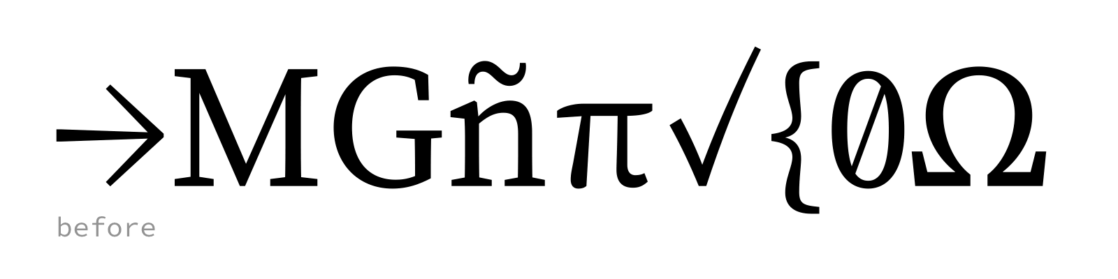
Greek & Cyrillic support
Version 2.0 of Source Serif introduces support for Cyrillic (more specifically, Adobe Cyrillic 2) and monotonic Greek (Adobe Greek 1).
Designing type for a non-native writing system is a challenge for any designer, and many issues are not obvious to an outsider. Often, there is a tendency to “latinize” additional writing systems in search of overall harmonization, which may kill the spirit of the addition. To better understand the requirements of foreign (to me) writing systems, and to steer clear of obvious mistakes, I enlisted the help of advisors.
For the Greek part of the family, I could count on the help of Gerry Leonidas. He coaches a number of type designers at the MATD in Reading every year, and has a good sense of what kinds of designs are needed for Greek today. I have to admit the Greek was not the easiest part of the family, because the shapes are just so different. Some of Gerry’s suggestions made me reconsider the overall design various times. In the end, I found a voice I liked — but not without going on a lot of detours. I made a short video to illustrate the form-finding process (see two years of work distilled down into 30 seconds!):
[vimeo 198824671 w=800 h=450]
To kickstart my work on the Cyrillic portion of the family, I attended one of Maxim Zhukov’s workshops at the Type Directors Club in New York, which brought students to the Bakhmeteff Archive of Russian and East European Culture at Butler Library. A very good immersion strategy!
After the two-day workshop, we resumed communication via email. Maxim has a very systematic reviewing style, going through a project glyph-by-glyph and explaining why a certain solution may be better in a specific, historical context.
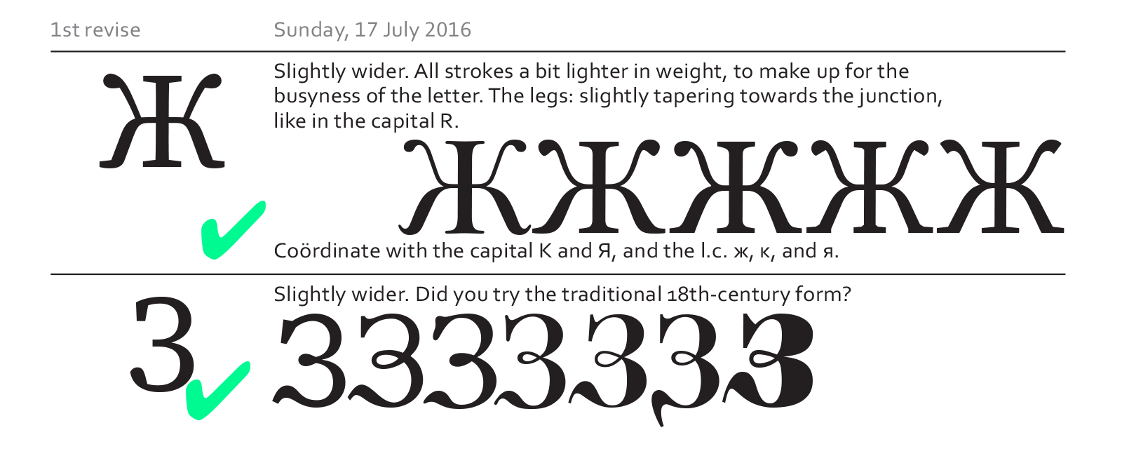
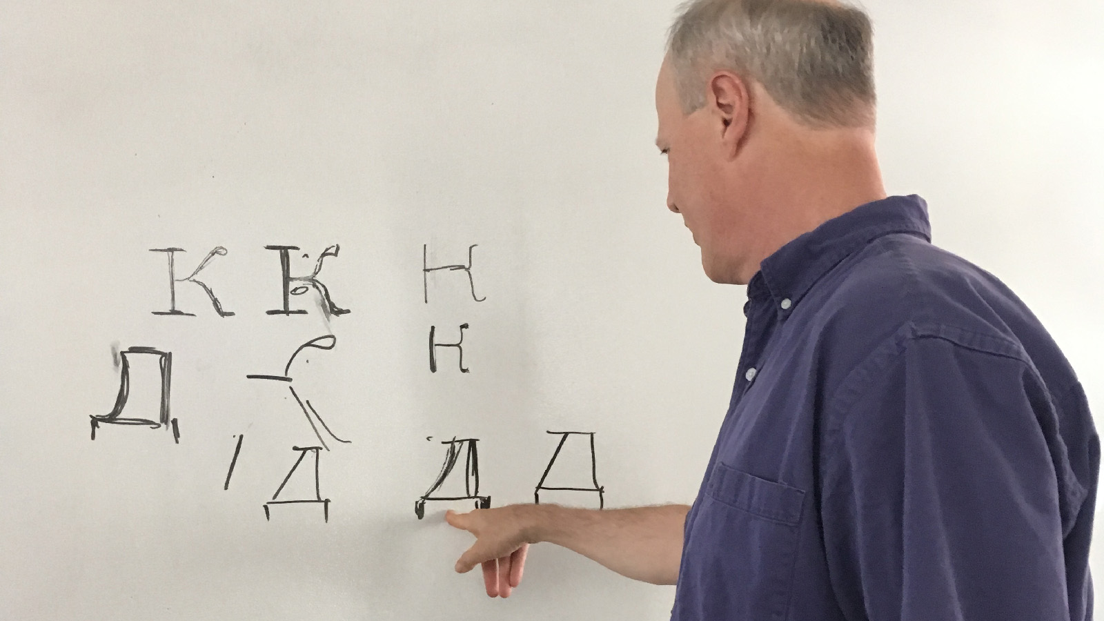
Typical example for a design evaluation from Maxim Zhukov.
On a visit to Moscow, I was able to to get more opinions on the Cyrillic design by sharing the project with Maria Doreuli, Irina Smirnova, and Ilya Ruderman, all Type & Media graduates. Those face-to-face reviews were very valuable, but the information retained was often limited by the speed of notation. I am glad they all took some time for an in-depth review after our meeting.
This process made me realize that tastes and reviewing styles differ widely — but I think of it as a positive thing. The diversity in opinion has allowed me to look at the design from different angles, and to better understand the requirements for a project like Source Serif.
Maria Doreuli’s review method: pen and paper.
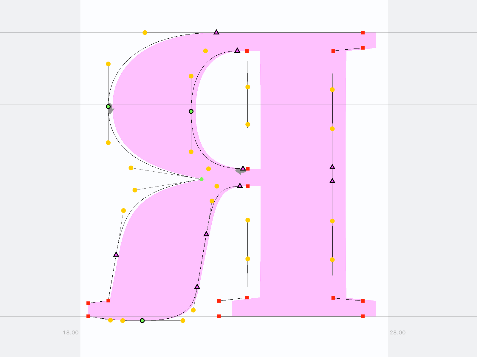
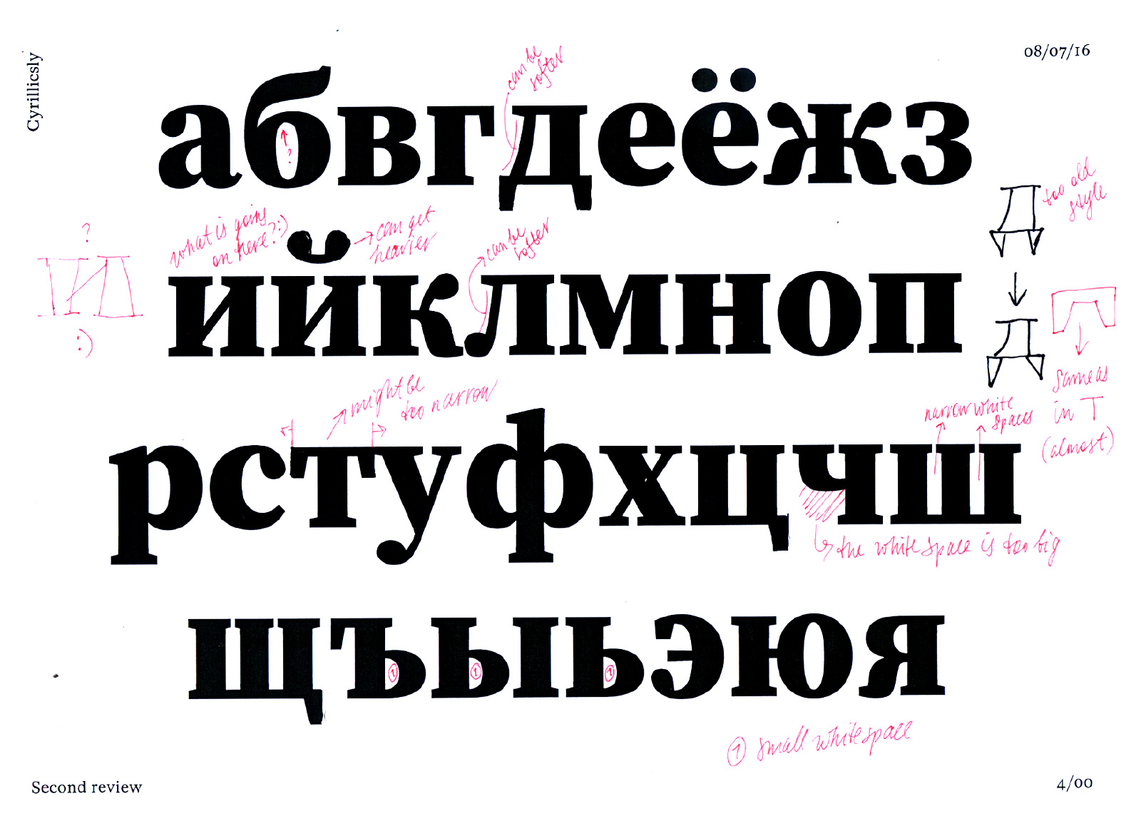
Ilya Ruderman likes to make changes straight in the font editor. The improvements he suggested are shown in the background (in pink).
Last but not least, indispensable help came from Robert Slimbach, who has collected lots of experience in designing many Greek and Cyrillic typefaces. Robert did not try to steer me in a certain direction, but he often helped me to organize my thoughts and unify competing design ideas.
Robert Slimbach in a design meeting
Making Source Serif Open Source
In the spirit of open source, all files used to create Source Serif are freely available. I did my best to keep the repository clean and organized, but I also did not take away any “secret ingredients”. The organization of the project represents the way we build fonts at Adobe today.
The font files for Source Serif can also be downloaded in a multitude of desktop and web formats (OTF, TTF, WOFF, WOFF2 and even EOT). Those may be used freely, according to the Open Font License.
Since Source Serif is on Github, users have a chance to comment on the project and suggest improvements. One user expressed a concern about missing superiors for uppercase letters, and I took the time to add them. I even added a pair of superior brackets – so full sentences in footnote references are now possible (as long as they aren’t accented). Who knows what’s next – perhaps an extension to AL-4.
Most other issues brought up on Github have been fixed with version 2.0, but one of them is a sore spot: the lack of Italics. Unfortunately this one cannot be closed yet, because the expansion of the upright styles took precedence. The good news, though: there has indeed been progress on the Italic part of the family. And as of today, my ongoing work on the Italic part of the family is public. Feel free to have a look!
Source Serif is not the only Open Source typeface from Adobe. In fact, it was drawn to harmonize with its companion Source Sans, which is a little older, and therefore several steps ahead in its development (it includes Italics, for example). The idea is to align the capabilities of both designs, so the addition of true small caps to Source Serif was a natural step. Small Caps can be used as a means of of emphasis, and are traditionally found in text faces, so they are a good addition.
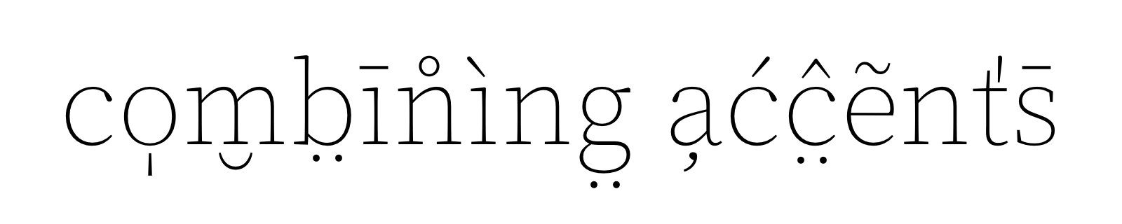
A final improvement worth mentioning is the added support for combining characters. This feature enables typing accented glyphs which may not be encoded in Unicode, but needed in a specific language. Since this is a somewhat experimental addition, please make sure to log any issues found.
I hope you enjoy working with Source Serif. I am looking forward to seeing it in the wild, perhaps even in Vietnamese!
8 Responses
Comments are closed.
A very welcome update. Naturally, I’m eager to see a companion italic, which will allow serious text use.
Very good news. Frank and Adobe deserve a big Thank You. Looking forward to the italic, of course.
Thanks for sharing the details of your process on this expanded version.
Very interesting ! Looking forward to italics too.
Yes! Guarani’s “g̃” works very well with the update. Thanks a lot!
But why, why you did not try traditional 18th cent. form of the Cyrillic ‘З’? LOL, those russians
Thank you for the insights. Great result! 👍 👏
👏👏👏👏👏 Very nice! Good post!! 👏👏👏👏👏