Emigre adds fonts to Typekit, plus an interview with Zuzana Licko
We’re always excited to announce additions to the Typekit library, and today’s new foundry partner is of especially historic importance in the world of digital type design and typesetting. Welcome, Emigre!
Emigre has been at the vanguard of digital type for over 30 years. In 1984, Rudy VanderLans and Zuzana Licko began publishing Emigre Magazine — Licko having just acquired her first Macintosh computer, which proved to be an important detail.
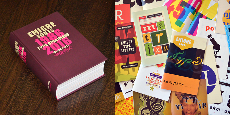
Emigre has just published a volume of their collected type specimens with Gingko Press.
Emigre Magazine quickly gained a reputation for publishing iconoclastic and high-spirited essays with intentionally challenging page layout and design. Licko designed bitmap fonts on her computer for use in the magazine.
The exposure resulted in growing requests to release the Emigre fonts for general purchase. By 1989, Licko and VanderLans had dropped their freelance work and were both full-time employees at their own company — which was by then unquestionably a type foundry as well.
Program, designed by Zuzana Licko in 2013.
This is an exciting addition to our library, and we were delighted when Zuzana Licko agreed to answer a few of our questions.
Working with font technology since the 1980s, you’ve seen a lot of shifts in the field. You’ve mentioned the role of the original restraints that personal computers put on design; can you say more about that?
ZL: Today, I’m not sure there are many technological constraints on type design. When Emigre started out, the technology was challenging; we had to figure out a lot of stuff with very primitive tools. And I thoroughly enjoyed these limitations. Paradoxically, working within constraints inspired more free exploration than working with today’s limitless possibilities. There was something to react against, a puzzle to solve, a problem to overcome, we had to reconsider basic assumptions. This lead to unusual forms that we might not have explored otherwise.
Having “something to react against” — is this still something you seek, in your work?
ZL: This happens unintentionally, so probably yes. Right now I am experimenting with ceramics. I’m using font software to create sketches for my ceramic sculptures, which exist of modular elements. Each sculpture has a variety of shapes that can be combined to make different sculptures. The font software helps me go through the possible variations. Perhaps my focusing on a physical medium is a reaction against everything being consumed digitally these days.
How do you think your typefaces would look if you were just starting today, with a different set of technological constraints?
ZL: Today, the situation is very different. The tools are there to create anything, which is an entirely different challenge. So, it’s difficult to predict my direction, if my career was starting today.
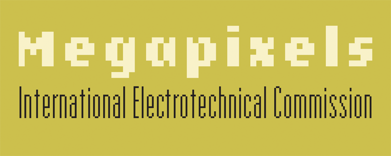
Lo-Res, designed by Zuzana Licko in 1985 and 2001.
Do you feel that any particular typefaces are especially representative of Emigre in general?
ZL: Each of our font families exudes a certain quality that is either tied to the technology of the time, the level of craftsmanship of the designer, or the prevailing esthetic preferences of the time. Because the Emigre library developed over the past 30 years, alongside and in reaction to evolving technologies, each typeface is like a snapshot in time.
Some Emigre fonts are tied to the period in which they were designed, like our low resolution fonts. Some actually came to define their era like Template Gothic, and possibly will always be associated with that time. So perhaps it’s not so much a particular typeface that’s representative, it’s the mindset, the process, that’s representative.
Can you say a little more about that mindset? How would you explain it?
ZL: The mindset is informed by the all the external influences, and the experiences; lessons learned from creating past work. This changes the mindset over time. So, the resulting work will change; the same design brief will yield a different design result, at different points in time.
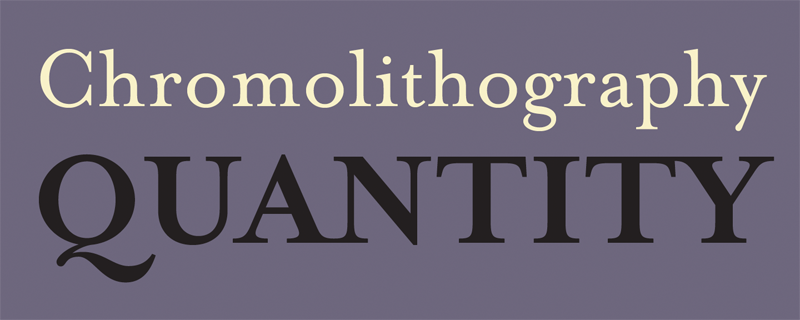
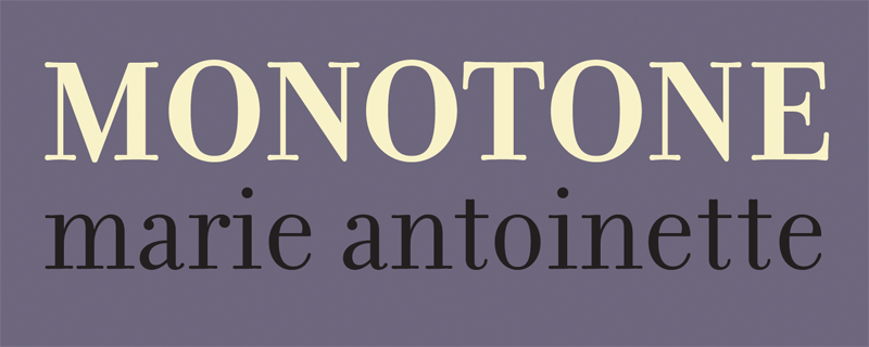
Mrs Eaves, designed by Zuzana Licko in 1996.
Filosofia, designed by Zuzana Licko in 1996.
When you’re working on historic revivals, do you find yourself considering the limitations the technology that would’ve been at the disposal of the original designers, or do you focus more on the aesthetic style of their output?
ZL: I did not intend to follow any specific model. Instead, I wanted to capture the warmth of the original printed samples, while creating an updated version that would be appropriate for digital technology, and that would address my personal preference for lower contrast. This was the approach I took for both of my revivals, Mrs Eaves (from Baskerville) and Filosofia (from Bodoni).
I aimed to distill an overall look from the qualities of the various printed samples. Then, I set out to draw the letterforms “from memory” so to speak. I let the impression and memory of the printed samples I had studied guide my design. Drawing “from memory” was suggested to me by Erik Spiekermann, which I thought was a great idea.
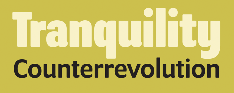
Variex, designed by Rudy VanderLans and Zuzana Licko in 1988.
Where do you draw most of your creative energy from?
ZL: Inspiration for the various designs emerged as the technology changed, or new software or hardware became available. Many of the designs were inspired by asking: “what if…”
For example, with Oblong, the goal was to make a bitmap design that did not show “jaggies.” So this design has no diagonals or curves, only right angles. Similarly, Journal has no curves, they are approximated by segments of straight lines. Totally Gothic started as an experiment with auto tracing. The Base families explored the proportions of the various bitmap masters. Variex was conceived as a stroke design; each character is defined by center-lines of uniform weight, so the x-height varies among the three different weights.
Base 900, designed by Zuzana Licko in 2010.
Are you ever tempted to revisit one of your typefaces from several years back with the technology you have today? In other words, to re-run an experiment under new conditions?
ZL: An example of this is Base 900, which is a spin-off of Base 9. Because of the rigid constraints set for Base 9 by the bitmap grid, there were certain nuances that could not be expressed. Later, I set out to explore this with the Base 900 fonts which still convey a modular, geometric style, reminiscent of the early computer technology era, but with an updated, more refined look made possible by a high resolution grid.
Mr Eaves XL, designed by Zuzana Licko in 2009.
Rudy wrote a reflection in 1998 on how the layout design of Emigre magazine was becoming less expressive as he gained confidence in the quality of the writing. Was there a concurrent shift in Emigre’s type design around this time too?
ZL: By then, font technology and font creation programs had greatly improved, and my skills as a type designer had also evolved. This created an opportunity to design fonts for text application, and this happened to coincide with Emigre magazine’s publishing of longer articles.
Around this time, a new generation of skilled type designers started entering the field, graduates from the recently created or expanded digital type education and training programs. This trend contributed to our release of designs with wide applicability such as Mrs Eaves XL, Mr Eaves, Vista, Base 900, Cardea, and Alda.
Fairplex, designed by Zuzana Licko in 2002.
When you wrote about the design of Fairplex, you said you were inspired to create a text face that was less heavily contrasted since you’d found you were running into reading issues yourself. Has reading experience influenced your designs in general?
ZL: My preference for reading low contrast type continues today, especially with my aging eyesight. Funny thing is, as my eyesight has gotten worse, reading has actually gotten easier, because I pay less attention to the details of letter shapes because I can’t see them as easily, so this is no longer a distraction. When I was younger, I found it difficult to concentrate on reading because I would constantly zoom in on the letter shape details.
Have you ever encountered one of your own typefaces used in a way that surprised you?
ZL: The most surprising encounter was a few years ago when I was reading a text printed quite large on a wall at the Jewish Museum in San Francisco. The text was about the work of Maira Kalman, and I found myself quite absorbed in the writing before I realized I was reading Mr Eaves, a typeface I had just released. I’m not sure what that means, but it surprised me.
Thanks to Zuzana for taking time to share this with us! If you haven’t already, get over to the Emigre page on Typekit to check out their collection for yourself. All fonts from Emigre are available for web and sync use.
12 Responses
Comments are closed.
153 font families and everything is available for desktop and web! I’m floored. Thank you all so much for making this happen!
WOO Amazing !!
WOW Thanks a lot!
Very exciting!
That’s really cool!! Thank you a lot!!
This is great, but will Filosofia Italic be included?
Brilliant news. Thanks.
Thanks, Typekit! This is huge!!
A dream comes true! Thank you very much!
WOO!
WOW! Awesome!
Awesome! Such good news!