New fonts on Typekit from Device Fonts
We’re adding 24 new families to the library — all from a new foundry partner we’re delighted to work with. Rian Hughes of Device Fonts is a British graphic and type designer who got his start in the world of comics.
Rian’s illustration background shines through in his typefaces, resulting in some very fun designs that we are excited to offer on Typekit. Visit the Device Fonts foundry page for the full list.
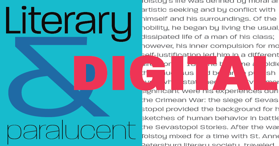
Paralucent
Paralucent follows the basic model of a grotesque family, but its unique forms make it stand out among its counterparts. It turns out that something can be square and round, playful and sturdy, legible and unique — all at the same time. We’ve also added the Condensed, Stencil, and Text versions.
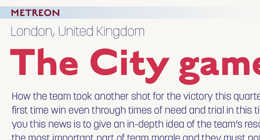
English Grotesque & Korolev
English Grotesque is wholly British, evoking aspects of early 20th century sans serifs. Its round, almost bulging forms — most exemplified by the capital C and G — make it unique and fun to use. It works particularly well at large sizes, while it is still functional for text.
The sans serif Korolev family feels modern, even though it is based on lettering from Soviet propaganda displays in the 1930s. We’ve added the full Korolev super family, which includes Condensed, Compressed, and Military Stencil.

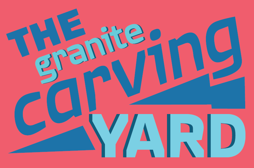
Quagmire
Quagmire’s chiseled forms are striking at large sizes. Although it is mostly made up of straight lines, they are often cut off with a subtle slant, its direction changing for every letter. This helps to retain a quirky and endearing quality. Check out the Extended version as well.
All families from Device Fonts are available for web and sync. We can’t wait to see where you use them!
One Response
Comments are closed.


Hahah a font named after Quagmire – and it suits him so much! Loved all the new fonts! 🙂