Choosing type for cover images
Sometimes the blank canvas is overwhelming. Getting started on a design takes some time. Many website templates help you out a little with this by proposing a simple (and often beautiful) formula: one full-screen cover image, and one big text headline.
This is a great way to make a bold front page for your site, and the question of its tone is still entirely up to you. How do you choose the type that you pair with a cover image?
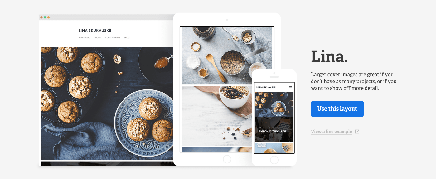
The cover image approach pairs big images with headlines, like in the Lina template from Adobe Portfolio.
We played around with this a little here at the Typekit office, just to see what we’d come up with if we started with images from Adobe Stock and thought of the ideal display typefaces to layer on top of them. I set a simple rule: the only text we’d use would be the short phrase, “Summer 2016.”
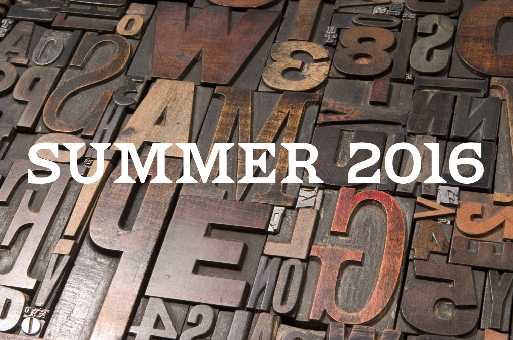
We sampled through the Hamilton Wood Type collection for this one, and most liked the look of Van Lanen by Matthew Carter. It fits right in with all the wood block behind it (after all, Carter literally cut this design into wood before digitizing it), but feels more intentional — it’s less a tribute than an experiment. We like it that way.
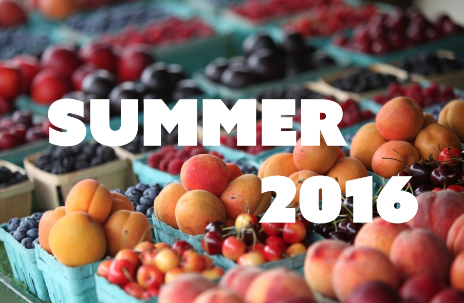
At first we thought a graceful script might do well over these bright, slightly blurry fruits, but we underestimated the power of fresh produce. The vibrant color and diagonal blur line ended up overpowering a number of more fragile typefaces, so we ended up going head-to-head with the image’s energy by choosing Azo Sans from Rui Abreu. Tight, tiny counters — not even a blueberry’s gonna get through those — and there’s a zing of extra energy from the sharp corners.
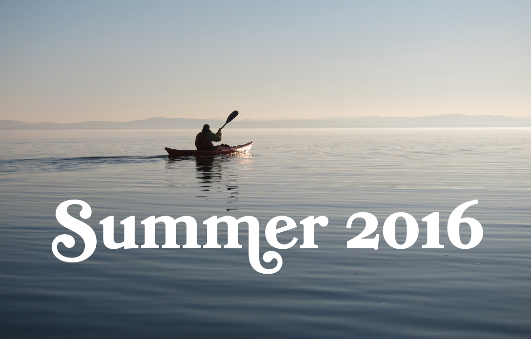
We played a little with scripts on this serene image as well, but found that we liked the way Bookmania‘s serifs helped to anchor the text — plus, it’s a fun typeface if you like to play around with swashes and alternates. It gives the composition a slightly nostalgic feel, and that’s fine with us for this experiment — but you could change the tone entirely with a different choice.
All the images we played with are from Adobe Stock, whose collection has millions of royalty-free photos, videos, illustrations, and graphics. If you use a lot of stock images in your work, their subscription plan might be a great deal for you — or you can also buy single images. Have a look at their catalog for some ideas. (And if you make something cool with type, let us know!)