New fonts from Rosetta Type: Skolar Sans, Aisha, and more
We are delighted to announce a number of new additions to the Typekit Library from Rosetta Type. Headed up by David Březina, designer of the popular typeface Skolar, Rosetta Type specializes in designing for a diverse, extensive range of languages. Their designs offer beautiful stylistic consistency across Latin and non-Latin characters in each typeface.
While Typekit continues to work toward bringing better, more performant multi-script language support to the web, we are happy for now to offer the Latin versions of a number of families, for both web and Creative Cloud font sync.
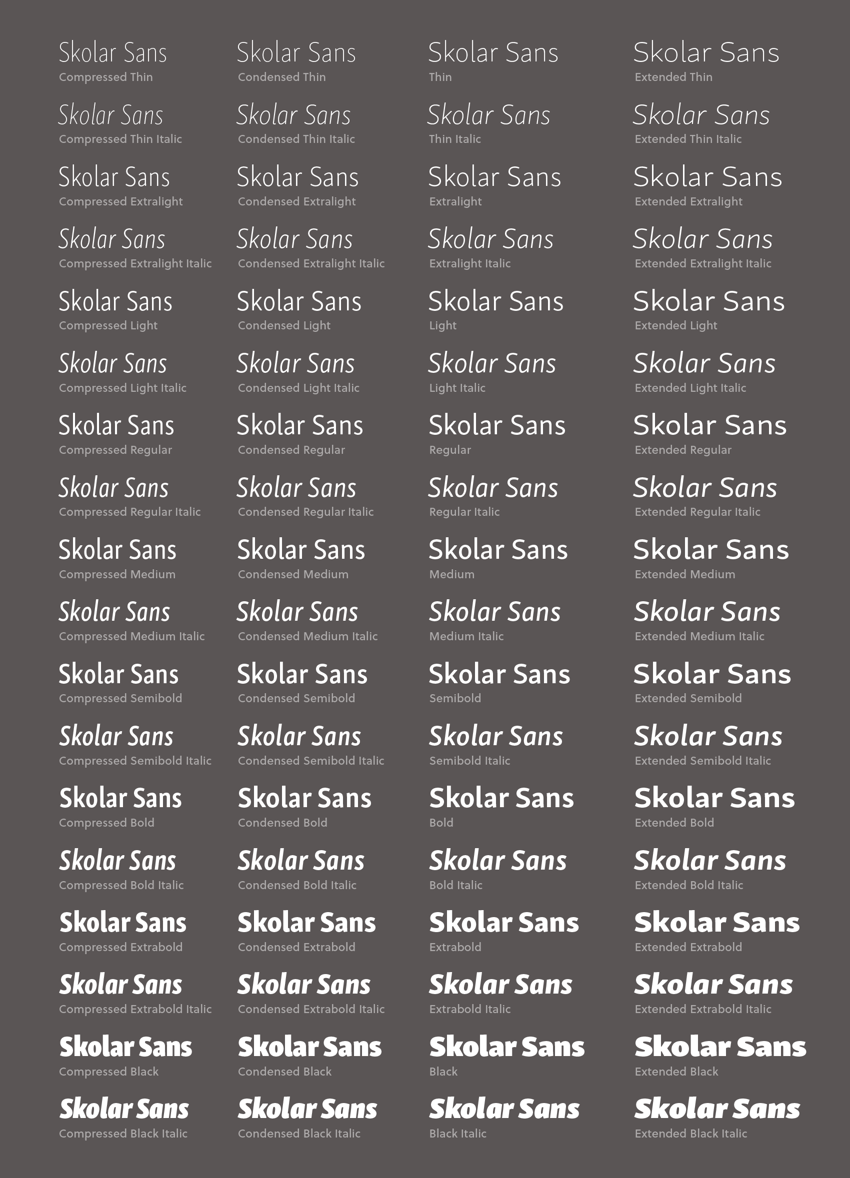
Skolar Sans is the sibling to the seriffed Skolar, a longtime go-to for Typekit users. With nine weights, four widths, and italics for all, the super-family weighs in at 72 fonts in total. Březina, along with co-designer Sláva Jevčinová, designed Skolar Sans based on its serif sibling’s skeleton, intending for the two to “play well” together, but at the same time designing Skolar Sans to stand on its own as a versatile workhorse. Each style contains small caps, discretionary ligatures, and a number of other OpenType features.
Speaking of the non-sans Skolar: with this release we will be replacing our current offering, Skolar Web, with the new and improved (and feature-packed) Skolar Latin. If you have already published a kit with Skolar Web, don’t worry — it will continue to work until you edit your kit. If you’ve been waiting to use Skolar small caps, add it to your kit now and be sure to check OpenType features in the kit editor.
Also note that the default numerals of Skolar Web are old style (or “lowercase”) figures, while Skolar Latin contains proportional lining (or “uppercase”) figures. To use old style numerals in Skolar Latin, you will need to enable them via OpenType features.

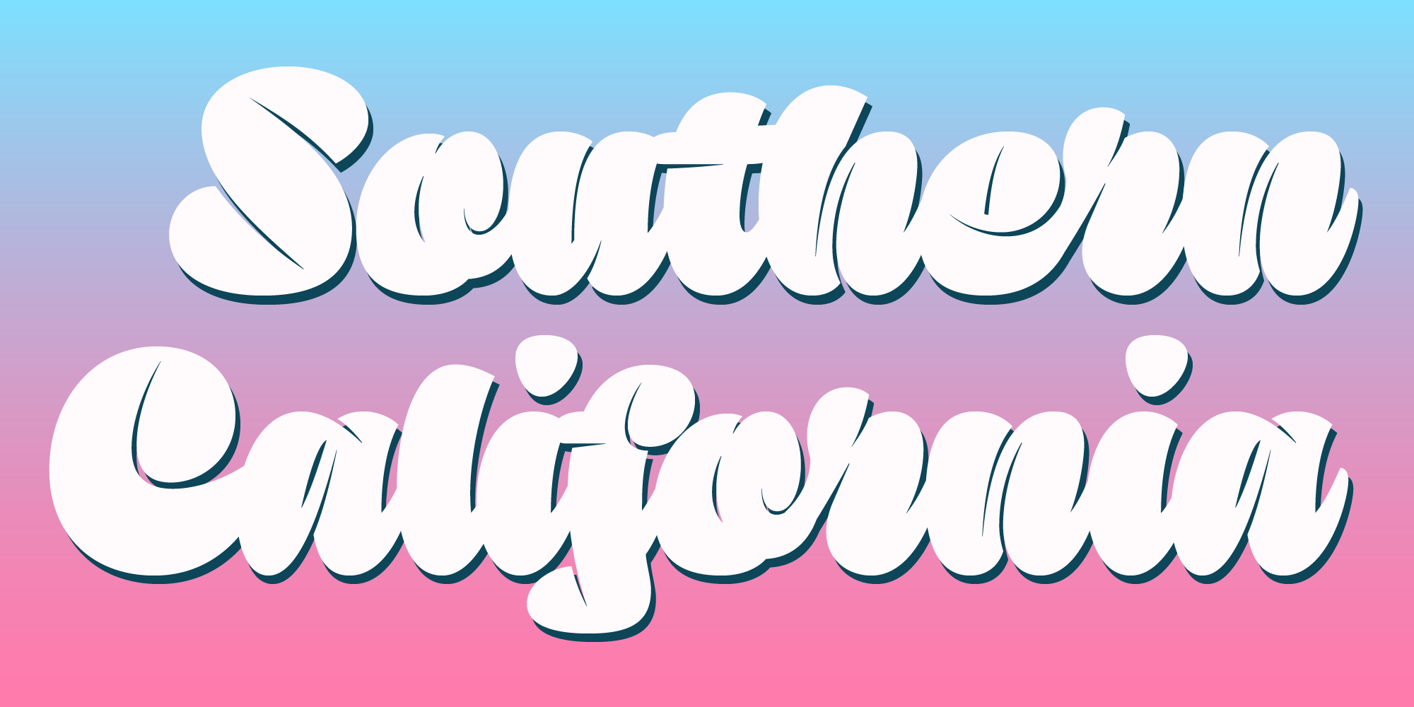
The bouncy and bountiful Sutturah, designed by Octavio Pardo, is a unique change-of-pace display script — heavy throughout, with the narrowest of counters, with strokes that are almost three-dimensional in how they overlap. In short: Have fun!

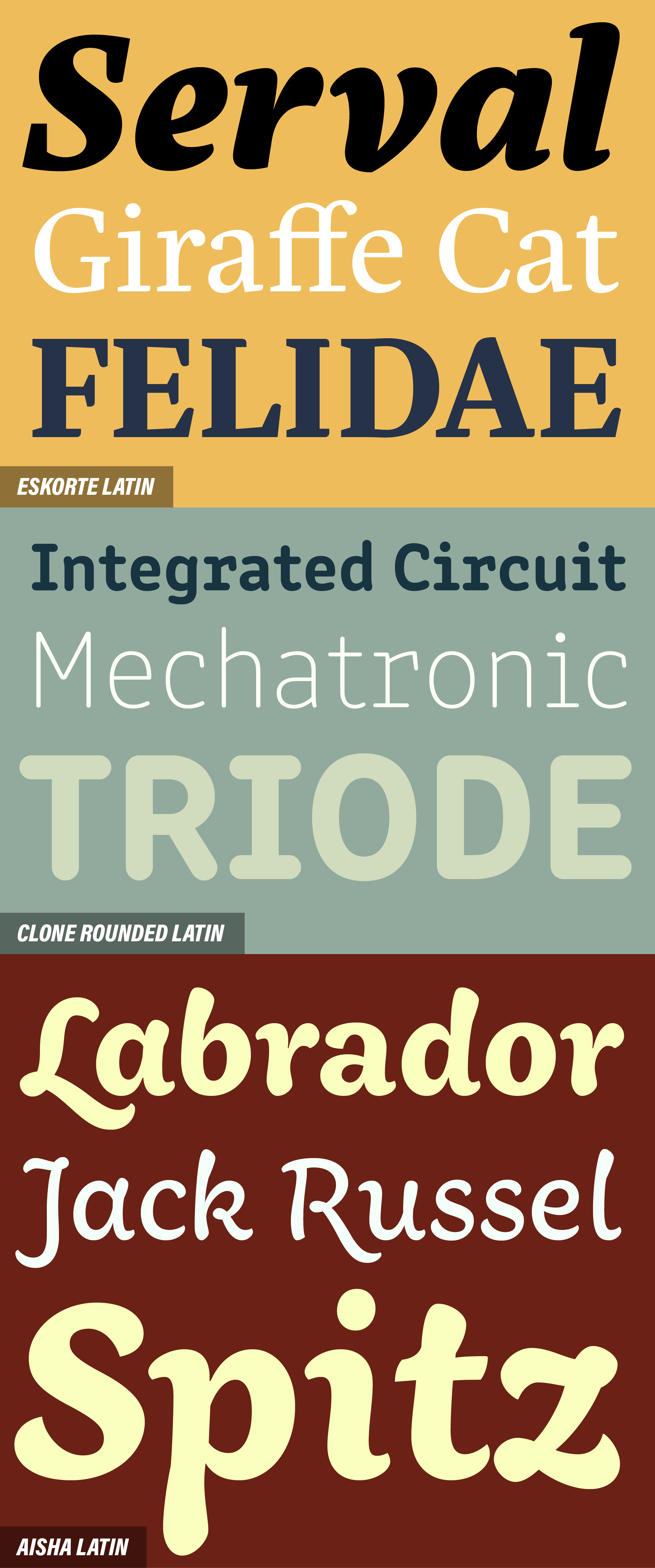
And there’s more! Here are Eskorte, Clone Rounded, and Aisha — great designs with different purposes.
Eskorte, designed by Elena Schneider, is a straight-laced contemporary serif, with a livelier italic that pairs well with its Arabic character set.
Lasko Dzurovski’s Clone is a stylized faux monospace typeface that helps tell a story about technology and code without sacrificing the familiar flow and feel of a proportionally spaced design.
Finally, the Latin version of Aisha was somewhat atypically designed as a complement to the Arabic design, rather than vice versa; the designer Titus Nemeth drew inspiration from Moroccan hand lettering and Maghribi calligraphy.
With this Library update, all Rosetta families — with the exception of Skolar Latin — are available for both web and sync for Creative Cloud and Typekit subscribers with Portfolio plans and above.
[Editor’s note: The original publication omitted Sláva Jevčinová as co-designer of Skolar Sans. This post has been updated to correct that error.]
