Sites We Like: The Baffler & Seven Brief Lessons on Physics
We’re deep into winter now (although the days are getting longer!), which makes this a great time for some reading — and to study what makes a nice reading experience. We thought these two sites got a lot of it right.
The Baffler
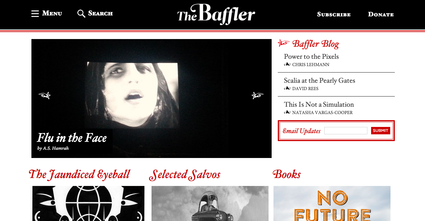
With an enlightening mix of nonfiction, stories, and poetry, The Baffler does all these literary forms justice by setting them in Minion — a classic serif with a surprising degree of flexibility for its sturdiness. Most of the site content is set in varying weights and sizes of the serif, with Proxima Nova as a very occasional sans-serif alternate.
Seven Brief Lessons On Physics
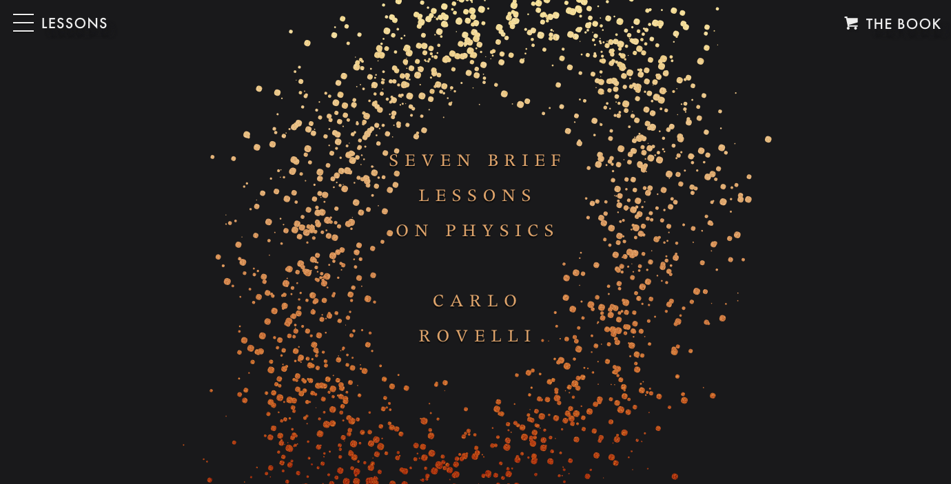
Serving up Futura PT for the navigation and Adrian Frutiger’s lovely Apollo for the body text, Seven Brief Lessons on Physics is an entrancing introduction to Carlo Rovelli’s book by the same name.
That’s it for this week; share sites you like in the comments!
2 Responses
Comments are closed.
I’ve always had a bit of a crush on my friend Erynn’s portfolio site. 🙂 http://www.erynnalice.com/
a classic serif with a surprising degree of flexibility for its sturdiness.