Sites We Love from 2015
Huh, 2016 already? That’ll take some getting used to. In the meantime, we’d like to take a moment and look back at some of the sites we found most inspiring over the past year. See if one of your favorites made the list!
Five Simple Steps
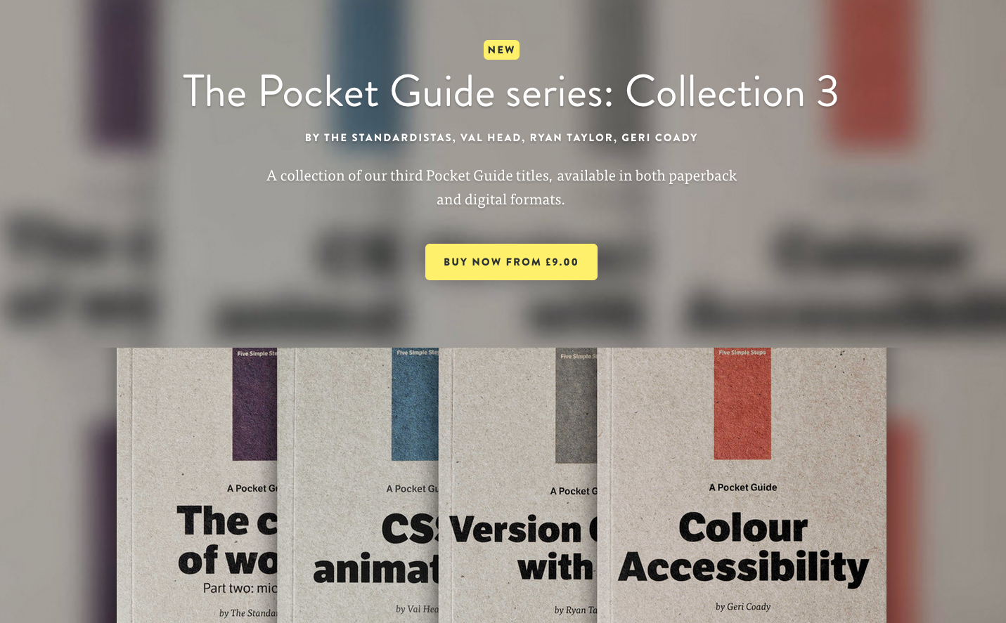
Brandon Grotesque with FF Tisa on the Five Simple Steps website. (From February 27.)
This Week’s Playlist
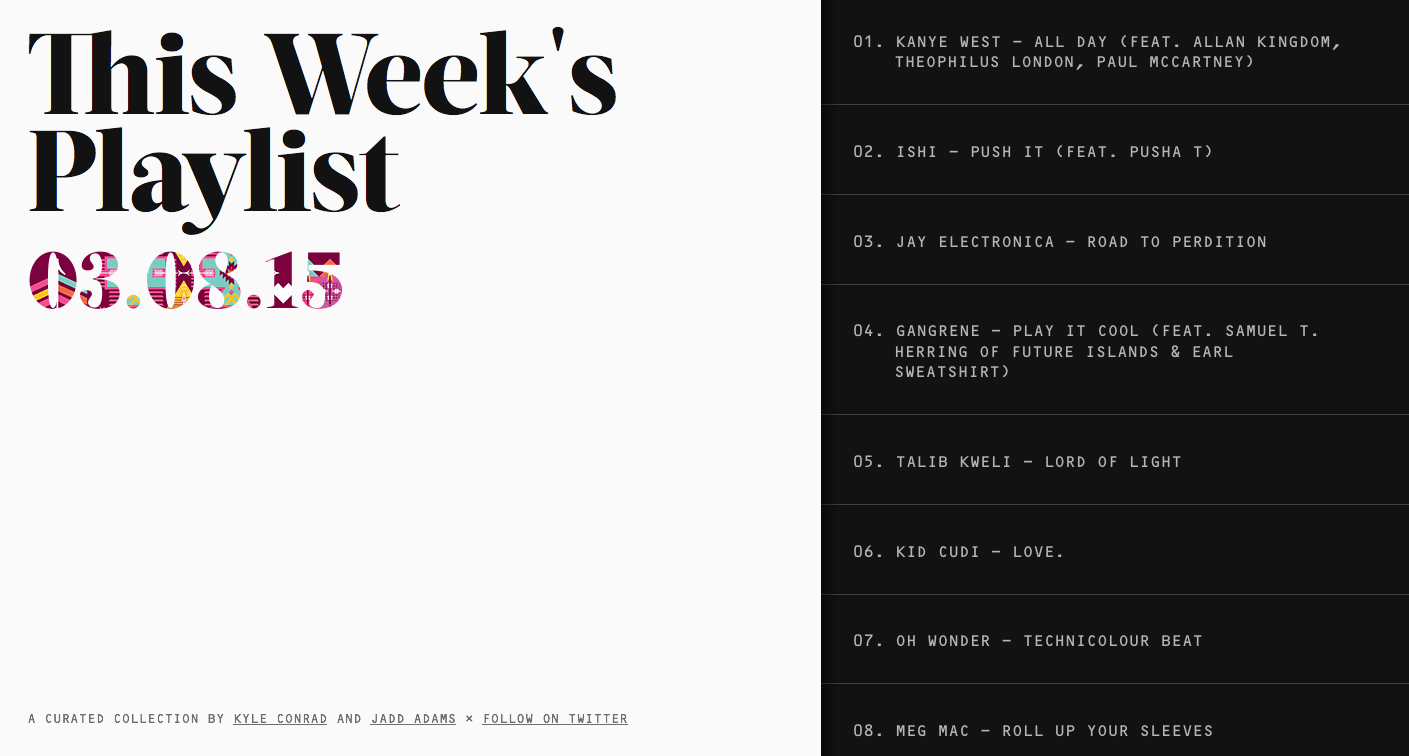
The tunes are still spinning over on This Week’s Playlist, featuring Acta Display and OCR-B. (From March 13.)
Thoughtbot
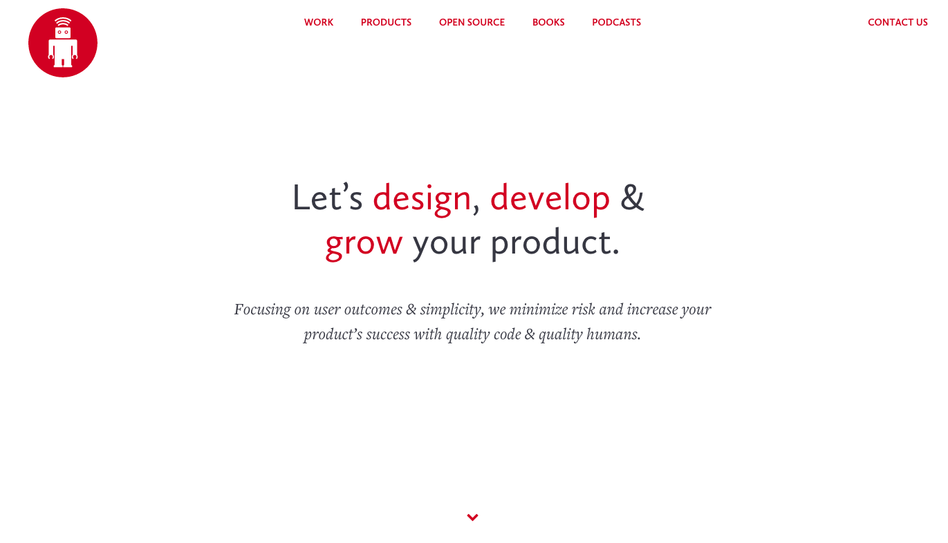
Lovely Calluna Sans headers, Freight Text body copy, and a tiny bit of Courier Prime on the Thoughtbot website. (From August 7.)
Tools and Toys
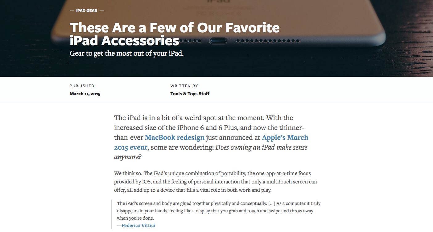
Tools & Toys balances Freight Text in the body copy with Freight Sans in the headings. (From March 13.)
Maptote
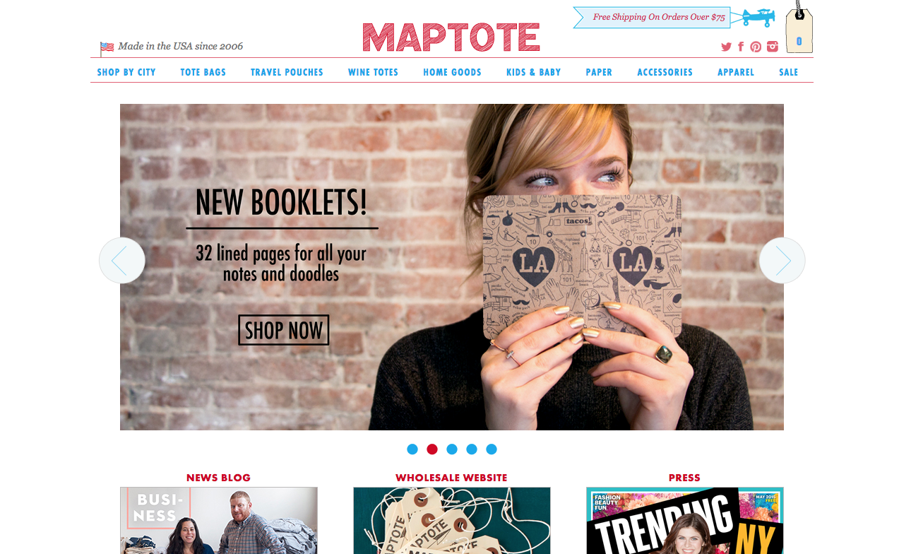
Maptote uses Futura PT Condensed in its headers, with regular-width Futura PT in the subheads and Museo Slab for body text — and Museo Sans for small footer text throughout. (From July 3.)
Type Detail
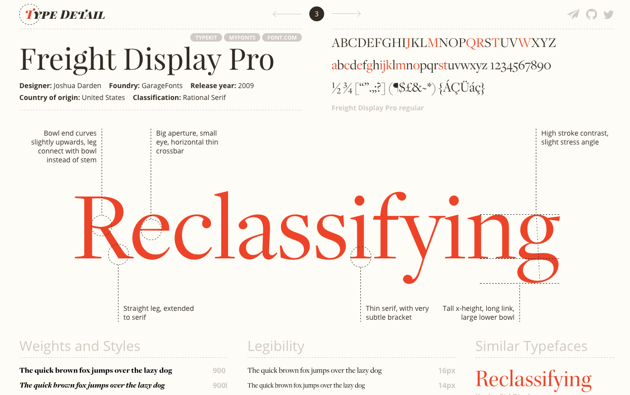
Freight Display, Adobe Caslon, and many more typefaces are lovingly profiled on Type Detail by our own Wenting Zhang. (From June 5.)
Jeni’s Ice Cream
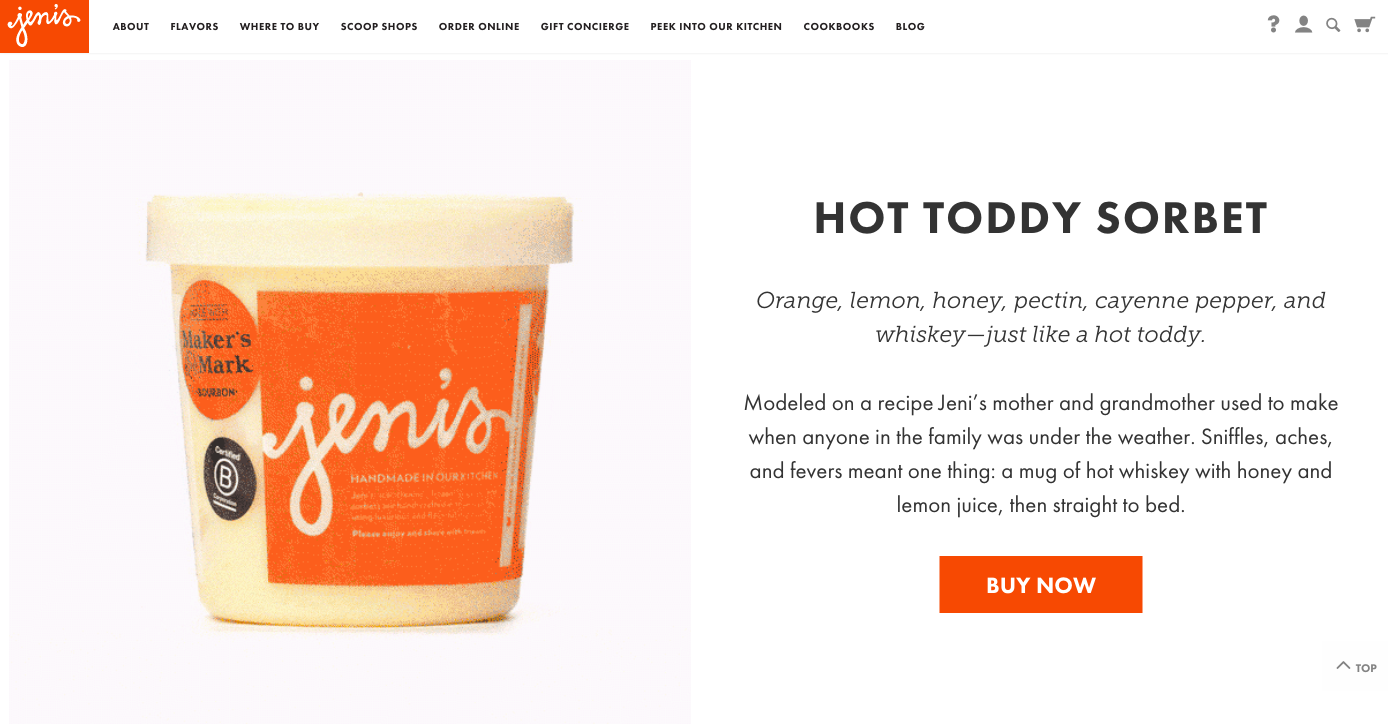
Jeni’s Ice Cream continues to tempt us with imaginative flavors, beautiful photos, and Futura PT paired with Museo Slab. (From January 30.)
Taylor Swift
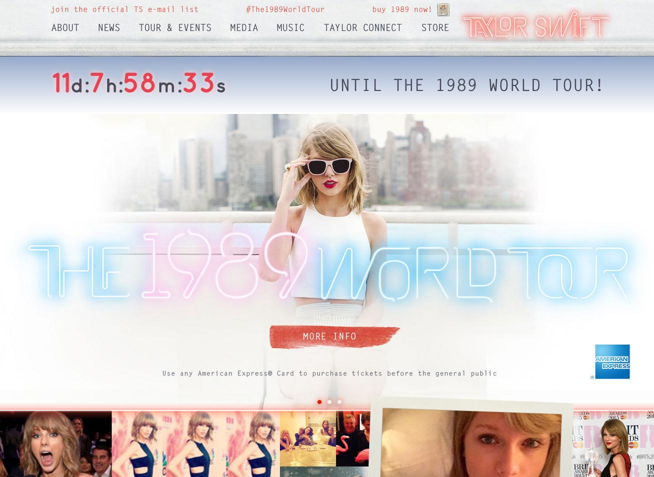
Lots of good stuff on the Taylor Swift website, including Letter Gothic, Bell Centennial Address and Name & Number, and immortalized on our blog with Jake’s unforgettable writeup using 95% Taylor Swift lyrics. (From April 24.)
Airport Codes
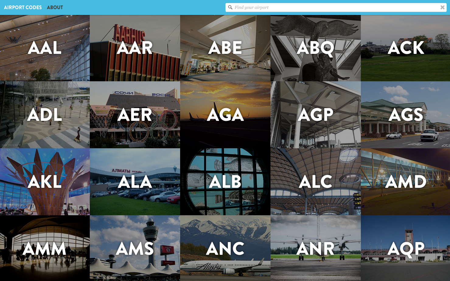
Airport Codes makes those inscrutable code names look snazzy with Brandon Grotesque and Clavo. (From April 10.)
Life in Numbers
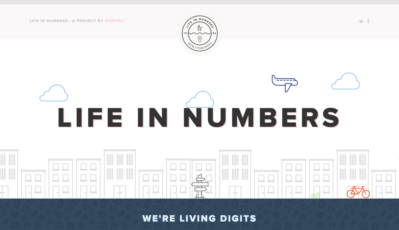
Proxima Nova takes center stage on Life in Numbers. (From July 31.)
We also took a little time earlier in 2015 to revamp our Gallery; see all these and more in one lovely showcase! And as always, let us know when you see fonts you love out in the wild. Comment here or send us a heads-up on Twitter.
3 Responses
Comments are closed.
Confusing layout — need more spacing between sites or some way to differentiate them. More space above each subtitle would do it. A LOT more space.
Thanks for the feedback — I’ve updated the post to make it a little easier to scan.
Much easier now, thank you.