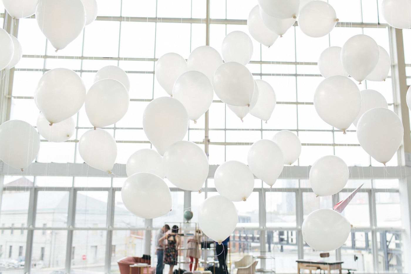
The Typekit pop-up library comes home
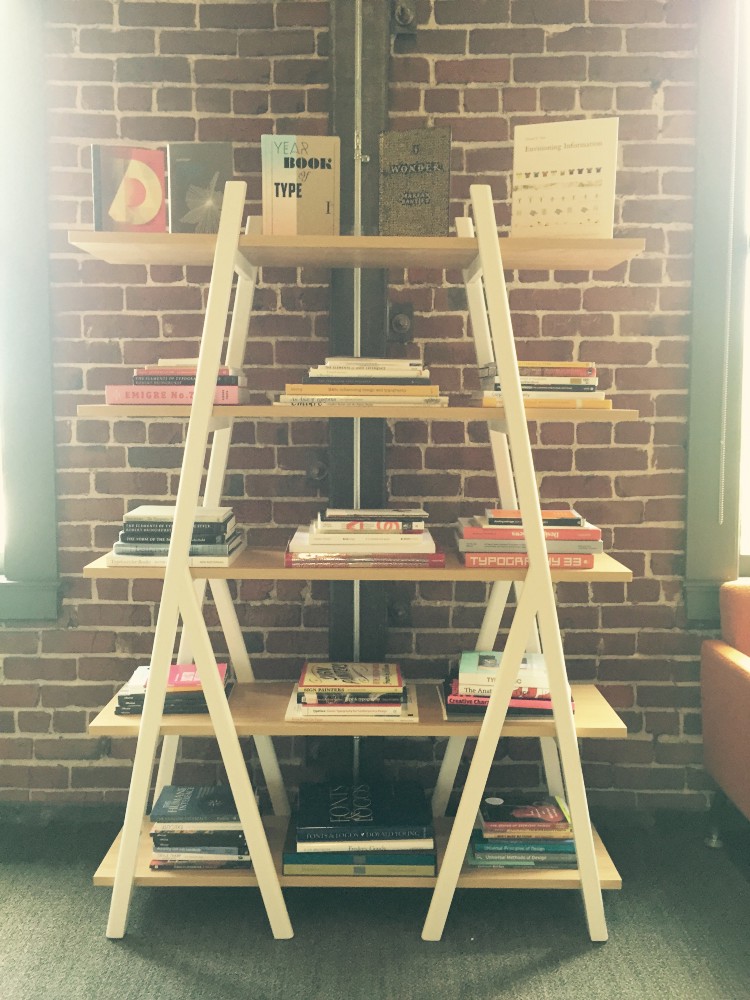
The Typekit pop-up library made its debut at the fourth annual Brooklyn Beta conference in New York, back in 2013. After more than a year of traveling the world, today it came home to live with us in the Adobe offices on Townsend Street in San Francisco. The library was an enormous collaborative effort on the part of Typekit and the broader type community, and it’s a story I want to share.
In 2013, I had been managing Typekit’s sponsorships for about a year. Typekit’s goal for sponsorships was — and still is — to support people and businesses who are doing awesome things for our industry. But at the time, the industry status quo for sponsorship contributions was pretty basic, existing largely on a soft marketing level. The expectation was that sponsors would support events financially, but not make any real qualitative contributions. I felt this fell short of what we could add to the community; noticing a similar impulse among other sponsors, I started to look for ways we could provide a more meaningful contribution to the conferences we sponsored.
For those in the design community, conferences are opportunities to step away from a computer — where the majority of work is done — and meet the colleagues they’ve perhaps only interacted with from behind a screen. The contribution I wanted Typekit to bring to events was one that would enhance the in-person experience by changing the tone of the space itself.
While determining how we would do this, I considered how conferences naturally take energy out of attendees (in a good way), as places where they’re constantly meeting new people and absorbing new information. To respond to this intensity, I wanted to create a place for people to refresh themselves without having to go back to their hotel room or leave the event.
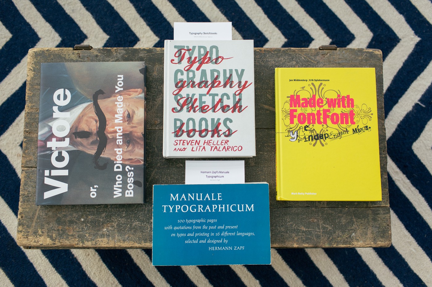
I brainstormed with the team on ways to translate Typekit into a physical experience, and the idea of the library started to take shape. We considered Typekit’s qualities, personality, and product, and arrived at the idea of giving conference attendees the opportunity to learn more about the history of typography. Typekit was founded on a profound care for great typography and design, and by becoming a resource for some of this knowledge we could enrich everyone’s use of web fonts and promote a deeper understanding of design.
With the general concept sketched out, it was time to select the books. Everyone really enjoyed this process, as it touched on our personal histories of how we all found ourselves working at Typekit and developed our passion for type; collectively, we have a broad range of knowledge about typography and design. I created a spreadsheet and opened it up to the whole team, and it quickly turned into a collaborative reading list, including notes from each contributor about why they’d picked certain titles and why they’d recommend them for other readers.
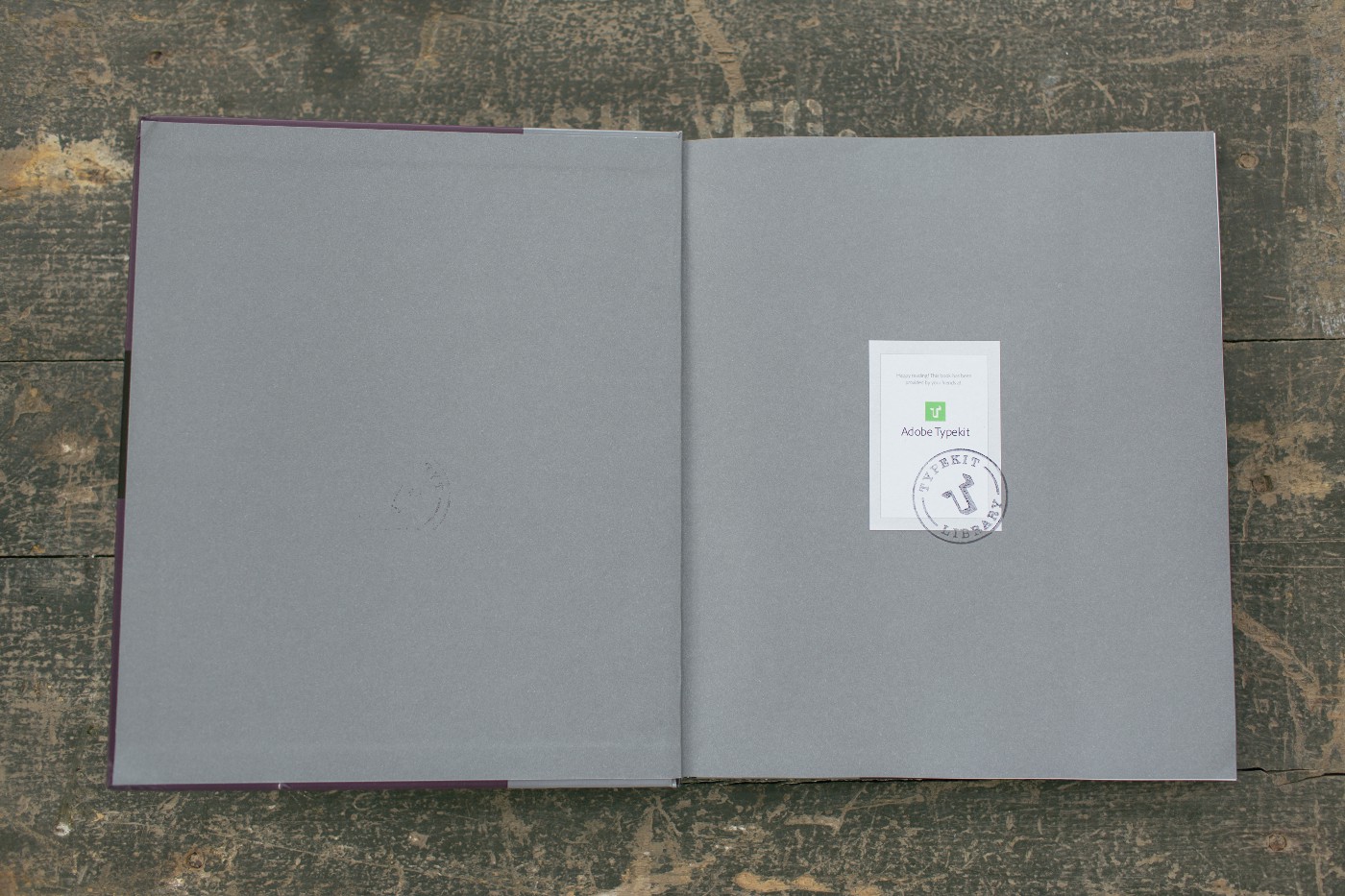
Once we had our list of books, I got started ordering them and planning out the logistics of a book collection. Some books were new and some of the rarer ones were used. Our designer, Elliot Jay Stocks, created a bookplate and stamp for us to put in each book to add to the library feel. This was also one of the few places we placed any overt Typekit branding in the library space. We wanted the experience to speak for itself.
Another important feature of the library was its visual aesthetic. Typically, conference venues are generic corporate hotel interiors, lacking design intrigue. We wanted the library to look more intentional than that. In order to accomplish this, we rented furniture from vendors local to each event, primarily selecting pieces with mid-century modern characteristics to reflect our consciousness of design history. We wanted the sight of the space and the furniture to signal that something special was happening.
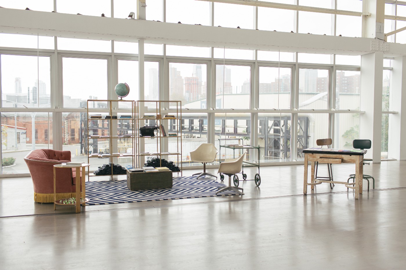
We were now ready to take the library on the road, and the first stop was Brooklyn Beta. Jessi Arrington and Creighton Mershon were so wonderful to take a risk with us by trusting that this new creation would actually be delightful to their conference goers. Ryan Essmaker met us there early in the morning to shoot photographs.
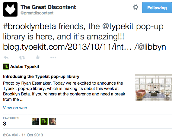
After the successful first event, I felt assured this would work at other conferences. One of my teammates bought two huge crates and we began shipping the library around the world. Here’s where it went.
An Event Apart — San Francisco, CA
An Event Apart — Atlanta, GA
An Event Apart — Seattle, WA
Beyond Tellerrand — Dusseldorf, Germany
Kerning Conference — Faenza, Italy
Smashing Conference — Oxford, England
Adobe MAX — Los Angeles, CA
People were often surprised by the library and wanted to know why were doing it. We would explain how it was intended to be a place to learn, to find inspiration, and to take a mental break. Some would be delighted to recognize many of the book titles, saying things like, “Wow, how did you find all these books? They’re all the best ones on type.” We found ourselves fielding a new level of conversations about Typekit and type that were interesting, intellectual, sometimes historical, and often fun — something our previous conference setups hadn’t quite been able to generate.
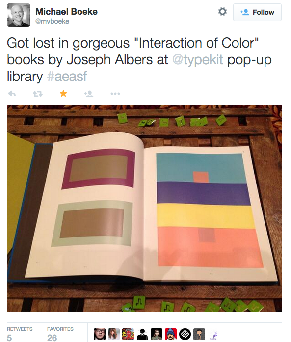
After seeing people’s interest in the books, I worked with Tim Brown to create a web page on Typekit dedicated to the pop-up library. The page lists all the books, along with reviews written by members of the Typekit team.
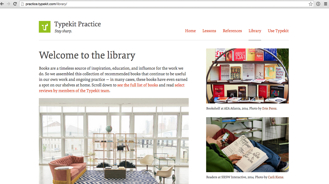
This page is part of another effort Tim is leading for Typekit, called Typekit Practice. When I started the library, I did not know what it would offer the type community outside of conferences. With it being integrated into Practice, I can see the longer-term value taking shape.
As the Typekit pop-up library journeying wound down, I started a new conference activity called the Typekit Studio. The Studio is a place where people can play with letterforms and type, using letterpressed paper, ink pads, and rubber stamps made from Typekit licensed typefaces. It’s a simplified version of older manual printing methods. What I like most about the Studio is how it isolates letters and invites people to inspect them as shapes, rather than as building blocks for words.
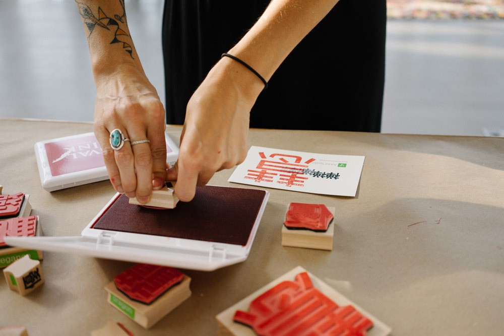
Traveling with the pop-up library and observing the ways people interacted with the books and the space led me to the idea of the Studio. It was important for me to travel as much as possible with the pop-up library, so I could make these observations and learn about what people enjoyed, expected, and found valuable. The Studio has already been a popular hit, and I’m looking forward to where that will take us next.
