New fonts on Typekit from Mark Simonson, Rui Abreu, & Typefolio
We have new additions to our library for you to try on both your desktop and websites. Three of our existing foundries — Mark Simonson, Rui Abreu and Typefolio — have added some great faces to play with. We’d love to hear what you think.
Mark Simonson
We’ve been busy getting a freshly updated version of Proxima Nova into the library this week. It include updates to standard ligatures, new currency and punctuation characters, and a few other optimizations. You can read up on the specifics in the Mark Simonson Studio Notebook. Republish your kits to get the new version. We’ve done extensive testing and tweaking to make sure that this new version will not cause layout problems for existing sites, but get in touch if you have any questions.
Along with that, we’ve added two scripts from Mark Simonson.
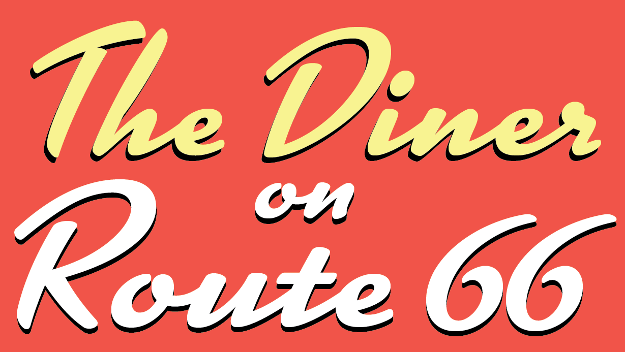
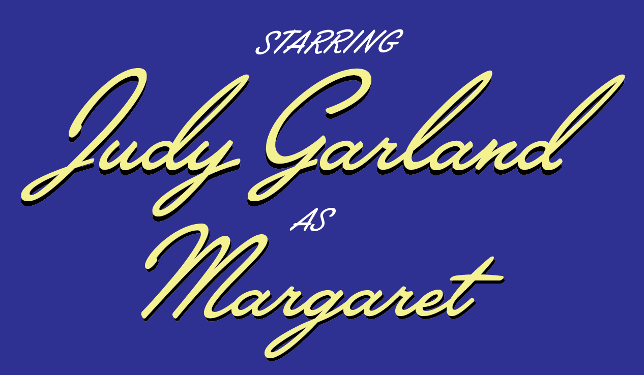
Kinescope
Kinescope has a 1940’s feel along with a playfulness that speaks to its origin in a Superman cartoon series. Simonson programmed contextual alternates into the font to automatically choose the appropriate letter shapes as you type. No more y’s reaching for a non-existent letter when they’re at the end of a word!
Lakeside
Inspired by the titles in a 1940’s film, Lakeside’s loops evoke that classic film noir style. It includes three styles of capital letters — standard, oversized caps for a more upscale appearance and plainer caps for an all-caps setting. Simonson used the same contextual alternate technology mentioned above for Kinescope, as the letters magically adapt to their position in a word.
Rui Abreu
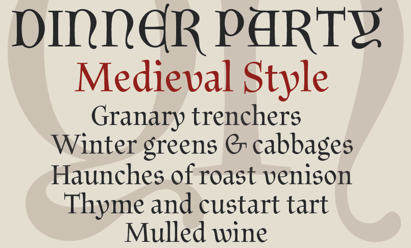
Litania
Litania plays off the natural writing style of medieval scribes, incorporating some of the inevitable variations that worked their way into manuscripts. The typeface contains the more decorative Lombardic capitals along with Roman capitals. Both complement each other well, and the lowercase letters are a great fit for either style. When set in this typeface, Lorem ipsum looks more like an incantation than a placeholder!
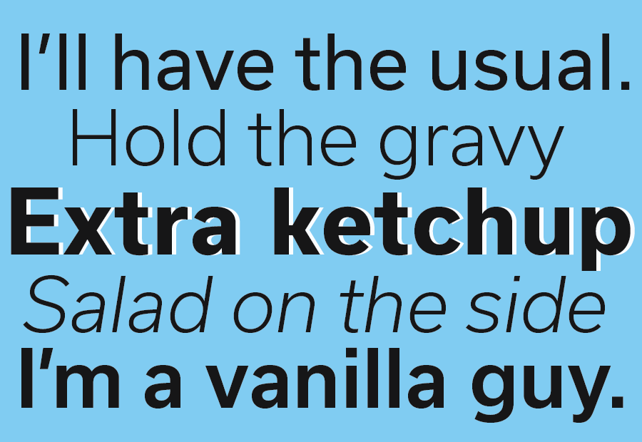
Usual
Usual is a neutral and versatile face whose five weights suit uses from text to headlines. Included in the offering are alternates with shorter descenders — this is great for adapting to tight line spacing without compromising the shape of the letter.
Typefolio
Stevie Sans
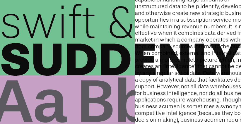
Stevie Sans is a modern grotesque with seven styles. Its high x-height and open counters make it perfect for digital text, as it lends itself well to screen reading. Maintaining this legibility at the smallest sizes and heaviest weights is no small feat.
Let us know what you think of these new fonts! If you don’t have a Typekit subscription, it’s free to try out and take a look around.