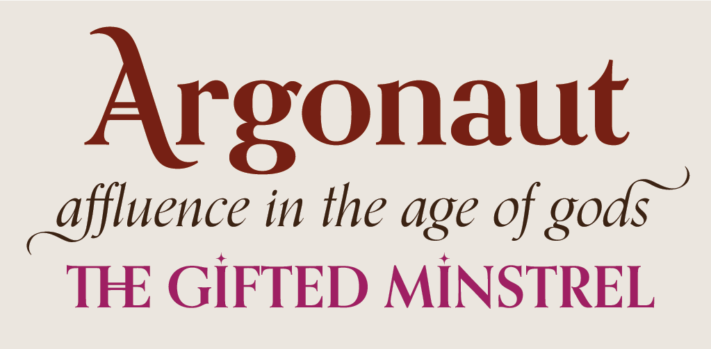
New fonts on Typekit: Canada Type
As we announced recently, we’ve added a ton of new fonts to the Typekit library from the extensive collection at WebINK. Among those foundries is Canada Type, a Toronto-based operation founded in 2004. Canada Type works with a number of different designers, making this one of the most stylistically diverse font collections we’ve added to our library at one time.
Classic Comic & Collector Comic
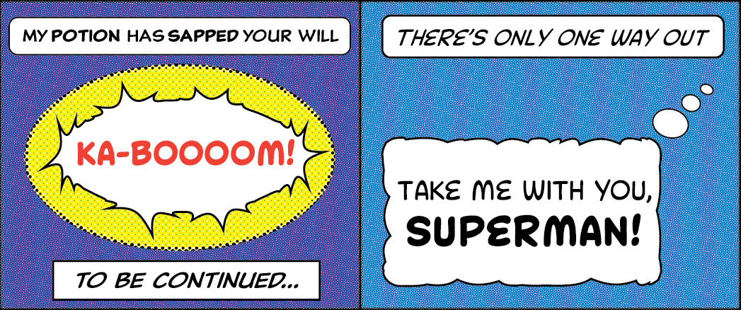
Classic Comic (left) and Collector Comic (“KA-BOOM” and right). All type specimens by Ariadne Remoundakis.
Heavily inspired by comic book lettering styles and “Patrick Griffin’s continued obsession with the genre,” the all-caps Classic Comic typeface brings an unmistakable flavor to display text (and would look completely at home inside a word bubble, if you want to go that route). Sturdy enough for really big sizes; bring it to your billboard. Collector Comic is a condensed, slightly lighter variation on this theme, and is ideal for infographics and more text-focused settings where you might need to elaborate a little beyond BLAMMO.
Clarendon & Clarendon Wide
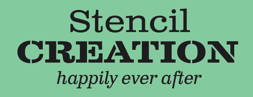
Clarendon Wide, Text, and Stencil
Clarendon Text is packed with fantastic details in some of its ligatures, and it also has a stunning wide companion font: Clarendon Wide, which we’ve added to the library in both solid and stencil.
Gibson
Gibson
This delightfully flexible humanist sans serif was named in honor of John Gibson, one of the original founders of the Society of Graphic Designers of Canada. With eight styles and weights, you’ll have plenty to play with; try combining a couple weights for a visually-dynamic look that maintains consistency.
Memoriam
Memoriam
Commissioned for the New York Times Magazine in 2008, elegant Memoriam was immediately a hit with readers — who were quick to demand a retail version. You can really get some mileage out of the swashes and alternates here — and we’ve got the Outline, Inline, and Headline variants too.
Orpheus
Orpheus
Orpheus is a revival of a typeface designed in the late 1920s for the metal type market; it enjoyed about a decade of popularity in Germany until World War II — and technological shifts in typography — pushed it out of view for a long spell. This version is packed with creative alternate characters, and the italics are especially lovely with a strong calligraphic flavor.
All the new typefaces from Canada Type are available for sync or for use on the web — try them out anywhere! If you don’t have a Typekit subscription, it’s free to try out and take a look around.