A brief interview with Stephen Coles
We’re looking forward to our first Working Late event in SF this Wednesday with Stephen Coles. If you haven’t already grabbed tickets, there’s still room; claim yours from the Eventbrite page.
Stephen will be presenting “A Typeface is a Chair,” which interweaves typography with Mid-century Modernist furniture design. To gear up for the talk, we asked Stephen a few questions about typography, his influences, and some of his favorite typographic inspirations around SF and online.
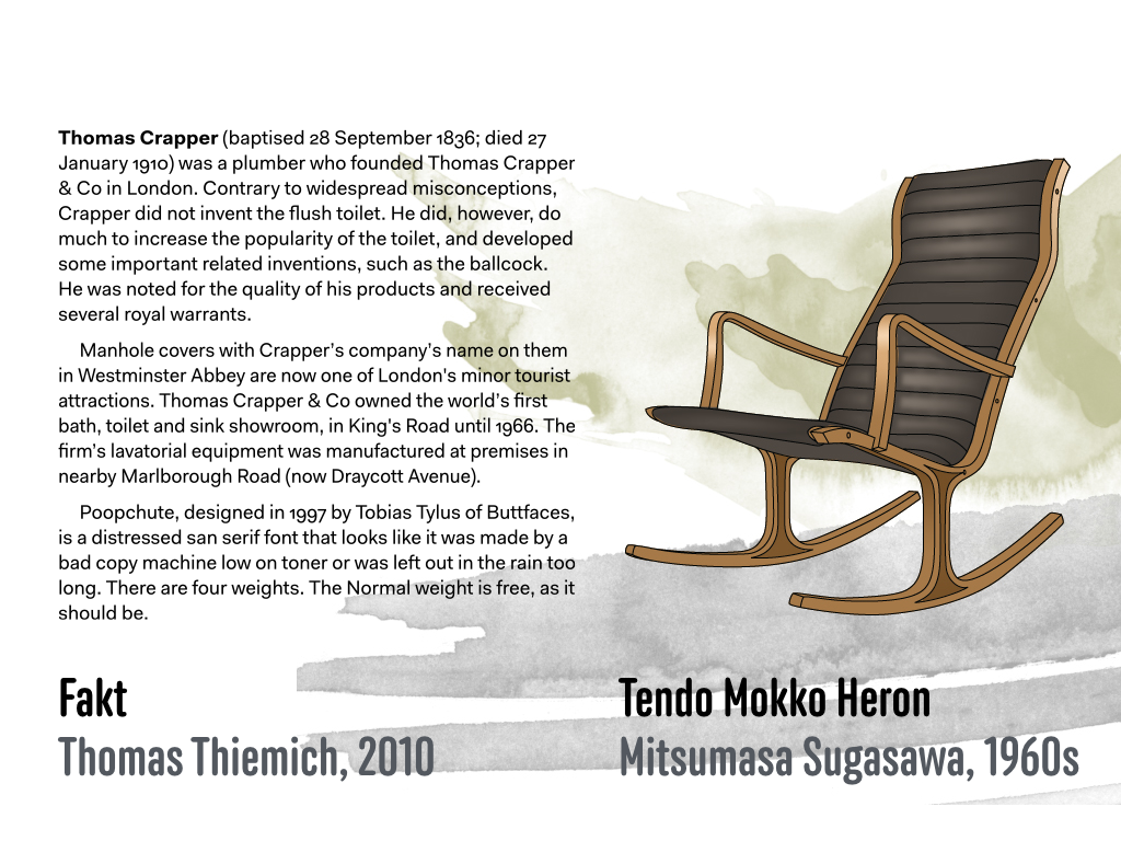
Illustration by Laura Serra
What excites you most about typography?
Just when I think I have seen it all — every typographic possibility has been exploited, the font market is saturated — someone does something new. Almost as exciting is when I discover that one of these things was done 50 years ago and most people didn’t realize it. That’s the stuff I usually post on Fonts In Use or Flickr.
Who have your mentors been? What are the most memorable things you’ve learned from them?
My first boss in the type industry, Erik Spiekermann, taught me an important lesson about hiring: Don’t start with a position and look for candidates to fill it. Instead, seek out smart people you trust and want to work with, and let them create the position that fits them.
My other mentor is my mom. She told me to be kind to people.
What are some fun places to go for typographic inspiration both online and off?
Online:
Flickr! Flickr is the best place on the internet to see old type specimens, rare magazines, and weird signs. Forget Instagram for type. Instagram is for pet videos and things that are square. Type is almost never square.
Offline:
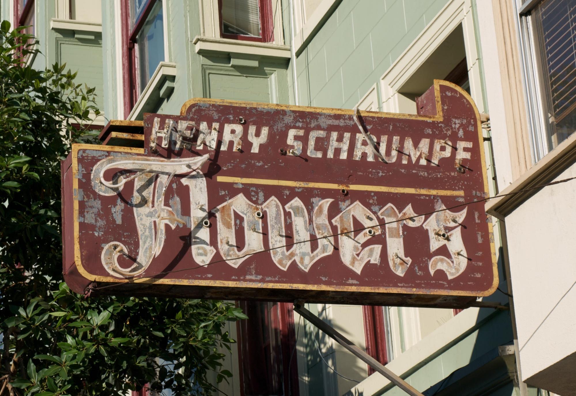
San Francisco Signseeing
1. Mission St, from 16th to Cesar Chavez
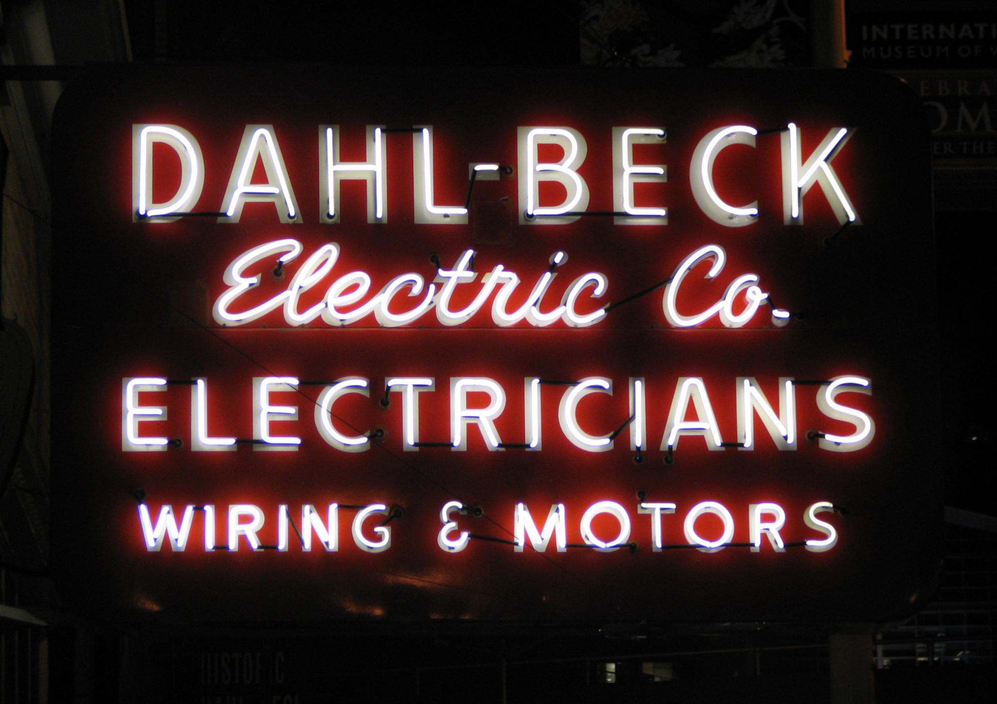
2. Dahl-Beck Electric sign on Mission and 2nd
3. 19th-century gravestones in Oakland’s Mountain View Cemetery
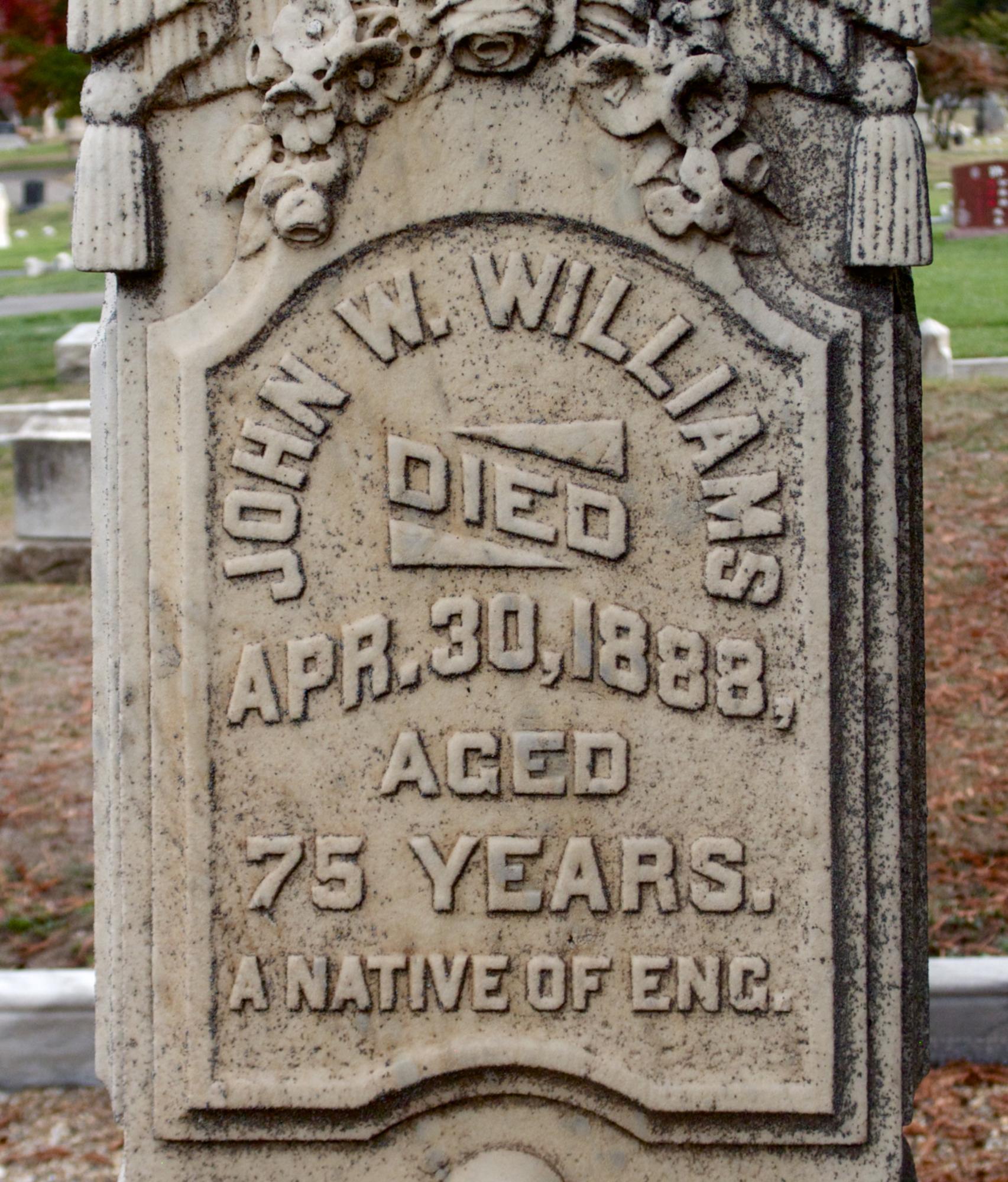
4. The Letterform Archive. Did you know that one of the world’s most complete collections of typographic ephemera, original artwork, and typeface specimens is here in San Francisco? Go see it.
What are you looking forward to with the future of typography?
For hundreds of years, type was arranged by typographers and set by typesetters: a narrow subset of design specialists with special equipment and special training. In this new era of self-publishing, suddenly everyone is a typographer. This is both scary and exciting. It brings new education challenges: for instance, basic terms like “type” are increasingly misused. (Hint: most of the signs and stone carving I mentioned above are all examples of lettering. Stuff made with fonts is type.) The positive news is that this expansion of the craft engages specialists from other fields who haven’t had to think about type until now. People from diverse disciplines (like web design and engineering) are contributing all sorts of new ideas to typography.
Also, font jokes make more sense at a normal person party than they used to.
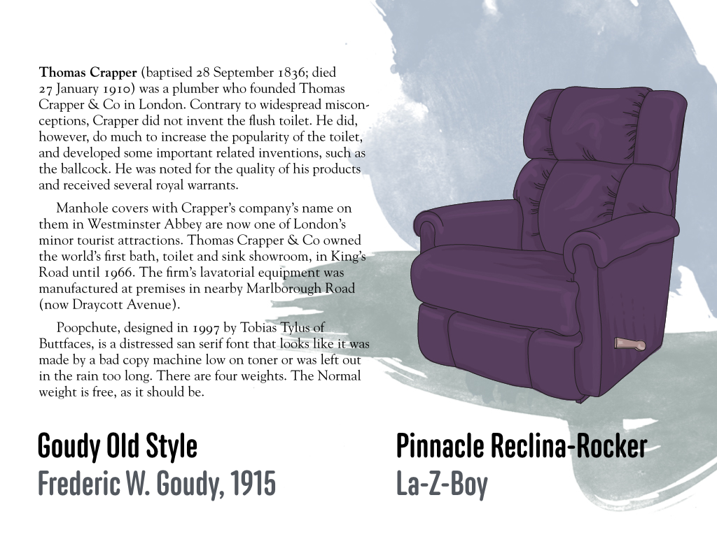
Illustration by Laura Serra
In anticipation of your talk this week, will you give us a teaser?
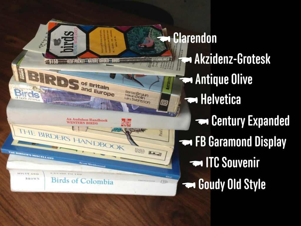
You will see how birdwatching is like fontspotting. You will learn how a chair is like a typeface. You will hear the sound Gill Sans makes.
We can’t wait to hear more from Stephen on Wednesday. We’ll have food and drinks for everyone, too. Visit Eventbrite to grab a ticket if you haven’t already, and we’ll see you there!