Pan-CJK Partner Profile: Iwata Corporation
An ambitious project from the start, the development of our Pan-CJK typeface Source Han Sans brought together the work of Adobe, Google, and three in-country type foundries: Iwata Corporation in Japan, Sandoll Communication in Korea, and Changzhou SinoType in China. We recently sat down with Yutaka Ozawa and Tsuyoshi Sugimoto of Iwata, one of Japan’s oldest and most respected type foundries, to talk about the Source Han Sans project.
Can you provide me with a little bit of history about Iwata?
Iwata Corporation can be traced back to Iwata Matrix Co., Ltd, which was founded in 1920 and has since consistently manufactured matrixes (metal matrixes for typecasting or master drawings for photocomposition). After various transitions, Iwata Corporation was founded as a sales company dealing with the font production of Iwata Matrix Co. In 2001, Iwata merged with Iwata Matrix and then became what Iwata is now.
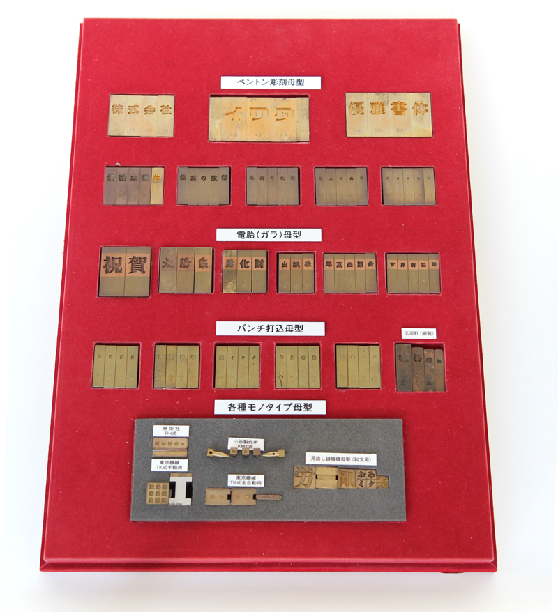
Different metal matrices according to the type of production method.
Do you primarily develop Japanese fonts?
We have been consistently focused on developing Japanese fonts, but in recent years we have developed multilingual fonts in addition to Japanese in order to meet the changing needs of the Japanese market. We have licensed these fonts with digital cameras, electronic dictionaries, and automotive devices.
What are your most popular fonts?
Iwata Mincho and Gothic are our time-honored fonts. Both have a long history and are well-loved by the reading public. Additionally, Iwata Newspaper Types, Iwata Textbook Types, IWATA UD (Universal Design) Gothic and a variety of our Brush Types are very popular.
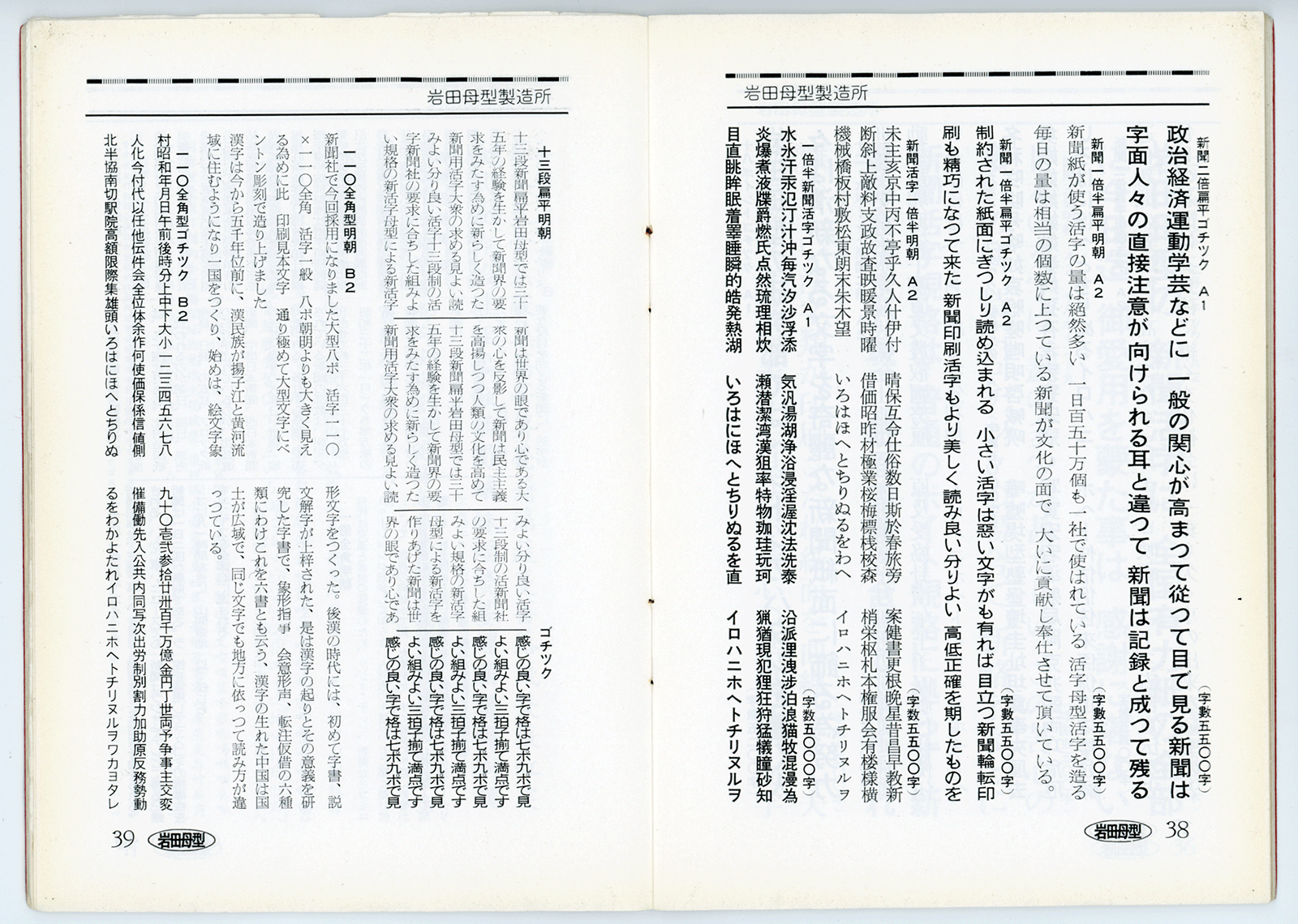
Vertical layout sample from an Iwata Specimen (1959).
Can you talk a little about how Iwata has innovated over the years?
We are pioneers for newspaper type. We developed a specialized typeface for newspaper, which is expanded in a horizontal direction in order to lay out more glyphs into a given space with a reasonable degree of visibility. That later became a de facto standard in Japanese newspapers. Currently every Japanese newspaper uses the same concept in its fonts.
In 2006 we released UD (Universal Design) fonts to meet the need in the Japanese market for fonts that focus on legibility and visibility for the aging population and those with weak eyesight or cataracts. The first UD release, Iwata UD Font, has been influential and widely adopted. You can find it in Japan on TV remote controls, tablets, apps, newspapers, and so on.
What is the most rewarding aspect of creating typefaces?
Combining our 100-year heritage with the latest digital technologies to create fonts that contribute to society.
As one of the partners for the Source Hans Sans project, you’ve been on the ground throughout much of the work that went into the font’s design. What were some of the challenges you faced in working on Source Han Sans?
On the design front, we were able to make the process go so smoothly because we had good and frequent communication with the Adobe team in Japan, and were able to discuss the design intent and share concepts with them in detail. But on the technology front, there were some challenges. We had to establish a new development environment for Source Han Sans. This entailed creating new internal rules to properly handle the fonts, developing a new version management tool, and creating a tool that would pick up analogous glyphs and placed them side by side automatically. We also had to learn Adobe’s design tool (TWB2).
How many people were involved on Source Han Sans?
There were three key people: Akira Mizuno (Technical Director), Kazuo Hashimoto (Chief Designer), and Tomihisa Uchida (R&D Director). All of these individuals have more than 25 years of experience in font technology. Under their direction a total of nine staff members were engaged in this project.
What was it like to work with several companies to produce designs that would harmonize across languages?
In this project, the Japanese glyphs were designed first, and then the Chinese and Korean glyphs were designed based on the Japanese. In that sense, it was easier for us to design the glyphs than it was for the other foundries involved in this project.
What is your overall opinion about Source Han Sans? Do you think it will be widely used?
Source Han Sans is innovative and has the potential to be widely and universally accepted by the CJK market. In the beginning most people will probably focus on the number of glyphs included in Source Han Sans, but after using it, we believe people will appreciate the quality of glyphs. The feedback we’ve received since its release supports our belief that Source Han Sans could become the default and de facto standard CJK font.