New fonts on Typekit: Kinesis from Adobe
A new font family is now available on Typekit: Kinesis, an Adobe Originals typeface, designed by Mark Jamra.
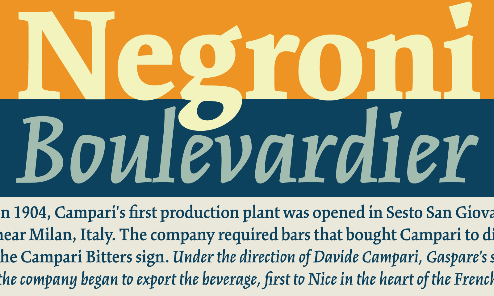
Kinesis, as the name suggests, is full of energy. Non-uniform counter shapes, significantly flared terminals, and active serifs lend to a sharp and sprightly expression in the uprights, especially in heavier weights and at larger sizes. Kinesis also works well in text sizes; sturdy shapes and active texture make it a good pick for body copy. Distinctive characteristics, like serifless ascenders and big sloping serifs on descenders, are well balanced and do not distract from the content. Kinesis’s italics are narrow and even sharper than the uprights, and evoke a sense of urgency, like they are in a hurry to get somewhere — excellent for emphasis in text, and uniquely expressive in headlines.

Big serifs on descenders, none on ascenders. “Squipled” is not an actual word.
The ten-style family is available for web to all paid Typekit subscribers. Select styles are available for Creative Cloud desktop sync. If you’ve never tried Typekit, sign up and take a look around, and upgrade to a paid plan when you’re ready.
One Response
Comments are closed.
I would love to see this typeface be made available for Desktop use as well.